Features of rectangular rooms
A rectangular room is easy to zone, but there is a risk of turning it into a narrow corridor. To prevent this from happening, follow the rules:
- Spread the walls apart with light shades, mirrors, and more.
- Consider your layout carefully: do not line all furniture and appliances along long walls.
- Avoid partitions for zoning in favor of a play of color and light.
- Pay attention to the floor, the podium is a great option for a rectangle.
- Use a minimum of furniture, leaving a lot of free space.
- Take care of the right lighting - a central chandelier won't be enough.
Recommendations for planning and zoning
We have already noted above that the arrangement of furniture along the walls will aggravate the problem of incorrect geometry, therefore, the layout of the elongated room must be thought out in advance. Massive furniture from the side will visually expand the space, the use of a central place will also create a feeling of spaciousness.
Tip: Do not forget about ergonomics: so that the room does not look cluttered and it is comfortable to walk, the width of the passage should be 70-80 cm.
Zoning is a good design solution. The number of functional areas and their division depends on the intended functionality and size of each individual room. A rectangular living room can combine areas for relaxation, work and eating. Rectangular bedroom - work and sleeping place.
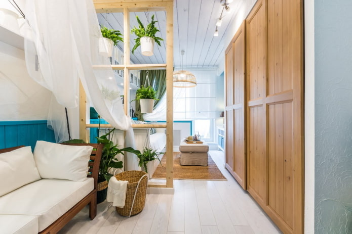
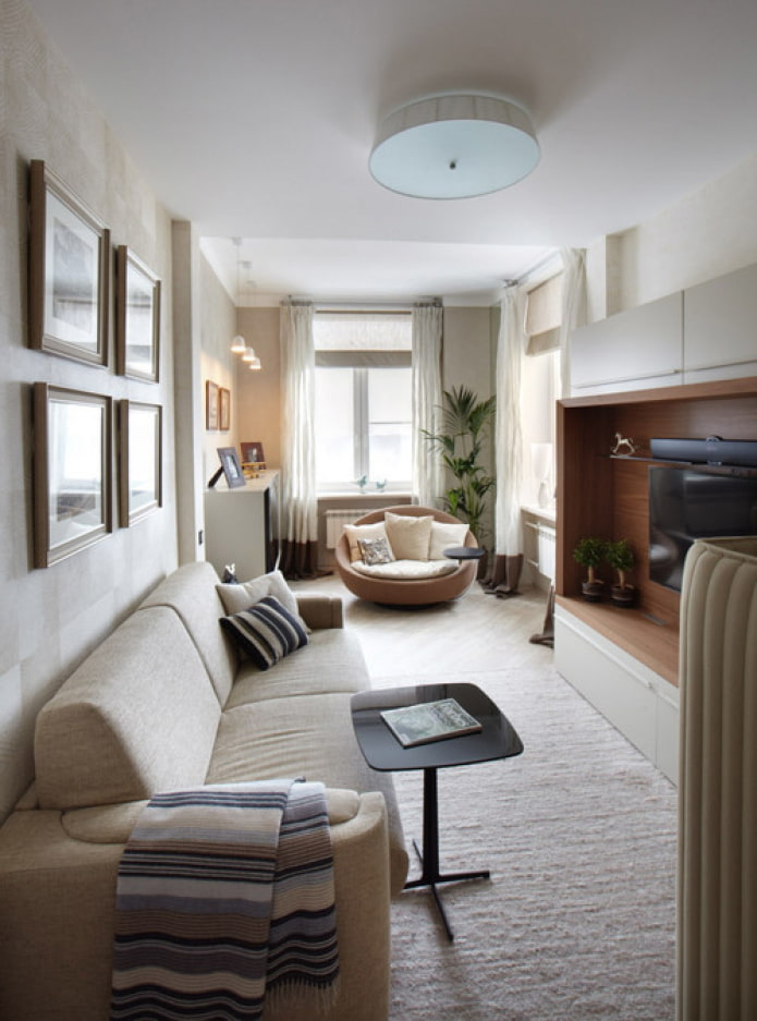
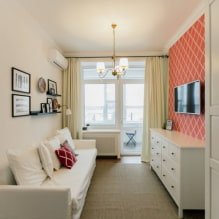
In the photo, the zoning in the living room-bedroom is done using a rack.
In large spaces, the use of partitions is suitable, but it is advisable to choose translucent models. There are drawbacks to screens: do not place more than one in the room, so that the room does not become a labyrinth.
Furniture is often used as a physical zone divider: a sofa, a rack, a console. If this option is suitable for your case, implement it.
Visual ideas for a rectangular room: different level or material on the floor, separate lighting in each zone, unique wall decoration or furniture colors.
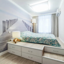
A podium is a great solution that will make a rectangular room look more square. You can install almost any area on it: a bed in the bedroom, a seating area in the hall, a writing or dining table.
Choosing the right color scheme
Since rectangular spaces differ not only in size, but also in aspect ratio, the choice of colors is individual for each case.
- Small rooms become visually larger in light colors of decoration and furniture. Add bright and dark contrasting accents in moderation, in small items.
- The happy owners of spacious apartments are not limited by anything in the choice of color - proceed from personal preferences and the chosen style.
- Narrow oblong rooms must be made wider - for this, paint long walls in light, and short ones in deep dark.
- In sunny southern apartments, use cold colors: blue, turquoise, lilac. Spaces with windows to the north will be decorated with warm yellows, oranges, beige shades.
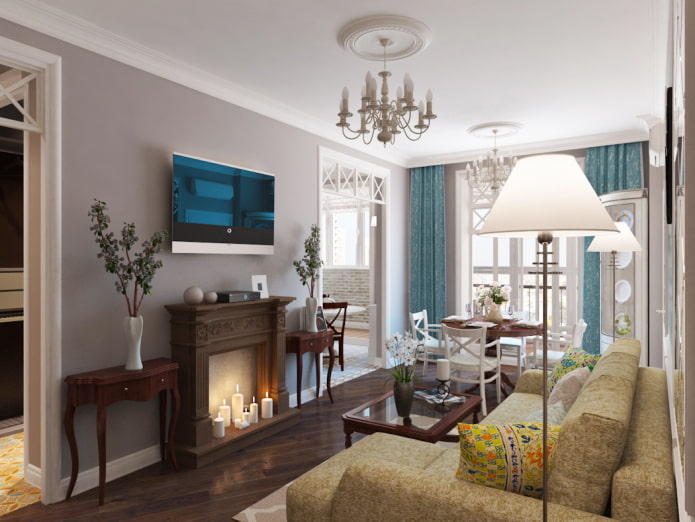
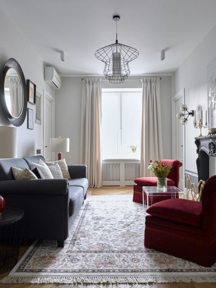
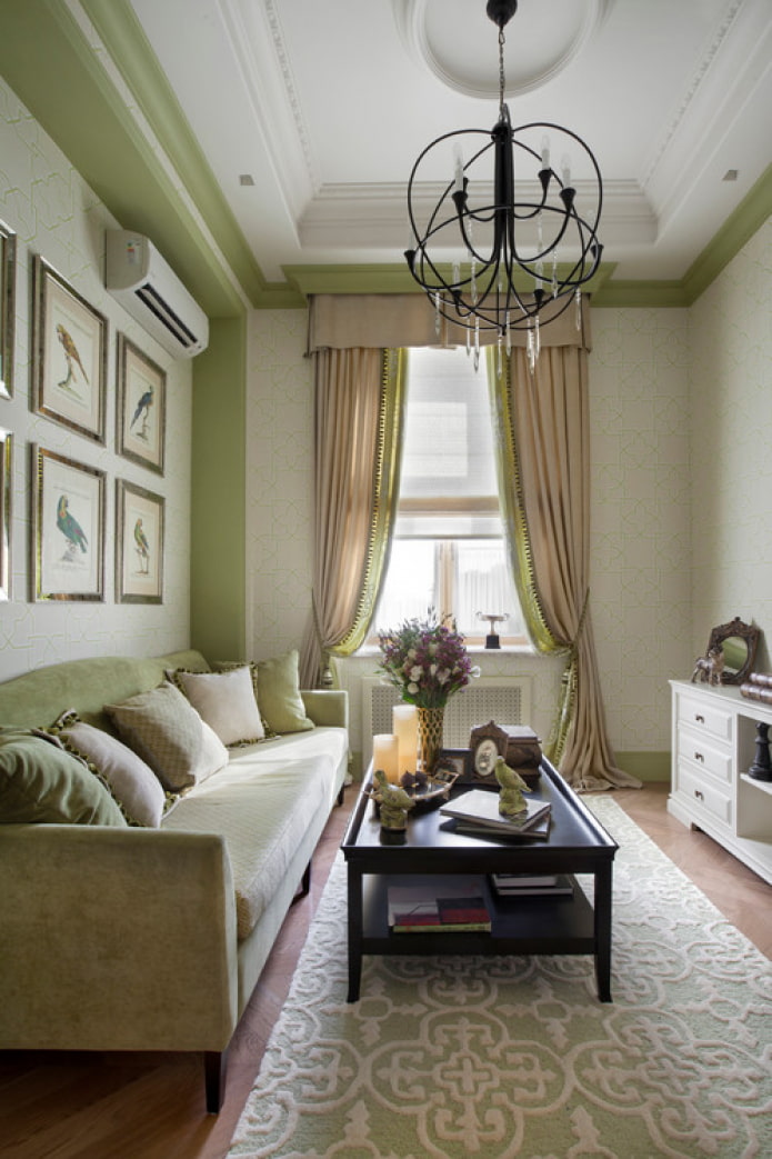
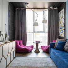
Pictured living room in gray tones
What to consider when repairing?
- Ceiling. A standard ceiling (up to 3 meters) cannot be made darker than the walls, otherwise it will crush. Classic white is best, but don't leave it alone. Shapes from moldings, perpendicular stripes or ceiling rosettes can help with geometry correction. A stretch ceiling made of glossy canvas will enlarge a small room. From matte - will decorate the overall.
- Walls. We have already said about the color palette of the long and short sides, we will decide on the finishing materials. Wall murals with perspective really make the space wider, as do the horizontal stripes. Vertical lines will "raise" the ceiling if necessary. In large rooms, feel free to use large drawings and macro images, in tiny rooms - wallpaper with a small pattern and a scale of 1: 1.
- Floor. The classic technique of pushing the boundaries is the transverse arrangement of the floor covering. For zoning, they combine 2 different shades or materials, for example, tiles in the kitchen work area and laminate in the dining room. A carpet thrown along the short wall will also brighten the room.
Furniture placement rules
Furniture in a rectangular room accomplishes the same task: approximating the shape of a square.
The simplest arrangement is to pick one central element and shape the room around it. A coffee table in the living room, a dining table in the kitchen, a bed in the bedroom.
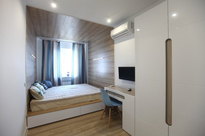
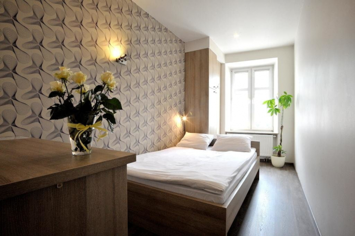
The photo shows an example of the arrangement of furniture in a rectangular bedroom
Another rule of thumb is to use two short pieces of furniture instead of one long piece. Or tall instead of wide. This means that the full-length wall should be replaced with a pair of elegant cabinets. Instead of a 3-meter sofa, prefer 2 x 1.5 meters.
The most suitable layout for a rectangular one is asymmetrical. Do not group furniture in one place, distribute it evenly throughout the room.
We make competent lighting
One lamp in the center looks sad and does not cope with its task: in the far corners it is dark even with the brightest light bulb.
Competent lighting of a rectangular room consists in placing independent sources in each zone. When dining in the kitchen, you only leave the suspension above the table on, turning off the headset's spot lighting. Common options for a modern rectangular room interior:
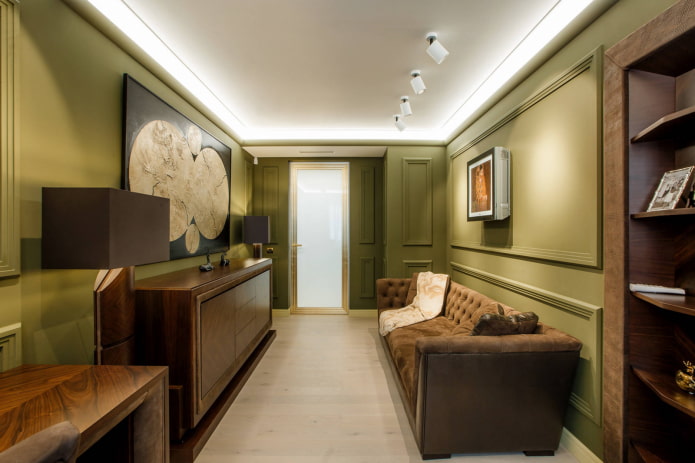
- Spotlights. It is convenient to install in stretch and suspended ceilings. Suitable for relaxation areas in the living room, working in the kitchen, corridor and bath.
- Hanging suspensions. Placed above the bar, tables, bed.
- Sconce. They are hung on the sides of upholstered furniture.
- Table lamps. For bedside tables and desk.
- Floor lamps. They are located by the sofa and armchairs, near the bed.
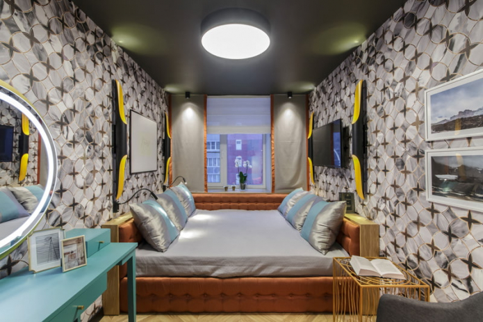
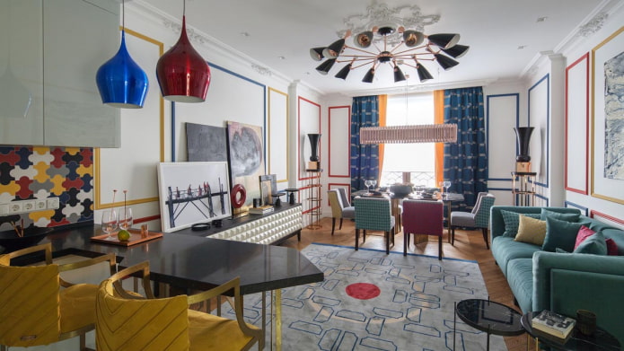
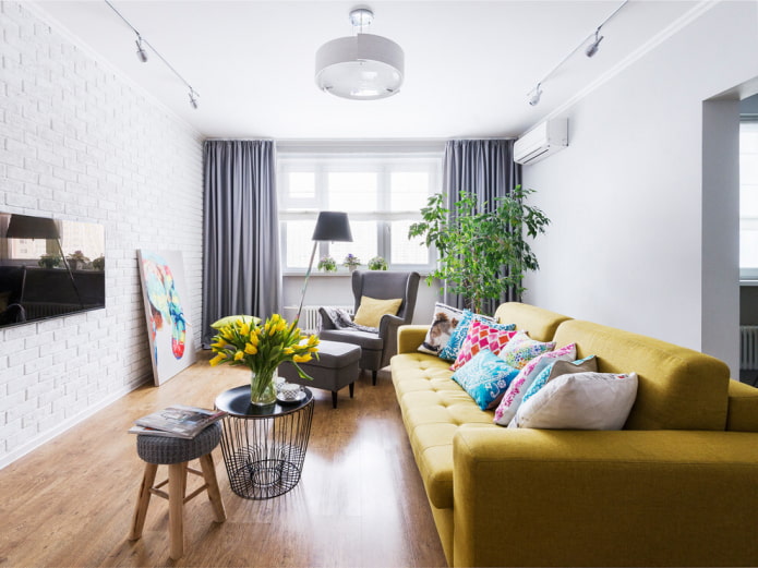
In the photo, the embodiment of a bright fusion style
The nuances of arrangement by room
We have already found out that any space of an apartment can have a rectangular shape - we suggest figuring out how best to design each of them.
Rectangular living room design
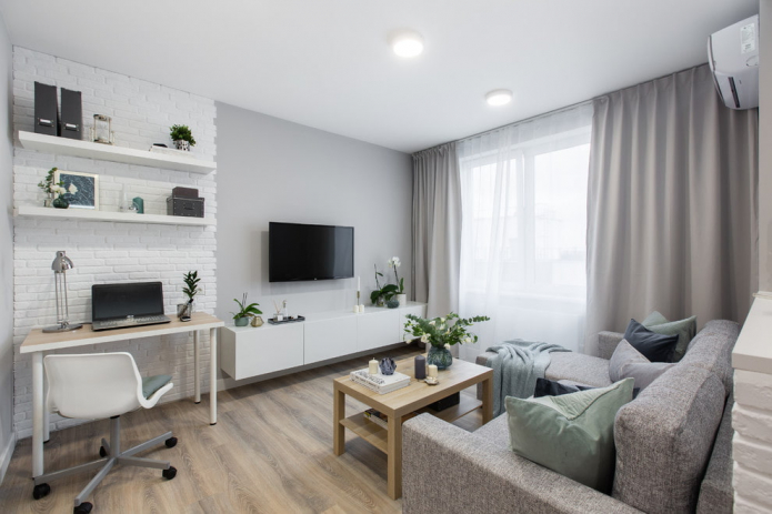
A rectangular living room is the best fit for zoning. It can be combined:
- from the dining room by setting up a dining table with a sofa or chairs;
- with a bedroom in the studio, placing the bed behind the partition;
- with an office, equipping a comfortable workplace.
Whatever additional furniture you place, avoid symmetry: it emphasizes the irregular shape of the hall. An asymmetrical layout in a rectangular living room looks more attractive.
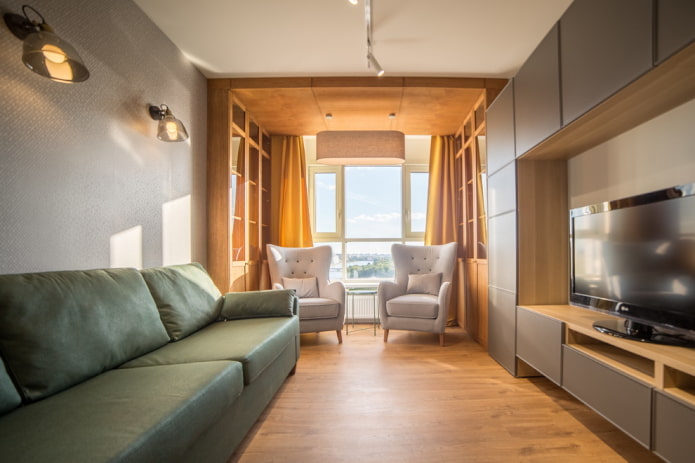
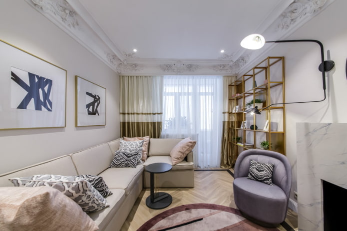
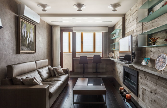
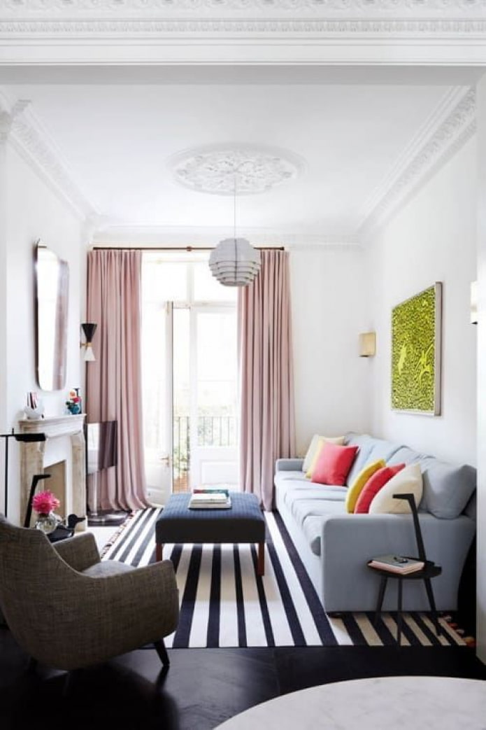
In the photo there is a rectangular hall with a balcony door
Furniture on the principle of "sofa along one wall, wardrobe along the other" is used only if these walls are short. For this, the window must be on the elongated side.
If the window opening occupies a narrow wall, it is preferable to arrange furniture perpendicularly, occupying the central part.
Rectangular bathroom design
In a rectangular bathroom, change horizontals to verticals:
- a high shower cabin instead of a wide bowl;
- laying tiles with the short side parallel to the floor instead of walls;
- pencil cases instead of low pedestals.
If you don't want to change the bath for a shower, install it along the short wall, and the sink and toilet in the rest of the room. Another option is a bathroom on the long side, but with high partitions.
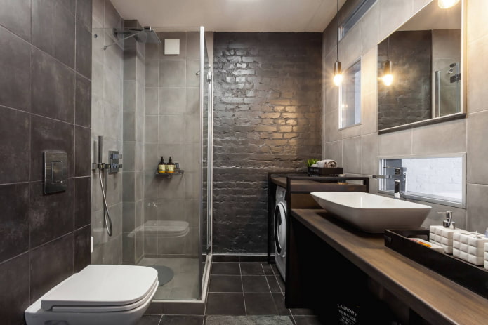
In the photo there is a rectangular bathroom with a shower
In small rooms, choose clear rectangular shapes, rounded ones interfere with the rational use of space.
By using a minimum of items, you also free up space and improve the look of the restroom. For example, instead of a freestanding sink and cabinet, place the sink in the countertop or hang it over it.
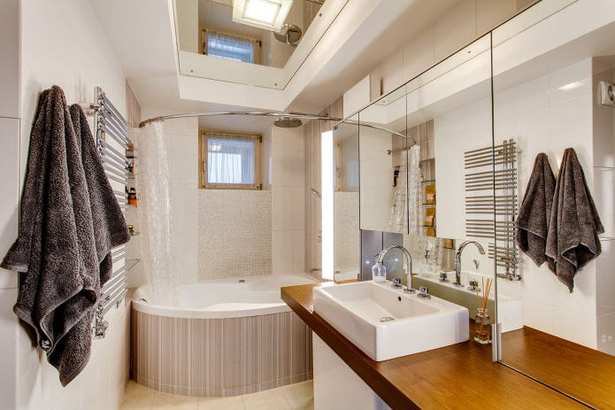
In the photo, the option of expanding the space with the help of mirrors
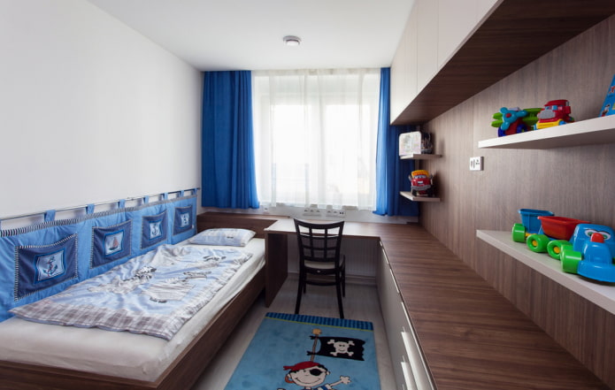
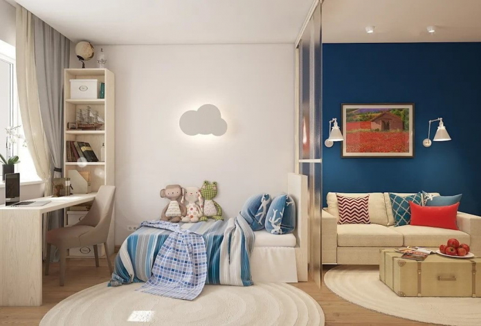
Rectangular children's room design
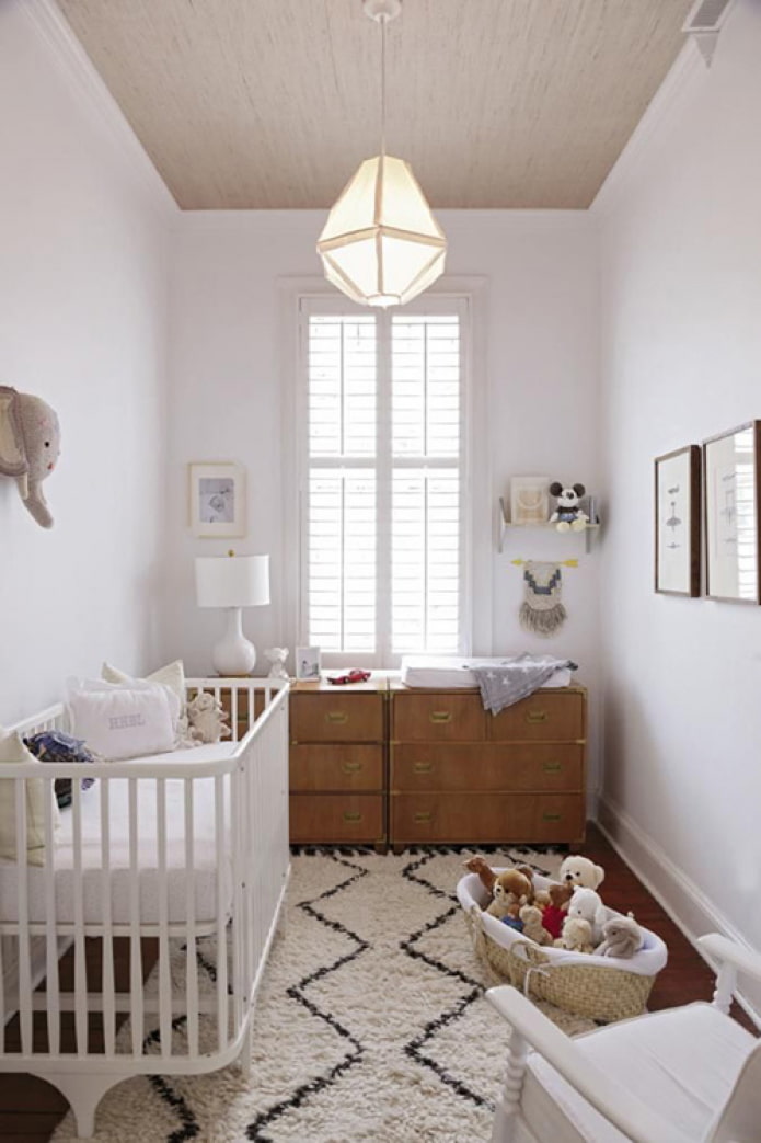
In the nursery, it is necessary to find a useful use for the window and correctly arrange the sleeping place.
Most often, a tabletop is placed on the windowsill for study and creativity, and around it they make a framing of shelving. Ordinary curtains will have to be replaced with Roman or roller blinds.
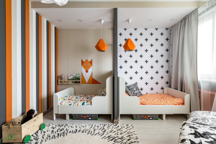
Pictured is a children's room for two children
Furniture in 2 rows does not fit, we change it to p or l-shaped. We put the bed with the end to the table on the windowsill, and in the corner opposite we attach the Swedish wall. If the rectangular room is very tiny, a two-story group will save: a table and a place for games below, a cozy bed on top.
Do not limit yourself in decorating a space for a child: a round rug is suitable for games and edits geometry, bright decorative wallpaper or a picture on the narrow side attracts attention and looks great.
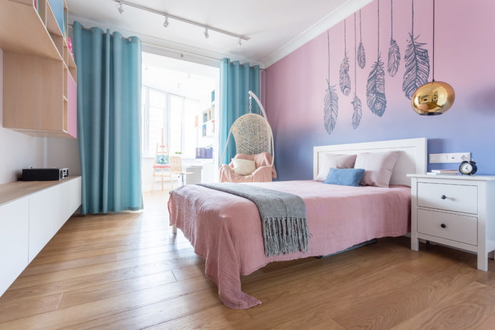
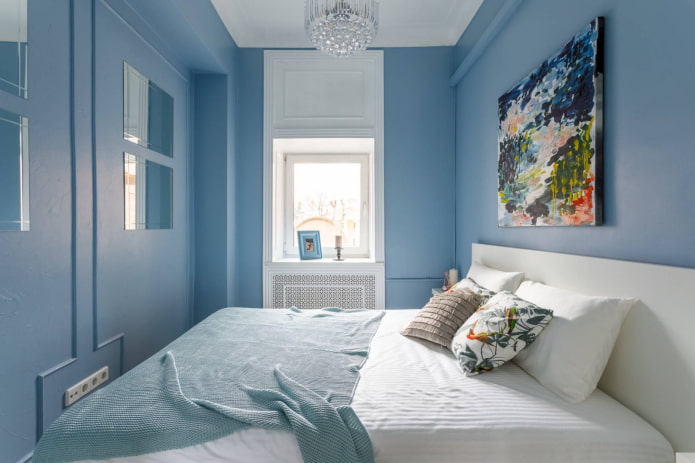
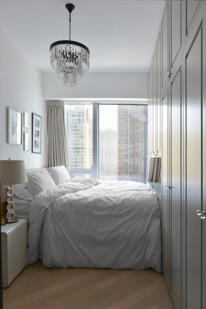
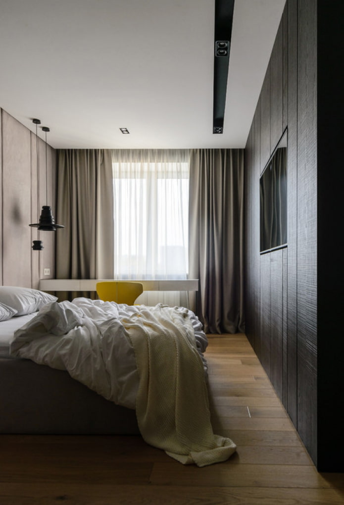
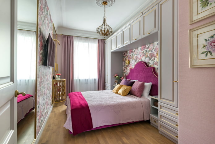
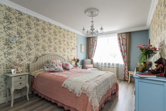
Rectangular bedroom design
A wide bed is a great buffer that will prevent the bedroom from looking like a corridor. However, you should not get carried away with the longitudinal arrangement of cabinets and dressers.
If only one zone is planned in the bedroom, the bed is placed in the center of the room, providing comfortable approaches.
The workplace, if necessary, is placed by the window - for this you can use a window sill or put a separate table. There is also a dressing table for a girl.
A tall wardrobe is suitable for the role of a storage system, if the layout allows - place it to the right or left of the door along a narrow partition.
Rectangular kitchen
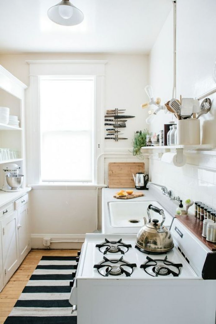
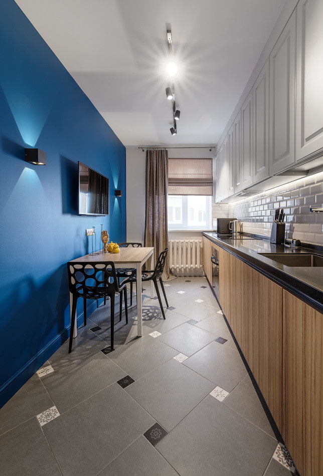
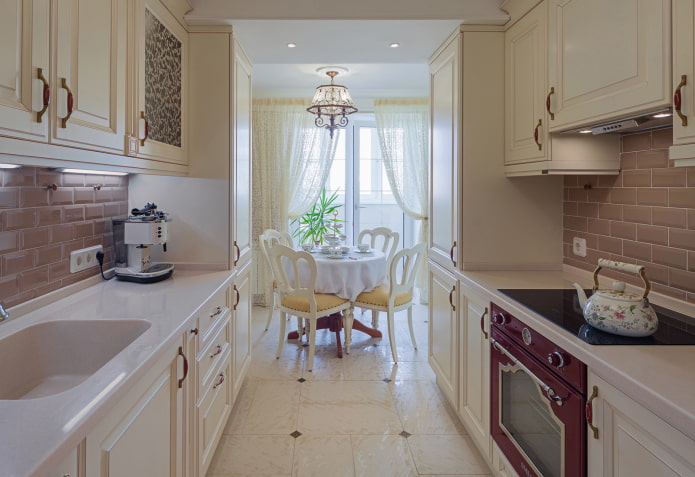
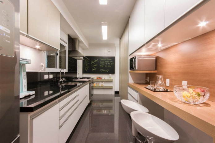
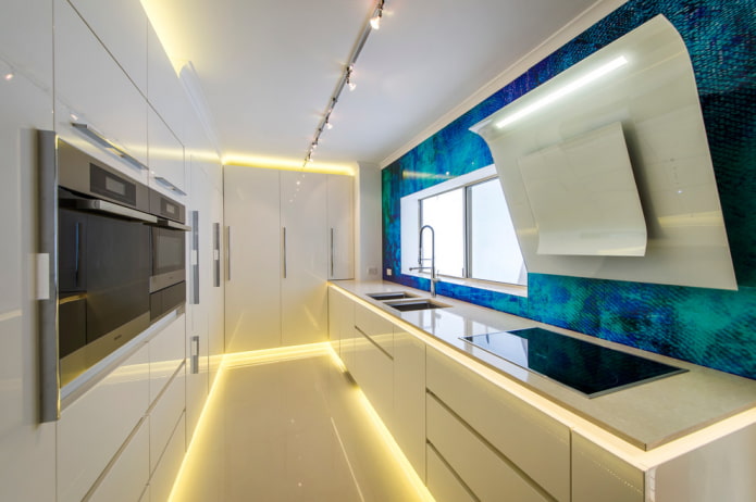
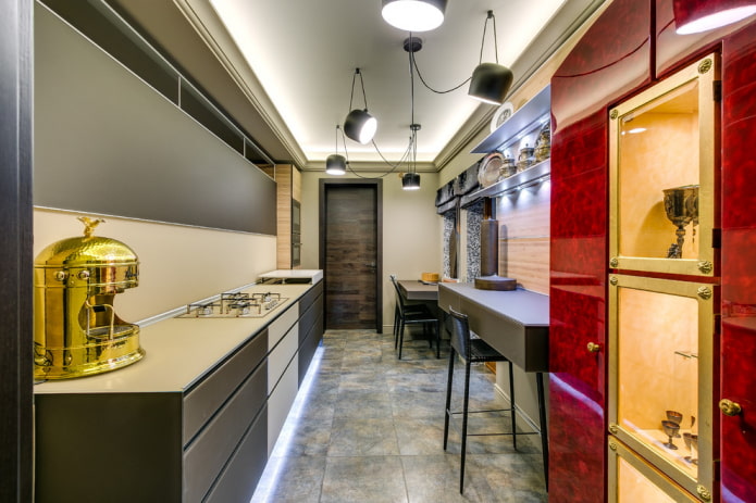
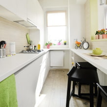
The easiest way to zone is a rectangular kitchen, it is ideal for placing a headset and a table with chairs. The design of the kitchen structure in this form can be different. From the classic linear arrangement of the working area, to the comfortable corner and spacious U-shaped. In a room with an attached balcony, a place for rest or eating is taken out on it.
Photo gallery
The layout of a rectangular room is not difficult if you know how to make it harmonious. To get a high-quality result, make a plan, use visual expansion techniques to correct the room and arrange furniture correctly.

 10 practical tips for arranging a small kitchen in the country
 12 simple ideas for a small garden that will make it visually spacious

 13 bad habits a good housewife shouldn't have
 24/7 home cleanliness - 4 secrets for the perfect housewife
 6 hotels in Sochi that will give odds to the promoted foreign hotels
 Top 10 interior design trends 2020
 Rating of cheap TVs with Smart-TV
 New Year's LED garlands on AliExpress - we disassemble while it's hot, so that it's bright at home