Features of the use of color in the interior
Green color has the same meaning for many peoples: it identifies prosperity, growth, development. In the interior design, it includes spring and the rooms bloom, life begins in them.
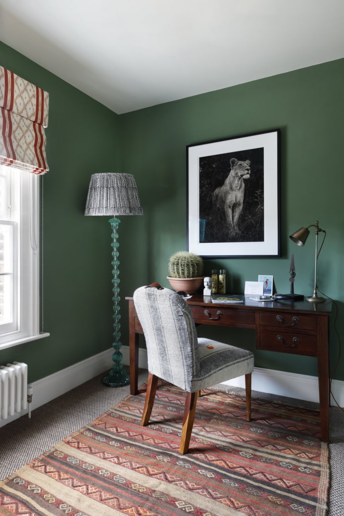
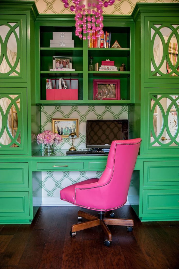
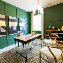
- One of the most important effects of color is that it helps you focus. Therefore, at one time the green table was so popular in the classic interior of the study - it was comfortable to work at it.
-
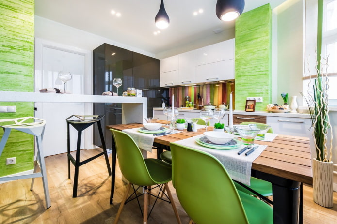
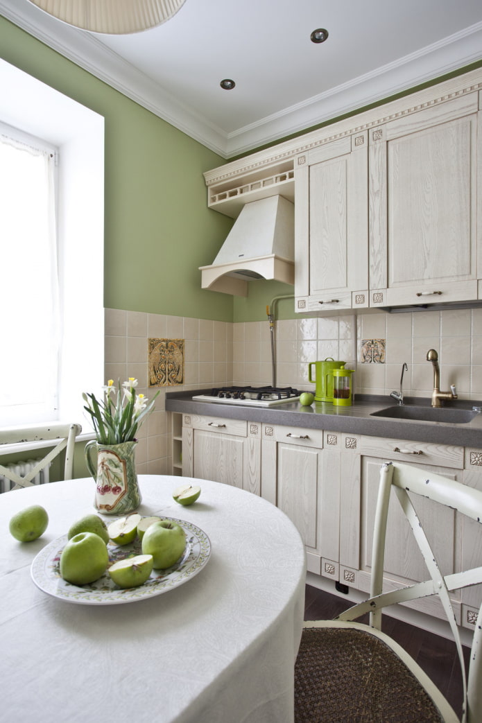
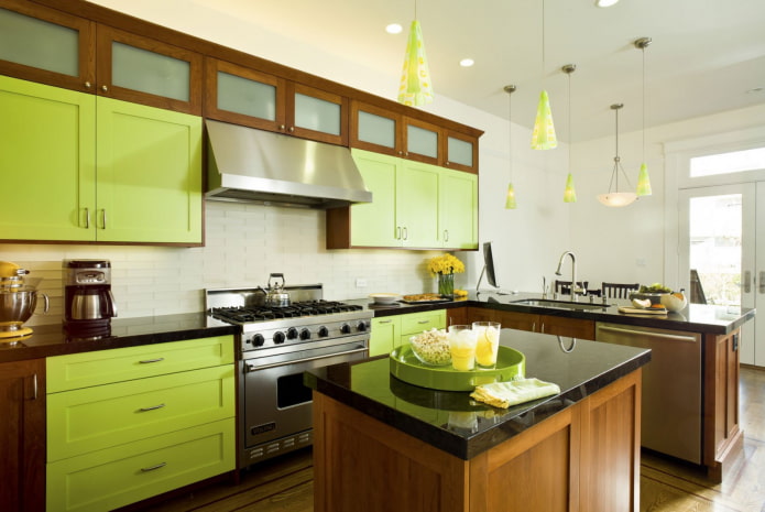
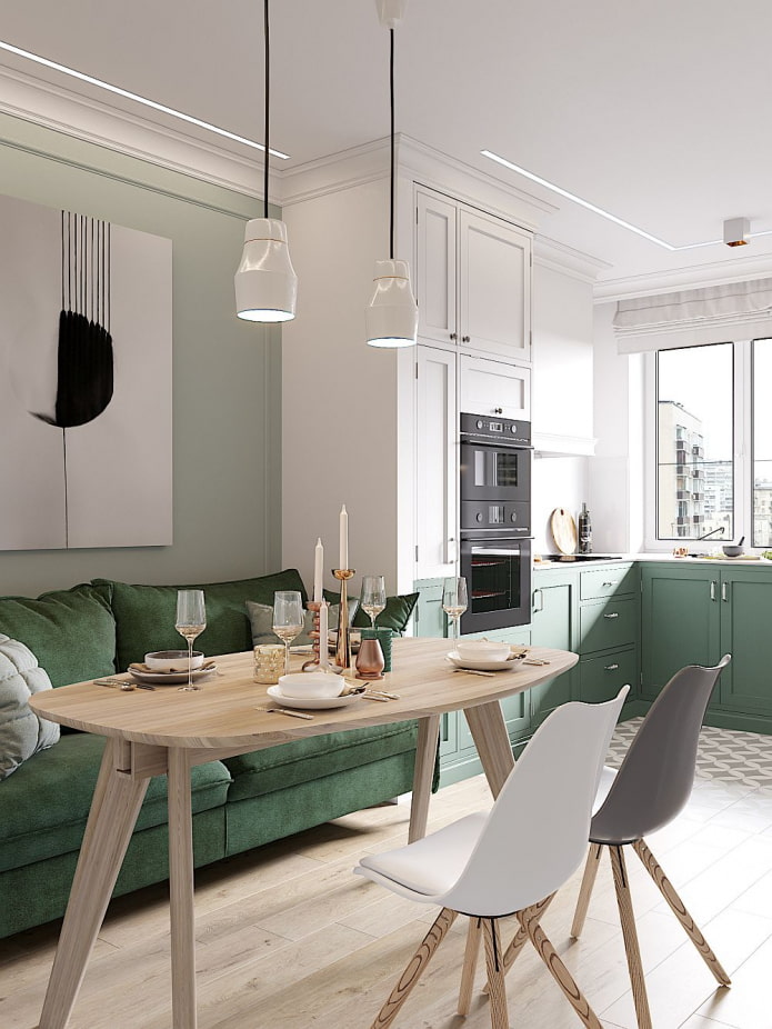
The green color in the interior of the kitchen is different: light, light green, embodying delicious juicy greens. It awakens the appetite, contributes to the creation of a pleasant atmosphere for quiet breakfasts, lunches, dinners. In the kitchen, kitchen cabinets, an apron, walls, a sofa or chairs, a table, accessories: tablecloths, potholders, napkins, towels look great in this color.Read also
Important! Different shades of tableware have different effects on appetite: soft green makes food attractive, dark - repulsive, turquoise can increase the desire to eat.
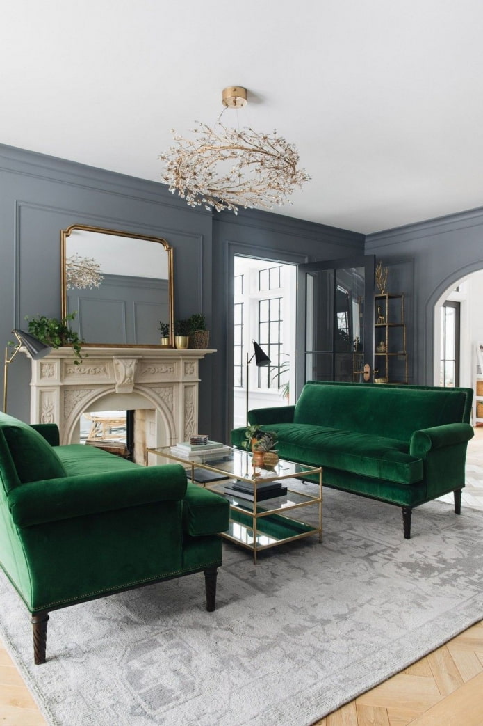
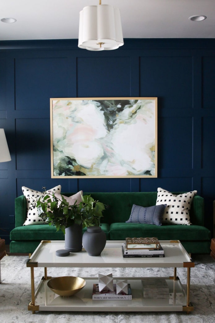
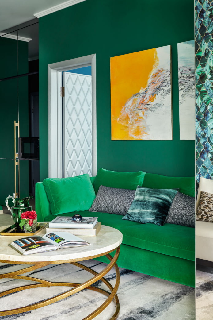
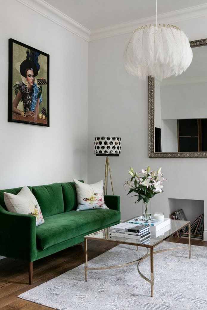
- The main focus of the living room will be sofa... Emerald looks great in a Scandinavian, classic, industrial style. Olive is suitable for Provence, country. Think in advance about the combination of green furniture with accessories: pillows can be brown, white, yellow, red.
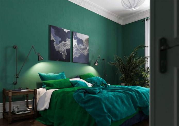
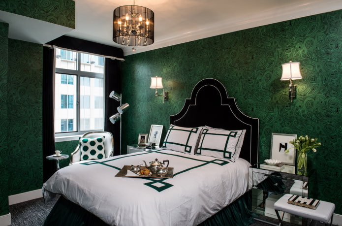
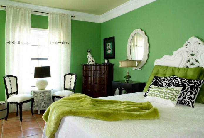
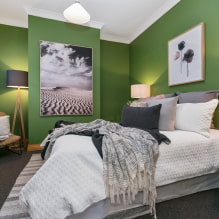
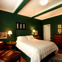
- A soft headboard can be a green accent in the bedroom interior. It looks great in dark (emerald, turquoise), especially when combined with a white finish. Light herbal, on the other hand, will become a contrast to a dark brown, black background.
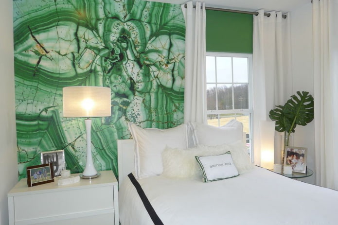
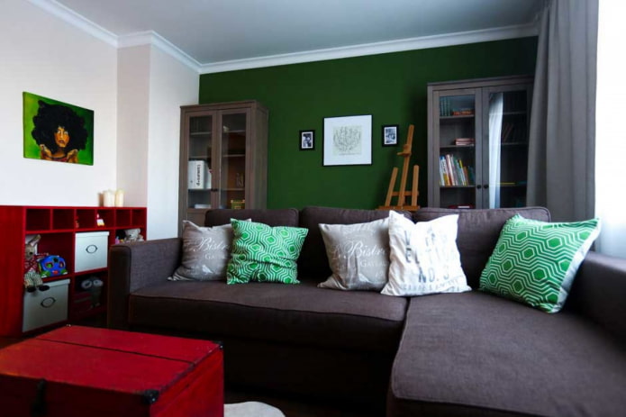
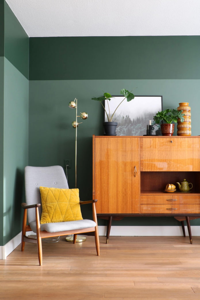
- The green color of the walls in the interior seems to many not very suitable and the maximum that the owners of the apartments decide on is to paint one side in this shade, for example, behind the bed or sofa. But in a modern style, a muted grayish is ideal for decorating all walls in any room - from the hallway to the bedroom. On malachite, for example, the black and white palette looks perfect. Green tea, gray-green, marsh tea is a suitable background for a setting in pastel natural shades.
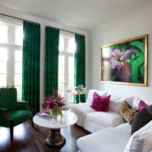
- Decor in green allows you to add harmony to the room without spending a lot of money. Curtains, bedspreads, pillows, blankets, carpets in herbaceous colors have a positive effect on the psychological state: they soothe, relax.
Which shade of green should you choose?
A color appears when yellow and blue are mixed, and its shades differ in the saturation of one or the other tone. At the same time, black is added to the dark, and white to the light.
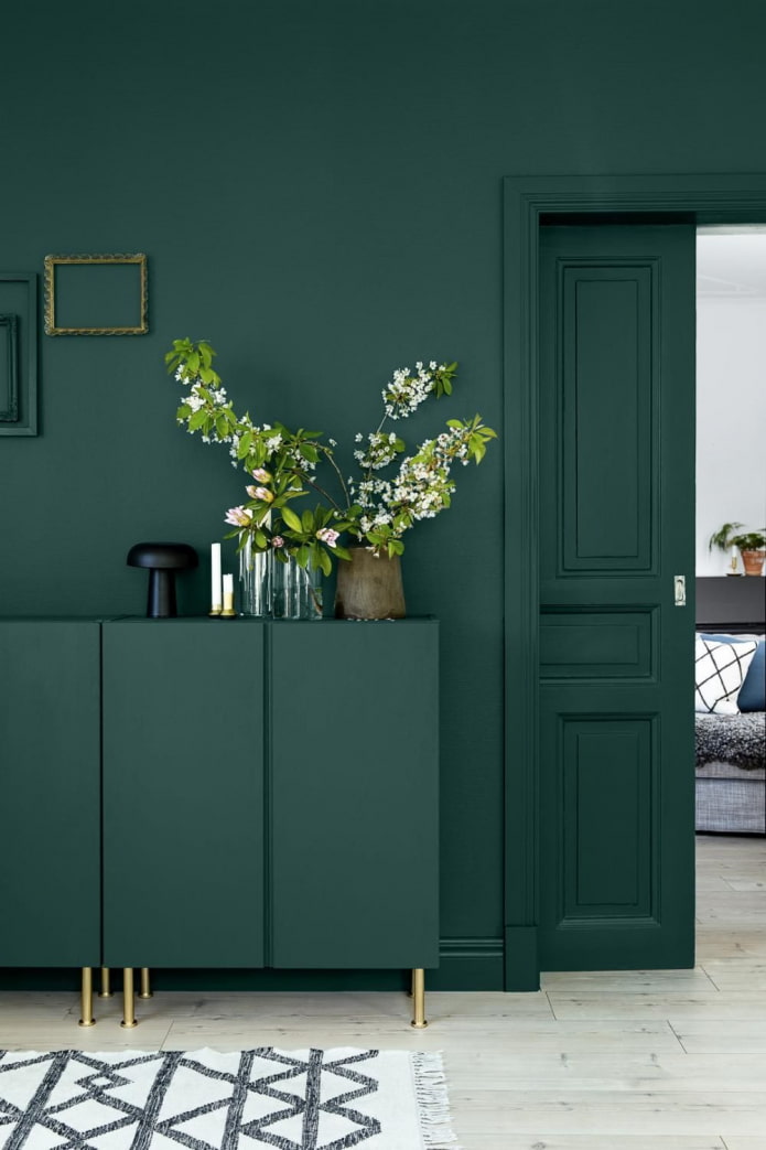
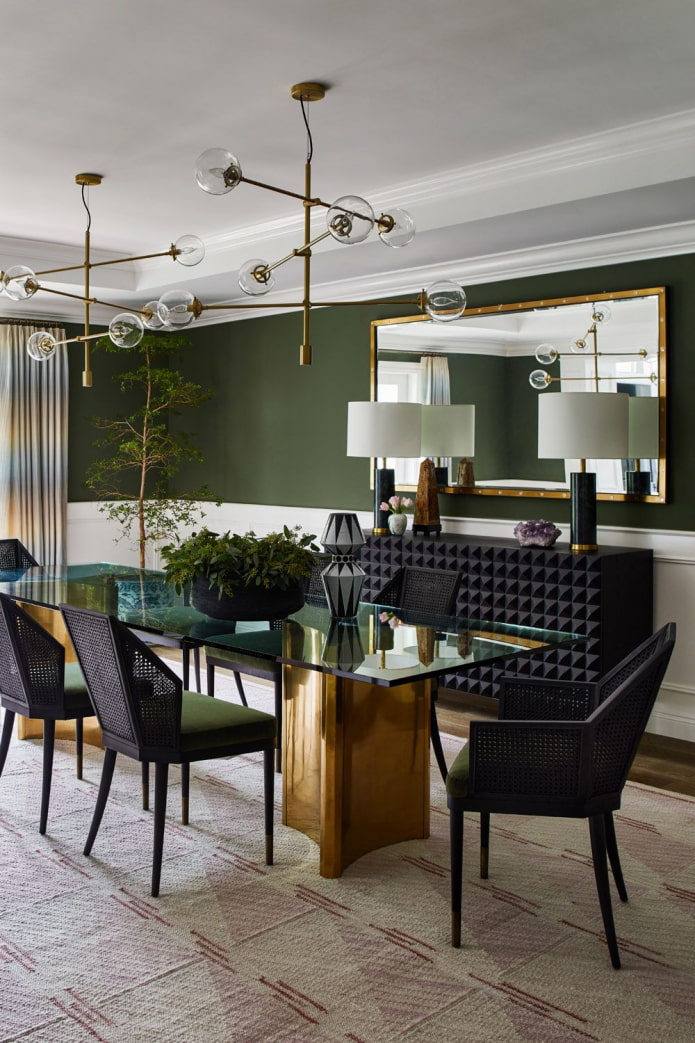
Recently, rich, deep tones have gained great popularity:
- malachite;
- emerald;
- needles;
- turquoise;
- nephritis.
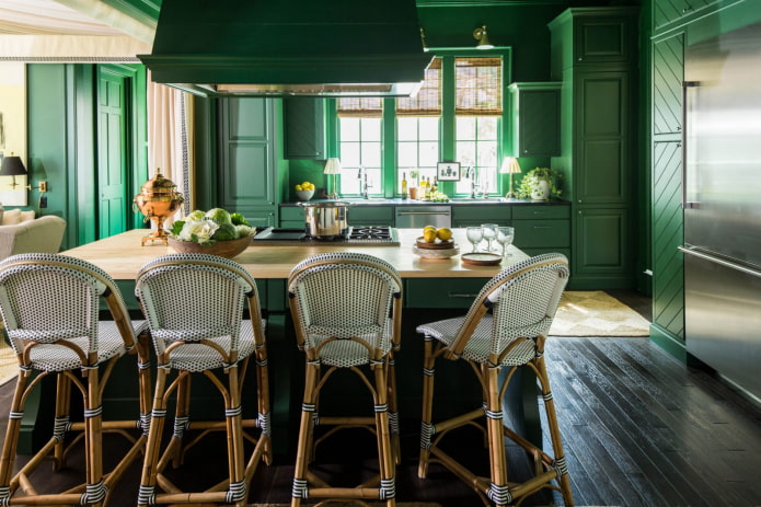
In the photo there is a stylish spacious kitchen
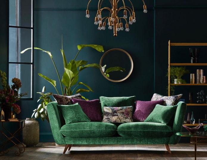
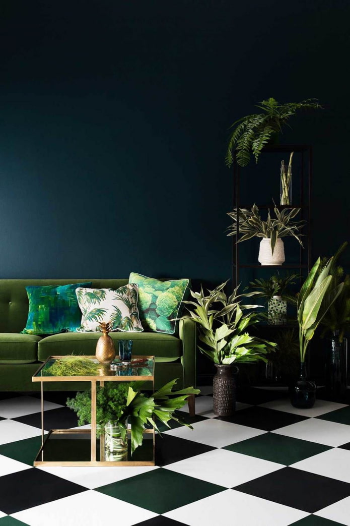
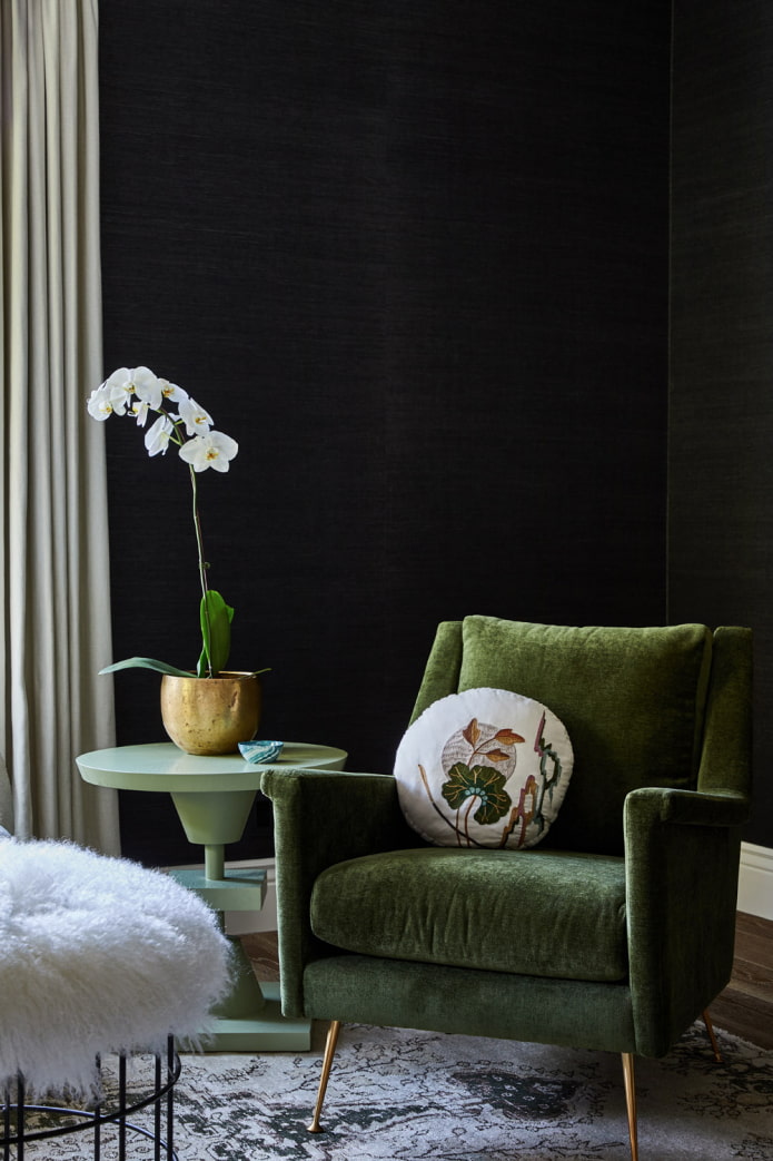
Armchairs, sofas, poufs, headboards and other soft elements in dark velor upholstery look noble and elegant. Deep shades of green in the interior look no less impressive on visually smooth matte surfaces.You can't go wrong if you create contrast with white.
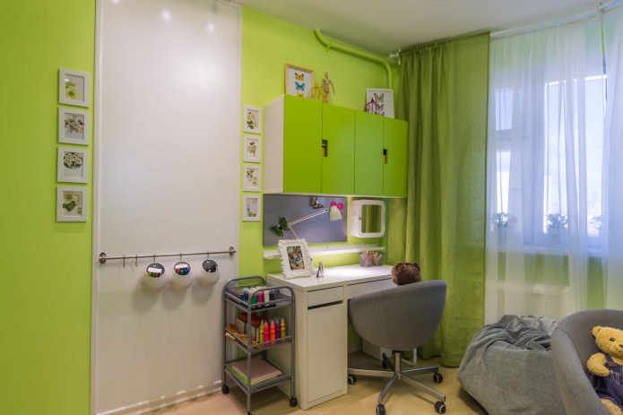
The light range gives a feeling of freshness, vigor, fun. Unsaturated olive, mint, pistachio, lime is used even on the walls, but a bright green room will look too much - poisonous tones are permissible only in details.
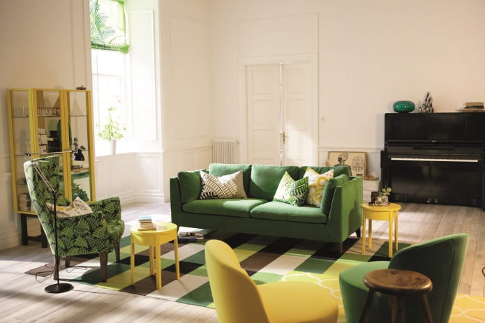
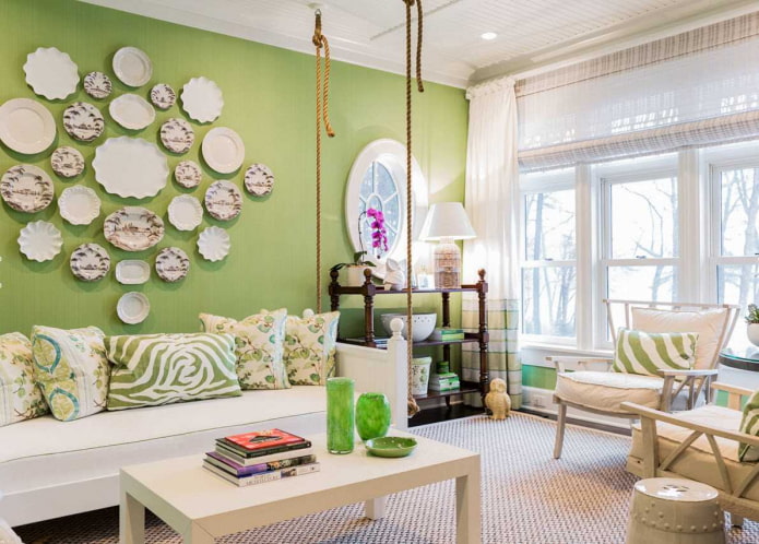
The photo shows a yellow-green combination
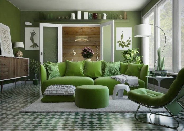
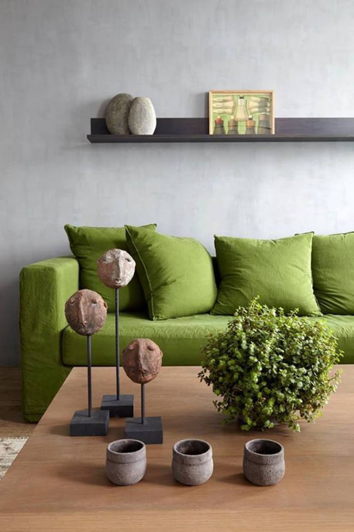
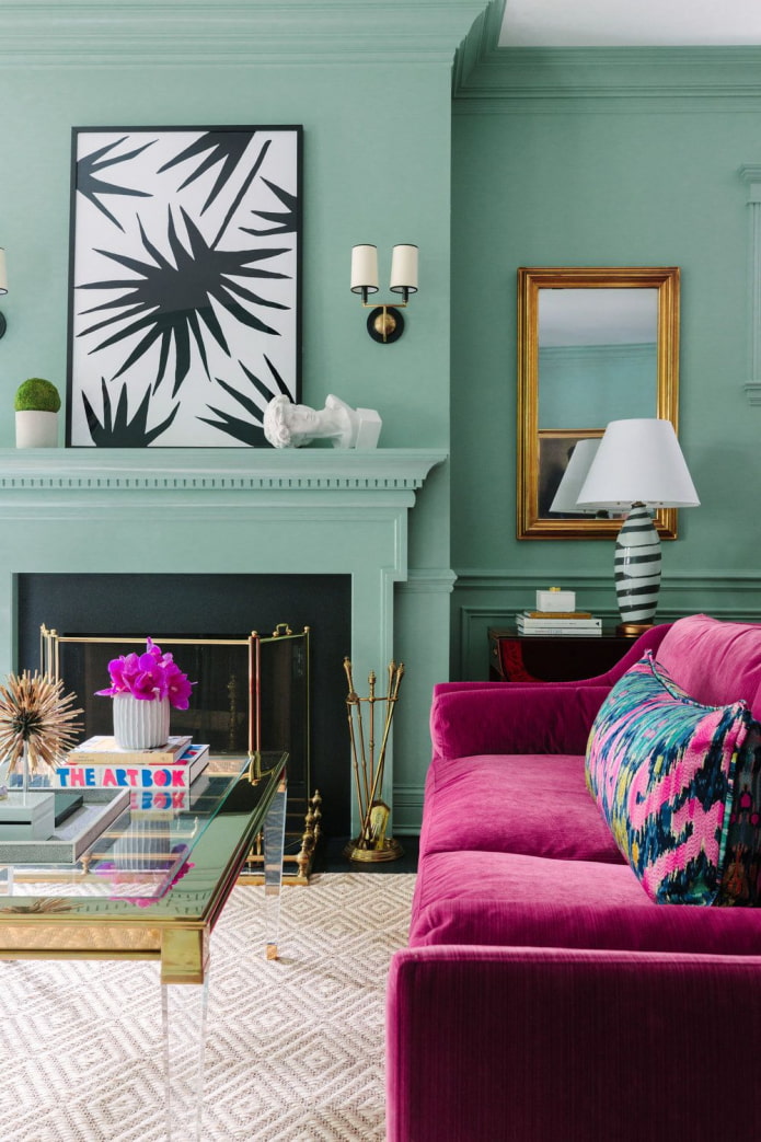
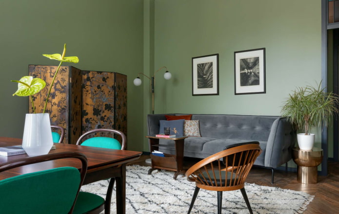
A separate group is distinguished by gray-green shades: asparagus, marsh, camouflage. Sophisticated green tones are appropriate in any interior, from classic to modern. Walls, large furniture, textiles look good in these neutral shades.
The photo shows an example of combining different tones.
The best combinations of green with other colors
In fact, what color is combined with green in the interior depends on the shade of greenery. Let's analyze the main tandems.
Interior in gray-green
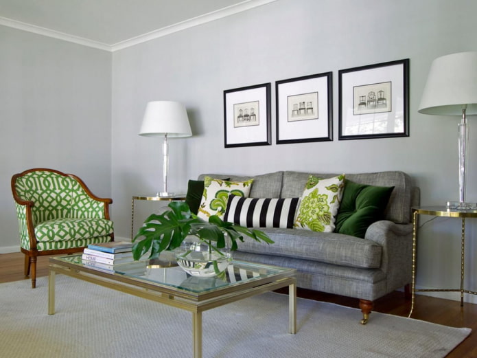
Gray is versatile in and of itself, so it will suit in any case, no matter what green shades of the room you choose.
A win-win rule is to combine dark with dark. Wet asphalt or graphite with emerald. And to light mint or saladinstead, pick up gainsborough or platinum.
Usually grayish walls are the backdrop for bright greenish furniture.
In the photo, accents in the gray hall
Blue-green interior
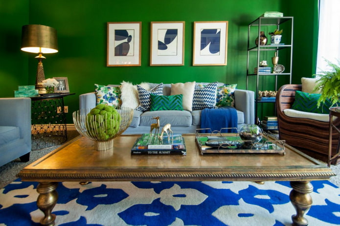
Green color in the interior in combination with blue becomes colder, keep this in mind when decorating a room. A room kept in these shades does not tire or irritate, on the contrary - it promotes relaxation, gives the eyes a rest.
Advice! Use a blue-green color scheme in your kitchen if you are looking to lose weight or maintain weight. This palette reduces appetite.
In the bedroom and in the nursery, blue in combination with pale green promotes fast falling asleep, quality rest.
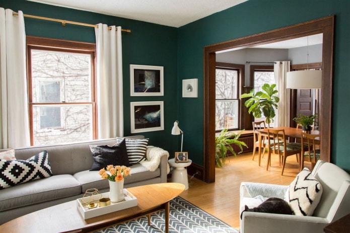
The photo shows bright blue details in the living room.
White-green color
Universal white is suitable for shades of any saturation: pure. dusty and dirty, light and dark. But it looks best in contrast with a bright or deep color.
White, like gray, becomes the background - decorate the walls with it, large details, and place accents with green furniture and accessories.
In the photo there is an accent wall in the bedroom
Green with brown tones
It is difficult to find a more natural combination of green with other colors than this. Look at any tree or plant and you will see how the shades are in perfect harmony with each other.
The best duo is formed when using a complex undertone: olive, emerald, malachite, asparagus. Brown, at the same time, it is better to take dark: chocolate, coffee. But even with light beige, the combination will turn out to be interesting.
In the photo, the pale green facades of the kitchen
Black and green interior
Dramatic black enhances any other, an effect known to any artist. Therefore, if you want maximum contrast, use it as a background.
Combining with green looks exotic, resembles a jungle, repeats the colors of some reptiles. Looks great with both bright lime and grayish viridan.
Pictured is a black bed and curtains in the bedroom
Examples with bright accents
The duo of green with other shades is dictated by the color wheel:
- An analogous combination of close green and yellow in the interior looks bright, summer-like, reminiscent of juicy ripe fruits, breathes with revitalized nature. Fits perfectly into the design of a veranda or a country house, a summer residence.
The photo shows a bright unusual combination of shades
- A contrasting duet with red energetic, invigorating, lively. If you do not want the interior to press, use scarlet in limited quantities, there should be little of it. Do not forget that the darker the green, the deeper the red should be.
- The tandem with purple can also be called complementary. A combination with yellow-green shades - citrus, chartreuse, lime, pear will look more harmonious.
How does it look in different styles?
In the past few years, green has conquered the hearts of many people and settled in a variety of interiors.
- Scandinavian... Noble shades of precious stones are used. Combined with white or light gray walls, furniture and floors in a natural wood shade, this creates a trendy design.
- Loft... A muted color like kale matches perfectly with orange brickwork, which is why it is often used for furniture in industrial apartments.
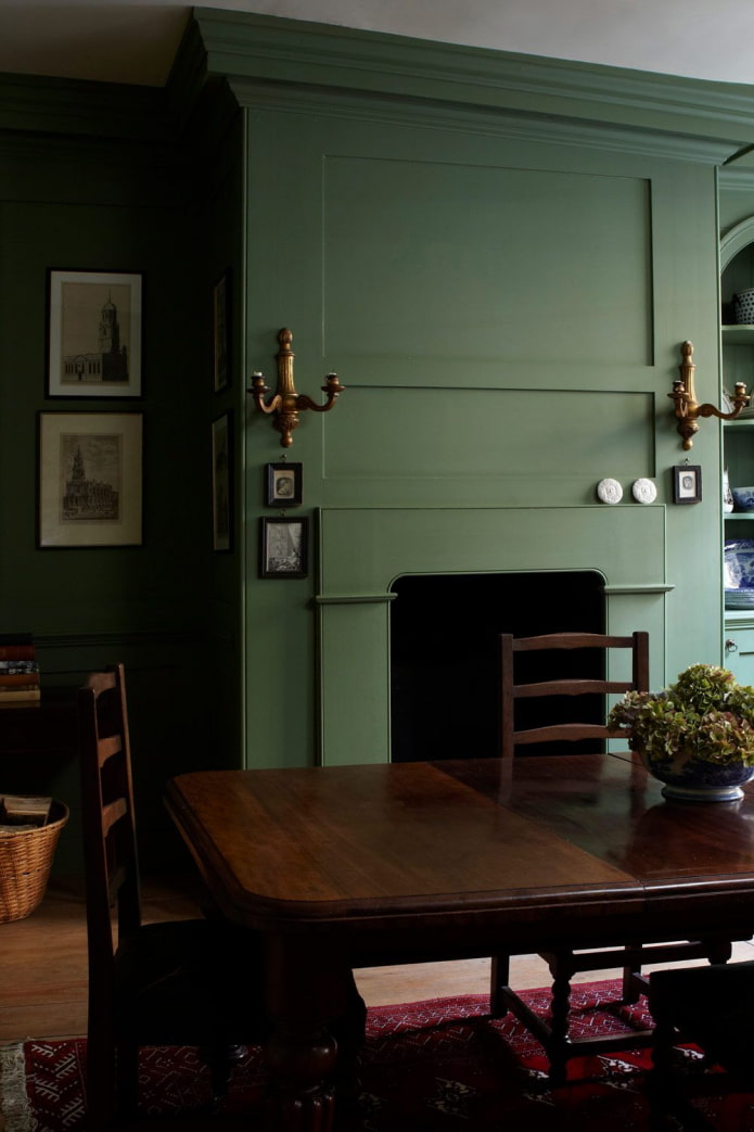
The photo shows an example of a classic American style.
- Classical... Adherents of the classics prefer non-contrasting combinations of warm beige and light green. It is used for curtains, furniture upholstery, textiles.
- Modern... Exceptionally complex undertones, usually navy blue, matte textures. Walls, kitchen fronts, headboards look up-to-date.
Examples of interior decoration of rooms
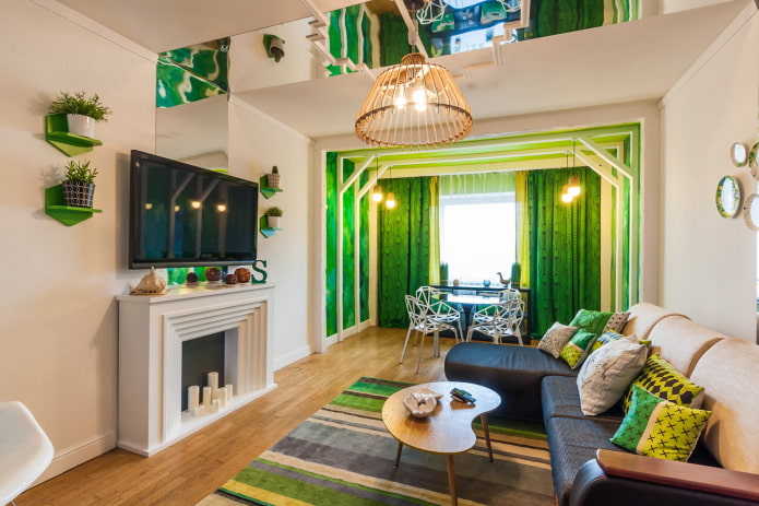
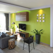
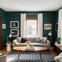
Living room... The interior in green tones is relaxing, so in such a room it will be cozy and comfortable to relax after work, to gather with your family. If only one wall is green, choose the one that is constantly in front of your eyes. That is, not behind the sofa, but opposite it. Dark green upholstered furniture looks great, but if you have animals at home, keep in mind that the upholstery will have to be cleaned of wool quite often, so the fabric should be selected with an easy cleaning technology.
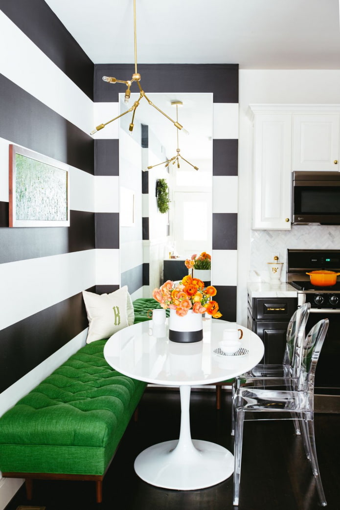
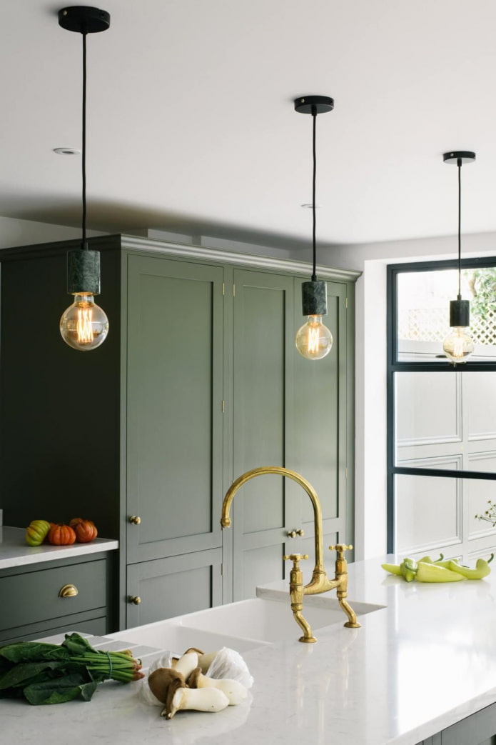
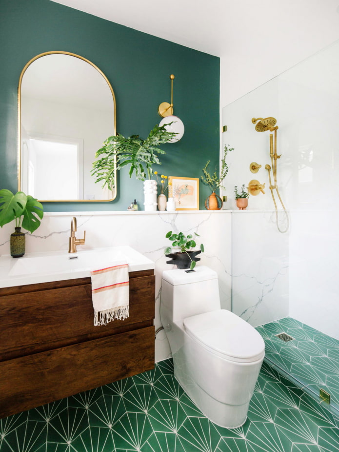
Kitchen... The combination of emerald, white and gold has already become a classic - the interior looks modern, does not strain the eyes and does not get bored. What can not be said about bright light green facades. If you want an acidic scale, let it be in the little things: dishes, textiles, decor - it is easier and cheaper to change them when you get tired of the increased brightness.
Pictured is a modern plain kitchen
Bedroom... No contrasting combinations, choose either very light or, conversely, deep palettes. To add depth, you need to combine several subtones of the same color with different brightness. The combination with black, gray, white, brown looks favorable.
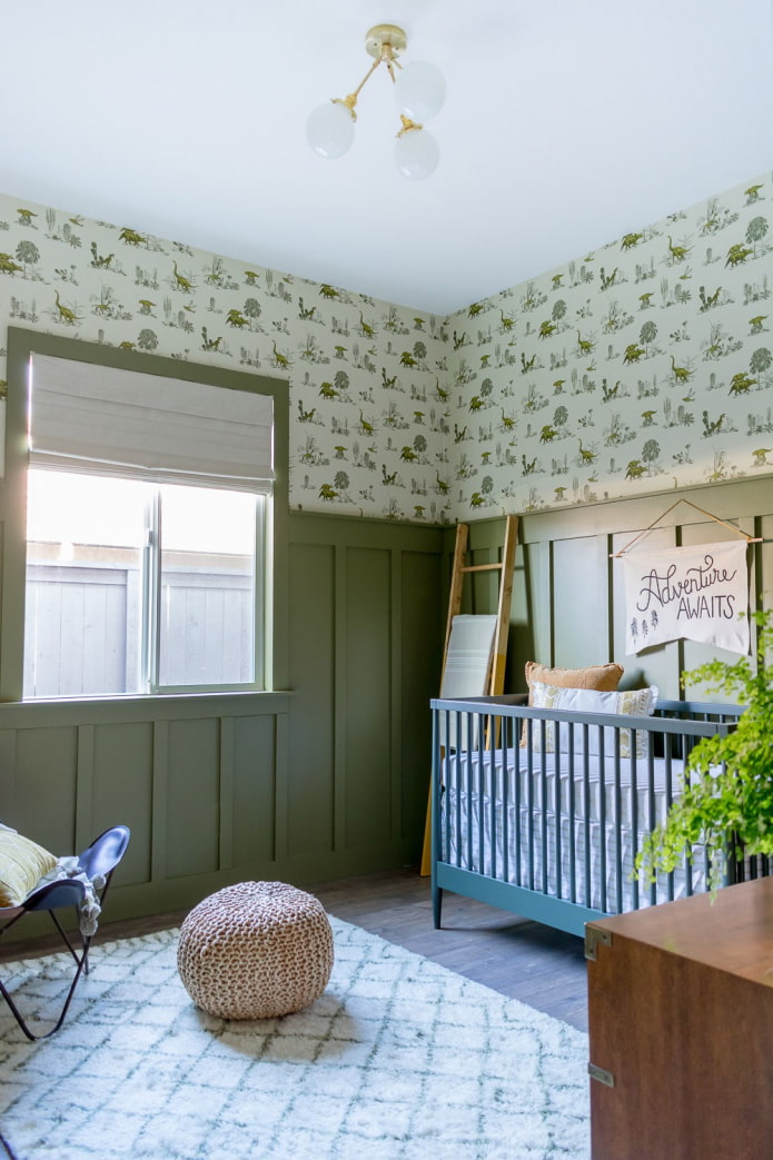
Children... The universal shade suits both girls and boys. The child's room will look unusual, unlike the standard and already boring pink and blue. Green is ideal for hyperactive children, it calms and grounded.
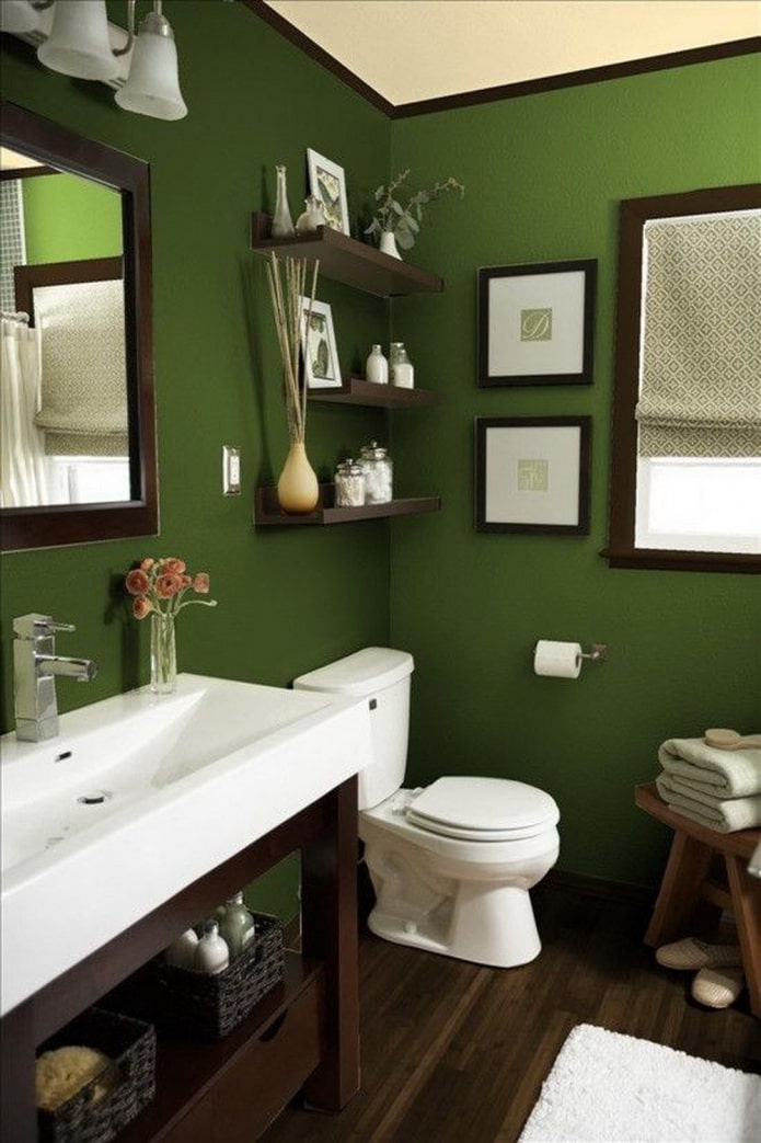
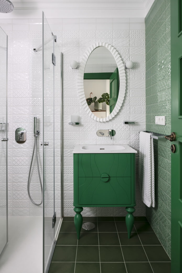
Bathroom... Any greenery goes well with snow-white sanitary ware. Use plain finishes or plant-printed materials.
In the photo, zoning the living room using color
Photo gallery
The selection of green can also be unfortunate, in order to avoid this and get a stylish design - give preference to complex mixed shades and simple combinations.


 10 practical tips for arranging a small kitchen in the country
 12 simple ideas for a small garden that will make it visually spacious
 13 bad habits a good housewife shouldn't have
 24/7 home cleanliness - 4 secrets for the perfect housewife
 6 hotels in Sochi that will give odds to the promoted foreign hotels
 Top 10 interior design trends 2020
 Rating of cheap TVs with Smart-TV
 New Year's LED garlands on AliExpress - we disassemble while it's hot, so that it's bright at home