Stone and sun
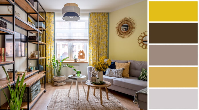
In December, the American company Pantone (a recognized world authority in the field of color) announced for the second time in its history that a couple of shades became the color of the year: it is gray and yellow.
Warm grey, symbolizing sea pebbles, serves as the perfect backdrop for striking accents. Cheerful yellow comes to the fore, adding optimism and promising sunny days after the 2020 trials.
This combination will appeal to those who are tired of bad weather outside the window and strive to give the interior a little more color.
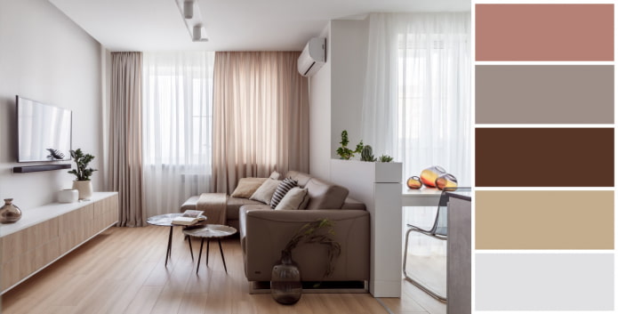
The elegance of powdery and beige
Muted pink looks great in small living roombecause it is a neutral color. To create a calm atmosphere without abrupt transitions, combine shades of the same brightness, located next to each other in the color wheel.
Milky and earthy beige deep shades are perfect for powdery. Use this combination if you want to create a subtle, subdued interior, but traditional beige doesn't suit you.
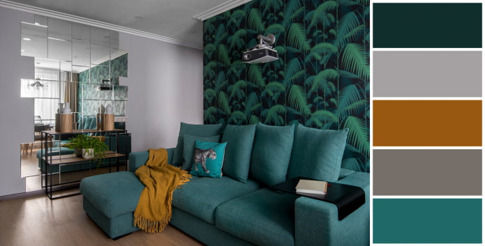
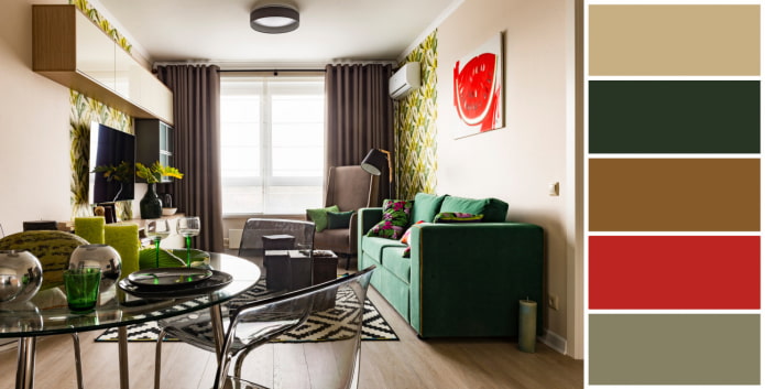
Emerald gamut
The deep color of the gem is associated with wealth and mystery. Emerald shade has a special magnetism: people with refined taste will appreciate it. Dark green with cold or warm notes instantly attracts attention, therefore it is not suitable for total painting of all walls.
Add a mustard or honey accent to create a harmonious living room interior.
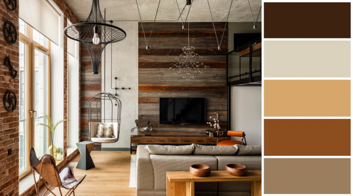
All shades of brown
Will appeal to those who are tired of the gloss and gloss of city apartments. Conditionally "masculine" combination of red bricks and various woody shades are emphasized by contrasting black. Moderately strict combination, bringing closer to nature due to earthy and terracotta tones.
Based on Brown color, and the depth of the space is achieved through its midtones and the degree of saturation, including light gray and black.
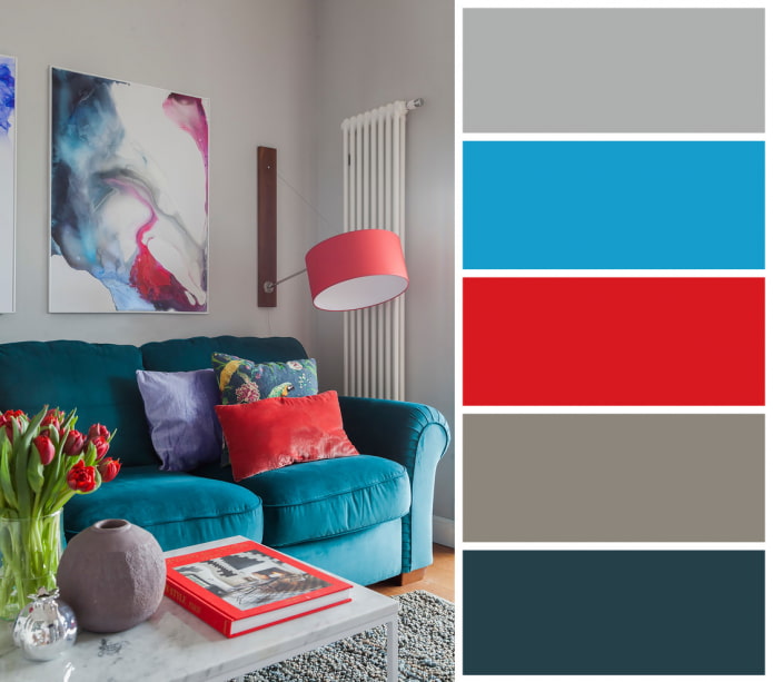
Vivid contrasts
Combinations of pure shades (for example, red and blue) are rarely used in interior design - they are more often found in children's rooms, but even here trends in recent years tend to more muted and complex palettes.
To decorate a bright living room a combination of coral and turquoise is perfect - they are on opposite sides of the color wheel, due to which they look harmonious together.
Creamy, ocher and brass
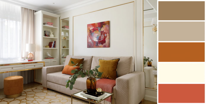
The background for the unusually warm yet sophisticated living room is a cream shade that combines elements of ocher and peach tones. Such a solution will emphasize your individuality, and also set you up for a sincere conversation: the living room looks in the chosen color scheme brightbut cozy.
Details from brass will help add a touch of chic - this metal is at the peak of its popularity today.
The coolness of the blue and the warmth of the wood
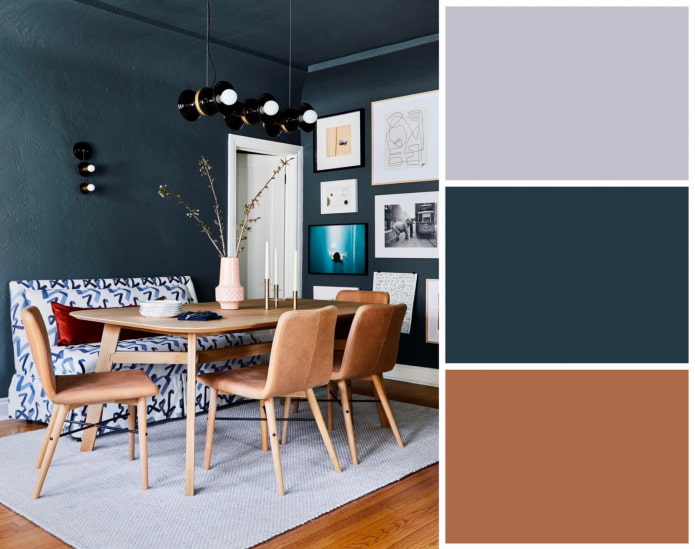
Classic blue won universal recognition last year, but this does not mean that it is time to say goodbye to him: the color is still relevant and attractive.
Blue is traditionally perceived as calming, non-aggressive, and associated with the boundless evening sky. Its depth and reliability are best emphasized by the warm woody range.
Winter Garden
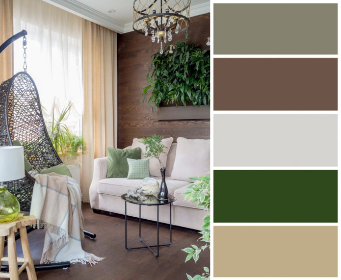
Another way to create an atmosphere close to nature is to fill the living room with natural shades: browns, sandy and grassy greens. They support the "forest" theme, soothe, tune in to rest and provide an opportunity to escape from the bustle of the metropolis.
When creating such an interior balance is important: coffee and beige tones should serve as a backdrop for green, and not vice versa.
Discreet luxury
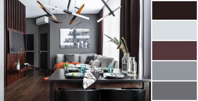
Dark purple is considered the color of power and majesty. If you want to emphasize your status, use a muted eggplant shade to decorate the living room, combining it with warm gray.
Finishes and textiles in these colors look harmonious with mahogany furniture and golden elements.
August palette
The combination of bronze, marsh green and scarlet will appeal to lovers of natural shades and rich colors. Such contradictory colors can easily get along with each other, if you apply red dotted - as one or two accents.
The combination symbolizes the outgoing summer, which is still capable of giving vivid impressions.
When decorating a living room, do not be afraid of bold shades - combine them using the color wheel and rely on your own feelings.

 10 practical tips for arranging a small kitchen in the country
 12 simple ideas for a small garden that will make it visually spacious
 Choosing the best style of living room interior: 88 photos and ideas
 Curtains in the living room: 70 stylish photo ideas in the interior
 Wall decoration in the living room: choice of colors, finishes, accent wall in the interior
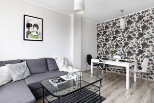 White and black and white wallpapers in the living room: 55 photos in the interior
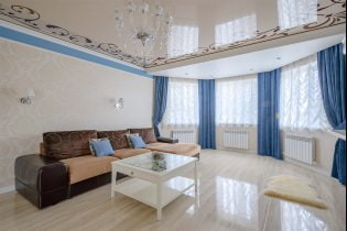 Stretch ceilings in the living room: views, design, lighting, 60 photos in the interior
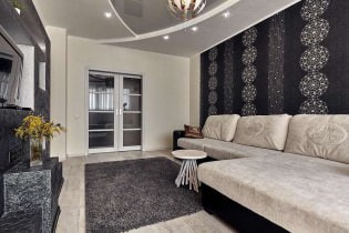 Wallpaper in the living room interior: 60 modern design options