We transform the headset
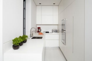
The trend towards minimalism has taken over the world - and this is not surprising, because the laconic interior of the kitchen looks much more expensive than the environment overloaded with things and appliances. When choosing facades for a headset, you should give preference to simple monochromatic products. Bright yellow, neon green, defiant red headsets look cheaper than regular whites. It is better to replace milling, as well as rounded doors and drawers with flat and laconic, no frills, since imitation of classical forms often looks unconvincing and old-fashioned.
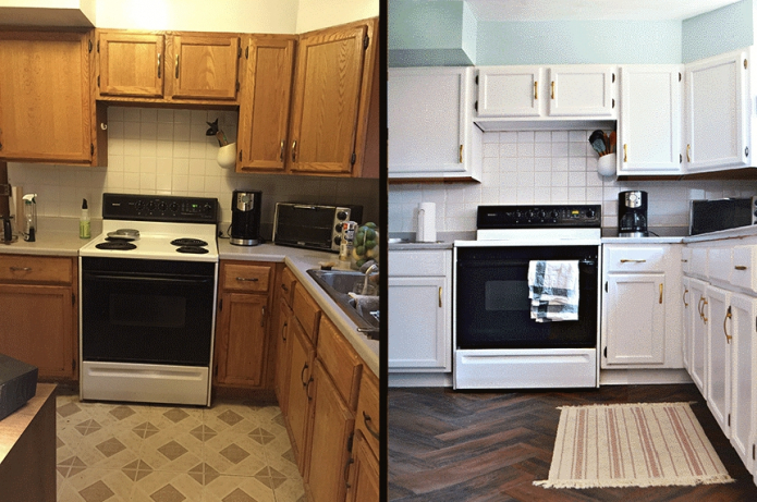
Even if no renovation is planned, old facades can always be repainted by first removing the top film under hot air. Any furniture paint, such as Tikkurila Empire, will work.
Change the table top
It is possible to choose a single tabletop - it's worth using it! The one-piece work surface with cut-out holes for the hob and sink looks more noble than a set composed of separate pedestals. It is also practical - dirt and grease will not clog into the joints.
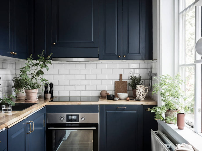
It is better not to choose banal textures for granite, marble and malachite countertops. The optimal solution is wood imitation. And one more nuance: the thicker the countertop (5–6 cm), the more expensive it looks.
We fill the kitchen with accessories
Kitchen decor is just as important as decorating your living room or bedroom. A simple table can be successfully hidden behind a high-quality tablecloth, empty walls can be filled with picturesque posters or paintings, and with the help of flowers in ceramic pots, you can make the room cozy. Even a single original piece of furniture or decor can enhance the status of the entire environment.
Acquiring new pens
A cheap kitchen looks more expensive if it does not use standard handles in the form of metal pipes, but stylish ones purchased separately. When buying, you should pay attention to the laconic design and noble shades, and abandon complex ornate shapes, rhinestone inserts and banal chrome plating.
Combining cabinets with shelves
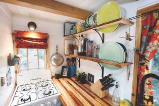
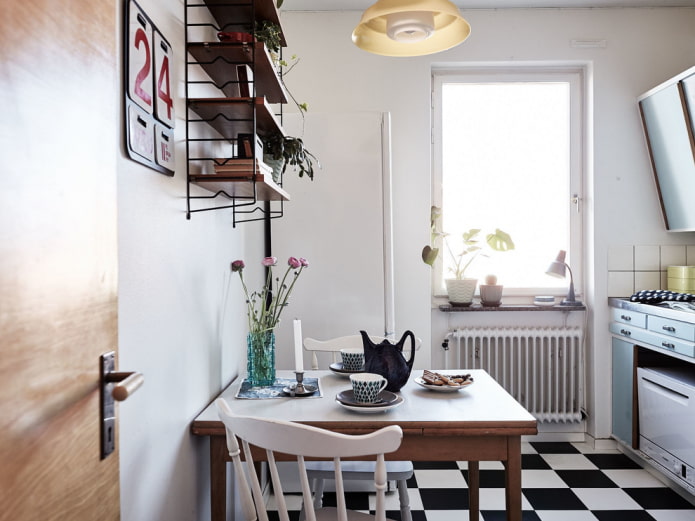
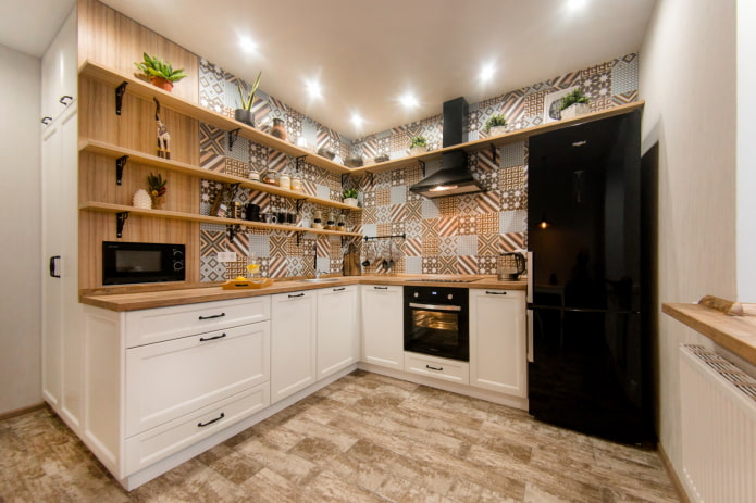
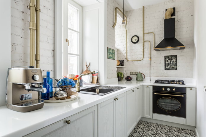
Until recently, the replacement of wall cabinets with open shelves was perceived by the townsfolk with hostility: the abundance of dust and the lack of storage space were frightening. Today the shelves in the kitchen will surprise nobody. Many people have abandoned the abundance of things in favor of "decluttering", getting rid of unnecessary pots and pans. The shelves make the kitchen look more like a stylish room, and for a small room, they add space and light.
Choosing materials
It is known that natural materials look more expensive than artificial materials, but this does not require finishing the entire kitchen in marble. The main thing is to avoid cheap imitation, the disadvantages of which are visible to the naked eye. These materials include vinyl film, linoleum with an unnatural yellow tint "wood-like", wallpaper with a banal pattern. A kitchen painted with high-quality monochromatic paint looks more expensive than wallpaper.
When choosing between facades made of plastic or MDF, experts advise to give preference to plastic, which looks better and will last longer. The fronts for the kitchen set can be ordered separately, and the "insides" - cheaper, can be purchased from another manufacturer.
We select the style and color
A fragmented, disharmonious interior will never look expensive, even if the finishes and furniture are made exclusively of quality materials. When transforming a kitchen or creating an environment from scratch, it is important to maintain a specific color palette and a pre-selected style (contemporary, Scandinavian, loft, classic or otherwise). Here are some practical tips:
- Search the Internet for a color wheel and a description for it. Having learned to use ready-made schemes, it is easy to bring the kitchen interior to harmony.
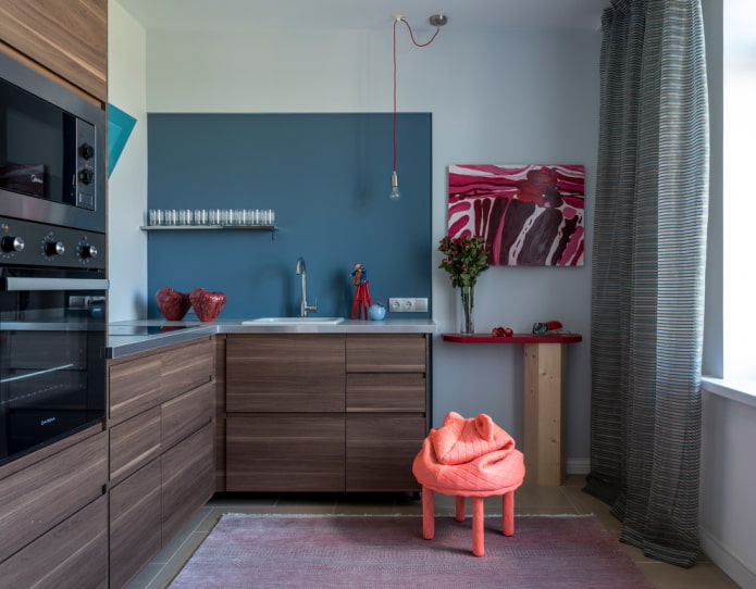
- Follow the rule of three colors: 60% should be the main shade (for example, walls), 30% - additional (furniture and curtains), 10% - accent (paintings and decor).
- Choose a photo of the interior you like on the Internet and rely on it when renovating.
We select an apron
By installing an apron, we not only protect the cooking area from contamination, but also create an interesting accent in the interior design. The more expensive the apron looks, the better the impression of the whole kitchen. Winning options:
- One-colored apron without multi-colored patterns and inserts.
- Tile imitating wood.
- Strained glass.
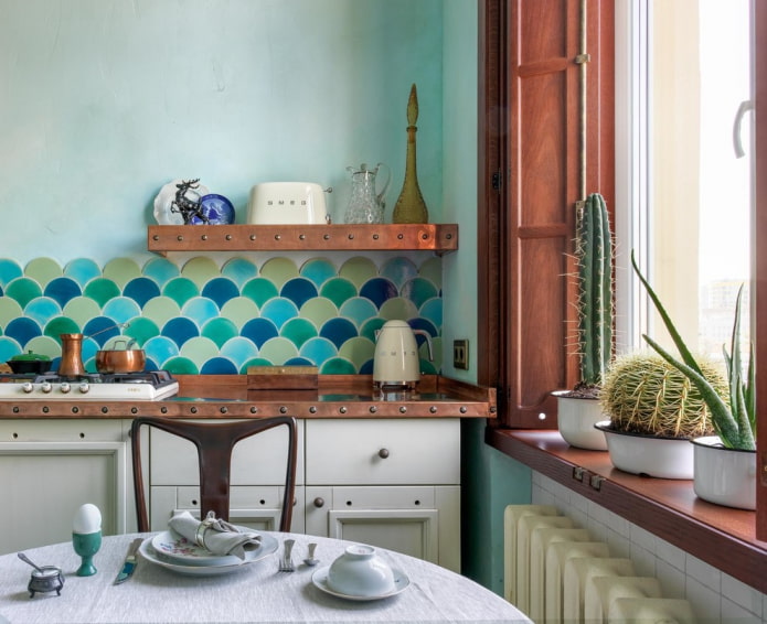
- An interesting tile in the form of scales, honeycomb or non-standardly laid boar.
Do you have a ready-made ceramic apron that you don't want to change, but its color does not suit? In hardware stores, special paint for tiles is sold.
Aprons that visually make the kitchen cheaper:
- Plastic panels.
- Apron with photo printing with a picture from the catalog.
- A cheap imitation of precious stones with a repeating texture.
We refuse stainless steel
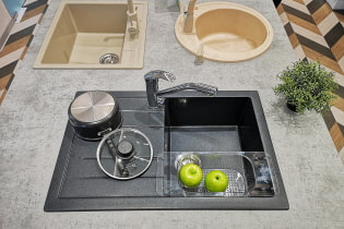
Steel sinks are practical, wear-resistant and are not afraid of moisture or mechanical damage. A stainless steel sink will not spoil the stylish interior of the kitchen, but if both the set and the finish leave much to be desired, the steel sink will only highlight the flaws. An alternative is durable artificial stone products.
We think over the lighting
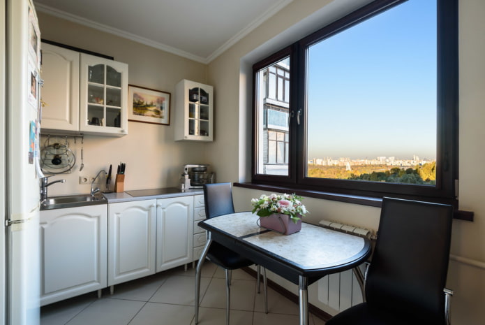
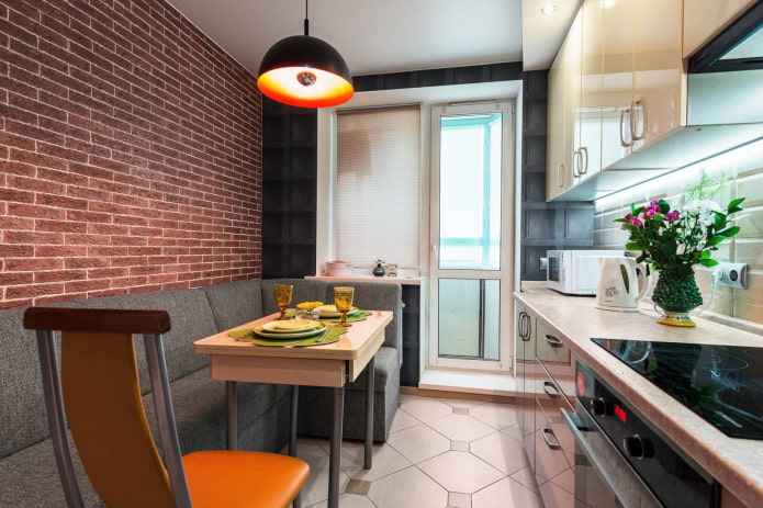
A single chandelier in the center of the ceiling not only cheapens the kitchen, but also deprives the room of additional light. To make the interior look more expensive, you should add lighting to the work area and think about local light above the dining table. If the kitchen is small, the abundance of light will visually expand its space.
I am transforming my kitchen, you need to remember that it is you who will be in it for a long time, which means that it is up to you to decide which things are convenient and beautiful, and which ones spoil the whole look. The most important thing is to keep the kitchen clean, because order is the key to the success of many interiors.

 10 practical tips for arranging a small kitchen in the country
 12 simple ideas for a small garden that will make it visually spacious

 How to choose the color of your kitchen sink?
 White kitchen set: features of choice, combination, 70 photos in the interior
 Black set in the interior in the kitchen: design, choice of wallpaper, 90 photos
 How to choose curtains for the kitchen and not regret it? - we understand all the nuances
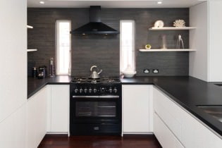 Design of a white kitchen with a black countertop: 80 best ideas, photos in the interior
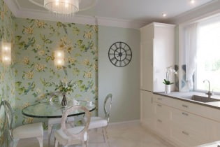 Kitchen design with green wallpaper: 55 modern photos in the interior