Color combination rules
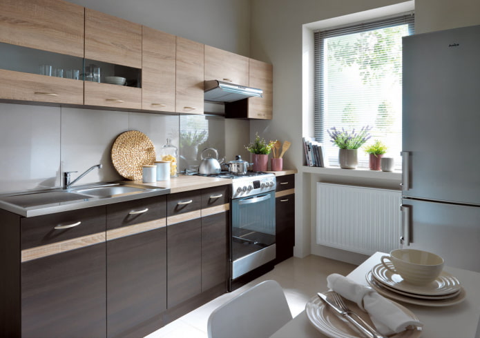
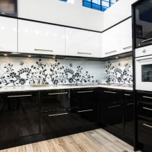
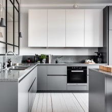
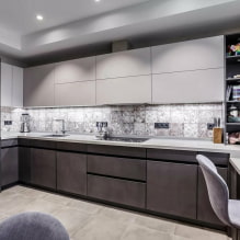
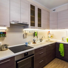
The interior of the kitchen dark bottom light top has its own characteristics, primarily regarding color combinations:
- The shade of the facade in relation to the walls. Most often, it is advised to make the furniture a little darker, but if you have a small kitchen and you want to "dissolve" hanging cabinets, order them to match the walls. For example paint both surfaces white.
- With regard to gender. Choose a dark bottom slightly lighter than the floor covering.
- No more than 3 colors. In a kitchen set, it is not necessary to stop at 2 shades, but you should not use 4 or more.
- Black and white are not the only options. To make the combination contrasting, dark bottom and light top, you can find an alternative. Bright + pastel, neutral + flashy.
- Neutral top. To be comfortable in the kitchen, choose a calm shade for wall cabinets, and order the bottom in a bright or dark color.
- Color circle. Use it in order not to be mistaken in choosing a suitable palette. For the kitchen, an analog, contrast, complementary, monochrome scheme is applicable.
Most popular combinations
Choosing a combination of dark and light for your kitchen does not need to reinvent the wheel. It is enough to look at the successful combined cases and choose what is right for you.
The black
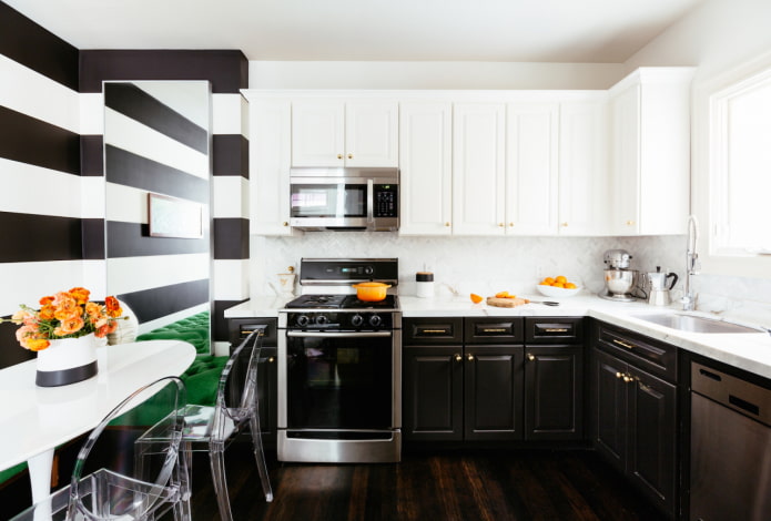
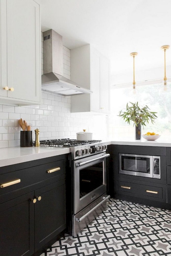
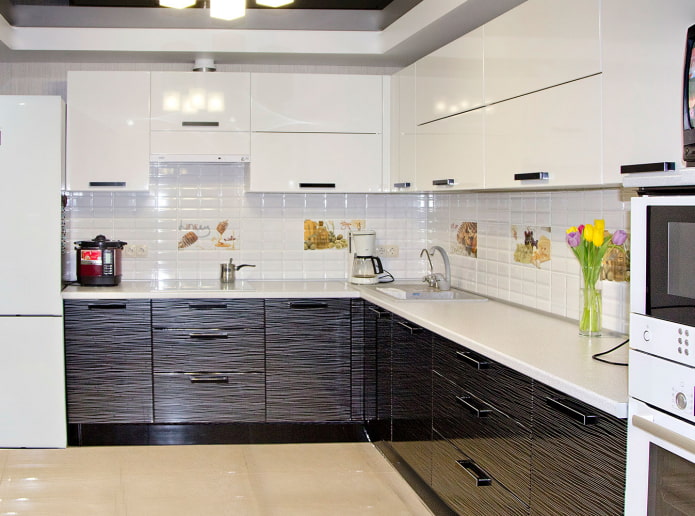
The standard combination of minimalism - black and white - is considered by some to be boring, but if you add color accents, the headset will sparkle with new colors. As an additional option, take a pastel or bright tone, or a warm metallic - copper, bronze, gold.
Overall, black is versatile. Choose it for the dark bottom, and use any other at the top. Light pastel, bright contrasting, monochrome gray or beige.
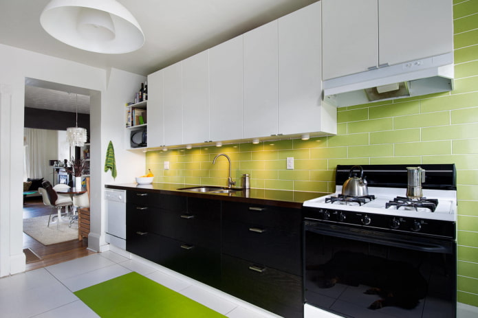
In the photo, a combination of a white and black headset and a green apron
Blue
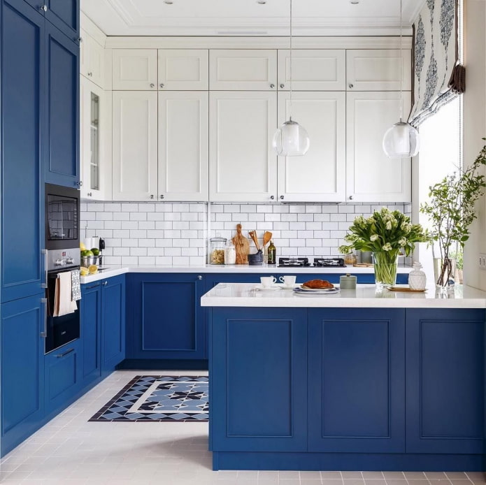
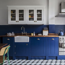
Despite the cold temperature, the monochrome kitchen in blue tones looks cozy.
On the color wheel, blue contrasts with orange, this combination of two tones is the most daring possible. For a darker blue-violet, a combination with a lighter yellow is suitable.
The analogue combination with green is not so catchy, but you need to take shades of different saturations: light blue and emerald, or dark blue and light lime.
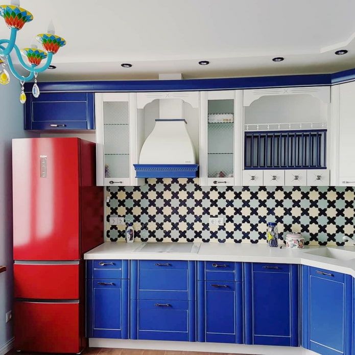
A classic simple option is a blue and white kitchen design. If you add red to this range, you get a harmonious interior in a nautical style.
Brown
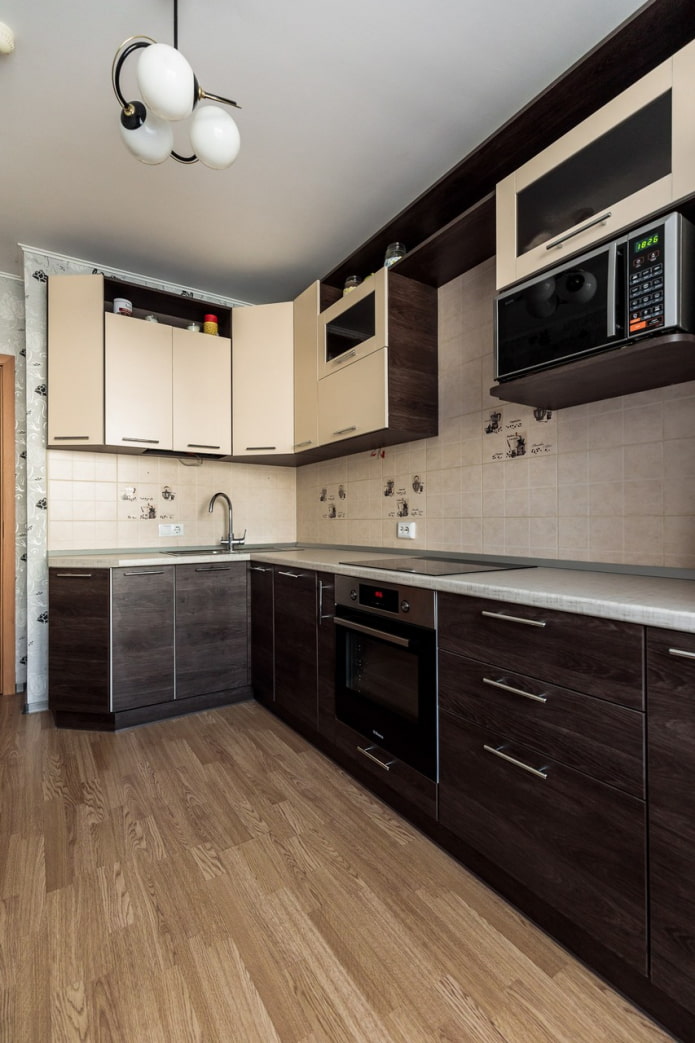
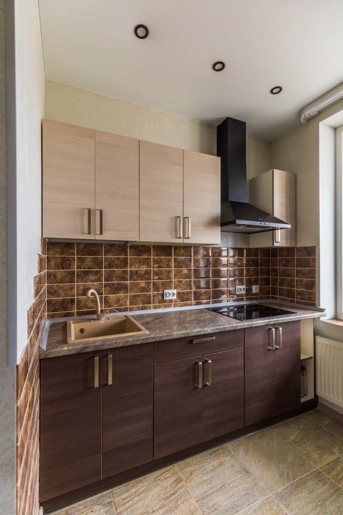
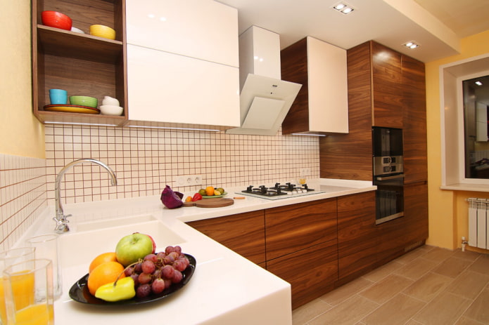
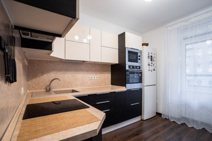
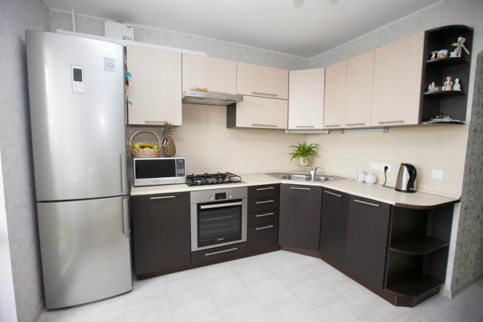
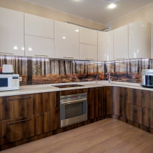
Usually, beige is used in tandem with dark brown: this is an equally successful solution for both monochromatic gloss in a modern style and wood texture in classic style.
If this duo is already boring to you, consider alternative options. Replace white with beige to add contrast. Add green for an eco-friendly interior. The combination of dark chocolate with rich tangerine looks cozy.
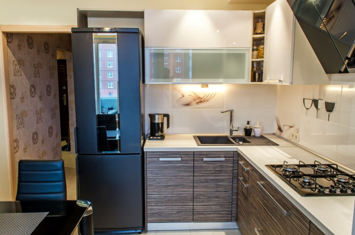
In the photo, the facades with the texture of wood
Grey
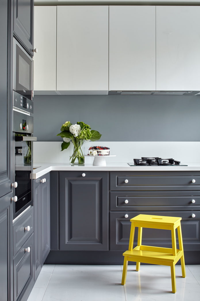
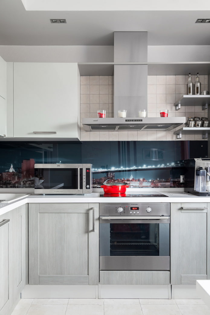
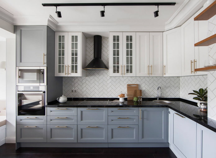
Perhaps the most versatile after white and black.Depending on the saturation, they are used at different levels: the dark bottom is made out in a shade of graphite or wet asphalt; for a light top, consider gainsborough, zircon, platinum.
Gray can be combined with itself, choosing tones of different saturation. Or add white (black) to it for a monochrome effect.
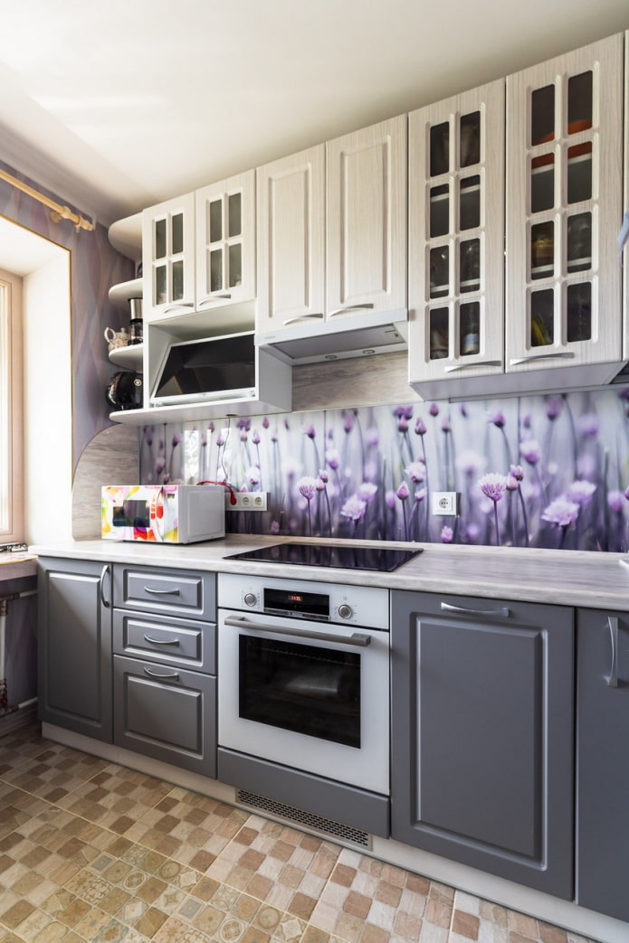
Use the rest of the shades to your liking. The only caveat is temperature. Warm gray (platinum, nickel) will suit a warm palette (yellow, red, orange). Cold (dark lead, silver) - cold (blue, green, purple).
Pictured is a modern headset with gold handles
Green
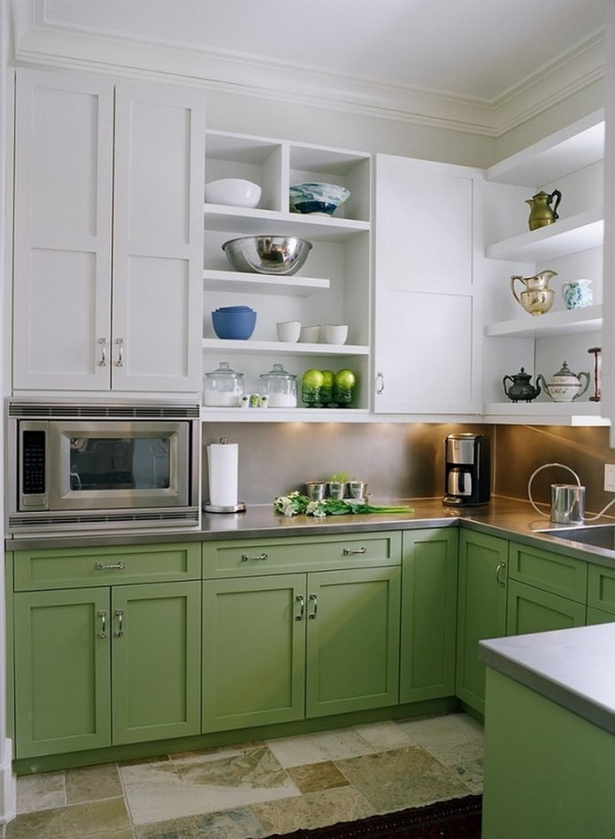
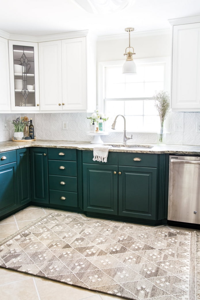
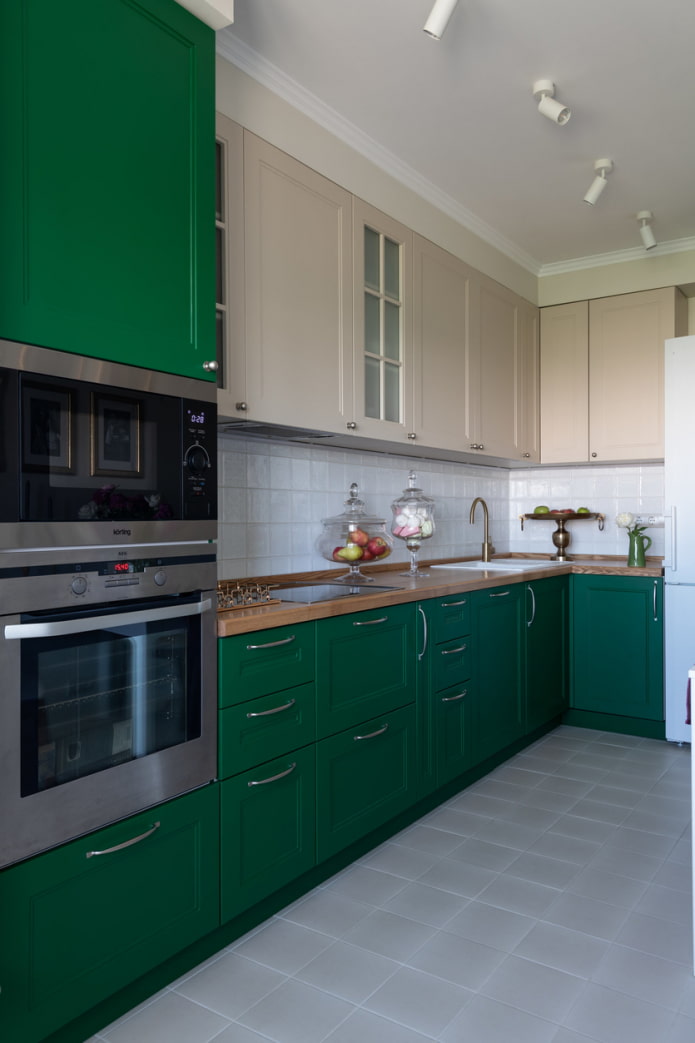
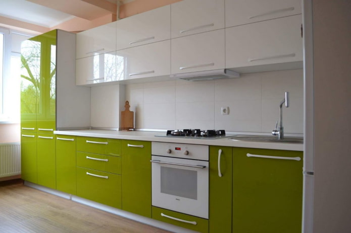
One of the most popular shades in kitchen design lately. Light green on the upper facades is harmoniously combined with black or dark chocolate. The noble emerald is perfectly complemented by light vanilla, ivory, and almonds.
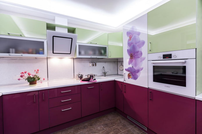
Successful combinations with bright green or yellow-green: indigo, purple, orange. Dark green is complemented by blue, light lemon, fuchsia.
Red
It is better not to use this aggressive color scheme for the upper facades, but if you are not afraid to overload the kitchen, order the red top, black bottom set.
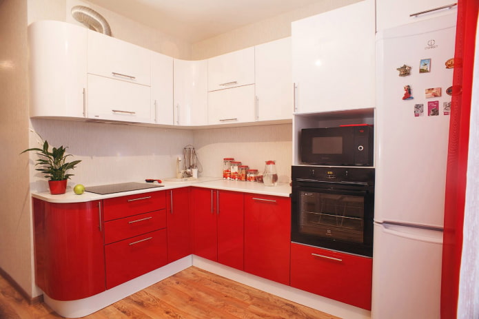
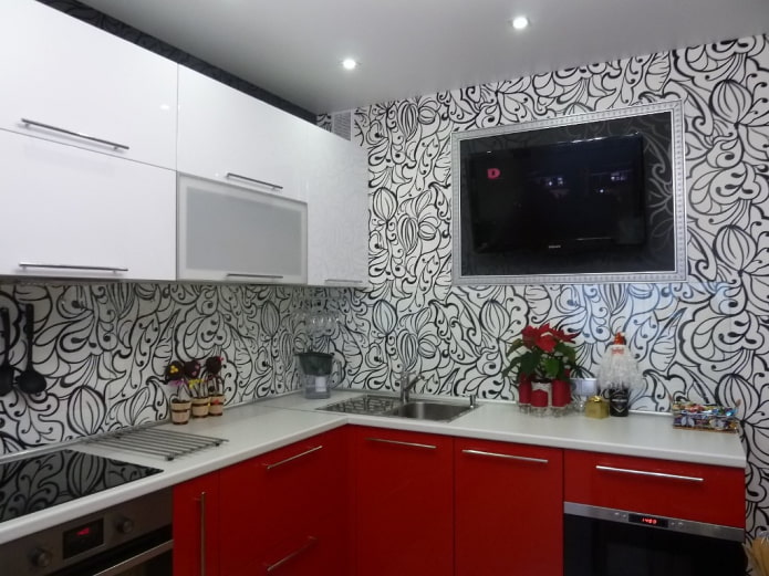
In other cases, the red is lowered down. The combination with white is popular, but it is not the only one. A less active combination is with gray. The most striking - with green, yellow, blue. Sometimes the set is complemented with beige facades, but here you need 100% hitting the shade in terms of temperature.
Purple
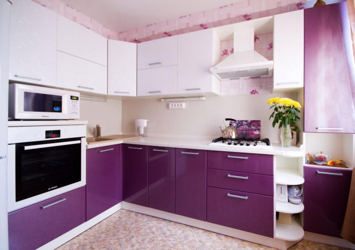
Dark purple is usually placed underneath, complementing the top with a pure white shade. You can also combine it with a faded purple for a less contrasting version.
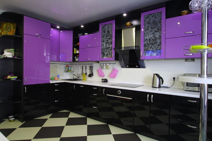
For a dramatic effect, move purple to the top kitchen units and place black cabinets at the bottom.
Bright combination with yellow only for large kitchens. In corner headsets, you can use three colors: white, yellow and purple. Having painted only 1-2 upper facades in lemon and repeating it in the decor.
Which apron is right for you?
When decorating the kitchen with a light top and a dark bottom, do not forget that there is a protective apron between the cabinets.
The photo shows a combination of glossy facades with a wooden texture
There are three selection strategies:
- Connecting element. The top and bottom row paints are used on the apron.
- Repeat one shade. A monochromatic surface duplicates the tone of either the lower or upper facade.
- Neutral. The most suitable for your kitchen: white, gray, beige, black. Or in the color of the walls.
We select household appliances, sink and mixer
Universal white or black technology will suit absolutely any headset. If you want a color technique, match it to one of the tones used. It is better to buy white household appliances in a small multi-colored kitchen - they do not distract attention, do not overload the interior.
In the photo there is a dark black and purple headset
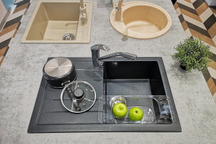
The neutral version of the sink is metal. The sink can also be in the color of the countertop, or duplicate the color of the lower tier of the kitchen.
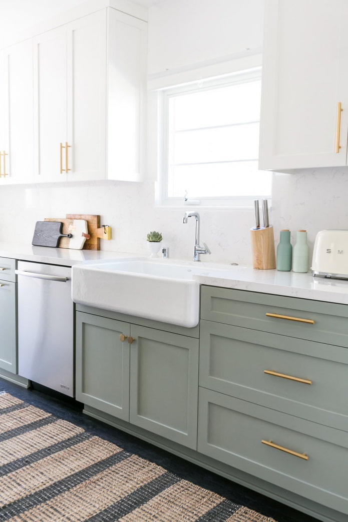
You can play with the tint of the mixer - it's best to match it to the fittings. Handles, roof rails, etc. The combination of black and white kitchen with gold or copper accessories looks stylish.
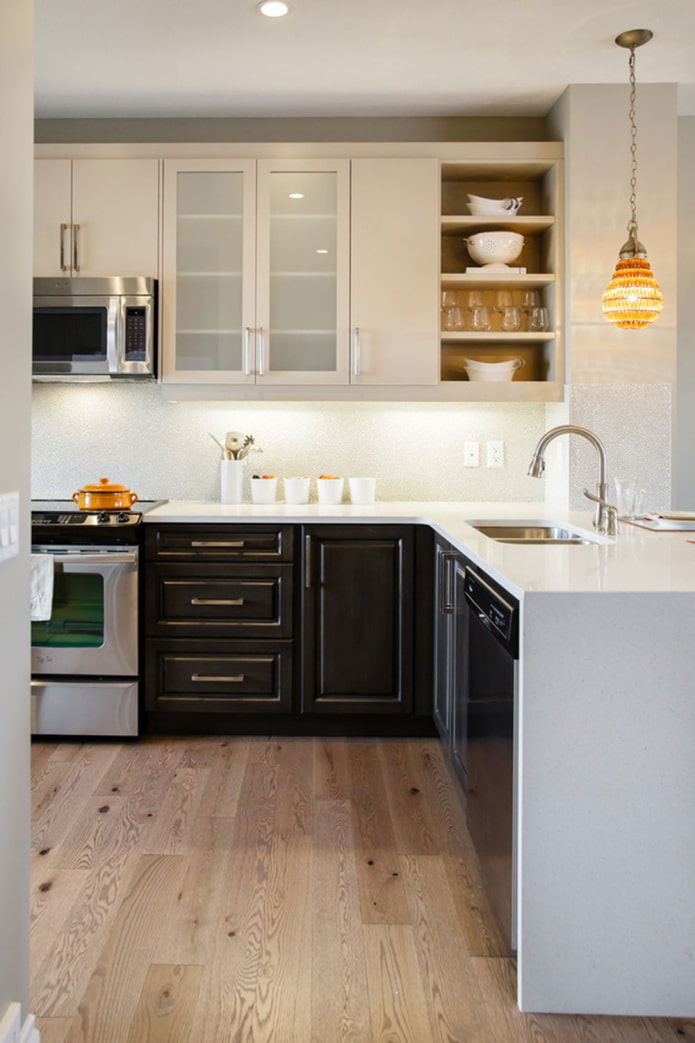
In the photo, neutral kitchen appliances
What fittings and accessories to choose?
The main visible fittings are door handles. They can be of one neutral color (white, black, metal), matching the color of each row, or they may not exist at all. If you have a complex color palette, order fronts without handles: with the Gola profile, the Push-To-Open system or other mechanisms. So the fittings will not distract attention from the rich colors.
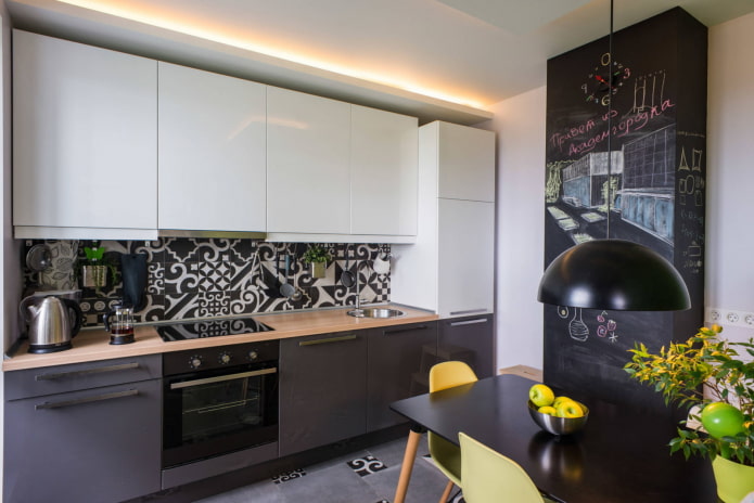
In the photo there is a black and white apron made of tiles
To make the furniture (especially for bright cabinets) not look out of place, complement it in the decor. Cushions on the sofa, curtains, small appliances, clocks, paintings and other accessories will complete the overall picture.
Photo gallery
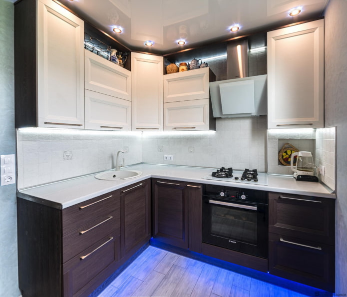
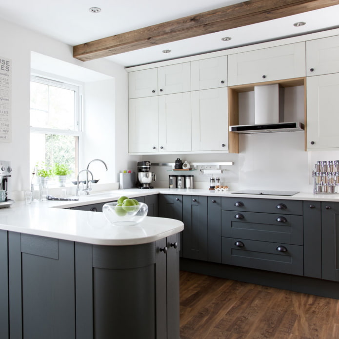
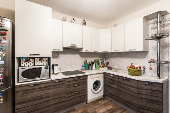
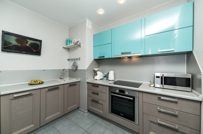
When choosing a two-tone kitchen set, consider your room size and contrast level.The smaller the kitchen, the less dark, contrasting and saturated furniture should be.

 10 practical tips for arranging a small kitchen in the country
 12 simple ideas for a small garden that will make it visually spacious
 How to choose the color of your kitchen sink?
 White kitchen set: features of choice, combination, 70 photos in the interior
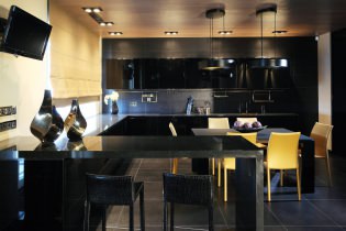 Black set in the interior in the kitchen: design, choice of wallpaper, 90 photos
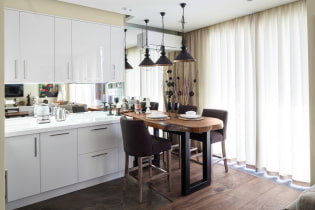 How to choose curtains for the kitchen and not regret it? - we understand all the nuances
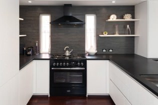 Design of a white kitchen with a black countertop: 80 best ideas, photos in the interior
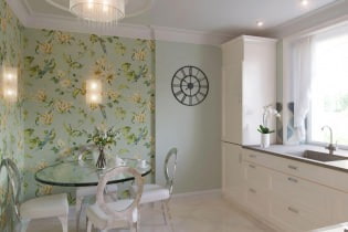 Kitchen design with green wallpaper: 55 modern photos in the interior