Color matching rules
There is no wrong or correct combination of colors in the kitchen. However, if you fulfill some of the requirements, then the overall picture will turn out to be more harmonious.
- Use the 60/30/10 Rule... Where 60 - neutral colors, 30 - additional, up to 10% - bright and dark. Do not use more than 3 shades. If you're new to design, combining more colors in your kitchen can be a daunting task.
- Consider the degree of light... The dull interior of the kitchen, whose windows face north, requires warm colors - soft white, beige, yellow, orange. If the kitchen is southern, on the contrary, add tenderness: boiling white, blue, pink and other pastels will balance the level of warmth.
- Start from the size of the room... The color scheme for small kitchens should be as light as possible. Best of all, white color expands the space, which is diluted not with other tones, but with textures - glossy facades, brickwork, light wood.
- Turn to psychology... The color of walls and other interior elements directly affects your mood and desires. For example, warm colors stimulate appetite, cold ones, on the contrary, pacify. This does not mean that if you are trying to keep yourself in shape, you need to decorate the entire kitchen in chilling shades - just choose the right tablecloth and dishes.
- Strike a balance... Match bright or dark walls with a neutral kitchen set. And vice versa - a flashy headset will look better against a background of light or even white walls.
- Follow the matching rule on surfaces... It can be enclosed in one phrase: from bottom to top. The darkest in the room is always the floor, the lightest is the ceiling.
- Don't forget about the texture... The same color will look completely different on glossy and matte surfaces. In the first case, the tone will become richer, in the second - muted.
What are the color schemes and their features?
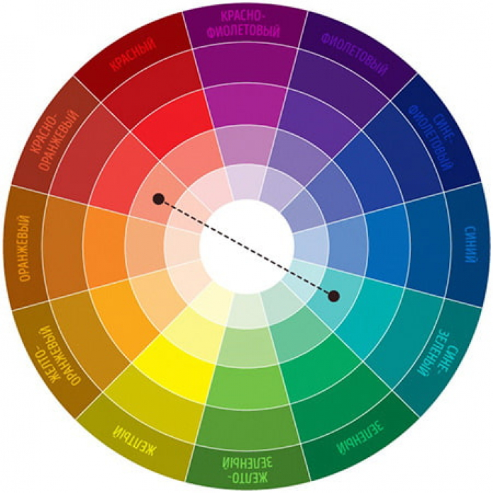
To correctly choose the combination of colors in the interior of the kitchen, use the color wheel - depending on the location of the sectors, several win-win schemes are distinguished on it.
Gradient or tint
This color combination for the kitchen is also called monochromatic or monochrome. The point is to take one segment of the circle and make the interior in these colors. That is, only one tone is taken as a basis, and the depth of space and dynamics are achieved due to its semitones.
Thanks to this technique, you can bring a sense of unity to the interior, combine many details without the danger of oversaturation and clutter of the interior.
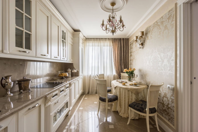
In the photo, the beige color of the kitchen is an example of a tint combination of colors.
To prevent a monochrome interior from looking boring, add more contrast between shades, use several interesting textures and details in the interior. In this case, the brightest should be the elements that you want to highlight or emphasize.
This scheme is the only one where you do not need to follow the rule of maximum 3 shades.You can achieve an interesting effect if you use 5-6 tones.
Contrasting color combination
A complementary pair is considered to be placed opposite each other in the color wheel scheme. Sunny yellow, for example, complements nighttime violet. The bright red contrasts with the rich green. An energetic orange is paired with a heavenly blue.
The main advantage of the two-tone interior design is expressiveness. The design will definitely not turn out boring and the colors will not argue with each other.
But you need to combine colors in the interior of the kitchen with care so that the effect does not turn out to be too flashy, choose one color as the main one, and use the second to place bright accents. The final result depends on the brightness of the base color - the calmer it is, the calmer the kitchen will be.
From the spectrum of colors, try to choose not pure, but diluted, muted or dirty shades. Complex tones allow you to create the most comfortable space. For example, replace orange with rusty, pumpkin, tangerine, ocher or bronze.
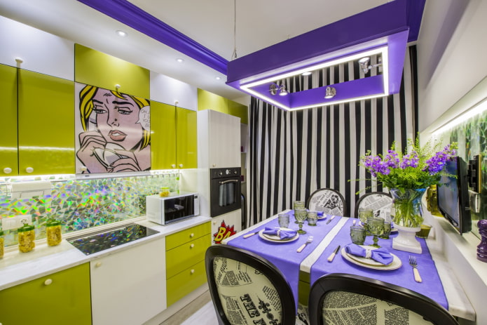
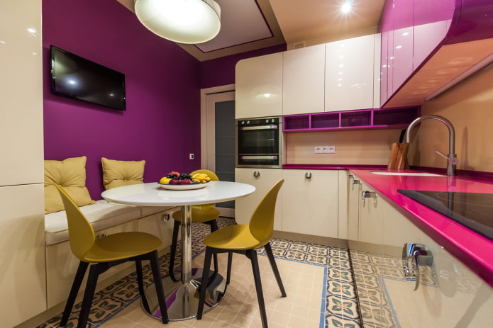
The photo shows a light green-lilac interior with pop art elements
Triad
As the name implies, this color scheme has three components. In this case, the triad happens:
-
Analog... On the color wheel, these are three colors of the same brightness, located next to each other. For example, for a yellow kitchen, the combination of colors green + tangerine will be considered analog. To make it easier to decorate the interior, one of the shades is chosen as the main one - a kitchen set or walls are made in it. The second tone is supportive, the third is accent.

-
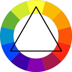
Classic... If you draw an equilateral triangle on a circle, then its vertices will just indicate the colors of the classic triple combination. This scheme uses sectors equidistant from each other - in a twelve-sector circle - through three sectors. Example: purple + pumpkin + green, scarlet + lemon + sky. Also, as in analog, the first step is to choose a shade that will become the base, the second - an addition, the third - an accent.
-
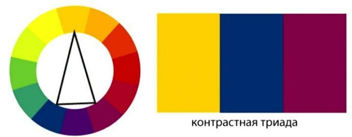
Contrast... A variant of a complementary combination, but instead of one opposite, a pair of adjacent shades is used. If you draw a triangle, then it will be isosceles. That is, for orange, instead of blue, take dark blue and turquoise. Purple is diluted with green and light orange. Such a combined scale is more difficult to perceive, but more interesting.
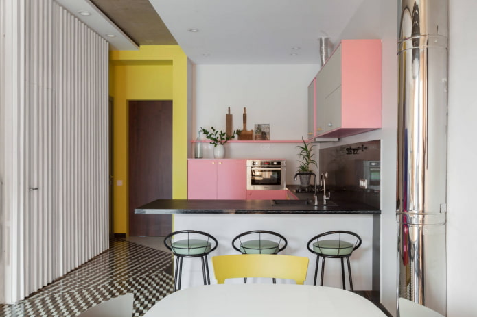
The photo shows a combination of muted pink, pale yellow and gray-green
Black and white kitchen
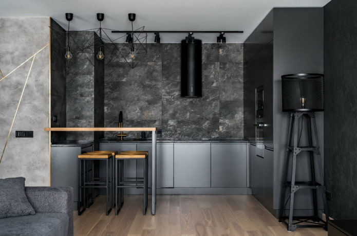
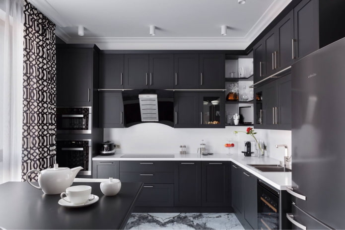
Such kitchens are contrasting, but in comparison with colored ones, they are considered less active. Recently, combined black and white shades have been found in Scandinavian, minimalist and other modern interiors.
Boring black and white is diluted with one or two additional textures and shades:
- metallic black silver;
- complex white in the form of ivory, marshmallow, vanilla;
- steel and brown;
- colors of natural wood combined with texture.
Particular attention should be paid to lighting in a black and white kitchen. It can be either colored or standard - warm or cold, depending on the desired effect.
Most popular combinations table
If the basic tones are combined with almost all colors, then there are more complex combinations. But no less beautiful.
How to choose the right circuit?
The color of the walls in the kitchen affects the color combination in the same way as the color of the furniture, floor and ceiling.In order not to miscalculate, start from something large - for example, upper and lower cabinets, and based on their shade, select the rest of the details (chairs, curtains, decor).
Choosing the color of the headset
The color of the kitchen set today is not limited by anything - a large assortment of films and paints allows you to choose absolutely any shade. It should be based on personal preferences, the size of the room and furniture, ease of care.
For a small kitchen, the facades are only light and glossy is better. Dark colors, especially matte colors, absorb light and make the room look smaller. A white kitchen set in combination with white walls will literally dissolve into space, and glossy surfaces will reflect and multiply the light, making the kitchen brighter and more spacious.
It seems to some that white or light doors are absolutely impractical - this is a misconception. Dark glossy facades are considered the most impractical - prints remain on them, and even the slightest traces of grease and water leaks are noticeable.
It is not necessary to choose one color for all furniture. A dark or bright bottom and a light or neutral top are a win-win for any size kitchen.
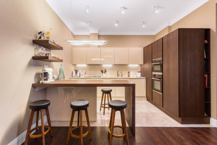
In the photo there is a two-tone set with a wooden tabletop
Deciding on the color of the technique
When choosing home appliances, you can go three ways: standard white, black or bright accent.
- White appliances in a bright kitchen will not stand out or weigh down the space; they are easy to care for.
- Black appliances are eye-catching and need to be complemented with accessories or details of the same color. Combines well with a matching worktop. Glossy and glass surfaces require special care.
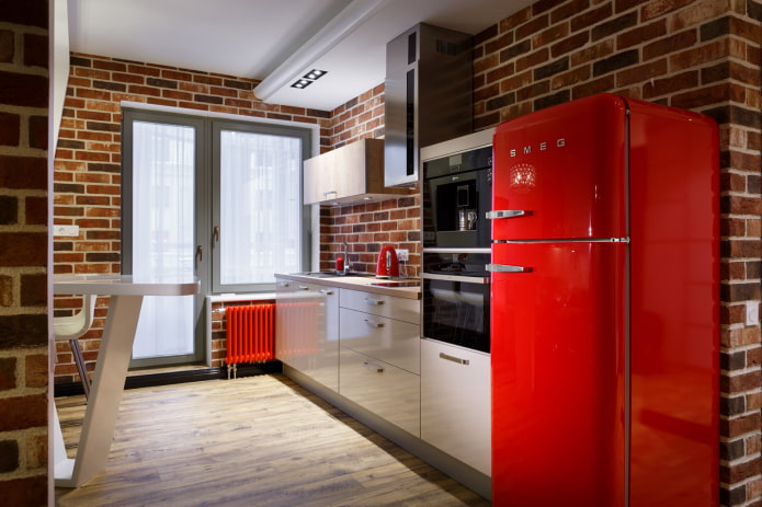
- Flamboyant technique can be used in colored and achromatic kitchens to emphasize the right place. The combination of elegant red or blue with white or black looks fresh and stylish. But do not overdo it - 2-4 devices will be enough.
The photo shows red accents in the kitchen: refrigerator, radiator, kettle
Choosing the color of the countertop
Most designers and apartment owners try to make this surface neutral - and this is the right decision. The main thing is not to choose a color that is too dark - otherwise it will be difficult to keep it clean.
Important! The most practical colors are: streaked white, beige, natural wood, gray.
The safest way to choose a shade and create coziness is to repeat the palette of one of the design zones. Floor, backsplash tiles, dining table, decorative items.
We select the color of the walls
The walls can be absolutely any, the main thing is to achieve a harmonious combination with furniture and appliances. And also take into account the features of the room:
- Color saturation. Dark crushes, narrows the room, light - adds space.
- Temperature. Warm range softens, cold - refreshes.
- Print size. Large flowers, ornaments and other elements are suitable only for spacious kitchens, they can visually reduce the size of the room. Small patterns, on the contrary, increase.
- The direction of the drawing. To make the ceilings in the apartment visually higher, pick up vertically directed stripes. A narrow room will be transformed by horizontal ones. If the interior lacks dynamics, the diagonal will help.
Photo gallery
Finding your perfect match for your kitchen isn't easy. We hope our tips will help you cope with this task, and you will create the space of your dreams!

 10 practical tips for arranging a small kitchen in the country
 12 simple ideas for a small garden that will make it visually spacious


 How to choose the color of your kitchen sink?
 White kitchen set: features of choice, combination, 70 photos in the interior
 Black set in the interior in the kitchen: design, choice of wallpaper, 90 photos
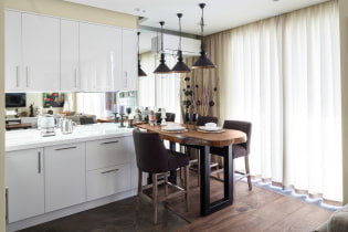 How to choose curtains for the kitchen and not regret it? - we understand all the nuances
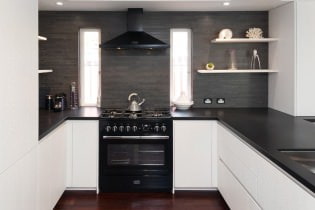 Design of a white kitchen with a black countertop: 80 best ideas, photos in the interior
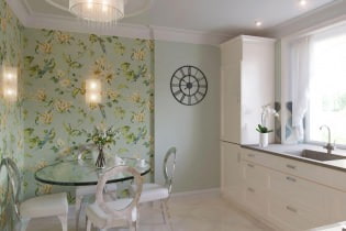 Kitchen design with green wallpaper: 55 modern photos in the interior