Layout options 3 by 3
Kitchen design begins with an assessment of the initial data: where the room is located, what are the pros and cons of its layout. The area of 9 square meters cannot be called tiny, but the irrational use of space can make it so.
Before creating a project, evaluate:
- the presence and size of a window or balcony
- location of communications
- number and location of outlets
- the initial state of the wiring
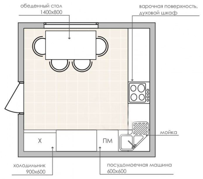
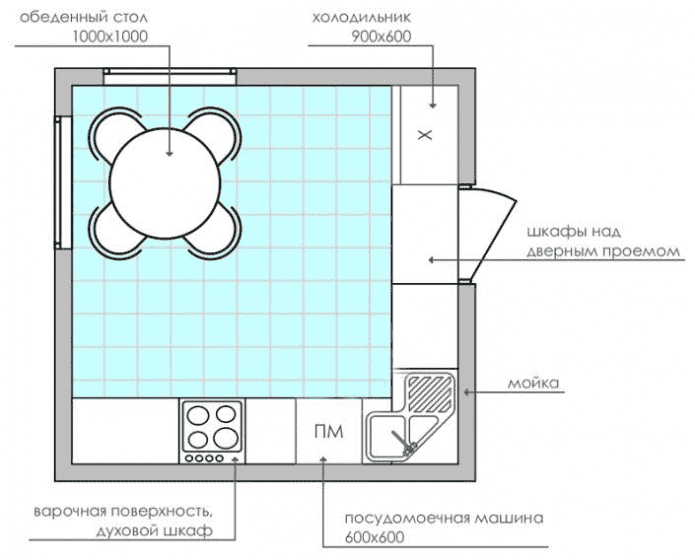
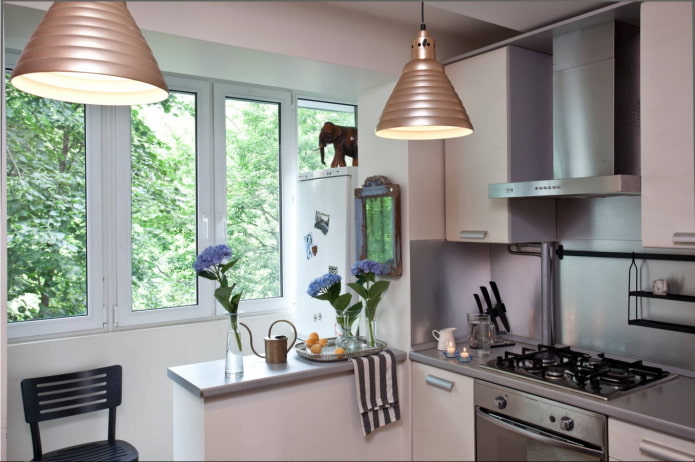
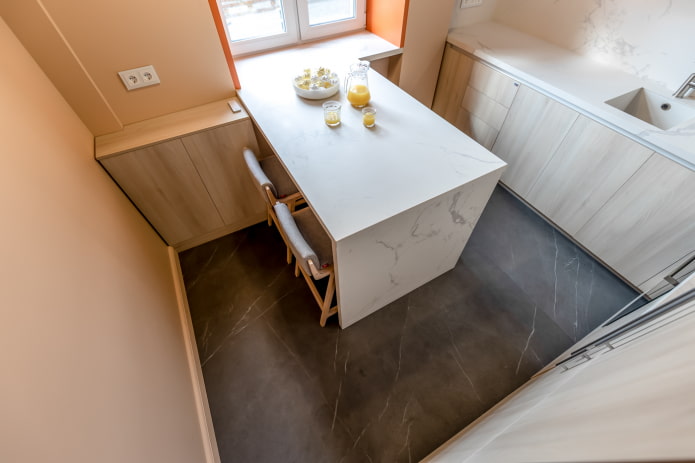
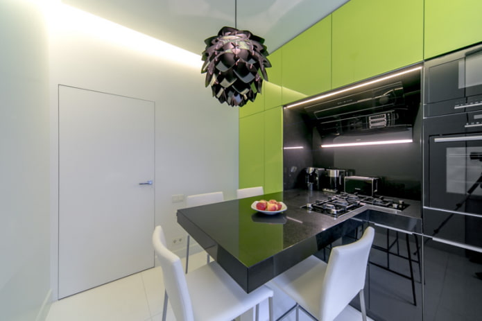
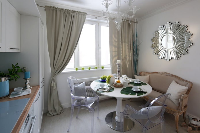
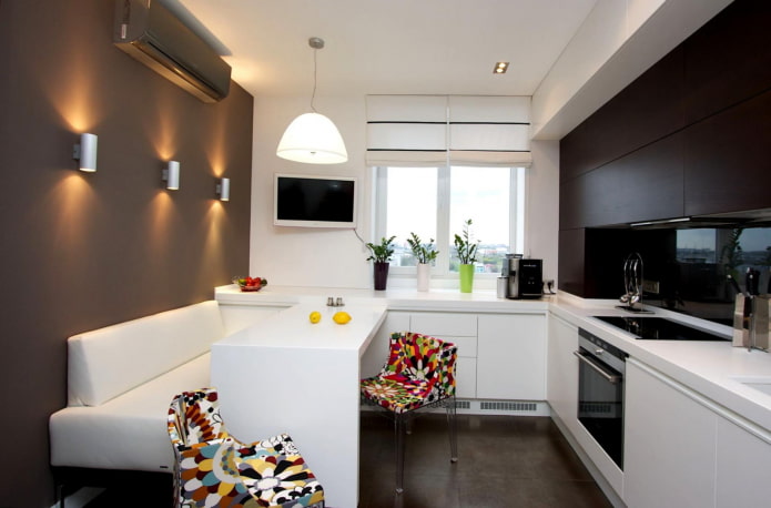
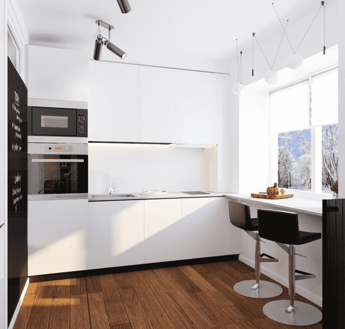
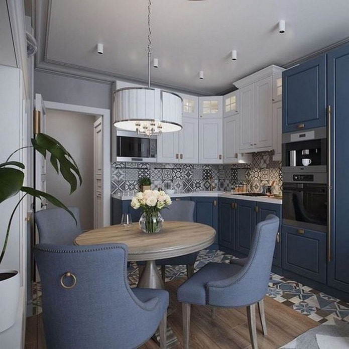
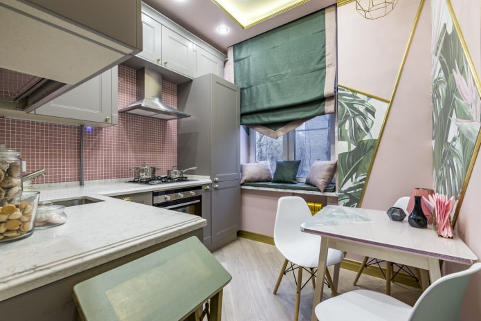
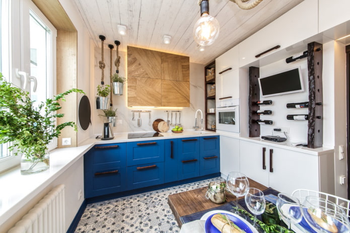
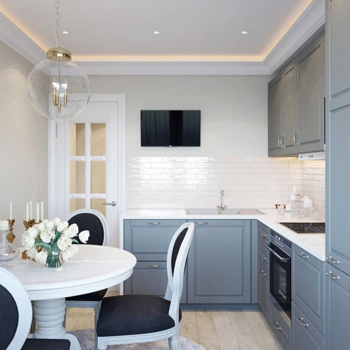
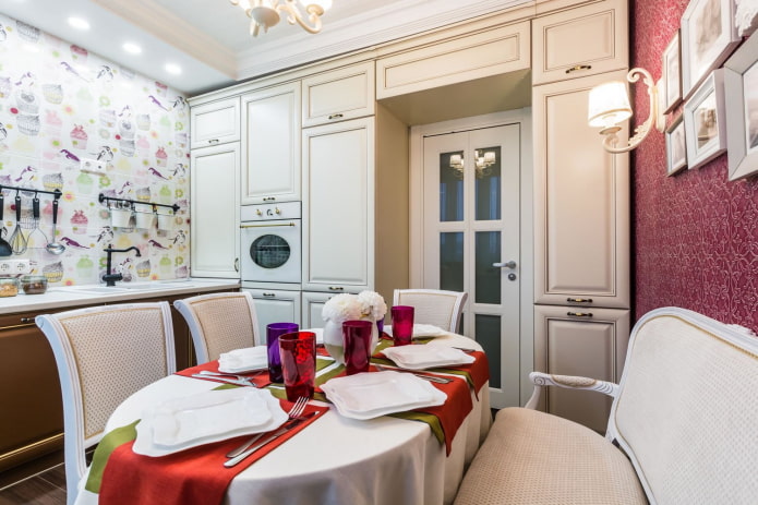
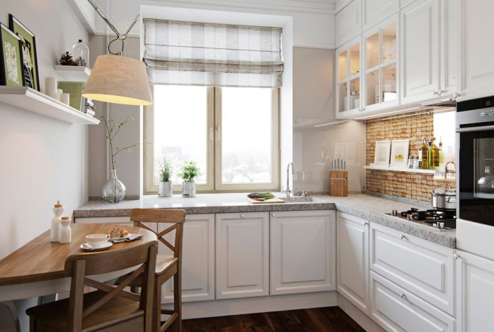
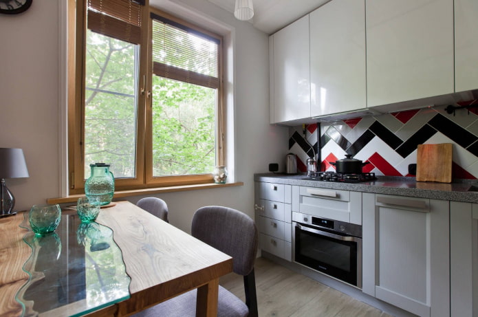
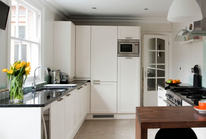
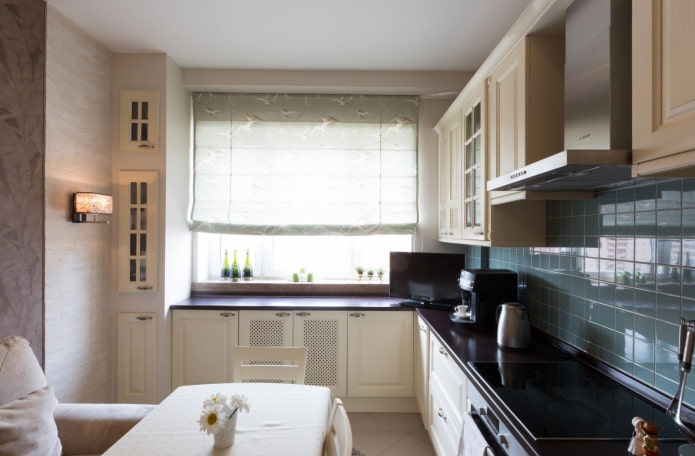
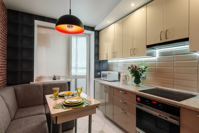
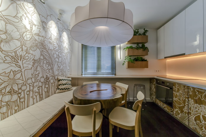
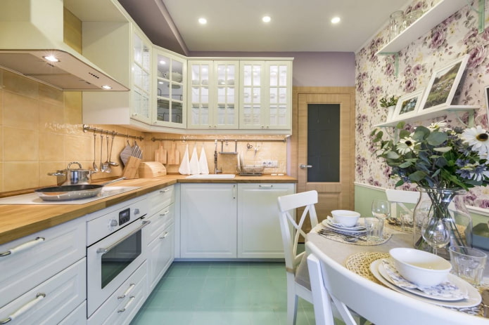
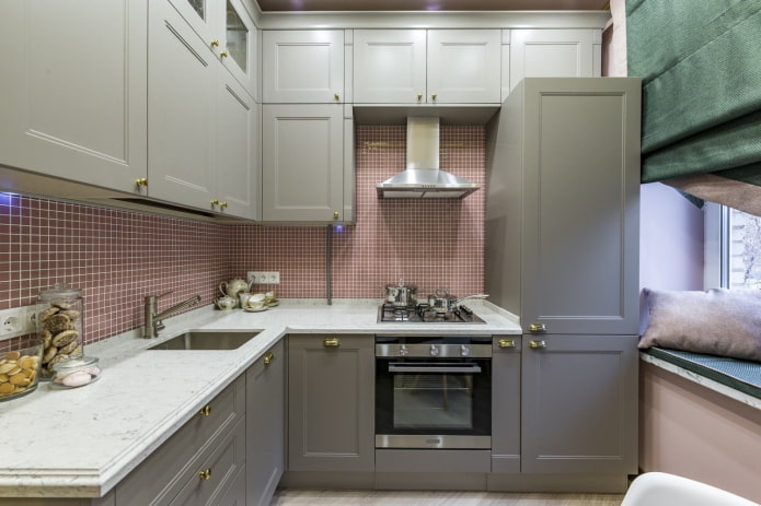
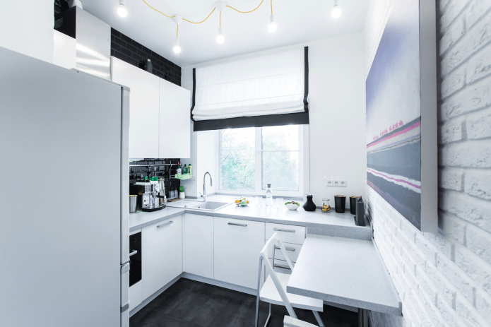
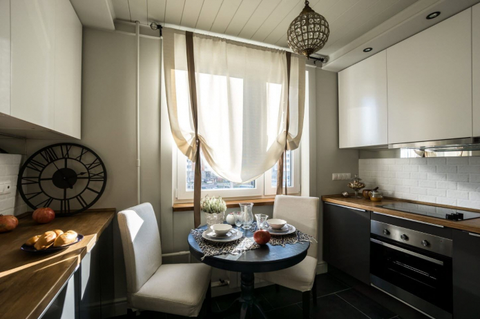
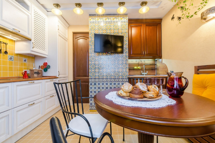
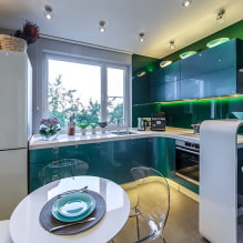
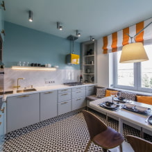
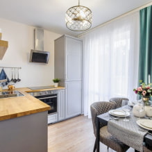
In the photo, options for kitchen layouts are 9 sq. m.
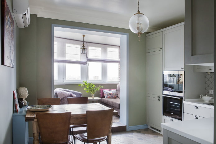
Does your room have a balcony? Take advantage of this: adding a dining area or additional storage space will increase your free space. It is forbidden to carry out communications by town planning norms, therefore, the location of the working area here is excluded. But dismantling the window frame and balcony door will make the window sill a suitable place for eating.
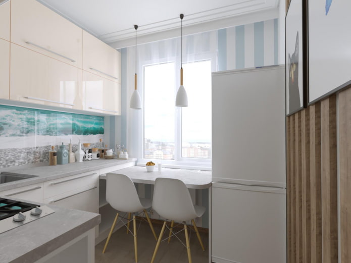
The absence of a balcony presupposes the presence of a window, which can also be advantageously beaten in a 3 by 3 kitchen layout. Having sacrificed several upper cabinets, make a work area under the window with a sink or countertop. In addition, the window sill is a great place to place your kitchen appliances.
Tip: if you want to place a microwave oven or other equipment on the windowsill, take care of placing the sockets in the window slopes in advance.
In the photo, kitchens combined with a balcony
What color is better to decorate the interior in?
The 3 by 3 area and the geometry of the space dictate their own rules when choosing a color scheme. Dark tones in the design reduce, and too bright tones get tired. The right solution would be to design an interior in light shades using contrasts.
Important: a large number of dark or bright accents overload the kitchen.
The optimal kitchen design starts with a pastel background (walls, suite, large furniture) and ends with accents. Bright pillows on the sofa, prints on the walls, an original apron, colored curtains will make the overall picture juicier.
In the photo there is a light kitchen 3 by 3 meters in a minimalist style.
Dark colors also have a place to be, and sometimes they are really necessary - for example, when designing a small loft-style room. But this color scheme requires careful lighting.
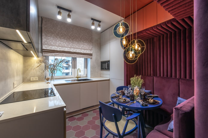
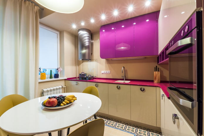
A 3 by 3 kitchen interior can be enlivened with color with a contrasting wall design, bright facades or furniture. An accent wall visually expands the space, and with colored furniture the room will become unique of its kind.
The photo shows an emphasis on bright kitchen chairs
What to consider when renovating a small kitchen?
The choice of materials for renovating a kitchen 3 by 3 meters depends on the goals and objectives that you set for yourself. You can expand the space of small-sized kitchens with the help of a glossy texture and light shades, this rule works on all surfaces.
Ceiling
A shiny stretch ceiling actually reduces the height of the room, but visually makes it taller by reflecting light.In the case of painting or whitewashing, choose a boiling white color - it will add volume. Sophisticated plasterboard structures will make the kitchen smaller and simplify the design, but if they are needed, add lighting to "raise" them.
Walls
Washable wallpaper, painted walls, ceramic tiles, panels, decorative plaster - when purchasing materials for kitchen walls, proceed from the budget and the chosen style.
Coloring is preferable for Scandinavian style, minimalism, hi-tech. Wallpaper and panels are suitable for Provence, decorative plaster in different designs for classic and loft designs. The apron is decorated with tiles, panels, mosaics or paint.
A solid color or small pattern will work best. Vertical lines will make the room taller, horizontal lines wider. Scale patterns and reliefs on the walls will make the room smaller.
In the photo, the design of the kitchen 3 by 3 meters with the original wall decor
Floor
In a space of 3 by 3 meters, laminate, linoleum or floor tiles are suitable. There is a large selection of colors and textures of these materials on the market. Consider also the peculiarities of their use:
- A practical option for floor decoration is tiles. It is durable, easy to clean and not afraid of moisture. Of the minuses - the high price and complexity of installation. In addition, the tile is a cold material, for comfort you will need a "warm floor".
- Laminate is not so cold, but it is afraid of moisture - any leak can threaten to replace the floor covering.
- Linoleum is easy to lay and it is not afraid of water spilled from above, but getting it under the bottom can provoke the development of a fungus.
How to equip a kitchen?
The right lighting ensures comfort during cooking and eating. The ceiling chandelier in the center of the room cannot provide all the necessary areas with light. The workplace requires a separate light source - it can be the illumination of the table top under the hinged modules, wall sconces or ceiling lamps of directional light. A pendant light will highlight the dining table. If its role is played by a bar counter, install spot or track lamps above it.
In the photo there is a stylish dining area in the kitchen 3 by 3 meters
The main decorative element of any kitchen is an apron. Increasing the area will allow a glossy or mirror finish, to attract attention - an unusual design on glass or bright tiles.
Textiles in a 3 by 3 kitchen are just as important as in a bedroom. The choice of curtains is dictated by the planning features. In a room combined with a balcony, you can do without them. If there is a tabletop or dining table under the window, it is preferable to use blinds, roman or roll curtains. Laconic Japanese panels or, for example, Austrian curtains will ennoble the free window.
Arrangement of kitchen furniture and appliances
Not only the type of kitchen depends on the arrangement of furniture, but also the convenience of its use in the future.
In a square kitchen 3 by 3 meters, the preferred layout options are angular and linear.
With the help of a corner set, it is easiest to organize an ergonomic working triangle "stove-sink-refrigerator". The sink can be installed in the corner, the stove can be placed to the right of it, and the refrigerator can be installed to the left. Other advantages of the L-shaped arrangement are the many cabinets and a wide work surface. The dining table is positioned against a parallel wall.
By placing cabinets along one wall of 3 meters, the storage space for tableware and the working area are almost halved. But there is more free space in the room. Household appliances are also located along one wall. If desired, the refrigerator can be placed against an adjacent wall, creating a convenient triangle. The linear layout is ideal for minimalists.
If the dining area is taken out to the balcony, there will be enough space in the room itself for a U-shaped headset. There is enough space between the cabinets for comfortable movement, a free table top for cooking, the volume of the cabinets for storing large supplies.Without taking out the dining area to the balcony, such a scheme can be implemented in a small room by making the dining table part of the headset or by placing a bar counter.
The design of the dining area depends on the size of the kitchen unit. A round table saves space, but it cannot be placed in a corner. Rectangular or square is left in the corner, pulling out if necessary. Installing a sofa requires a lot of space; if there is a shortage of it, chairs are more suitable, which can always be pushed under the table.
Design ideas in various styles
9 square meters can look different depending on the style you choose.
The classical style assumes a riot of decor (forged elements, stucco molding, gilding), natural finishing materials, luxury furniture, expensive textiles.
Choosing modern minimalism for a small kitchen, give preference to clear lines, pure colors, geometric lines. You can refuse wall cabinets or make them as simple as possible.
In the photo there is a square kitchen 3 by 3 meters in the Provence style
A loft is primarily about decor. The walls can be concrete or brick, the wiring is external, the floor and ceiling are as simple as possible.
A square Scandinavian-style kitchen requires light colors (white, beige, gray) and lightness in space. Light, simplicity of design and wooden elements are the basis for scandi.
Photo gallery
In a 3 by 3 meter kitchen, the design should take into account the peculiarities of the geometry of the room. Before starting the repair, draw up a plan, think over the situation and only after that proceed to the decoration and arrangement.

 10 practical tips for arranging a small kitchen in the country
 12 simple ideas for a small garden that will make it visually spacious


 How to choose the color of your kitchen sink?
 White kitchen set: features of choice, combination, 70 photos in the interior
 Black set in the interior in the kitchen: design, choice of wallpaper, 90 photos
 How to choose curtains for the kitchen and not regret it? - we understand all the nuances
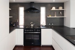 Design of a white kitchen with a black countertop: 80 best ideas, photos in the interior
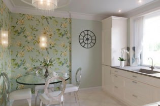 Kitchen design with green wallpaper: 55 modern photos in the interior