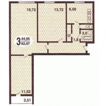
The design of a three-room apartment in a panel house provides for four separate rooms (living room, kitchen, bedroom and nursery), albeit small in size. Additionally, the owners wanted to have a dressing room, as well as a sufficient number of places where you can put things away.
There were no capital walls, which made it possible to radically change the design of the small 3-room apartment: some of the walls were rebuilt to fit into the entrance area of the storage system, some were removed, uniting the balcony to the largest room. In it, a place was allocated for a dressing room, which will perform not only its direct role - it is convenient to arrange clothes, but will also become an additional storage for household trifles.
Living room
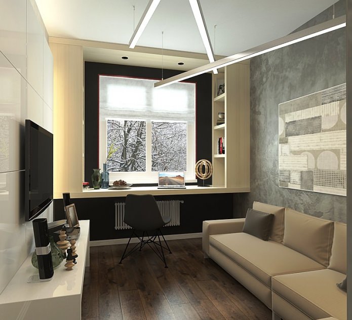
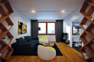
Living room in the design of an apartment of 63 sq. m. is made in gray-beige tones. Black was used as an accent color, highlighting the window opening. Dark wood flooring softens the cool gray tones of the walls. The same purpose is served by the backlighting of the panel on which the TV is fixed.
The decorative painting of the walls, reminiscent of rough aged plaster, gives the room an additional charm and slightly enhances it visually. A workplace has appeared near the window: a wide table top near the walls turns into open shelves for books. A cozy soft sofa can be expanded to turn the living room into a guest bedroom.
Kitchen
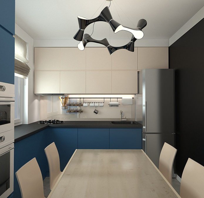
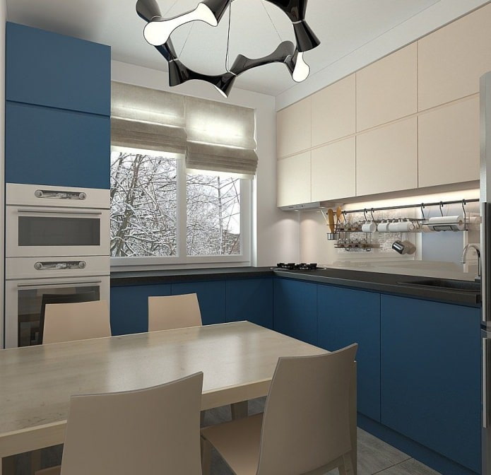
The design of a three-room apartment in a panel house has been carefully thought out in terms of placing places where household items, household appliances, and kitchen supplies will be removed.
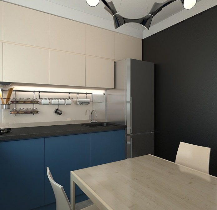
In the kitchen, the standard line of wall cabinets above the work area has been supplemented with mezzanines reaching up to the ceiling, thus increasing the usable storage volume. There you can keep those devices that are not needed every day.
It is very convenient in a small space, since the ergonomics are carefully calculated: from the refrigerator, supplies immediately go to the sink, then move to the work table for processing, and then go to the stove. As a result, the available space was sufficient to accommodate a fairly large table for family meals.
Children
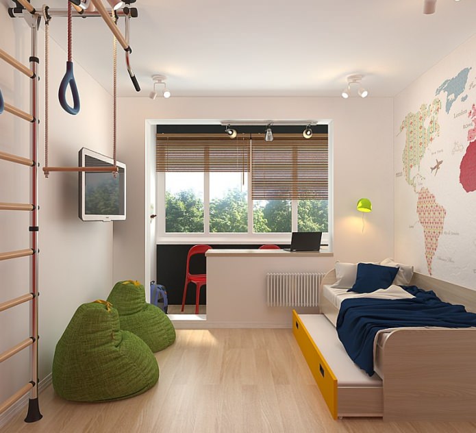
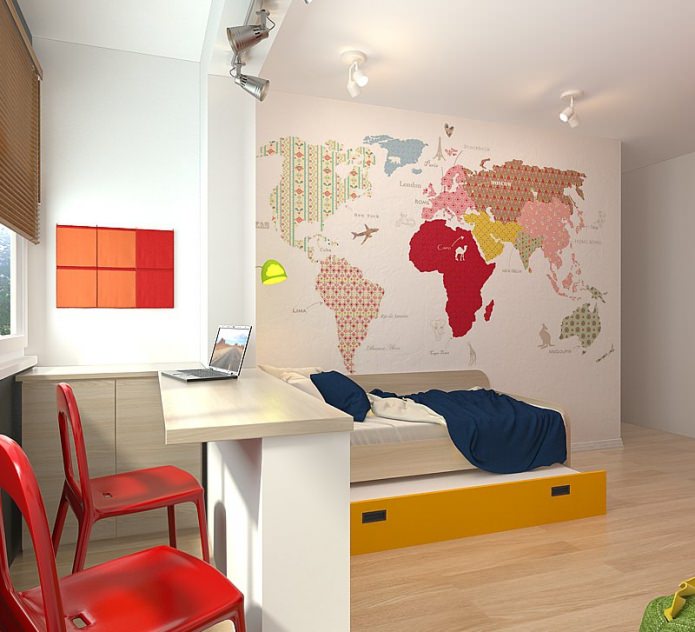
The nursery in the design of a small 3-room apartment is the largest and brightest room. It was created with an “eye” for two kids, and designed in accordance with these plans.
To leave as much free space as possible for children's outdoor games, the idea to put two beds was abandoned, replacing them with one roll-out: the second sleeping place “rolls out” from under the first one for the night, and each child is provided with an orthopedic bed for healthy sleep.
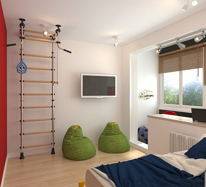
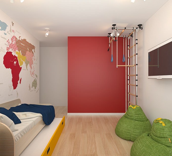
So far, this room has only a closet for storing things and a study on the former balcony. Part of the room was set aside for a sports corner, where a metal structure was reinforced for gymnastic exercises.
The design of the apartment is 63 sq. m. bright color accents are used, and they are especially relevant in the nursery. Green cushions, a multicolored map of the world on the wall and a red partition next to the sports equipment enliven the interior. Behind this partition there is a dressing room with its own entrance.
Bedroom
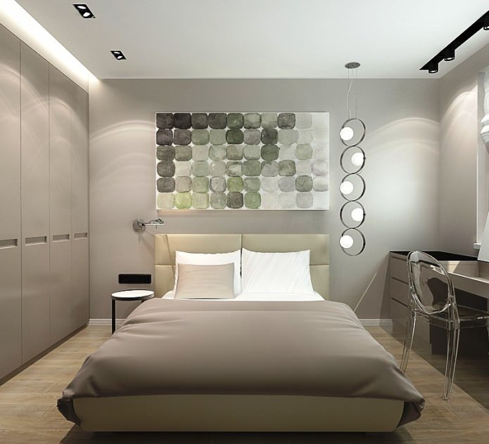
Aged in warm beige tones, the bedroom would not be too expressive if it were not for the use of contrasting black, which gives the room a stylish completeness.
The black metal rail on the ceiling, on which the lamps are fixed, the black glass panel that descends along the wall and turns into a dressing table, the black frame of the bedside table - all this brings elements of strict graphics into the interior, organizing the space into a single whole.
The design of a three-room apartment in a panel house provides for a large wardrobe in the bedroom of a discreet beige shade, and in addition, you can use drawers under the bed to clean, for example, bedding in them.
Since the size of the rooms is small, they refused from the volumetric curtains that eat up the space, replacing them with roller shutters. Near the window-sill working area - a comfortable invisible chair made of transparent plastic, which does not clutter up the space.
The design of a small 3-room apartment has an interesting lighting scheme: under the cornices there are lighting, bright lighting at the dressing table, lamps by the bed and general soft lighting using lamps built into the ceiling.
Entrance area
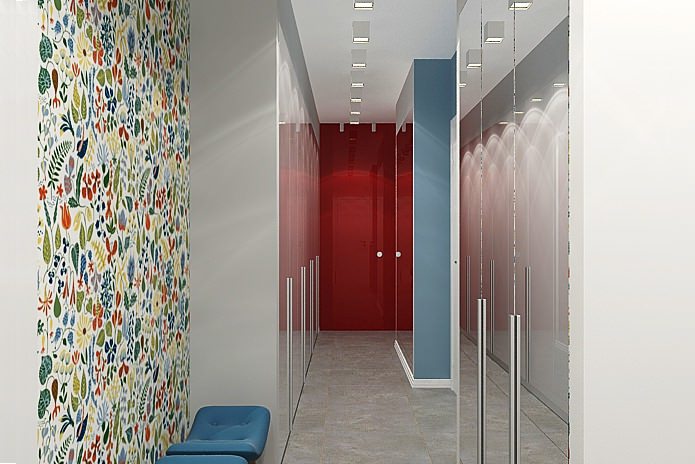
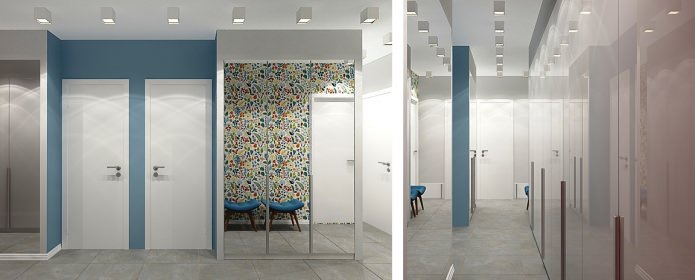
Here we managed to place two volumetric cabinets with mirrored facades - they help to "push apart" the walls a little and create the feeling of a large room, although in reality the distance between them is less than a meter - however, this is quite enough for a comfortable passage through this zone.

 10 practical tips for arranging a small kitchen in the country
 12 simple ideas for a small garden that will make it visually spacious



 Design project kopeck piece in brezhnevka
 Modern design of a one-room apartment: 13 best projects
 How to equip the design of a small apartment: 14 best projects
 Interior design project of an apartment in a modern style
 Design project of a 2-room apartment 60 sq. m.
 Design project of a 3-room apartment in a modern style