general information
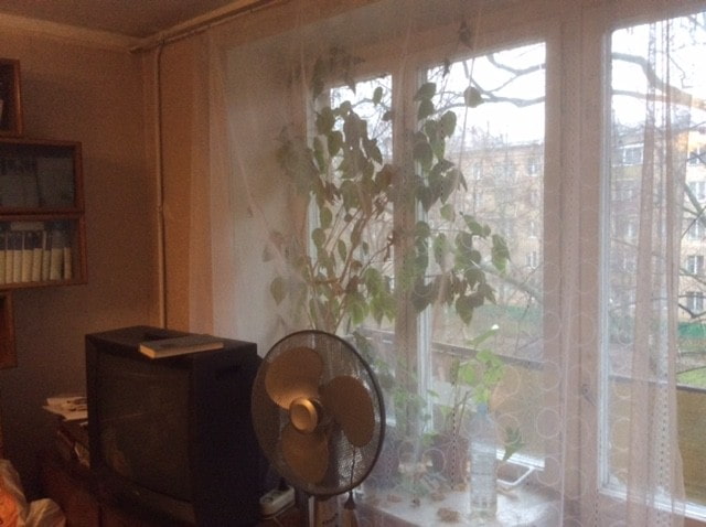
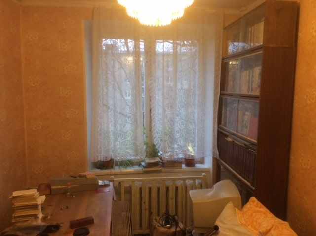
Three people live in a Moscow apartment: a young family and a child. They turned to Buro Brainstorm to buy technical documentation for one of the firm's projects they liked. As a result, specialists developed a new design on its basis, removing all the shortcomings and creating a more perfect interior.
Layout
To implement this project, the designers had to use a whole arsenal of tools in order to save useful space and make the former Khrushchev more functional.
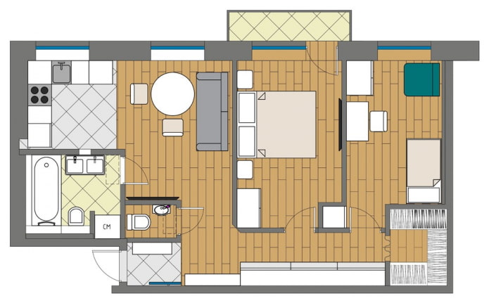
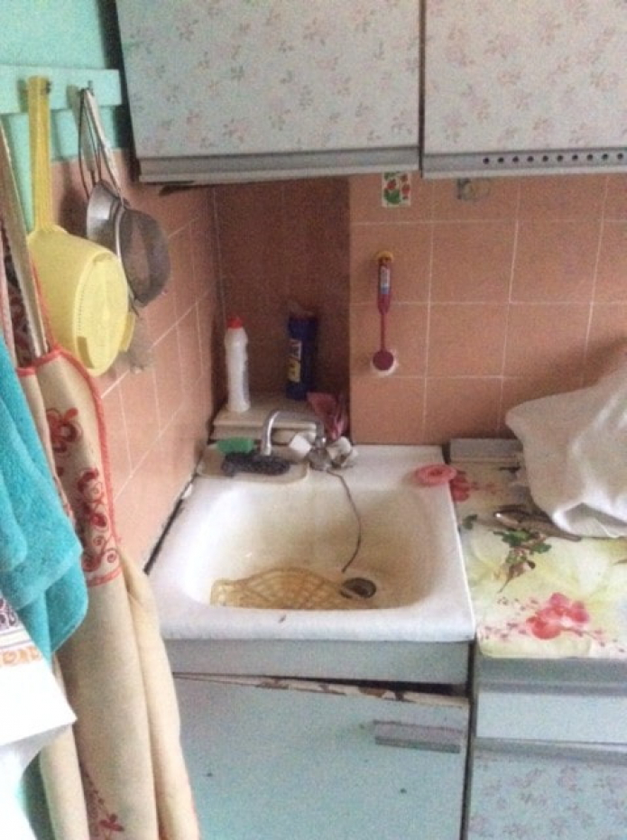
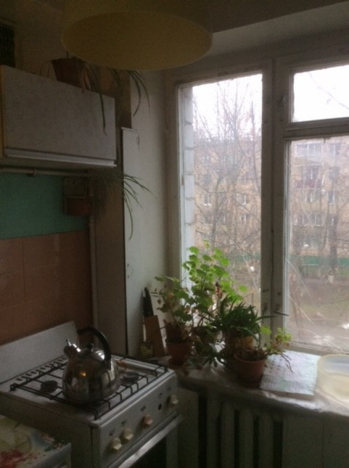
A typical apartment had a small kitchen: this disadvantage was eliminated by demolishing the partition. The resulting kitchen-living room began to occupy 14 square meters, and the bedroom and the nursery were allocated 9 square meters each.
The main features of this apartment are the built dressing room and the guest bathroom.
Kitchen-living room
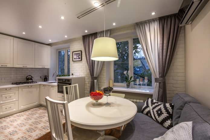
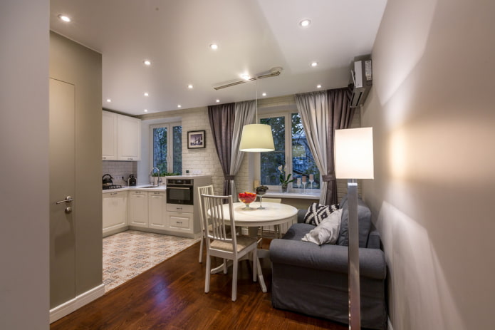
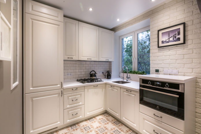
After the wall was demolished, the cooking and eating area became light and airy. The two zones are visually separated by flooring: ceramic tiles and parquet. The white corner set complements the smoky interior, as if dissolving against the background of brickwork.
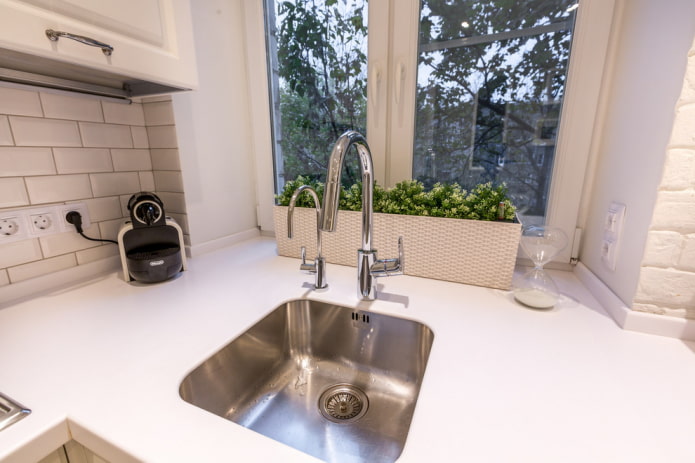
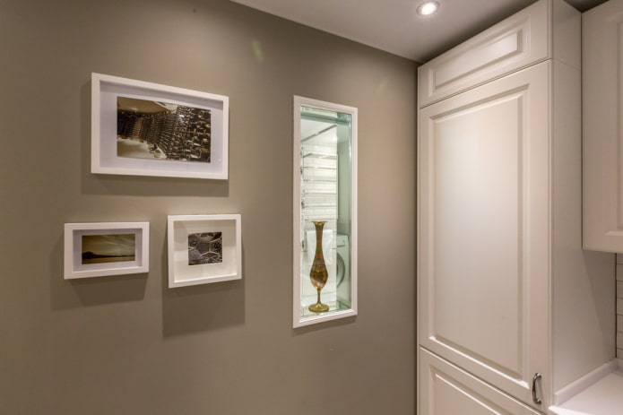
On the left, an entrance to the bathroom is made, which is hidden behind an invisible door. The refrigerator is built into the set, the sink has been moved to the window, and the oven is raised 120 cm from the floor and sometimes serves as an additional table.
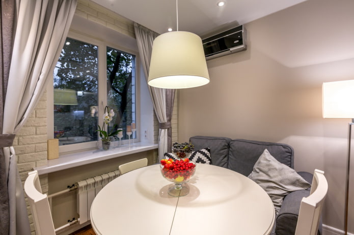
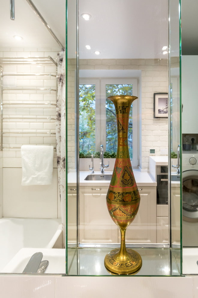
The dining area has a spacious round table on one leg, high-backed chairs and a cozy sofa. There is a window between the kitchen and the bathroom, thanks to which natural light enters the bathroom. It is complemented by a curtain that closes during water procedures.
Bedroom
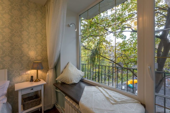
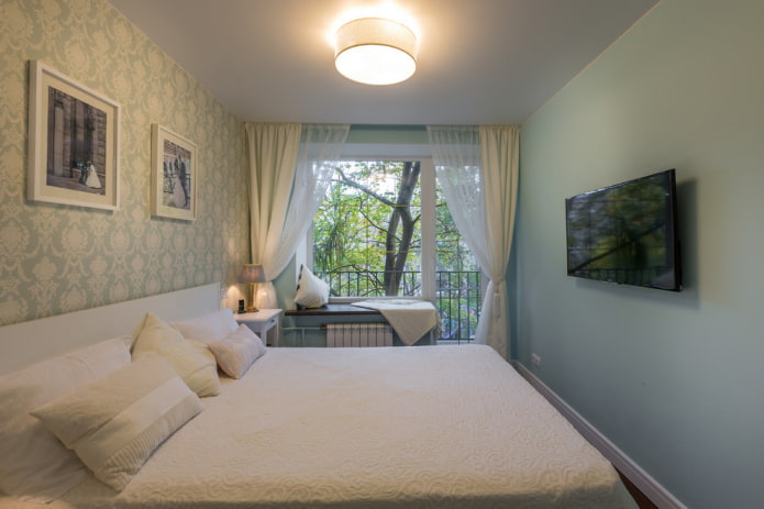
The main feature of the parent's room is the seating area on the windowsill. They lowered it and replaced the double-glazed unit, equipping it with a golden layout. On the slope, you can see the lighting, which allows you to use the window sill as a reading corner.
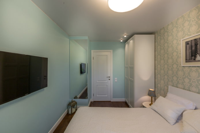
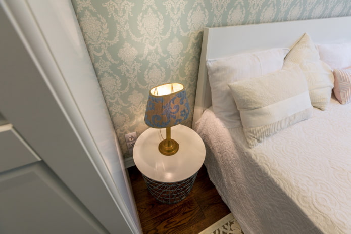
The headboard is decorated with picturesque wallpaper with ornaments to match the walls, painted in the Tiffanny Blue palette. The protrusion resulting from the redevelopment of the nursery was played with a full-length mirror.
Children
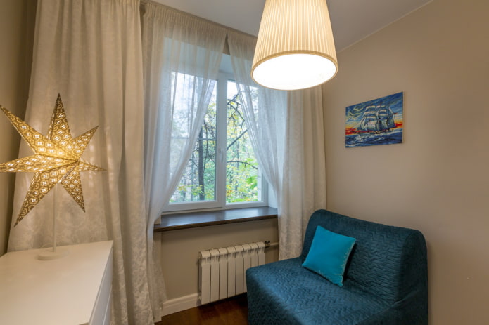
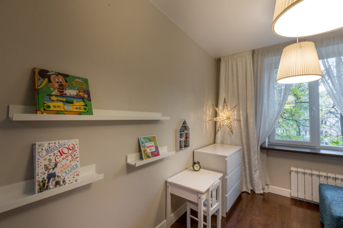
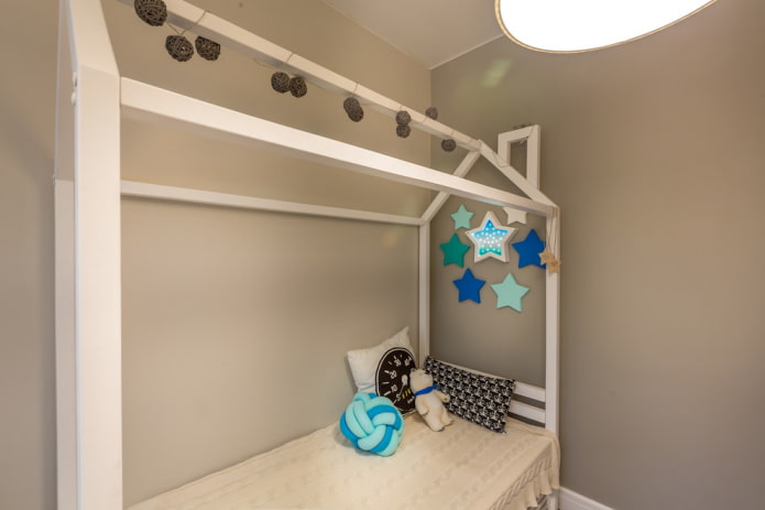
The son's room is designed in neutral warm gray tones. The interior can be changed as the boy grows up, adding color accents.
The white book shelves are kid-friendly as they showcase the covers, not the spines. A small sofa folds out and serves as an additional place to sleep.
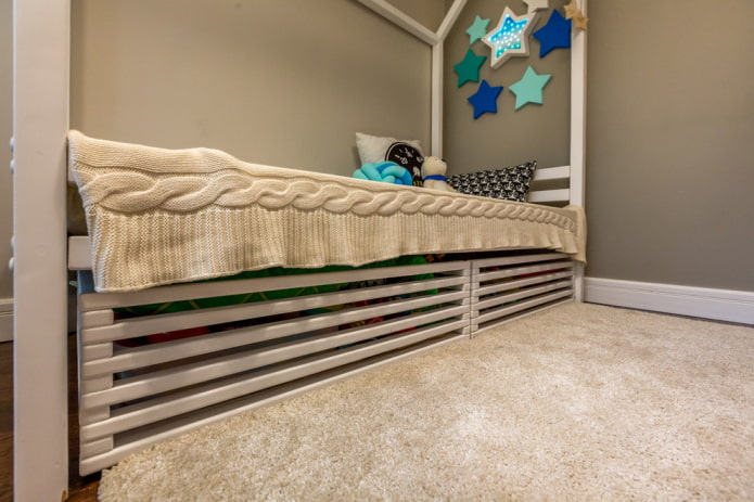
The bed in the form of a house is equipped with drawers for storing toys - this technique significantly saves space in a small room.
Hallway
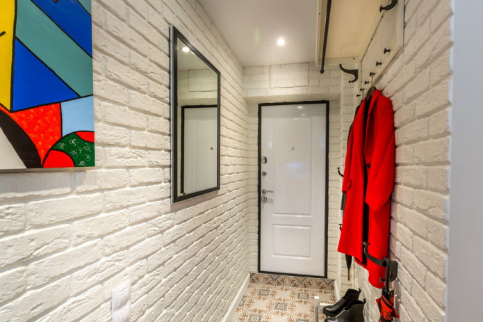
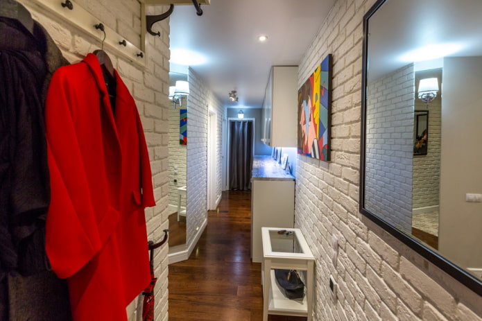
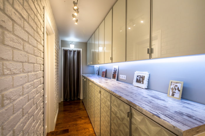
The walls of the corridor, like in the kitchen, are faced with plaster tiles in the form of bricks. In the entrance area, Spanish tiles are laid on the floor, and in the rest there is an engineering board. To the left of the door are open shelves for outerwear.
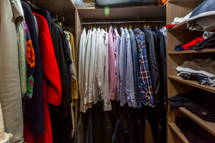
A long corridor begins with an entrance door and ends with a dressing room. It is fenced off with a fabric curtain - thanks to it, the air does not stagnate in a closed room.
Instead of a long cabinet against the wall, the designers installed a set of cabinets of different depths - everyday things are stored there. Transparent facades serve as an unusual frame for various images that can be changed, thereby adding variety to the environment.
Bathroom
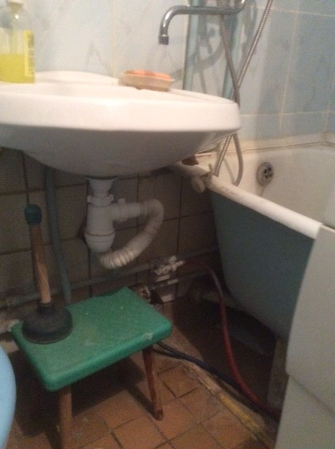
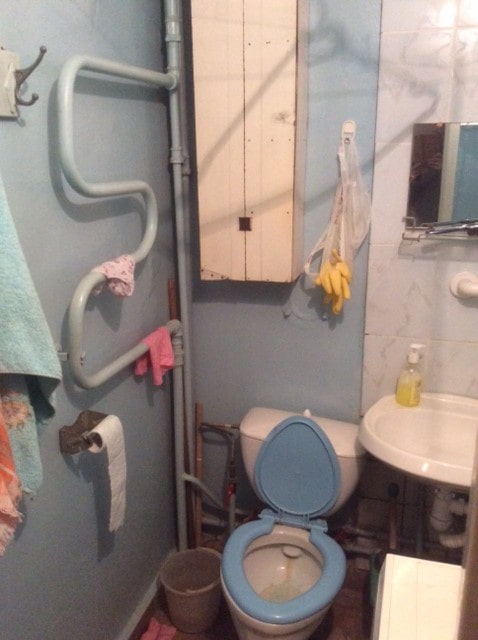
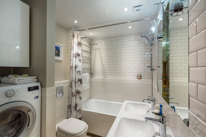
The walls of the toilet are tiled with glossy white tiles, visually expanding the space.The communications that spoiled the look of the bathroom are hidden in a plasterboard box - it also serves as a shelf for storing things.
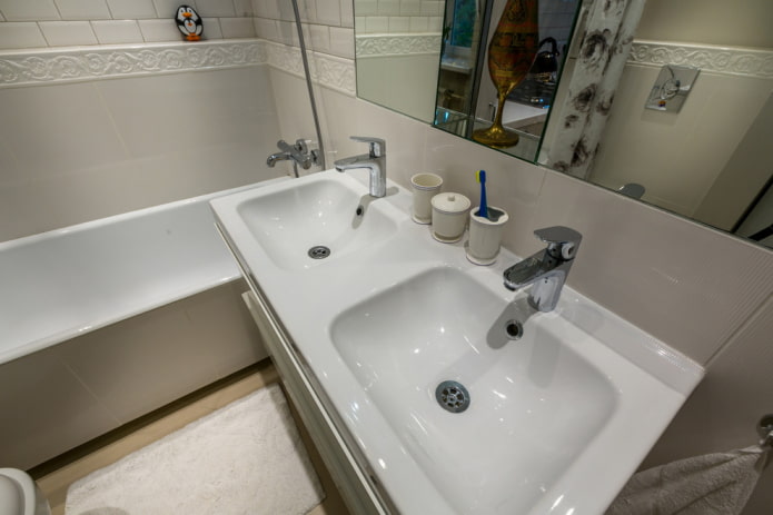
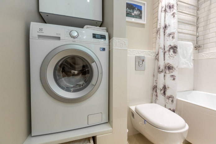
The bathroom is equipped with a double sink - this is a great solution for a family, where they go to work at the same time. The washing machine is located above floor level and recessed into a niche.
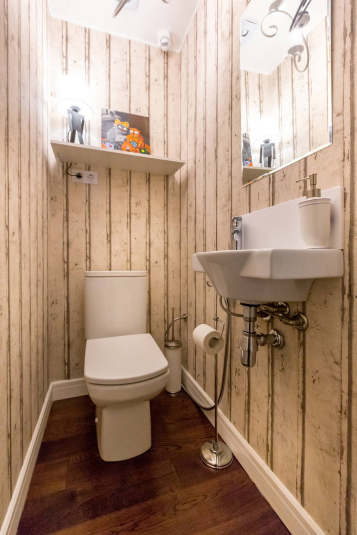
The window opening is originally decorated with mirror inserts. In the guest bathroom, in addition to the toilet, there is a small sink. Walls with antique wood wallpaper are varnished to prevent bacteria.
The lamp lights up using a motion sensor, so the bathroom is convenient to use at night.
More information about the project is in this video:
Buro Brainstorm designers have demonstrated and implemented several useful and inexpensive tricks, turning an uncomfortable apartment into a stylish and functional space.

 10 practical tips for arranging a small kitchen in the country
 12 simple ideas for a small garden that will make it visually spacious

 Design project kopeck piece in brezhnevka
 Modern design of a one-room apartment: 13 best projects
 How to equip the design of a small apartment: 14 best projects
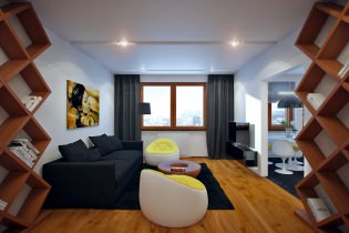 Interior design project of an apartment in a modern style
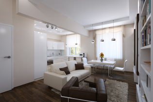 Design project of a 2-room apartment 60 sq. m.
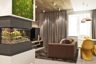 Design project of a 3-room apartment in a modern style