Pros and cons
Before starting to develop the design of a square hallway in an apartment, we will define its strengths and weaknesses.
Benefits:
- Harmonious appearance. All interior design tends to square, and you're lucky to have one right from the start!
- Simplicity of furniture arrangement. Even in a small square hallway, you will have no problem placing the necessary items.
- The layout does not require any special knowledge for finishing. If a narrow corridor needs to be visually expanded, then a square one does not require a special approach.
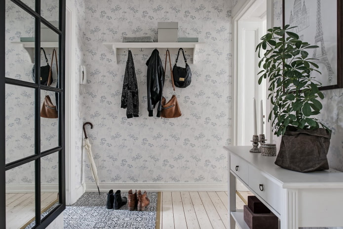
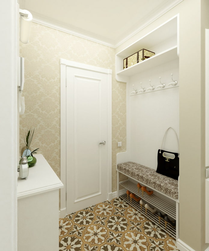
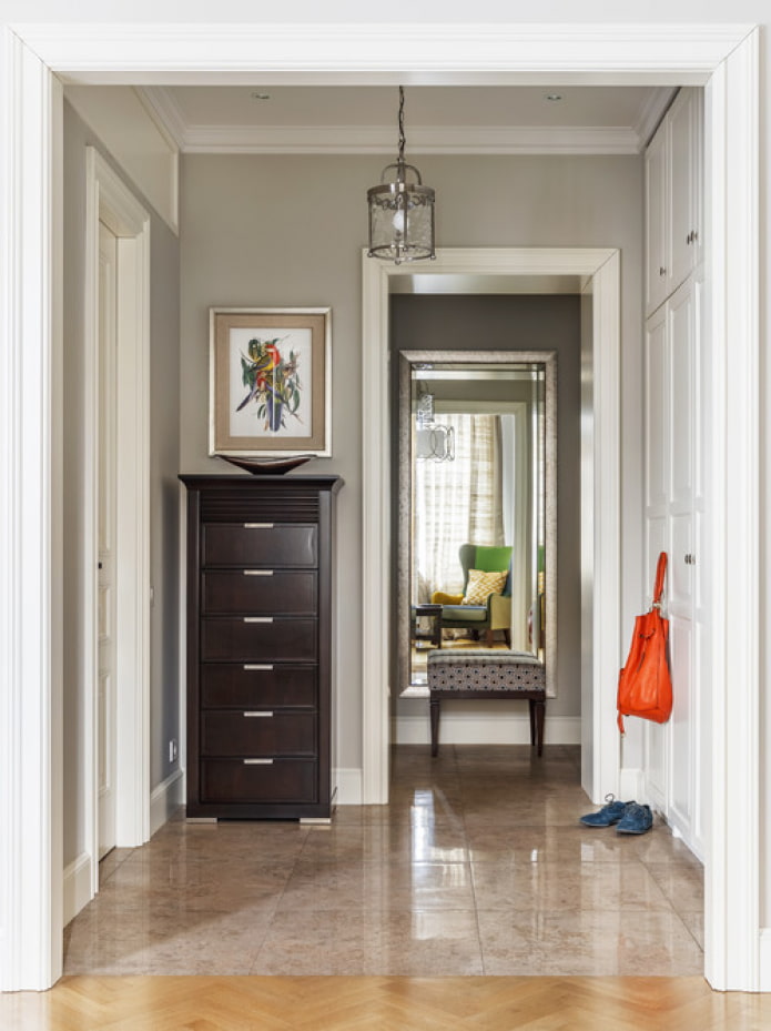
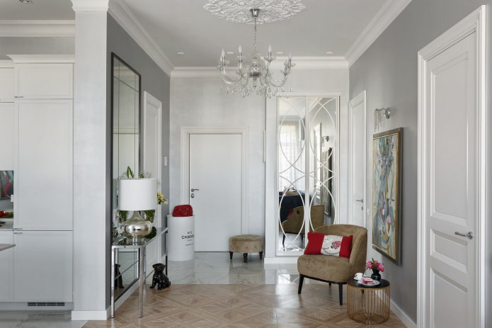
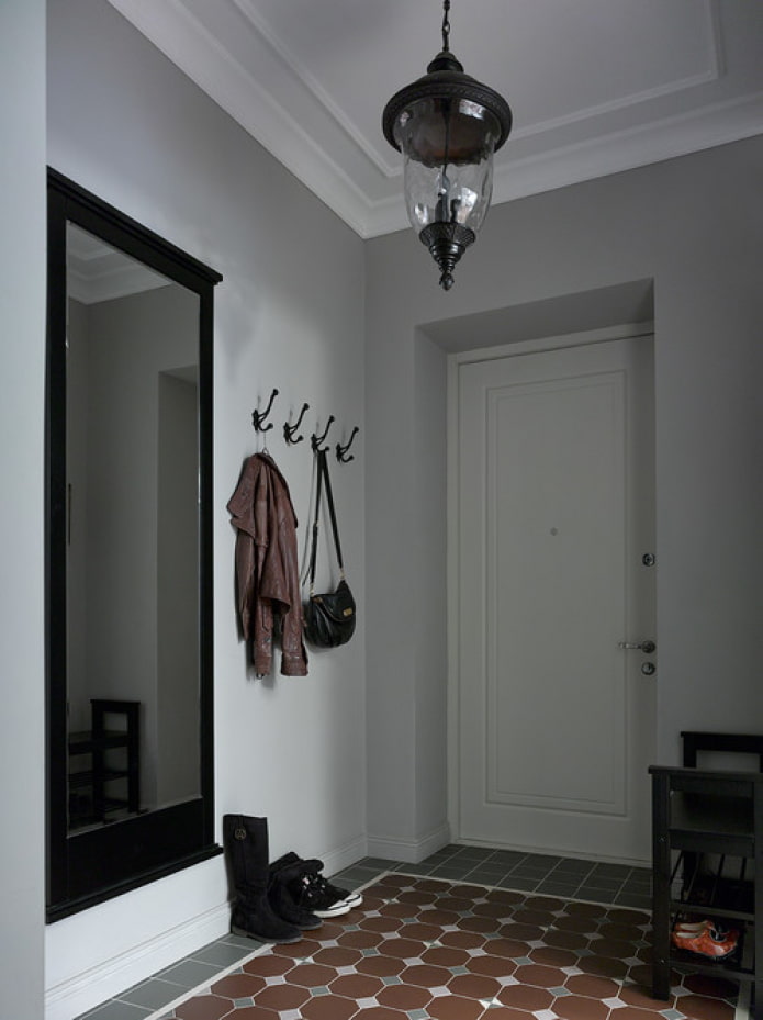
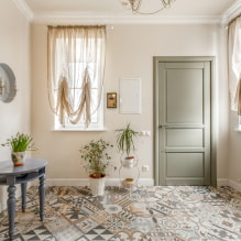
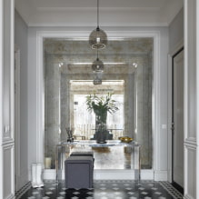
The photo shows an example of design in a classic English style
disadvantages minor:
- A small square hallway looks very cramped and will not allow you to place a large amount of furniture.
- Corridor zoning is difficult due to its initially correct shape.
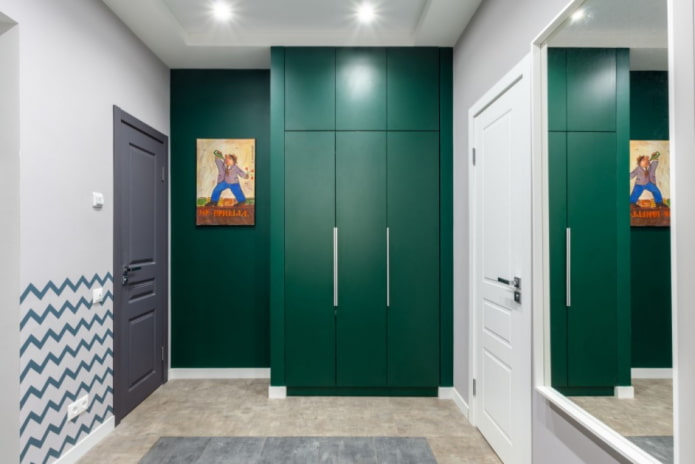
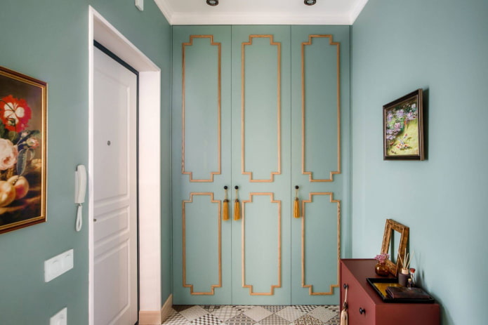
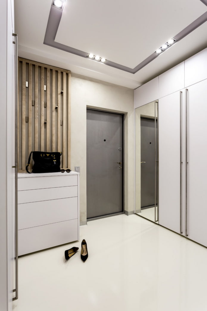
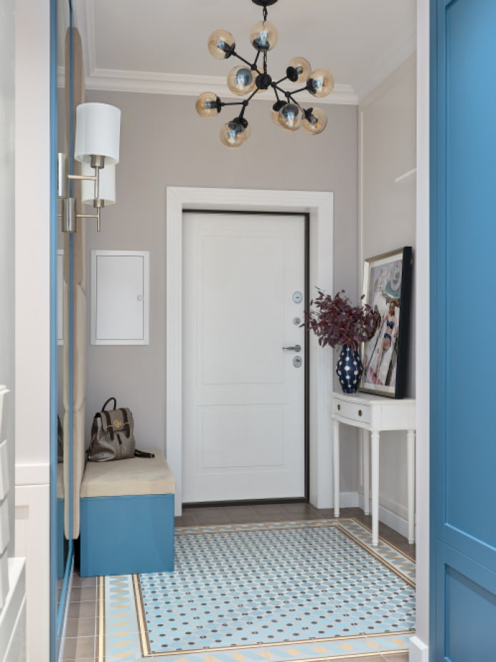
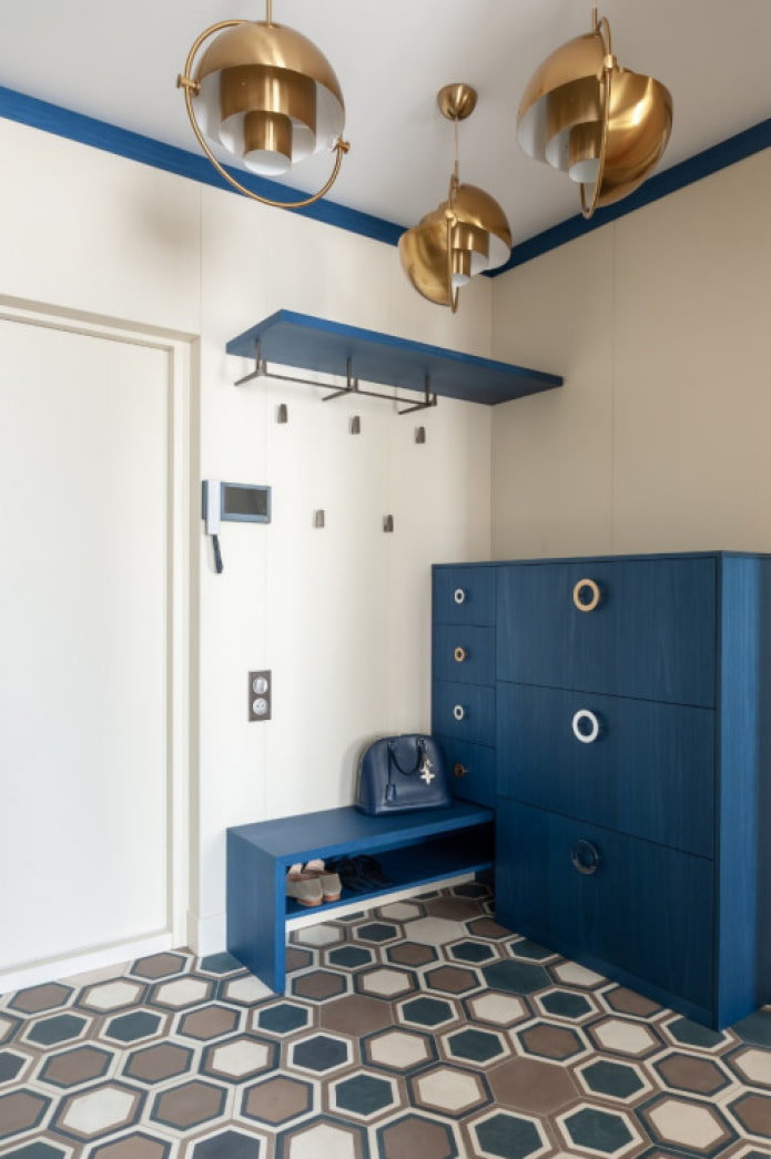
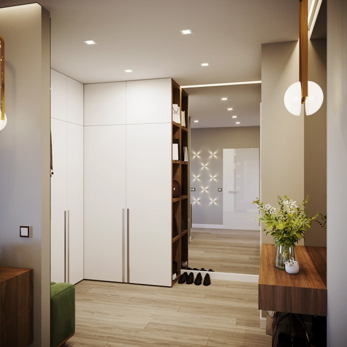
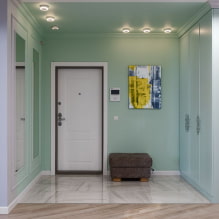
In the photo there is a bright built-in wardrobe in the hallway
Features of zoning and planning
Unfortunately, the square does not guarantee a problem-free wall decoration and furniture placement. At a minimum, it should be borne in mind that it can be of different sizes - and this fact greatly affects the final result.
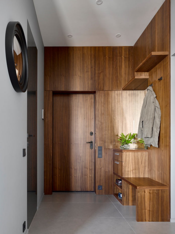
Small hallways (~ 3 sq.) Need careful handling and a careful assessment of the need for each item. It is better not to use bulky cabinets and dressers at all: replace them with an open wall hanger and a compact shoe rack.
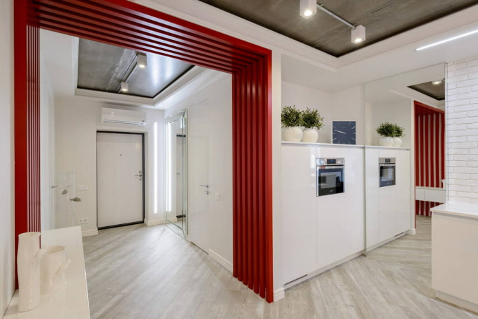
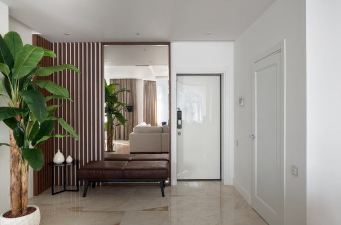
If the entrance lobby is not separated from the main room (as often happens in studios), you can leave it as it is - then it will look larger. Or make a partition. The main requirement for the screen: it should not be continuous. Rack options work best - they will simultaneously stretch the height of the ceilings, divide the rooms and will not look too bulky.
As for the spacious hallways (~ 10 sq m), their layout primarily depends on your needs. Often, the free space in the corridor is used for storing things that did not find a place in the apartment: a large built-in wardrobe will cope with this.
Zoning a large square corridor is not necessary outside, but inside, separating the functional areas from each other. Furniture, curtains, translucent compact screens will cope with this.
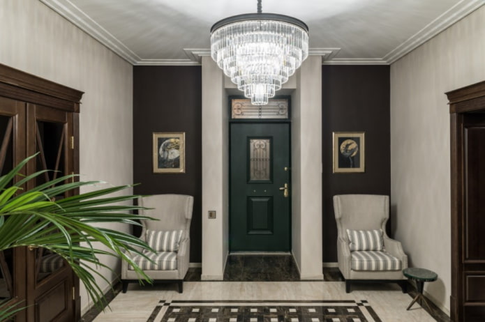
Advice! If the door is in the center of the wall, take a closer look at the option of symmetrical arrangement of furniture: in square corridors, symmetry looks especially good.
How to arrange furniture?
Mostly the final look of your hallway depends on how you furnish it. First, let's figure out which elements are needed:
- hanger or cupboard for storing outerwear;
- shelf for shoes or galoshes;
- mirror, preferably large;
- pouf or any other seat.
In addition to the required pieces of furniture, there are additional ones: open shelves, dressers, cabinets, wardrobes.Some even install a sink in the hallway - so you can wash your hands immediately upon entering the house.
As for the location of each individual item, the designers recommend starting from your standard path:
- The first step is to put your keys, bag, gloves, phone somewhere. A small shelving unit or an open shelf at the entrance is suitable for this.
- Next, you need to take off your shoes, which means the pouf and the shelf should be as close to the door as possible.
- The next step is outerwear. The hanger or cabinet is placed a little deeper.
Relatively mirrors - the best solution would be a full-length wall hanging model. In the interior of a tiny square hallway, it is installed directly on front doorto save space and be able to tweak your hair or outfit before heading out.
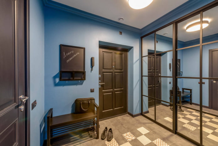
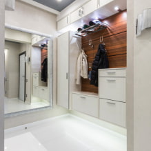
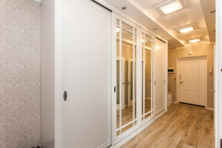
In the photo, an option to increase space - mirrored compartment doors
Arrangement recommendations
The implementation of the design of a square hallway begins with choice of colors. The general rule applies here: the smaller the room, the lighter shades are needed. In addition, it should be borne in mind that in most cases there is no natural light in the hallways (street door or window openings), so any color will look darker than it is.
Important! Do not be afraid of light colors in the hallway: yes, the surfaces are exposed to more stress here than in other rooms, but the right choice of materials will allow you to keep the hallway clean without too many problems.
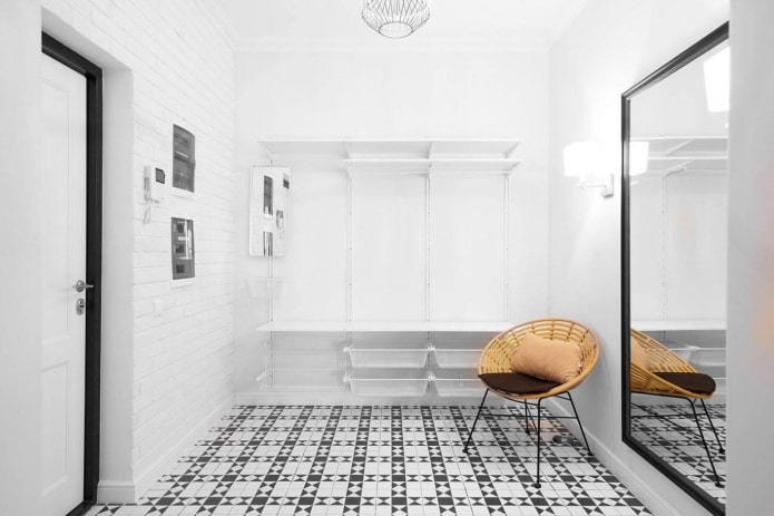
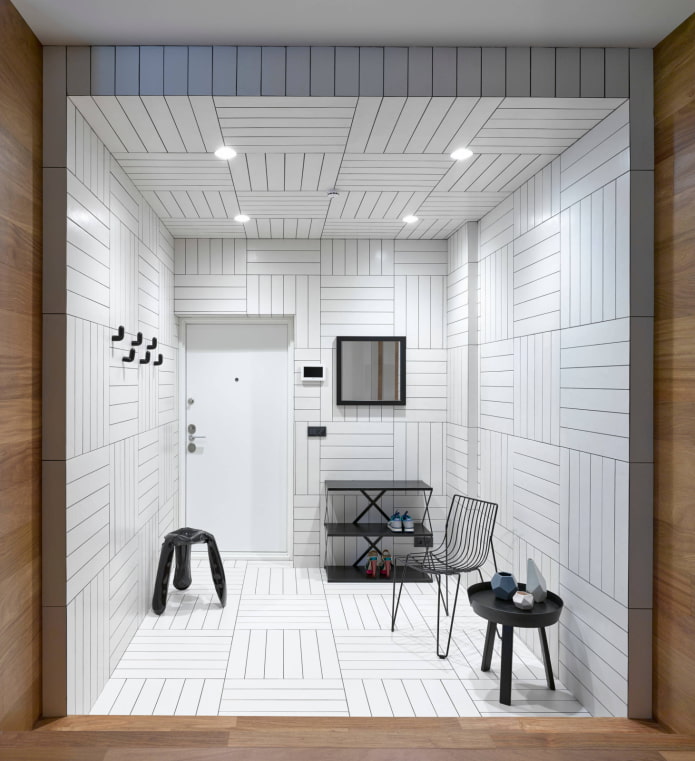
White, beige, gray colors visually expand the space and are able to transform a dark square 2x2 closet into a beautiful light room. If monotony seems boring, add accents in the form of greenery of indoor plants, bright paintings or posters.
Dark shades preferable to use in rooms with an area of at least 5-6 square meters. They look especially harmonious in the English style (dark green, indigo, burgundy) and loft (black, graphite, natural red brick).
Moving on to the decoration of the walls, floor and ceiling.
- Ceiling paint with white paint or do tension, a glossy canvas, by the way, visually enlarges the space.
- For wall decoration different materials are suitable, the main thing is that they are practical and washable: wallpaper with a special icon (at least three waves, preferably a wave and a brush), special paint, PVC panels, plaster with a durable finish. Based on the design style, you can resort to clapboard decoration (provence, country), brickwork (loft, scandi) and other decorative options.
- Flooring choose the most moisture resistant: this is especially true for autumn, winter and spring, when water flows from boots to the floor or snow falls. Together with the chemicals that get on the shoes, moisture can completely and very quickly destroy a quality laminate. Linoleum slightly more durable, but will require a commercial grade model as the corridor is considered to be a passageway. The safest option is tiled or quartz vinyl tiles. This modern floor is 100% safe from bloating when exposed to water.
The last nuance — lighting... We have already touched on the lack of windows, so you need to pay special attention to the lamps. In a tiny square corridor, there is enough bright chandelier on the ceiling, for large square hallways, it is ideal to complement a ceiling lamp with a sconce or, more simply, with a floor lamp.
Important! Mirrors reflect light perfectly, the more area they occupy, the brighter the corridor will be.
Tips for a small hallway
Ideas for compact corridors don't end with light finishes and compact furniture. Here are a few more tips for conserving valuable space and visual expansion:
- Reflective surfaces. These include not only mirrors, but also a glossy stretch ceiling, polished (not matte) furniture facades, etc.One mirrored wall will visually double the hallway.
- Minimalism. Give up small decor and other "cluttering" interior items. The freer the surfaces, the freer the room appears.
- Low furniture. A narrow cabinet will physically save space, but a low chair instead of a standard one will do it visually.
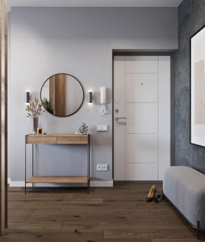
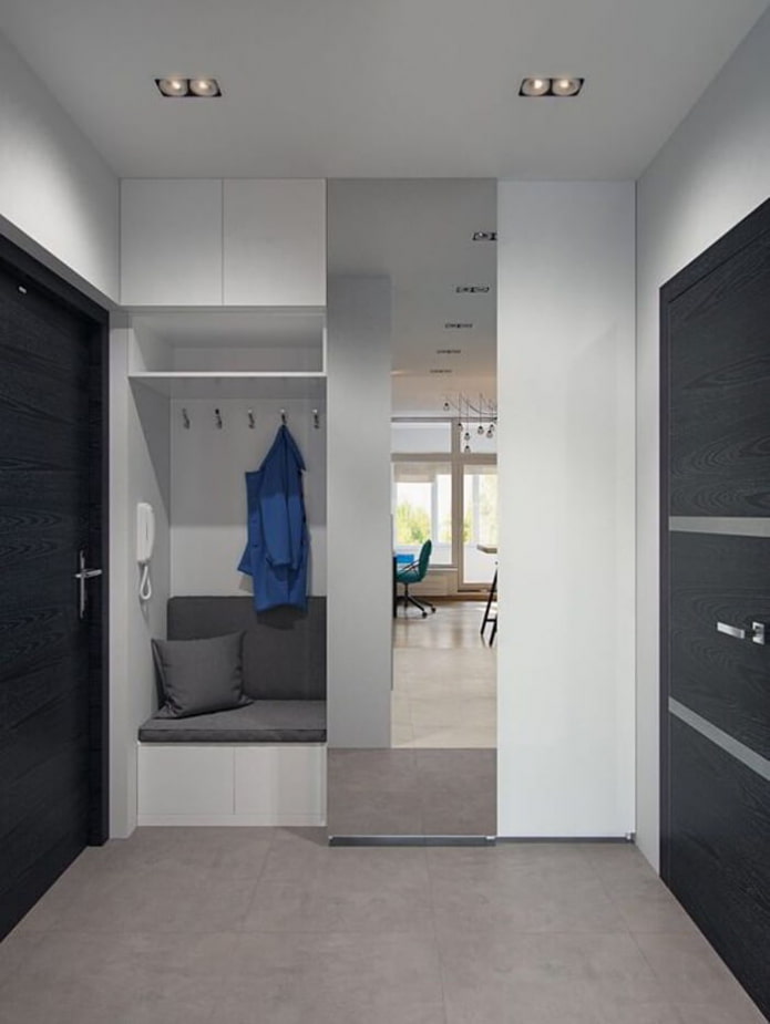
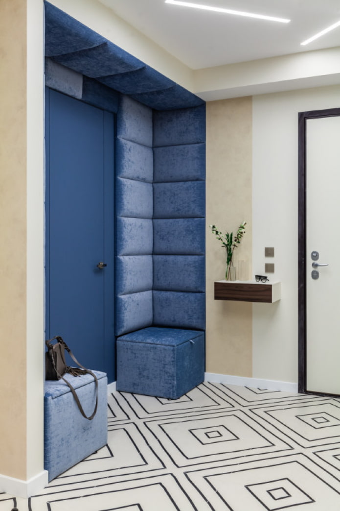
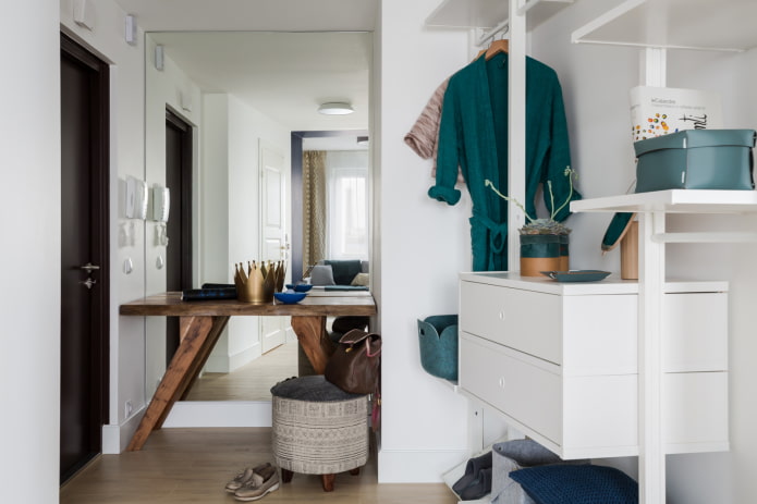
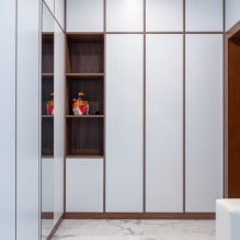
In the photo, an option for arranging furniture in a limited area
- Uniform lighting. Leave no dark corners, let the light penetrate all corners of the room! For example, you can replace one ceiling chandelier with 4 bright spots.
- Perspective. Wall murals are underestimated - the right pattern will easily defeat claustrophobia and increase the area like a mirror.
Design options
Whichever style you choose for your hallway, the main point is still its functionality. Consider storing necessary things and performing daily tasks: for example, if two people often come home at the same time, you should put 2 poufs instead of one.
Read also: 7 hallway mistakes that cause a lot of inconvenience.
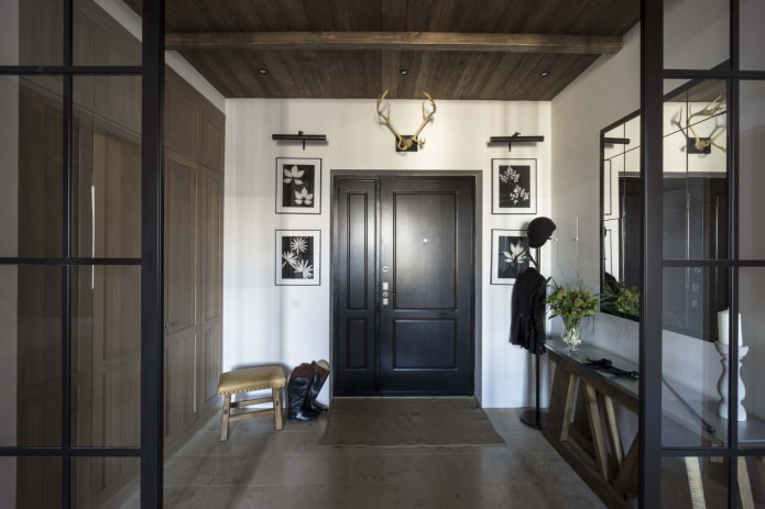
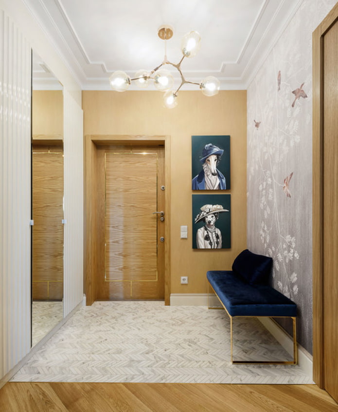
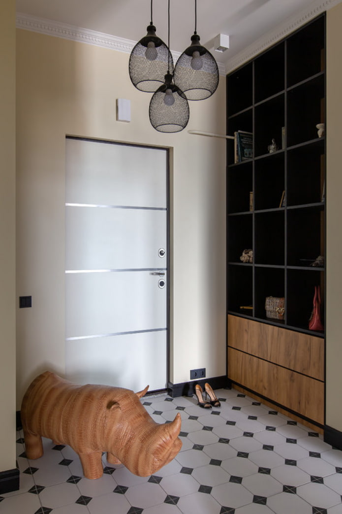
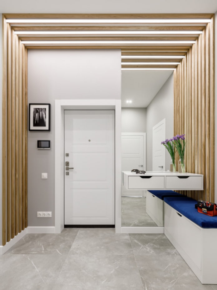
In the photo there is a symmetrical design of a spacious room.
Photo gallery
The Square Corridor is a great opportunity to test your design talents! Draw the future layout on the diagram, choose the best finishing materials and don't forget about the decor.

 10 practical tips for arranging a small kitchen in the country
 12 simple ideas for a small garden that will make it visually spacious


 How to choose wallpaper for a small hallway: 70 design ideas
 How beautiful to make a hallway in an apartment: design ideas, layout and arrangement
 Billiard room interior in the house: design rules, photo
 Hallway design in white
 The most beautiful swimming pools in the world
 How to choose a wardrobe in the hallway?