Act without planning
Arranging furniture "at random" is a direct path to difficulties and problems. Firstly, there is a risk of getting an uncomfortable environment with an ill-conceived composition, and secondly, moving massive objects without a clear plan is energy-intensive, and sometimes traumatic.
Correlate the size of the room with the furniture in advance, measure the dimensions of the objects and create a drawing. Great option - use the scheduler on a computer: many modern applications do not require downloading and are available online.
Ignore the center of the composition
Each living room has an object around which the interior is built. In the living room, this is most often sofa, in the bedroom - bed, in cabinet – table.
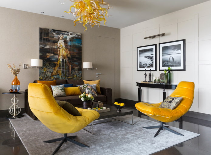
This central object is called the dominant. It is he who attracts attention in the first place and helps to build the rest of the composition. The dominant can be color (accent) or large-scale. It must be associated with other furnishings.
Interfere with movement
A person unconsciously looks for short roads to the goal: the same happens in the interior. If on the way to the closet every now and then you will come across coffee table or armchair, in the end it will get bored. When arranging furniture, take into account its dimensions and the distance between them, and also lay the opportunity so that two people can disperse freely.
Optimally place furniture in the living room at a distance of 30–40 cm. If two sofas or armchairs are facing each other, leave a little more than a meter between them.
Forget about the doors
It is included in the top of the most annoying mistakes in the selection and arrangement of furniture. When purchasing products with hinged and sliding drawers, it is important to calculate the distance to the nearest object: will the movable structure touch it? Will you be comfortable while opening?
Making out a compact room or hallway, it is wiser to abandon swing doors and purchase closet... The same goes for entrance doors - think if the canvas will touch the placed objects?
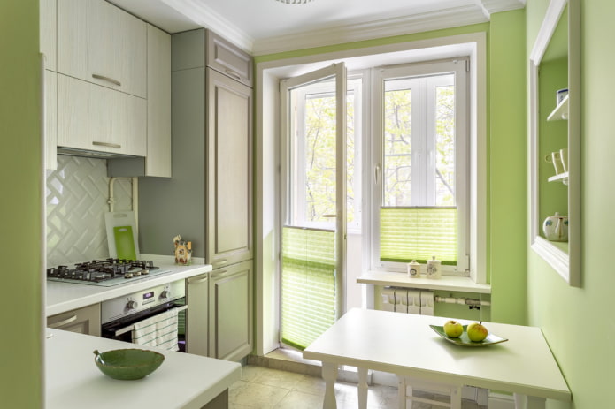
When placing the kitchen unit in two lines, in order for the doors to open freely, you need to leave 120 cm.Around the berth, leave at least 70 cm on the aisle.
Ignore lighting
When setting up a place to work, study or apply makeup, you should give preference to a window seat. If the person is right-handed, the light should come from the left side. If you can't put a table near the window, you should create high-quality artificial lighting.
Important: If you are constantly using your computer, the monitor may reflect glare or appear dim in sunlight. Check in advance how convenient the location of the table is near the window and, in order not to close the curtains during the day, arrange your home office in the opposite corner.
If you do not plan to change the wiring or supplement the room with sockets and switches, consider this moment before arranging furniture: if you place the reading area in one part of the room, and the outlet remains in another, you will have to use an extension cord (and they, as you know, do not decorate the interior) ...
Don't think about zoning
Each room should be functional and not feel cramped or cluttered. Competently distributing zones, you can create a comfortable environment where it will be pleasant to relax, dine, sleep and work.
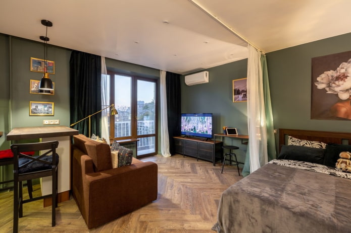
When arranging furniture, you need to consider your activities, as well as the interests of the people living with you. For example, if you like to do needlework or play computer games, you can allocate a separate area for this, fenced off with a screen, curtain or shelving.
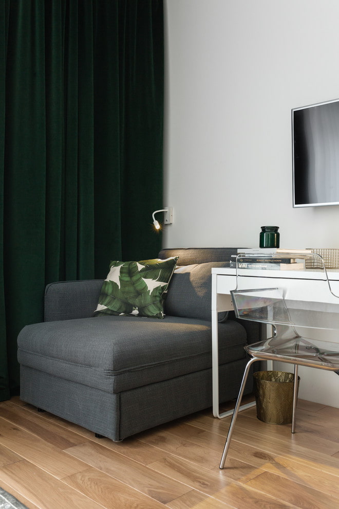
Even in an apartment with a shortage of space, it is easy to create a cozy corner by purchasing furniture transformer: folding table, folding chairs or bed-wardrobe.
Arrange along the walls
If the room is very small or the sofa has an unattractive "technical" drapery on the backrest, then its placement near the wall is justified. In other cases, it is worth looking for alternatives without embarrassing yourself in creativity.
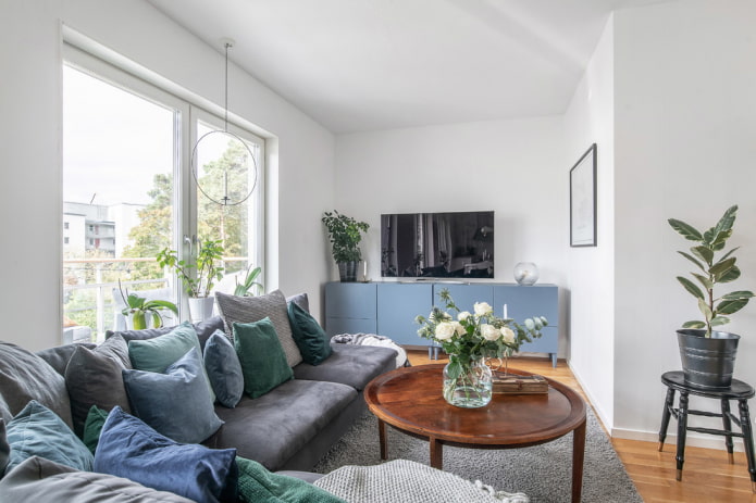
Modern room design encourages sofas and armchairs to be placed in the middle of the room, creating a cozy home space that looks stylish and original.
The living room, empty in the center, seems unfinished. In this case, even small room it should be supplemented with a compact coffee table - it is not only convenient, but also beautiful.
Do not fit the closet into the setting
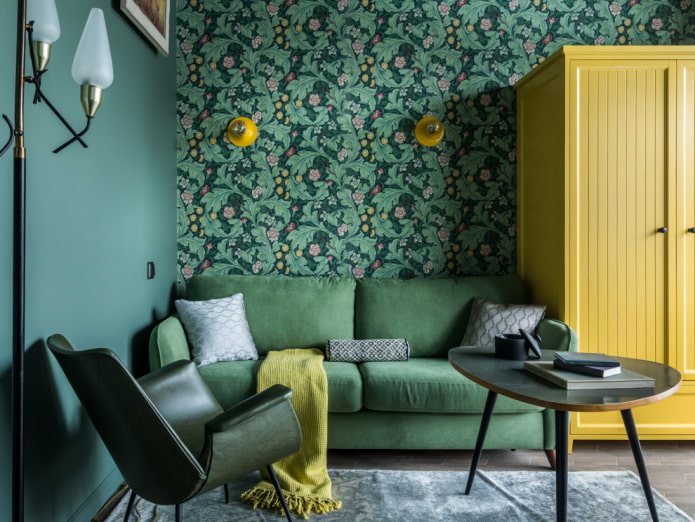
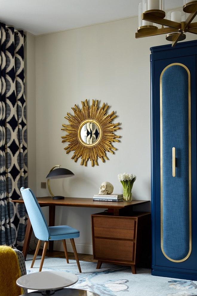
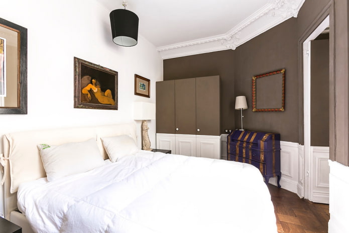
It is not enough just to buy a wardrobe and put it - it is an independent compositional element that should overlap with the interior. Both a free-standing and a built-in wardrobe can be integrated into the interior, for example, by filling a niche with it: so a bulky object will not attract much attention.
But a wardrobe can also serve as a decoration for a room if it has an unusual shade, carvings or decorative inserts. The main thing is that the structure does not restrict natural light from the window and does not interfere with the person entering the room.
Even an ordinary red wardrobe can be turned into a highlight of the room, if you come up with imagination to rework it - repaint, change accessories, add decorative elements in the form of a lattice or moldings (how to restore old furniture, see here).
Try to avoid the listed mistakes so that both the rooms and the kitchen look attractive and delight with their coziness.

 10 practical tips for arranging a small kitchen in the country
 12 simple ideas for a small garden that will make it visually spacious
 13 bad habits a good housewife shouldn't have
 24/7 home cleanliness - 4 secrets for the perfect housewife
 6 hotels in Sochi that will give odds to the promoted foreign hotels
 Top 10 interior design trends 2020
 Rating of cheap TVs with Smart-TV
 New Year's LED garlands on AliExpress - we disassemble while it's hot, so that it's bright at home