Mistake 1. Ignoring the color wheel
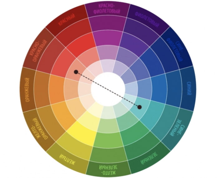
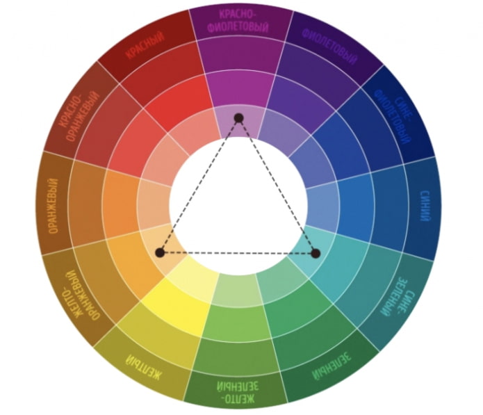
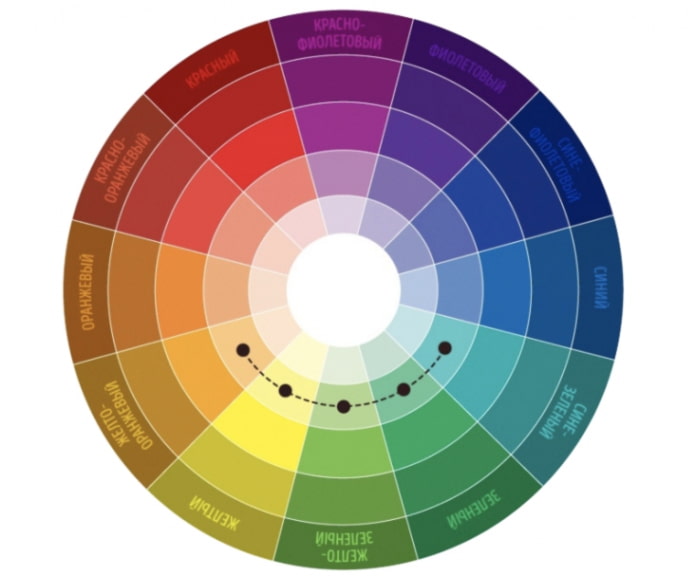
This tool should be used to successfully combine shades with each other and create a harmonious interior. The color wheel is designed so that well-chosen color combinations work well together.
See another article about color combination of doors, floor and skirting board and features of the combination of walls, floor and ceiling.
First scheme (complementary) creates a combination of colors that are opposite each other:
Second circuit (classic triad) creates a successful combination of three colors located at the corners of an equilateral triangle.
Third circuit (analog triad) allows you to create an organic combination of three or four related shades.
We'll talk about how much to use colors in the next paragraph.
Mistake 2. The principle of "all equally"
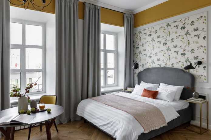
Having chosen tones that are in harmony with each other, it is important to fill the interior with them, observing a strict balance. If you saturate the space with them in equal proportions, the atmosphere will turn out to be colorful. When decorating a room, the principle "60x30x10" should be applied, which will allow the interior to look expressive.
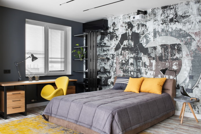
For example, you like white, gray and yellow shades. You can choose white as the main background, which will occupy 60% of the area, gray will serve as an additional (30%), and the remaining 10% will be yellow:
Mistake 3. Overuse of pure colors
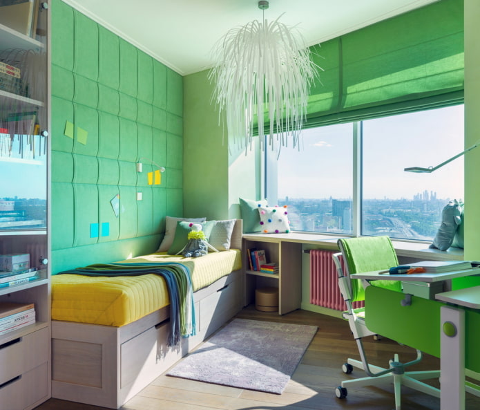
The richer and "simpler" the color, the more intrusive it looks in the interior. Bright greens, blues and yellows are good at children's room or as accents, that is, in a strictly limited number.
To make the environment look noble, you should use complex, as if "dusty" shades with the addition of gray.
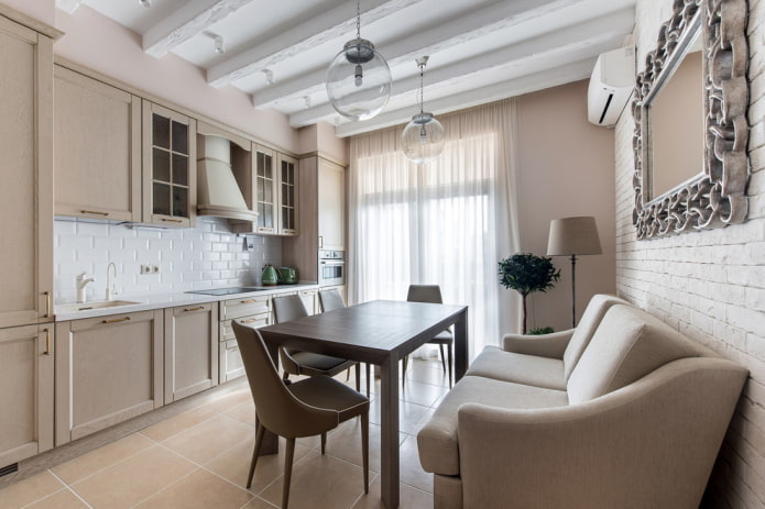
Mistake 4. An abundance of beige
It is believed that people who are "afraid of color" are afraid to live. Perhaps the trade-off when choosing a palette arises from self-doubt. Using exclusively sandy and close to it tones, the owner of the apartment creates a faceless, dull interior, devoid of individuality.
Demand creates supply, so many furniture stores are overwhelmed beige sofas, brown tables and light wood cabinets. But this approach is fundamentally wrong: beige requires certain color companions, which are not always successful to choose.
Mistake 5. Too contrasting colors
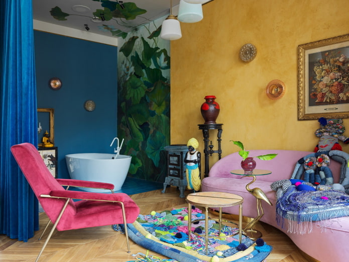
The opposite of an inconspicuous interior is a tasteless setting with lurid combinations. Trying to play on contrasts can lead to unsuccessful results: being in the room, you will quickly get tired and annoyed.
Use slightly less contrasting combinations, add neutral shades, do not overuse variegated ornaments. To create a bright yet harmonious environment (for example, in fusion style) requires a lot of skill.
Mistake 6. Choosing a shade without taking into account lighting
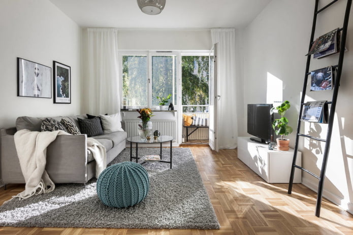
The same color looks different in different conditions. If the sun often looks in the windows, you can use almost any pastel shades: from cold blue to warm peach.
But in apartments where there is little sun, it is recommended to avoid faded colors. The interior will become cozier if the palette is warm and rich. Before painting a room, it is important to paint and evaluate what the selected color looks like..
Mistake 7. Using a single accent
If a luxurious "lemon" armchair was purchased for the company against the dark gray walls, you should add a couple more yellow elements to other parts of the room, otherwise the armchair will look out of place and "fall out" of context.
Look more wallpaper combination options.
It is not necessary to look for items with an accurate color match: accessories that differ by a couple of tones will better fit into the environment.
Mistake 8. Fear of dark shades
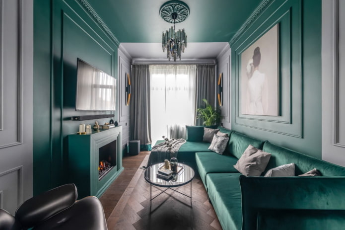
Light colors really increase the space visuallyby reflecting light and adding "air". But even in small apartments you can use a dark palette - there are colors that visually expand the room, as if deepening it.
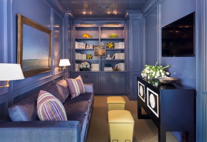
For small rooms emerald, dark purple, indigo will do. The collection will look especially luxurious against such a background. paintings, white furniture and light solid wood, as well as golden splashes. If the experiment with dark shades raises concerns, only one can be distinguished. accent wall and thus achieve a "wow effect".
Mistake 9. Whiter than white
The snow-white color, loved by many, is considered universal, but you also need to learn how to work with it. In small rooms, with a lack of natural light, white can look dirty and gloomy.
To prevent this, you should buy high-quality paints without a greenish tint and do at least a slight tinting. In well-lit rooms, the gray effect is easily avoided.
Mistake 10. Reliance only on fashion
If during the repair you are guided only by trends, you can get either a faceless or just uncomfortable home. Fashion is useful, as it introduces successful new products and helps to navigate in their own tastes.
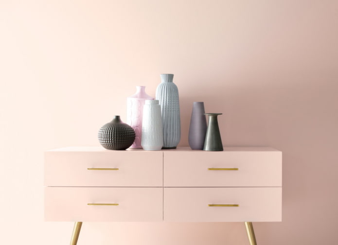
But if you don't like the current dusty pink or dark blue, you shouldn't fill your apartment with popular tones, drowning out your true preferences.
When decorating an interior, it is important to transfer feelings of happiness and comfort to the surrounding space. This is not difficult to do if you take a responsible approach to the choice of color.

 10 practical tips for arranging a small kitchen in the country
 12 simple ideas for a small garden that will make it visually spacious
 13 bad habits a good housewife shouldn't have
 24/7 home cleanliness - 4 secrets for the perfect housewife
 6 hotels in Sochi that will give odds to the promoted foreign hotels
 Top 10 interior design trends 2020
 Rating of cheap TVs with Smart-TV
 New Year's LED garlands on AliExpress - we disassemble while it's hot, so that it's bright at home