How to choose a design?
Picking up posters in the living room or another room, pay attention to 3 factors.
Content
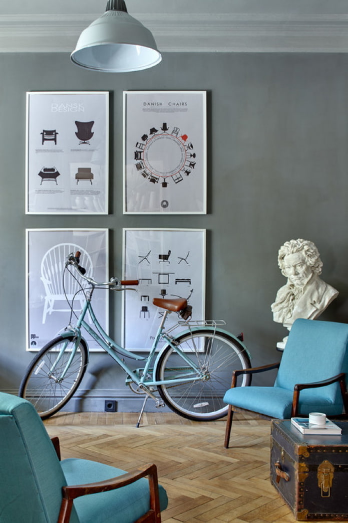
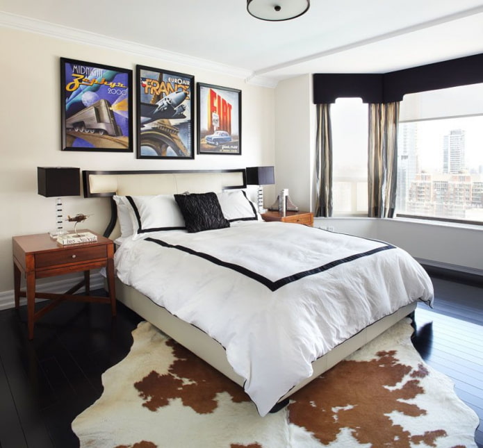
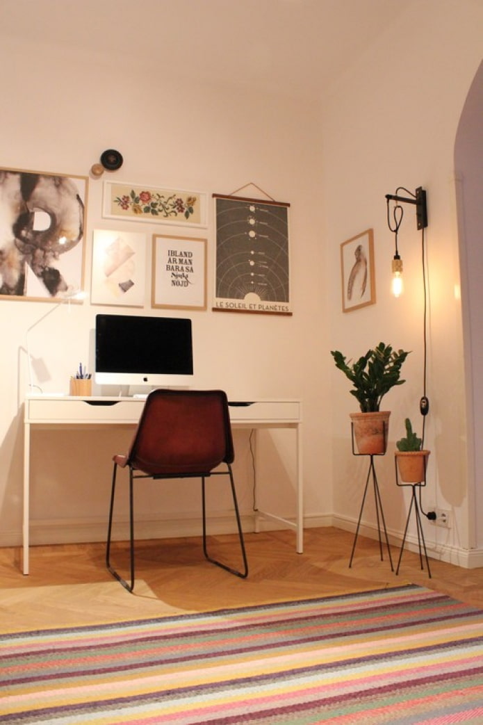
The image itself always comes to the fore - the motive drawn on the sheet. Harmonious decoration loft style - cityscape, retro cars, old maps, equipment assembly schemes.
In the African style, savannahs, black women, folk motives are appropriate. Plots in scandinavian style usually depict nature, inscriptions, geometric ornaments.
Color spectrum
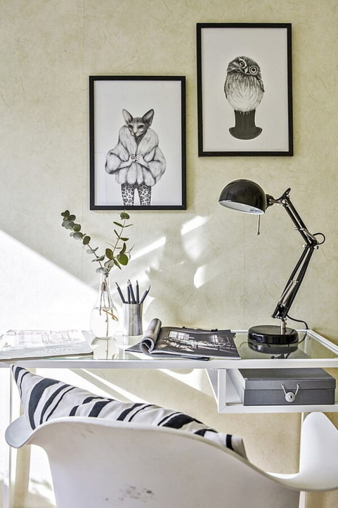
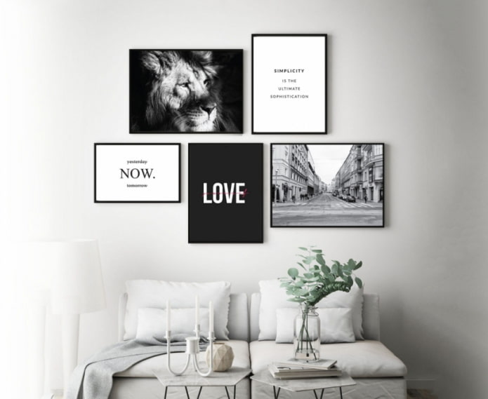
The first thing to do is choose a palette according to your personal preferences: do you like color or black and white posters? The latter are more suitable for the same achromatic designs. When deciding on color pictures, follow one of the proven models:
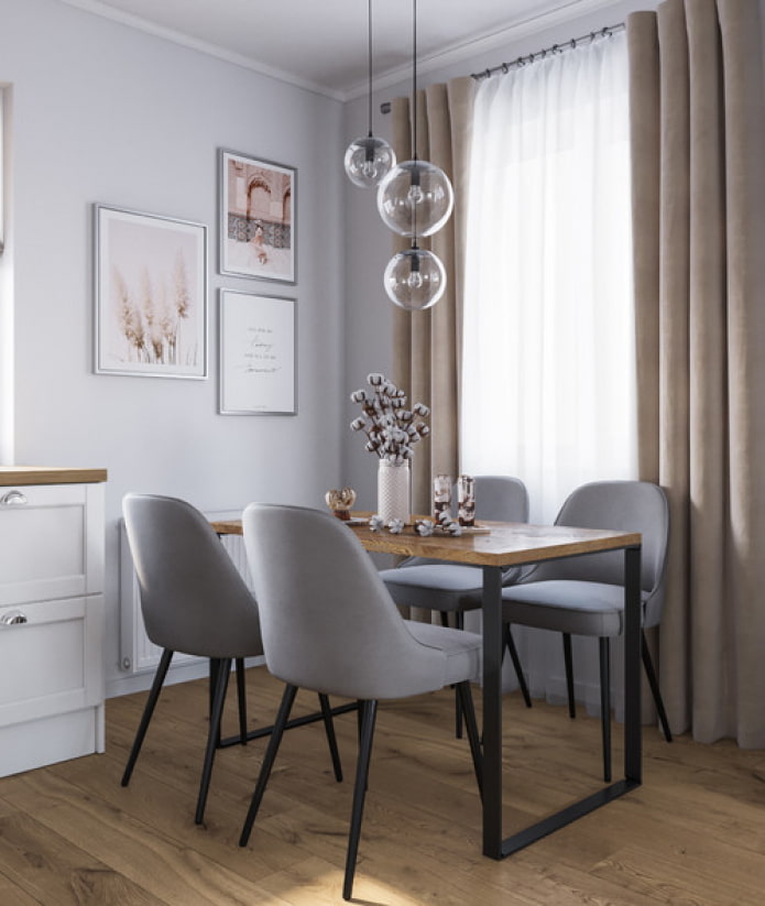
- In the color of the design. That is, in beige room with green details are looking for the same beige and green jewelry. Thus, the posters in the interior will remain almost invisible.
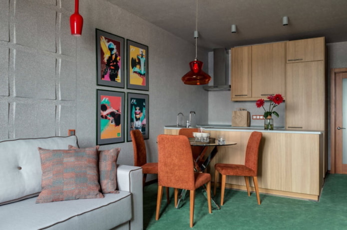
- A game of contrast. Bright flashy works that attract attention, work on the principle of combining contrasts: in a green nursery, red pictures, in white living room black posters.
- Recurring plus new. Unlike the second scheme, there is still a color used in the interior, but it is diluted with a new fresh shade. Example: gray living room with yellow accents complemented by a yellow and blue print.
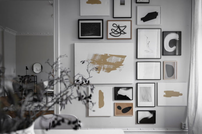
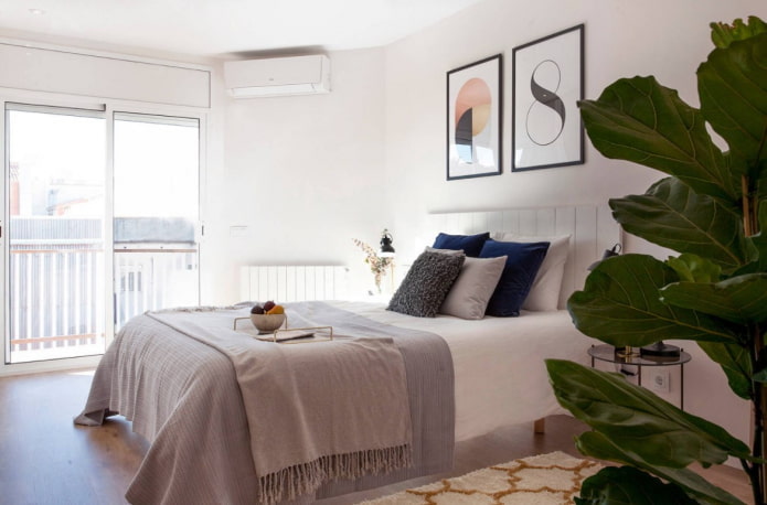
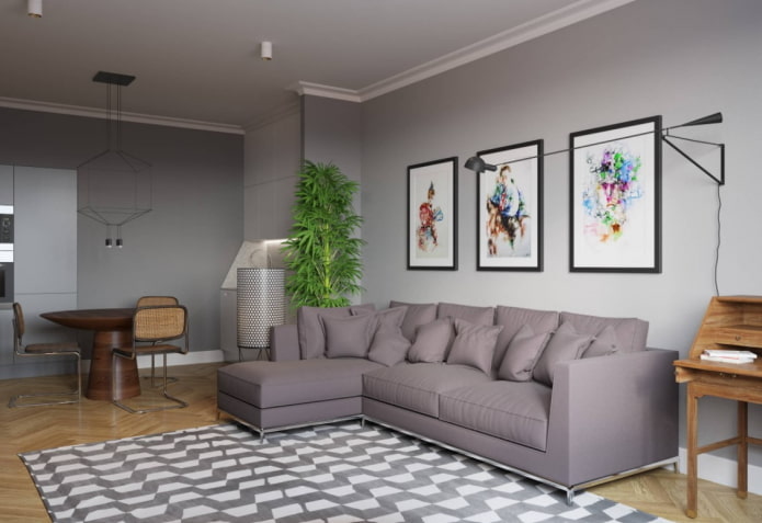
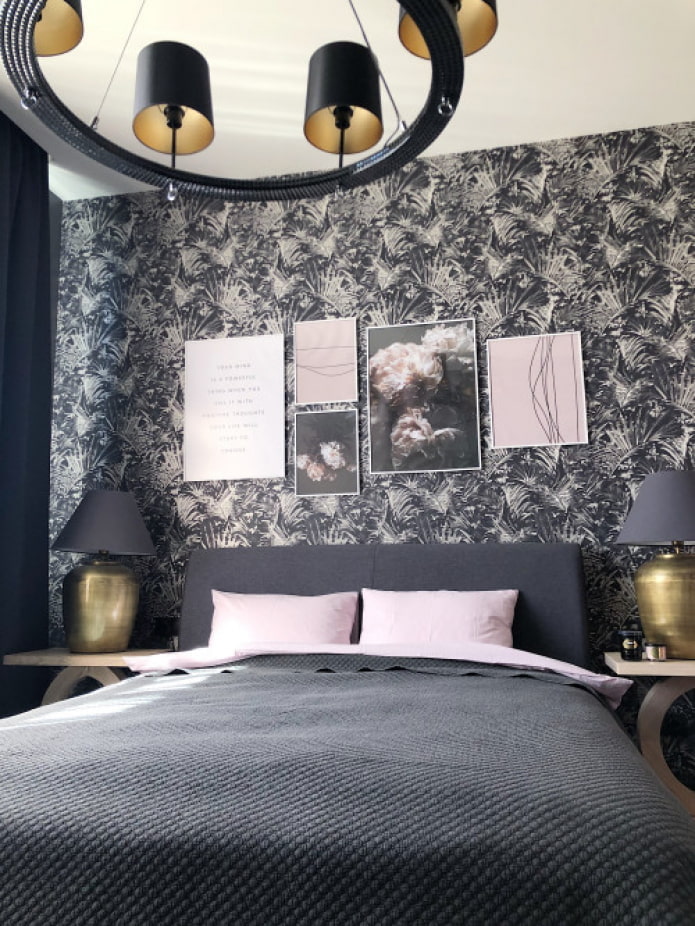
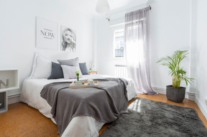
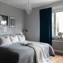
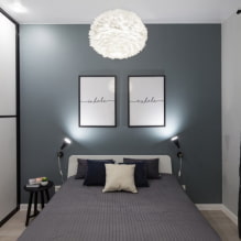
Pictured are posters with abstract images in the bedroom
Size and quantity
When choosing dimensions, be guided by the place where the placement is supposed to be. The easiest way is to choose an add-on on the wall above the bed or a sofa in the interior of the living room: the area of the frame should be at least half the width of the back (one large poster) or at least ⅔ (2-4 posters).
Is it supposed to be an empty wall? The area of the room will serve as a guideline:
- Small posters in the interior of a spacious living room they will be lost, it is better to use a smaller amount, but a large format.
- Large posters in tiny kitchen will look cumbersome: instead of one A1, take 4 A4.
What types of compositions are there?
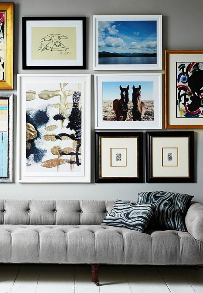
When planning to place several posters in one room (even if they are not on the same wall), create a thematic composition.
A theme is a small detail that will unite disparate objects with each other. Thanks to her, the set will look harmonious.
Popular Topics:
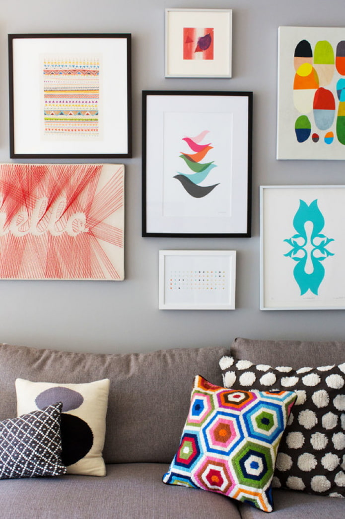
- Abstraction... Circles, squares, lines, stripes, strokes of any shape - they do not carry any semantic message, but they do an excellent job of attracting attention. When choosing one abstract poster, you should not complement it with a landscape or portrait - it is better to choose all the others the same.
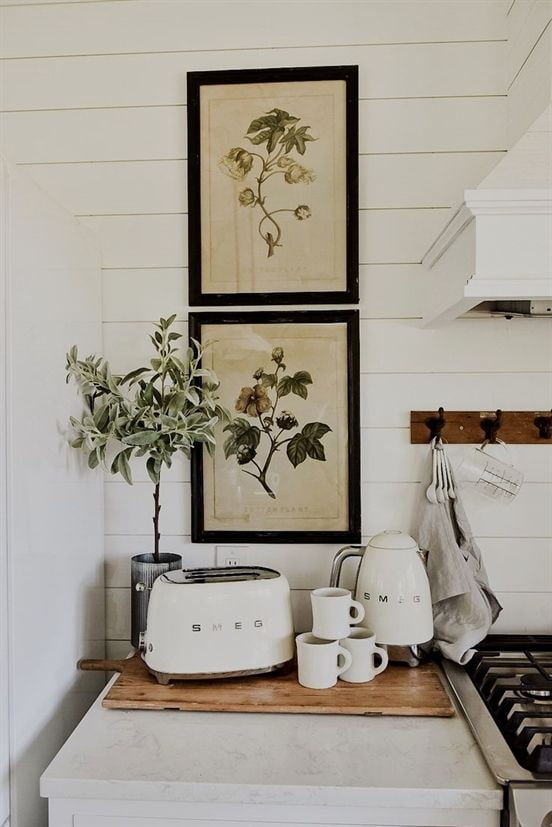
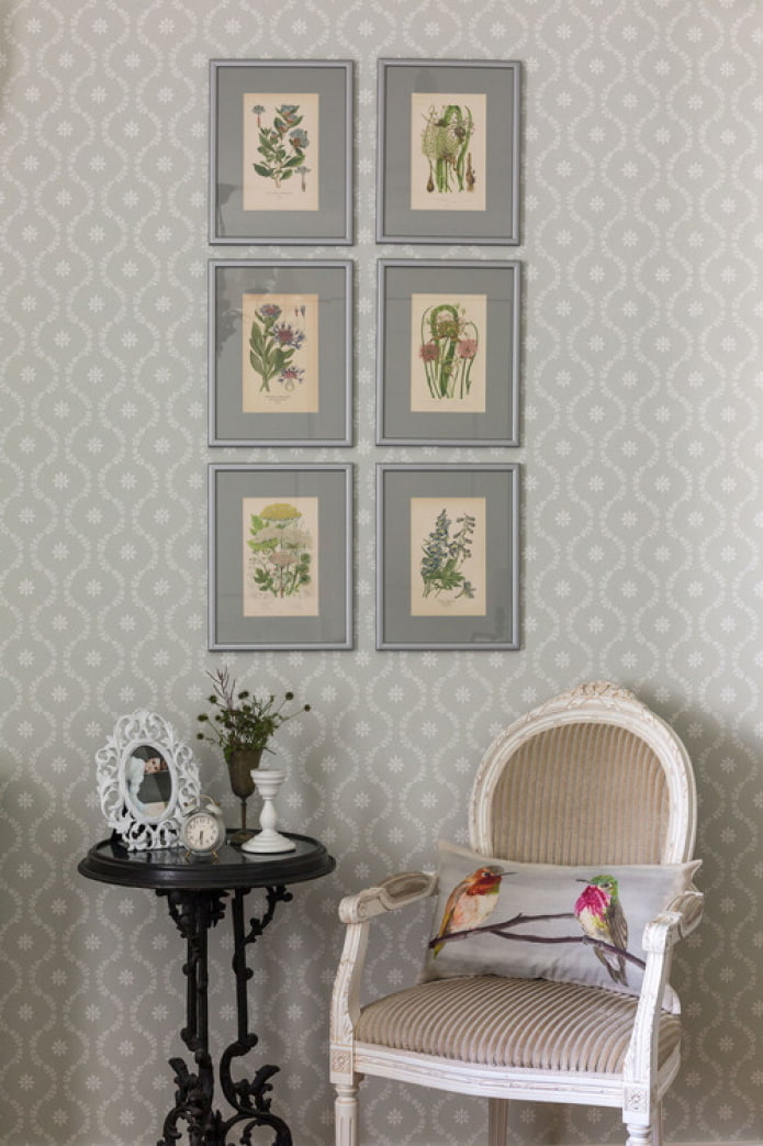
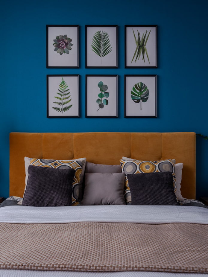
- Nature... General topics in which there are subsections: landscapes, motives (plant leaves), herbaria (dried leaves, flowers under glass), animal studies (images of animals). The appearance determines the adherence to style: tropical leaves or snowy landscapes are often used in the Scandinavian style, seascape is preferred in modern interiors, herbariums fit into Provence or country, standard landscapes, reproductions of famous paintings for classics.
- Retro... They are distinguished by colors, fonts, design techniques. Advertising posters in muted tones are used most often: images can be both grocery (cars, clothes) and social (the famous Soviet poster "Don't talk!" Or the American one "I want U to US army").In some cases, old photographs, circus or movie posters will be appropriate.
- Art... Divided into genres: contemporary, pop art, impressionism, realism. It is logical to use reproductions of contemporary artists in modern interiors, original pop-art posters - in an industrial style.
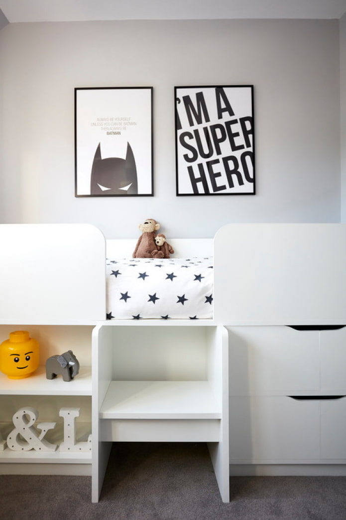
- Movie... As a basis for the idea of posters, you can take shots from your favorite films; in the nursery, shots or images of cartoon characters are often used.
- Comics... They decorate not only children's rooms: in living rooms or home theaters, plots from drawn books will also be appropriate.
How beautiful to place on the wall?
It is not enough to choose beautiful posters for your interior; they should be correctly placed so that the composition looks complete.
First, let's look at some interesting placement methods. by the standard number of elements in the composition:
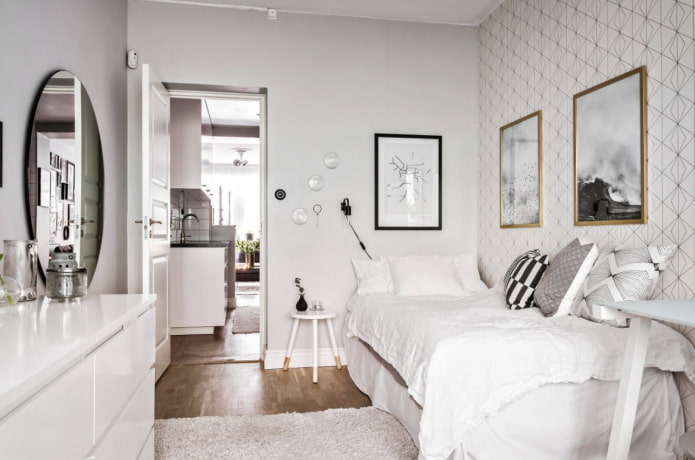
- 2... There are only 2 options - next to each other on the same level, vertically below each other.
- 3... 3 posters of the same size are hung horizontally or vertically on the same level. One large and two small ones are placed side by side so that the upper and lower borders lie in the same plane.
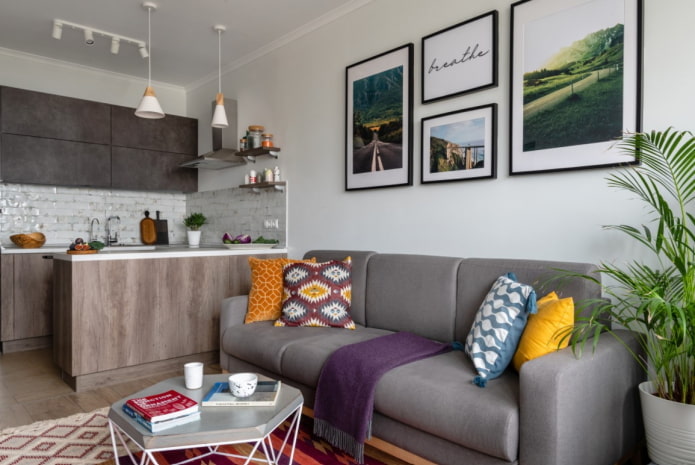
- 4... In a line sideways or down, or 2 rows of 2 pieces. 2 portrait and 2 landscape can be connected with a "cross".
- 5... 3 portrait bottom, 2 landscape top. Or one big one in the center, 2 small ones on the sides.
- 6... 2 rows of 3 posters. Or 2 large ones at the edges, between them 4 small ones.
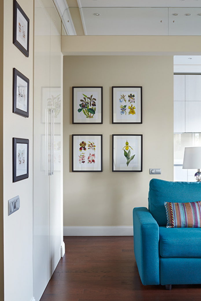
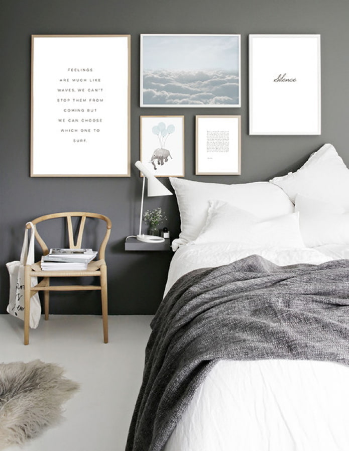
In the photo, the option of placing 4 frames
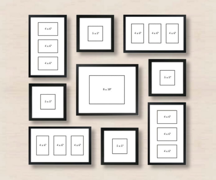
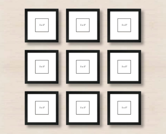
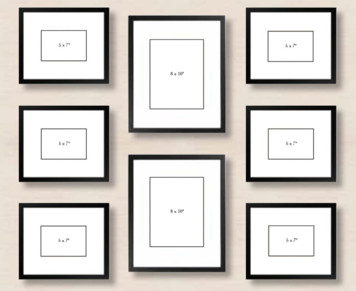
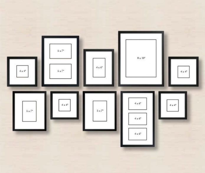
When there are more posters use ready-made schemes (see the examples in the photo in order):
- Spiral... 1 in the center, 8 around it.
- 9 squares... Everything is logical - 3 rows of 3 squares.
- Symmetry... No matter how many posters there are, make symmetrical vertical or horizontal rows.
- Reflection... The bottom row repeats the top one, but in a diagonal flip.
Examples in the interior of rooms
When deciding to decorate the walls with posters, start from which room these walls are in.
Living room
The choice of posters for the living room is not limited by anything: calm landscapes and vivid comic book plots will be equally appropriate here. In the main room of the house, you should not save on quantity: let there be a lot of them!
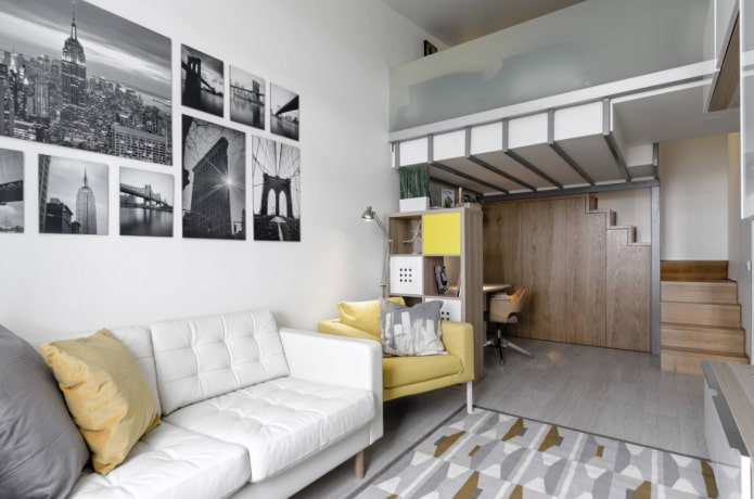
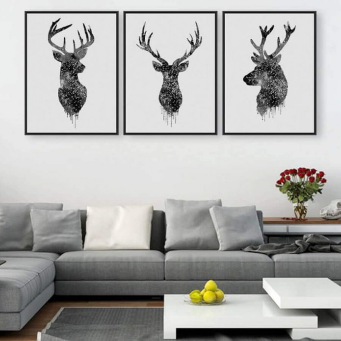
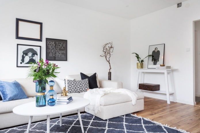
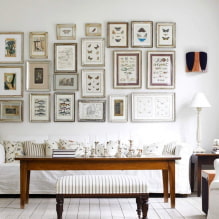
Pictured is a black and white set of posters
Posters on the walls in the living room usually occupy space above the sofa or near the TV, but decorated surfaces around the doors look no less impressive - they are usually ignored.
Kitchen
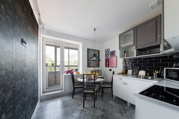
When choosing a theme for the kitchen area, it is not necessary to dwell on dishes, still lifes, recipes, food. Neutral lettering, images of plants or nature work just as well.
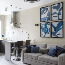
The photo shows accent images in an achromatic kitchen
Bedroom
The main requirement for the decor is that it should not "scream". Choose soothing images: water, forest, plants, abstraction.
Hallway
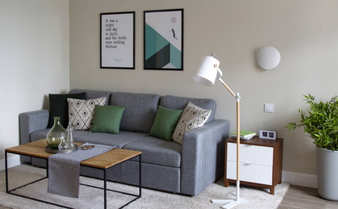
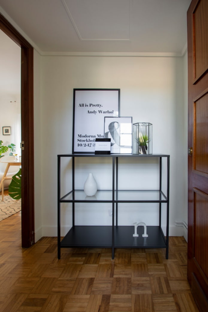
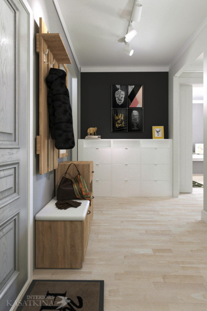
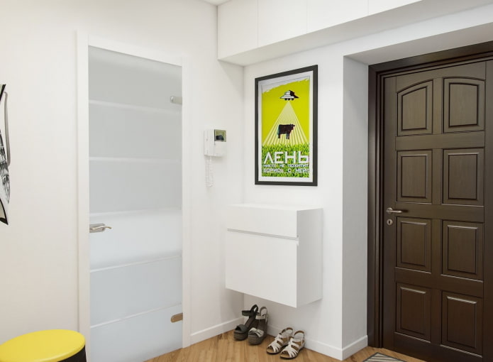
Landscapes are suitable: natural or urban. If the poster is on a door or near an exit, insert a motivating quote into it to recharge every time you leave the house.
In the photo, a motivating quote in a frame looks original and charges for the whole day
Bathroom and toilet
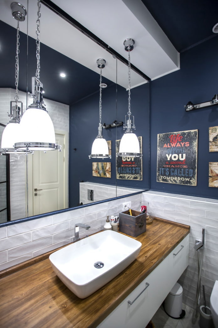
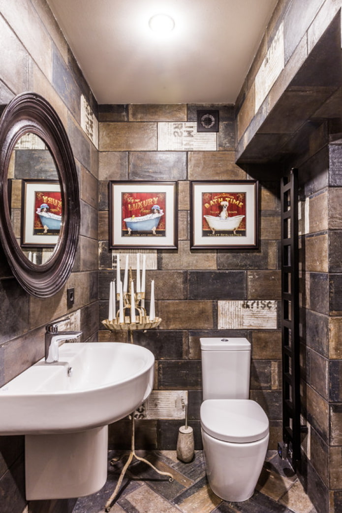
It is logical to place an image of the sea or the beach, but in the end it all depends on the style: tropical leaves, starry sky, funny inscriptions may also be appropriate.
Children's room
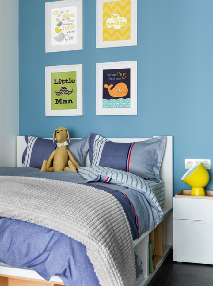
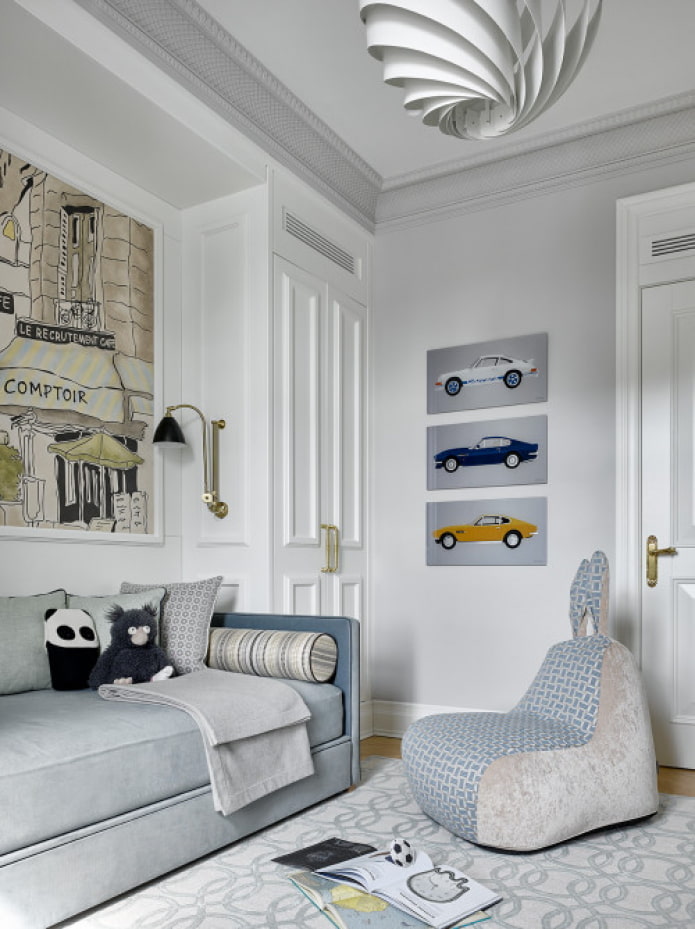
The baby's room is decorated with images of cartoon characters. An older child will love beautiful motifs in the Scandinavian style: painted watercolor deer, cute lettering. Teens will love World map, posters of favorite films, comic book pages.
The apartment, the walls of which are decorated with posters, becomes cozier and acquires a special charm! Do not be afraid to hang original images on the walls - remember that at any time they can be replaced with new ones or removed altogether.

 10 practical tips for arranging a small kitchen in the country
 12 simple ideas for a small garden that will make it visually spacious
 13 bad habits a good housewife shouldn't have
 24/7 home cleanliness - 4 secrets for the perfect housewife
 6 hotels in Sochi that will give odds to the promoted foreign hotels
 Top 10 interior design trends 2020
 Rating of cheap TVs with Smart-TV
 New Year's LED garlands on AliExpress - we disassemble while it's hot, so that it's bright at home