Pros and cons
Kitchen layout on two sides has its own advantages and disadvantages.
pros parallel two-row kitchen:
- large work surface;
- a lot of storage space;
- simple organization working triangle;
- the ability to accommodate a variety of built-in appliances.
The last point concerns not only the quantity, but also the dimensions: for example, when planning a two-line kitchen, you can afford to add a two-door refrigerator, a wide stove or a dishwasher.
Minuses kitchens in two rows:
- takes up a lot of space, suitable only for spacious rooms;
- difficulties with the placement of the dining table;
- bulky appearance.
Who is the parallel layout suitable for?
The layout of a parallel kitchen primarily assumes a special geometry of the room. This is due to the depth of the drawers and countertops, as well as the required distance between them.
The width of the room should be at least 2.5 meters, the distance between the rows should be 1.2-1.5 m. If between the boxes is less than 120 cm, it will be inconvenient for you to move around the room, because the furniture opens 40-60 cm and interferes with walking. If it is more than 150 cm, you will spend too much time and energy on movement during cooking.
Advice! For rooms less than 250 cm wide, place shallow floor and wall cabinets on one of the walls: this way you will be able to maintain the required distance between the rows to move comfortably.
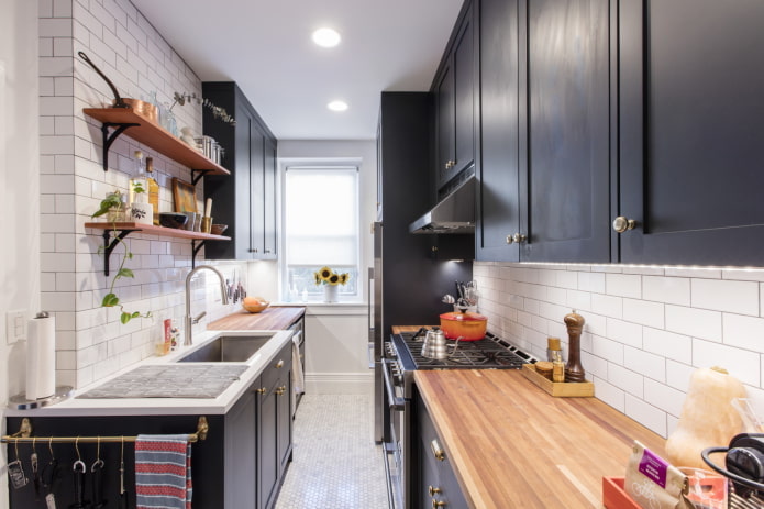
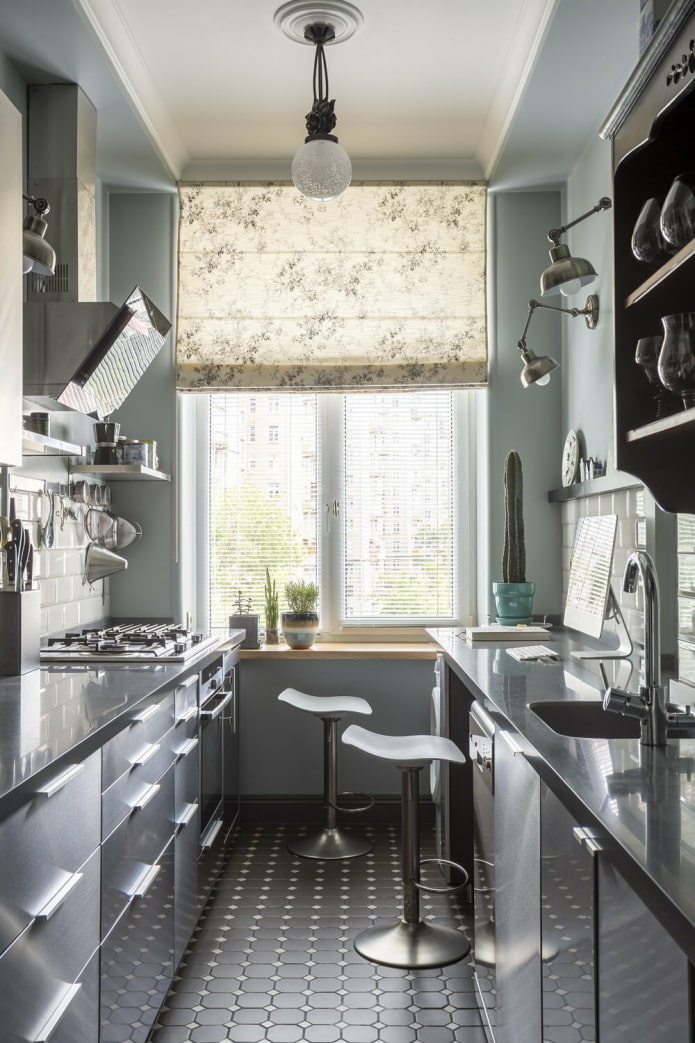
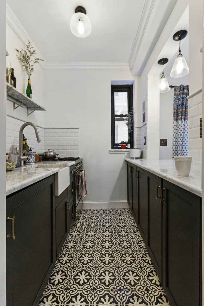
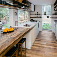
Pictured is a black headset with open shelves
Touching upon the expediency of placing furniture in two rows, it is worth noting: it is really necessary for those who love to cook, has a lot of things for storage and is going to place a maximum of kitchen appliances. Otherwise, designers advise to save space and get by with a kitchen set on one side.
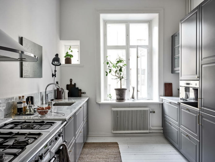
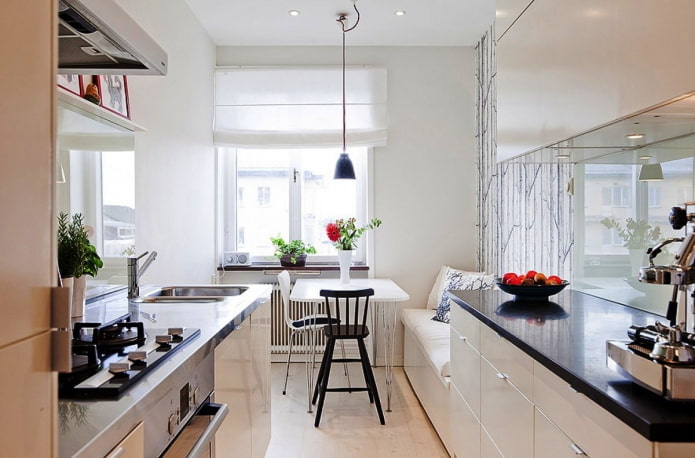
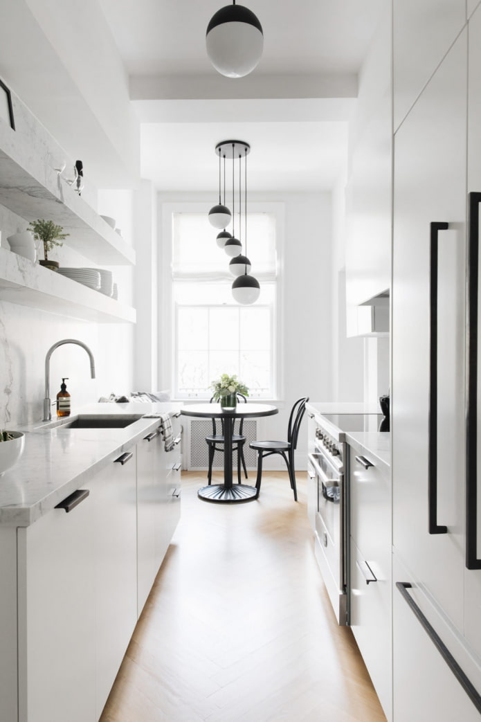
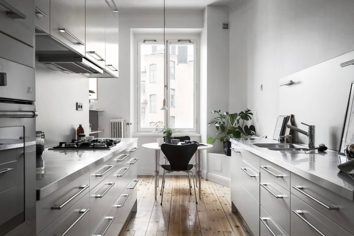
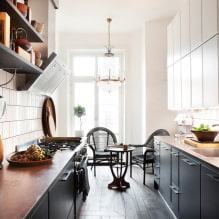
In the photo, an elongated Scandi-style kitchen
What is the best way to place the furniture?
A kitchen with two walls is more complicated than it sounds. Therefore, before ordering a headset, make a drawing and decide on the location of every little thing.
Storage systems
Perhaps the largest area in any kitchen is the storage area. Professionals prefer to note what and where will lie right on the diagram: food, cooking utensils, serving utensils, appliances, etc.
Proper zoning will allow you to build a logical and intuitive storage system:
- in the cooking area, that is, not far from the stove and oven, place pots, pans, baking sheets, spatulas, baking dishes;
- next to the stove there is a space for preparation, here knives and cutting boards, bowls, spice and seasonings;
- keep sponges, rags, dishwashing liquid near the sink, packages;
- the storage itself is divided into two parts: edible supplies are located in the refrigerator and boxes nearby, everything inedible (dishes, small household appliances, etc.) in modules on the other side.
Advice! To make it more convenient to use the furniture, order exclusively drawers on the lower tier: it is much easier to find something in them than in a swing closet.
As for the top level, there are 3 options:
- Add an additional third tier of cabinets by ordering a ceiling-to-ceiling 2-row recessed kitchen. This is useful if you are not sure that there is enough space for all things, or you need to hide the pipe from hoods.
- Replace the top tier with open shelves. The parallel kitchen will look more spacious and lighter due to this technique.
- Leave the top tier on one side only. It will also help to visually facilitate the parallel design, but will reduce the amount of storage space.
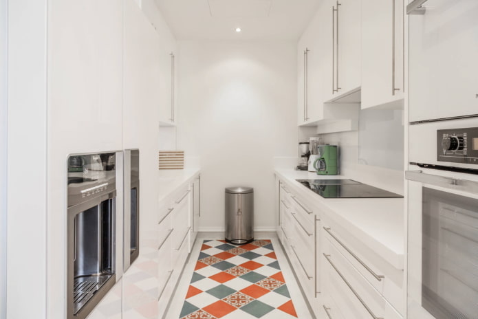
An important nuance - placement of the refrigerator. It is part of the working triangle, so you won't be able to put it in any free space, the location needs to be thought out. Experts advise installing the refrigerator on one side, and the stove, sink and the work surface on the other. It is also convenient to build the refrigerator into the wall of the columns, hiding the oven and microwave in them.
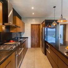
In the photo, a variant of placing a large number of modules
Cooking area
The most actively used space in any, including parallel, layout - working... We have already mentioned that the stove is located not far from the sink, on the side opposite to the refrigerator. Leave a worktop between them to prepare food. The width should not be less than 60 cm, it is better to have a 90-100 cm stock - it will be more convenient to cook this way.
In an elongated two-row kitchen with a large worktop, install a 3-4 large hotplate. In the case of a small walk-through kitchen, 2-3 burners are sufficient.
The oven is not directly related to the cooking zone, therefore it can be taken out of it: it will be more convenient for you to use equipment located at hand and eye level than under the hob.
Standard solution: 2-3 columns side by side, into which the oven and refrigerator are built.
Advice! Leave an empty countertop 60 cm near the column, so that when you take out the hot baking sheet, you can put it on right away, and not carry it through the entire room.
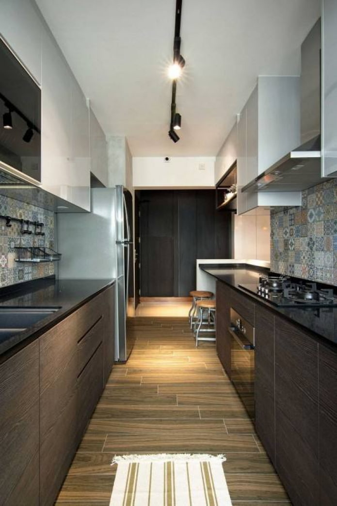
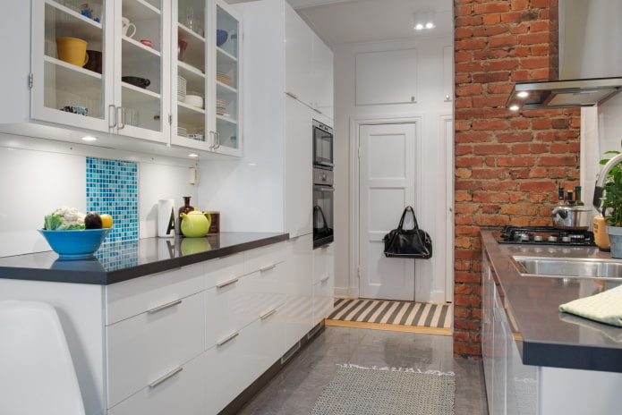
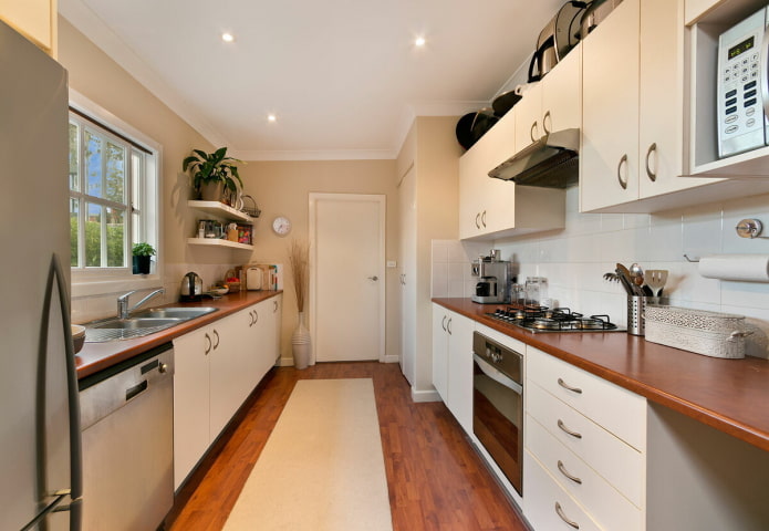
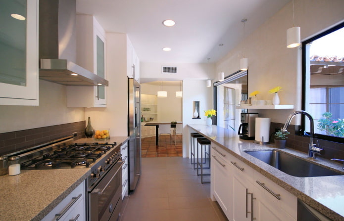
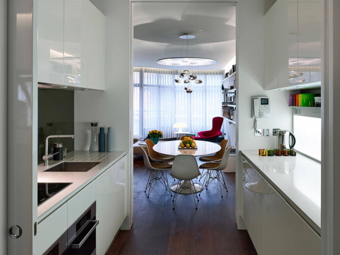
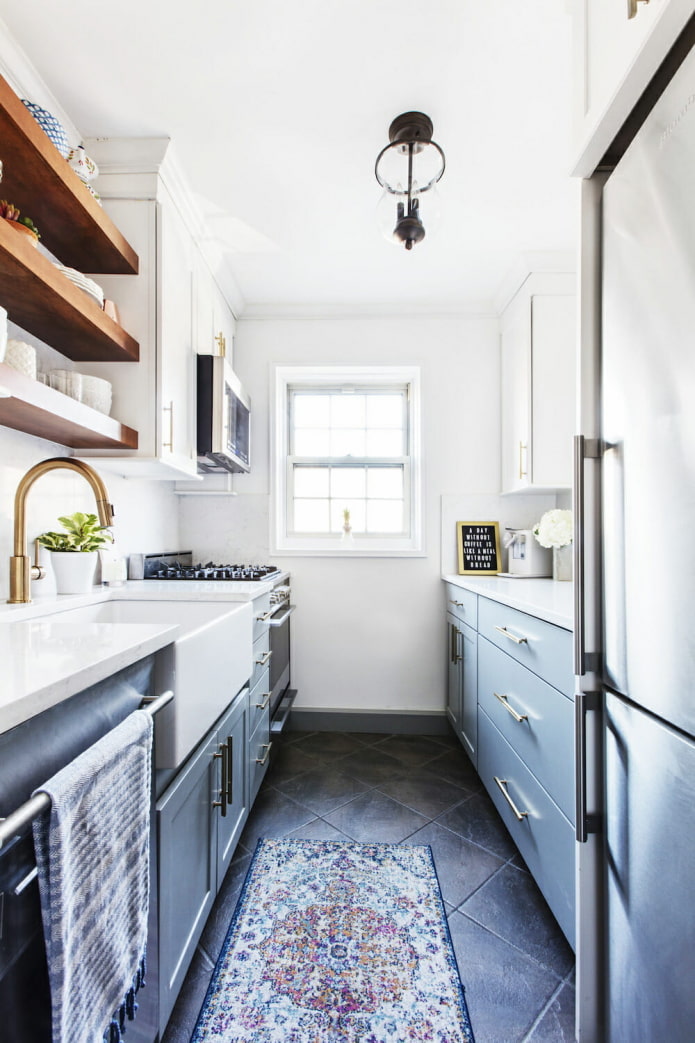
In the photo there is a walk-through kitchen room
Washing area
From the previous sections, it is clear that in a parallel kitchen in two rows, the sink is placed near the stove. A dishwasher is also installed here - so you do not have to pull the water supply and communications across the room.
Important! Do not put the sink in a corner, it will not be as convenient to use as the one that is located approximately in the center of the row.
Lunch group
The most difficult task that you have to solve: find a place in the narrow kitchen for a dining area.
The simplest and most optimal solution is to shorten one of the rows, and put a dining table with chairs in the free space.
If you want to rely on the dining area, and not the work area, shorten both sides of the two-row kitchen. The freed up space will be enough even to accommodate a sofa or kitchenette.
The option of a two-row kitchen with a dining area in a bay window or on a balcony is the most exotic and beautiful of all. Therefore, if you are lucky and the apartment has a bay window, panoramic windows or a loggia, use it.
Method number 4: bar counter. It can be organized on the windowsill between the rows, or you can refuse a couple of cabinets and turn part of the countertop into a table. Suitable if the apartment is home to 1-2 people or there is a separate dining room in the living room.
Advice! Even if there is enough space in the middle between the drawers (as is usually the case in square rooms or studios), it is not recommended to put a table there - the lack of aisle will reduce ergonomics of the kitchen.
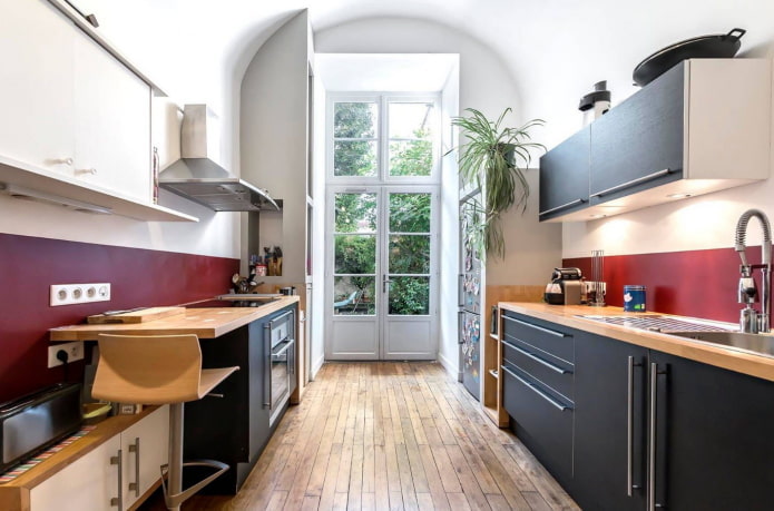
In the photo there is a headset with a bar counter
Headset design options
Although the main common feature of two-row layouts is the parallel arrangement, they differ from each other more than you might think. The final design depends on your desires and the characteristics of the room.
We have already mentioned many techniques in passing, but we suggest repeating them again:
- Tapered cabinets on one side. It is important to understand here that a depth of less than 50 cm will make it difficult to choose equipment for the arrangement.
- Replacing cabinets with open shelves. In the same row or both. The kitchen in 2 rows will become more spacious, but there will be more cleaning.
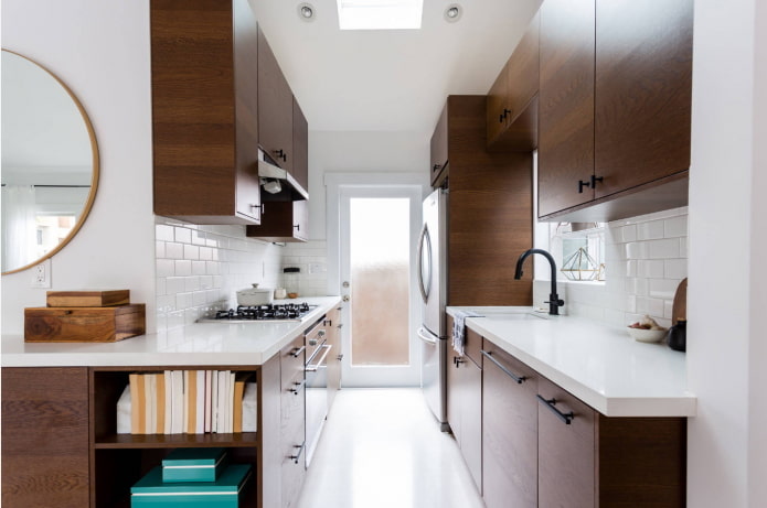
- Three-level headset. The second upper level will allow you to hide the duct and increase the storage area. In a modern style, the mid-level is “sunk” to add volume and avoid head bangs while cooking.
Advice! To save space, remove the door and leave a free opening, or replace it with a sliding door instead of a swing door.
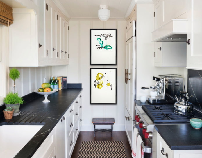
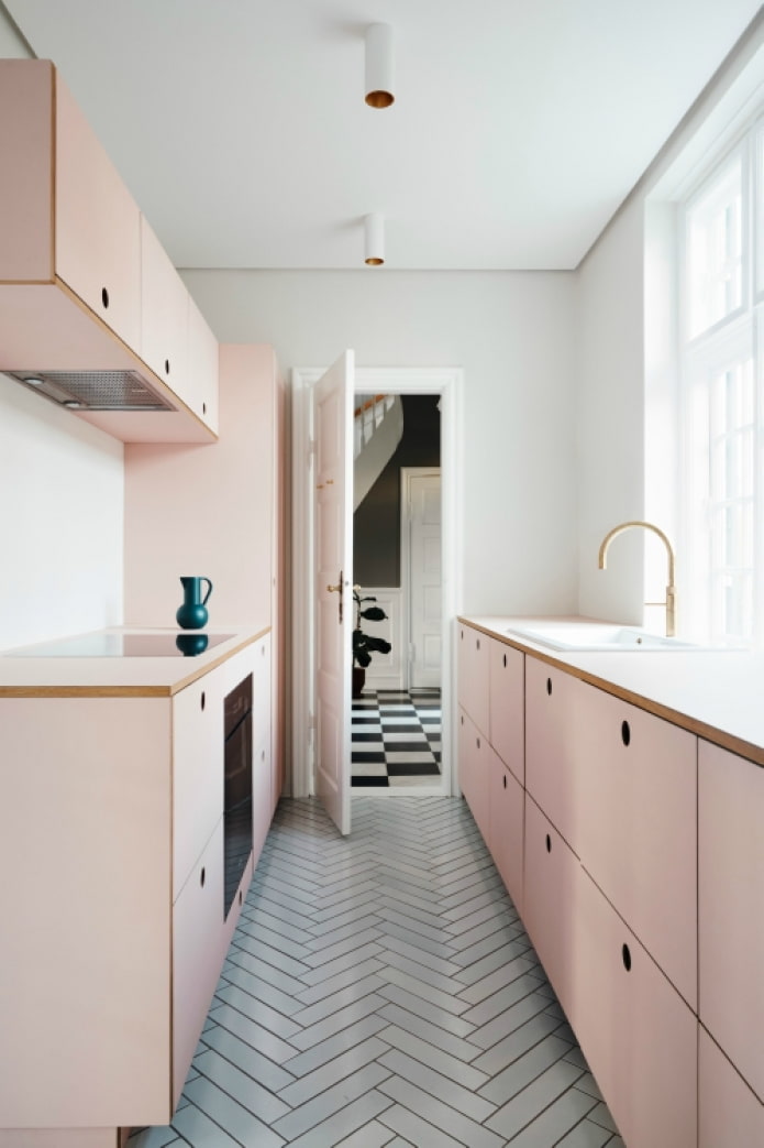
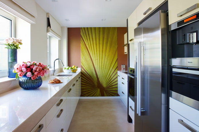
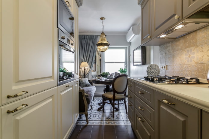
In the photo, furniture in the color of the walls
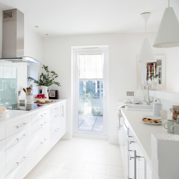
Another important issue that cannot be ignored is the color of the facades. Since there are really many cabinets, white and its shades will be the most suitable. Light colors will play a role and will not make the room overloaded.
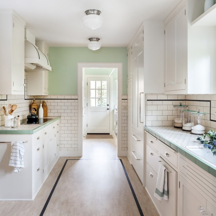
The second way - cabinets to match the walls. This technique literally dissolves furniture in space and makes it invisible.
The third option is a two-color parallel typeface. The top is as light as possible, preferably white. Bottom - any suitable shade.
Advice! In a small area, use glossy facades, they reflect light and visually expand the space.
Photo gallery
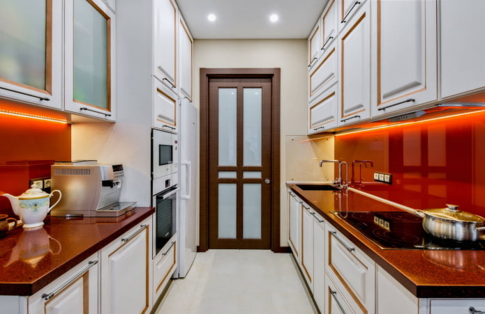
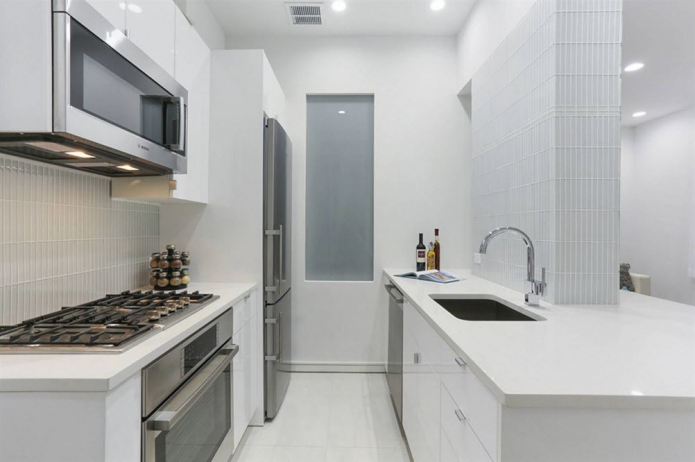
Congratulations, you have learned the basic theory of 2-row layout. But before moving on to practice, check out the photos of the parallel kitchen in our gallery.

 10 practical tips for arranging a small kitchen in the country
 12 simple ideas for a small garden that will make it visually spacious
 How to choose the color of your kitchen sink?
 White kitchen set: features of choice, combination, 70 photos in the interior
 Black set in the interior in the kitchen: design, choice of wallpaper, 90 photos
 How to choose curtains for the kitchen and not regret it? - we understand all the nuances
 Design of a white kitchen with a black countertop: 80 best ideas, photos in the interior
 Kitchen design with green wallpaper: 55 modern photos in the interior