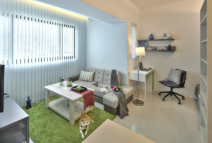
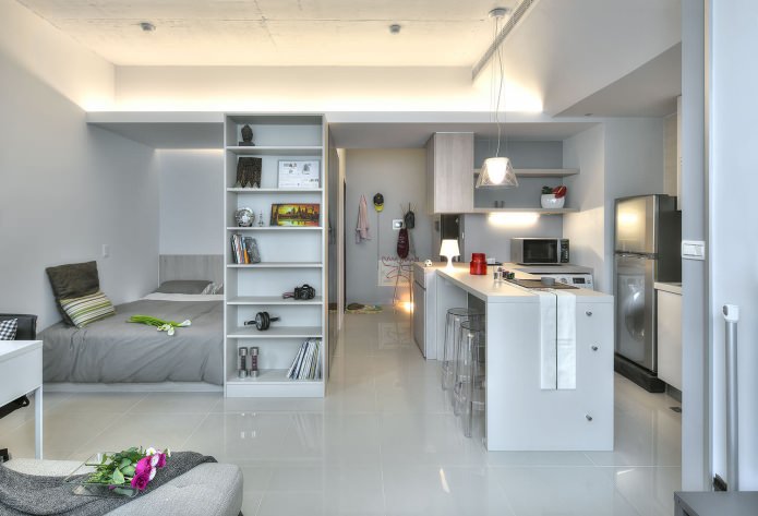
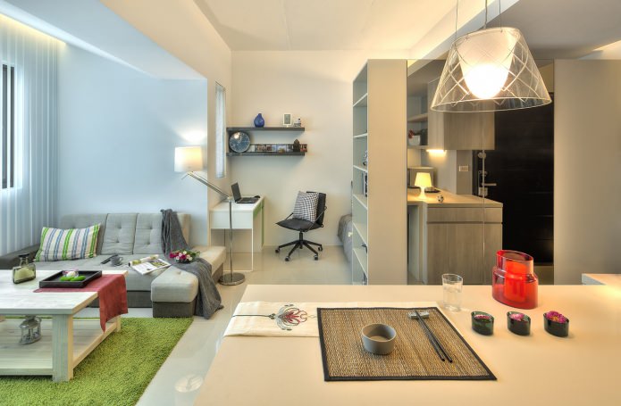
Since the apartment is quite small, it had to be maximized at least visually, which was achieved by choosing light colors for decoration. First of all, it is pure white, as well as pale blue and beige sand shades.
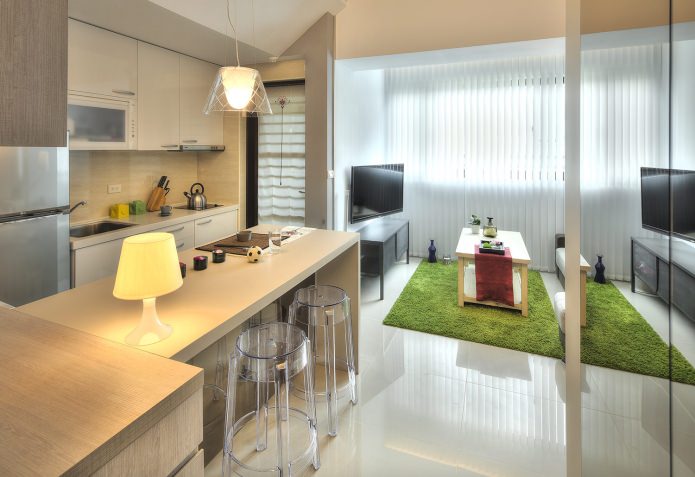
Glossy surfaces, due to the play of reflections, also add volume, and here they used this technique, using glossy tiles as a flooring.
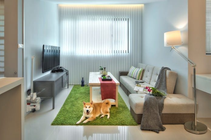
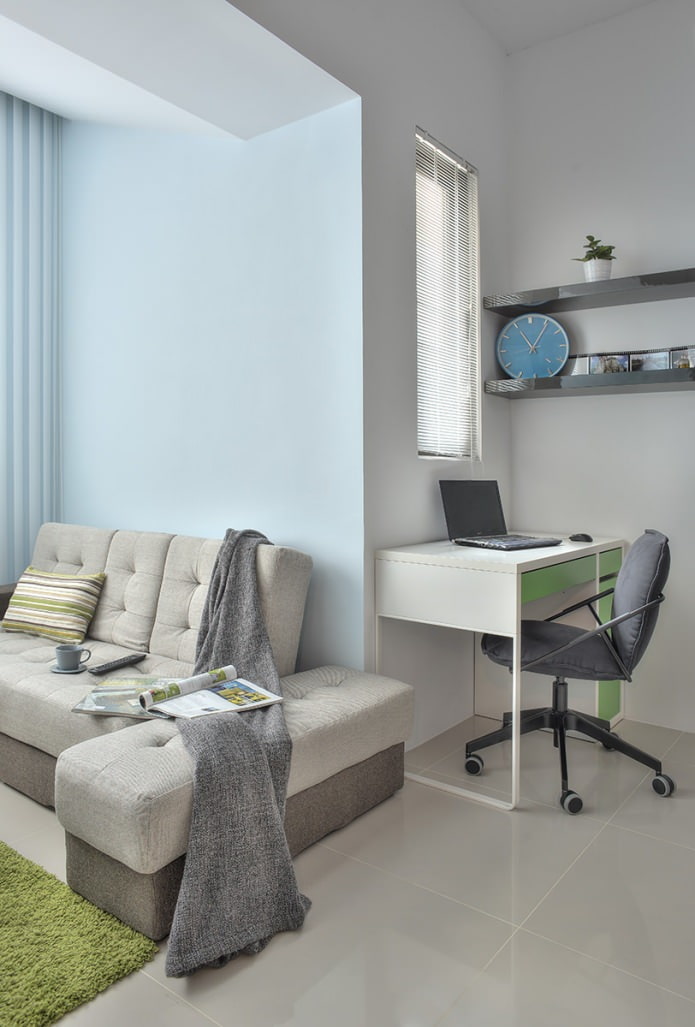
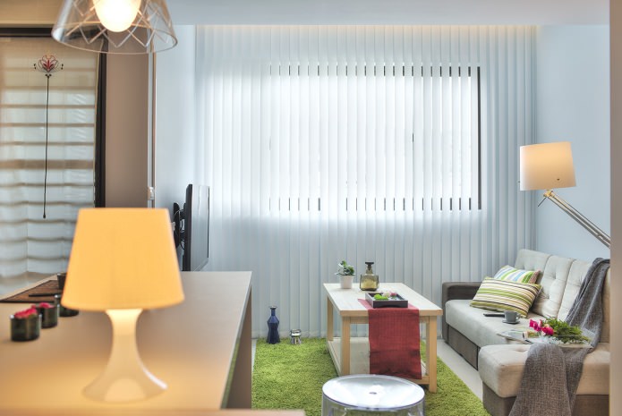
In the interior design of a studio apartment, the blue shades of the living area are highlighted not only by daylight falling from the window, but also by the lighting built into the top, which brings freshness to the atmosphere and adds spaciousness. The same illumination, in combination with elongated blinds that almost reach the floor, visually enlarge a small non-standard window.
The delicate blue tint of the walls and the light sand tones of the furniture and floor are naturally complemented by a green spot of the carpet - like a lush grass lawn on a sand spit. The accent tone of the accessories - soft burgundy red - reminds of ripe strawberries in a forest glade.
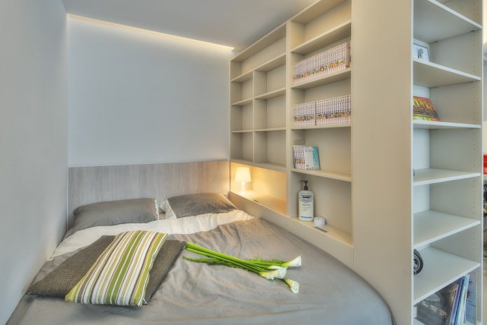
The design of a studio apartment is 32 sq. m. there are practically no partitions, the only exception is the bedroom area. The bed fits between the wall and the rack, one of the niches of which serves as a bedside table.
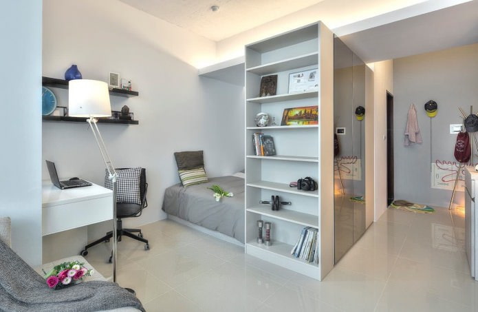
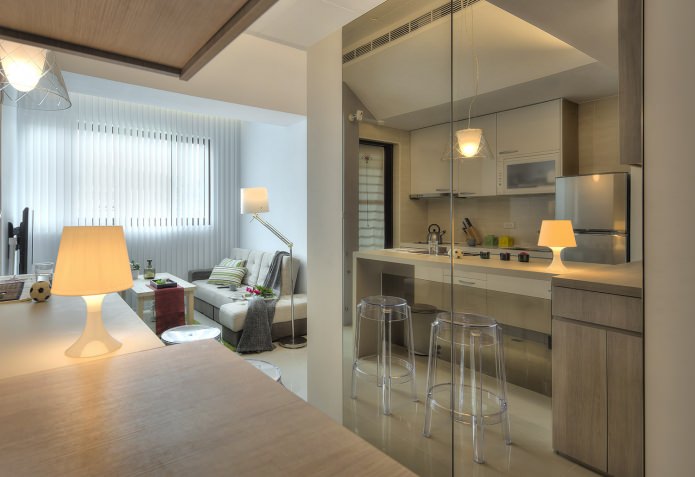
On the reverse side, this rack has a built-in spacious storage system, which is closed from the hallway with mirrored sliding doors. In these mirror planes, the entrance area is reflected, visually increasing it almost twice.
Thus, three tasks are solved at once: the bed stands out into a cozy private area, storage places are organized, and a narrow corridor visually expands.
Between the living room and sleeping areas, there was also a place for a work corner - a small table allows you to comfortably sit in front of a computer.
Key idea interior design of a studio apartment - a play of light and shadow.
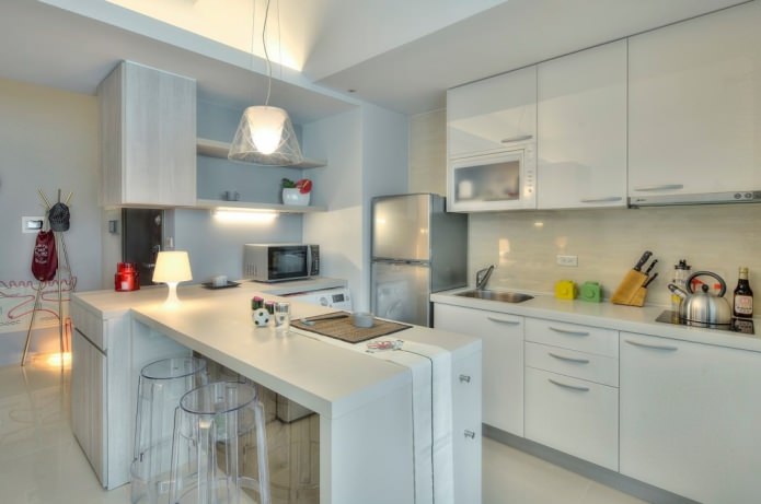
The gloss of surfaces, a variety of light sources - an elegant pendant chandelier, LED ceiling lighting, linear lighting of the kitchen working area - all this together creates a festive atmosphere and changes the perception of space, it begins to seem more free.
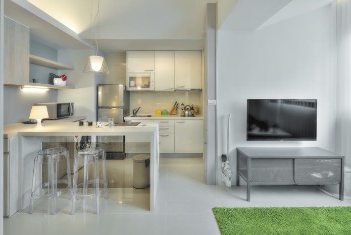
There is no dining table, instead there is a bar counter, it is used both as an additional work surface and as a table for snacks or dinners.
Bar stools made of transparent plexiglass are used in the design of a studio apartment of 32 sq. m instead of traditional chairs: they do not clutter up the space and allow you to sit comfortably near the counter.
Another function of the bar is interior. It separates the kitchen area from the living area.

 10 practical tips for arranging a small kitchen in the country
 12 simple ideas for a small garden that will make it visually spacious
 Design project kopeck piece in brezhnevka
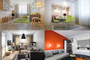 Modern design of a one-room apartment: 13 best projects
 How to equip the design of a small apartment: 14 best projects
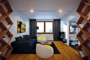 Interior design project of an apartment in a modern style
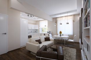 Design project of a 2-room apartment 60 sq. m.
 Design project of a 3-room apartment in a modern style