Layout
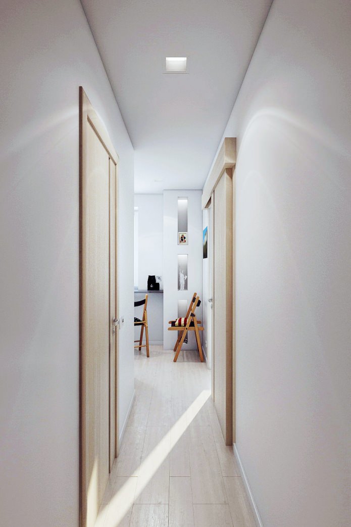
In the interior of a 2-room apartment, the hallway and kitchen are connected by a corridor. A sliding door to the bedroom allows you to further expand the space and visually unite all the rooms in the apartment, except for the living room. Such isolation of the living room is quite justified, since quite often it plays the role of a guest bedroom.
Thus, all functional areas are separated, but in general, the interior of the apartment is 46 sq. m. looks holistic due to the use of neutral light tones as the main color in all rooms. Against this background, bright color accents of textiles, posters, decorative facades of furniture are especially well perceived.
Living room
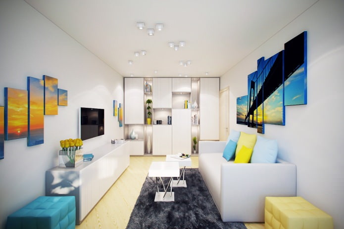
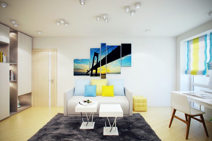
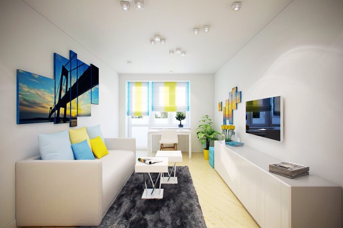
The interior of a 2-room apartment is designed in the same style, but each room has its own "face". In the living room, first of all, attention is drawn to the ceiling, on which small square-shaped lamps are chaotically scattered.
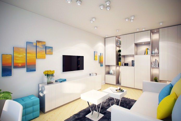
Yellow and blue are the main colors used in the decor. They are present in furniture decoration, on curtains, in posters above the sofa and on the opposite wall.
Two small tables can be combined or used separately from each other, two poufs - one yellow, and the other blue, also move freely at the request of the owners. Using them, more guests can be received in the living room. All this is a riot of colors in the interior of an apartment of 46 sq. m. in the living room softens and unites a calm dark gray carpet.
Opposite the window is a spacious shelving unit. It will store books, souvenirs, as well as bed linen and other things that should not be put on public display. Therefore, some of the shelves are left open, and some are covered with facades of a neutral shade. The irregular alternation of open and closed shelves adds dynamism to the room.
Kitchen
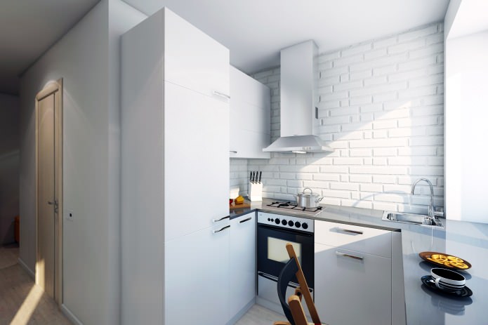
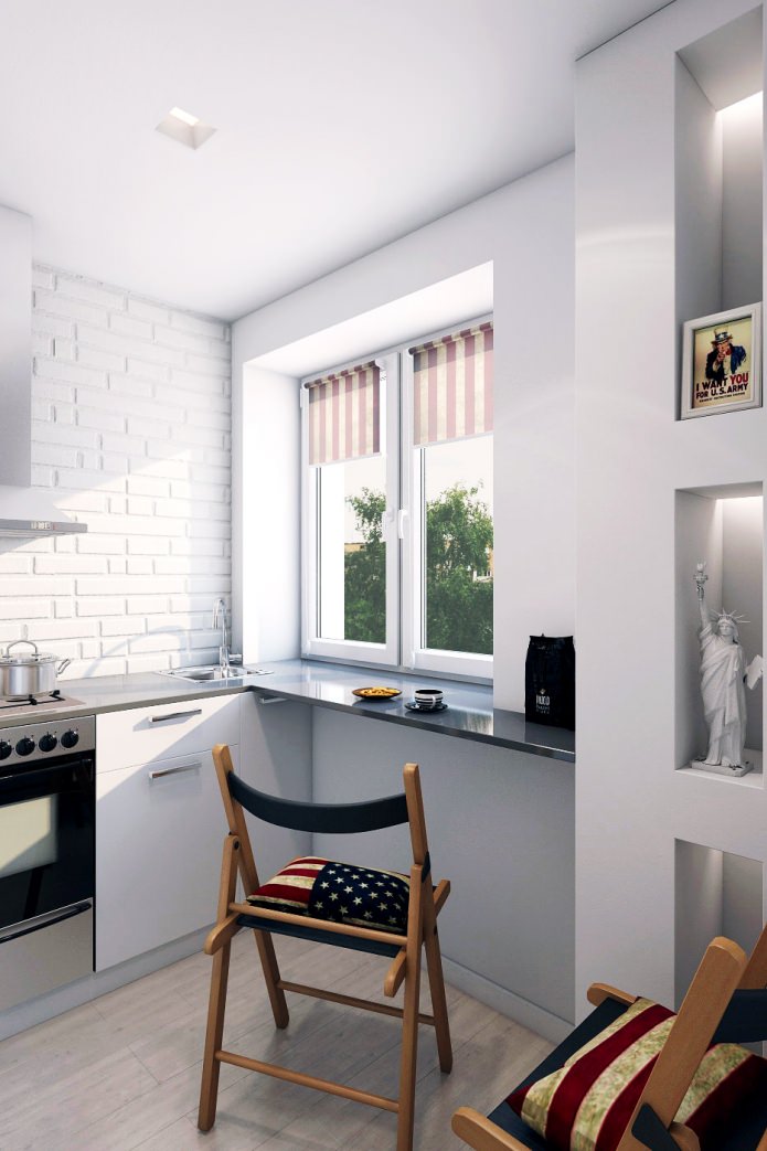
The interior of the apartment is 46 sq. m. the kitchen stands out. Small, painted white in order to seem more spacious, it nevertheless has its own, quite definite character. It is defined by the design of the backsplash and the wall behind the slab and has a distinct “industrial” style.
Whitewashed brick walls, a metal hood with a high “pipe” of a simple geometric shape - all this clearly refers to the loft style.
The wooden reclining chairs take up little space and blend in perfectly with the loft ambience, especially when fitted with decorative seating cushions in time-worn American flag covers.
The small size of the kitchen does not allow organizing a dining area in it, so the window sill was replaced with a wide countertop made of artificial stone, behind which you can conveniently have a snack or even dine.
Bedroom
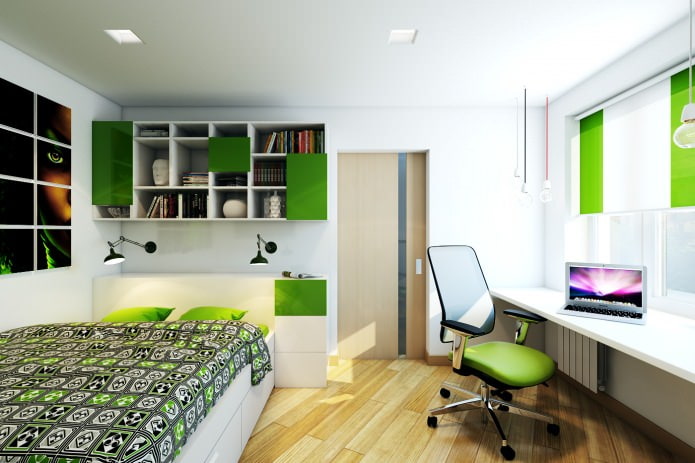
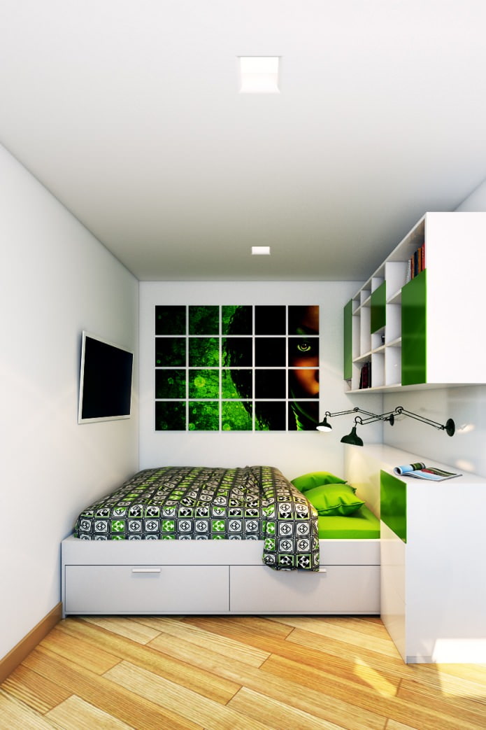
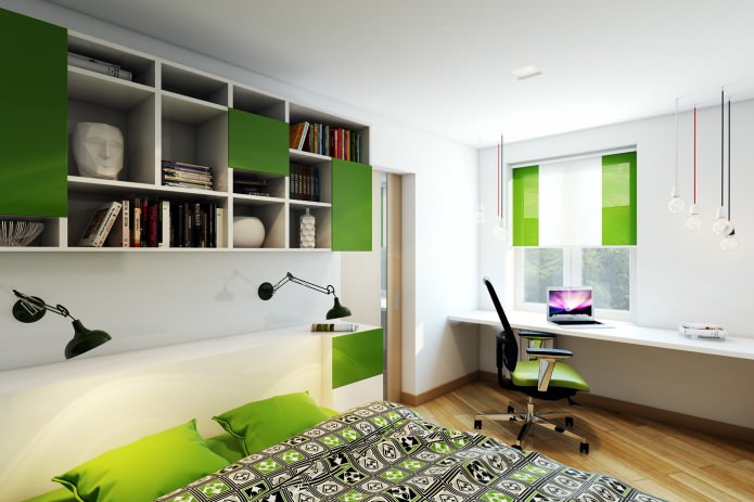
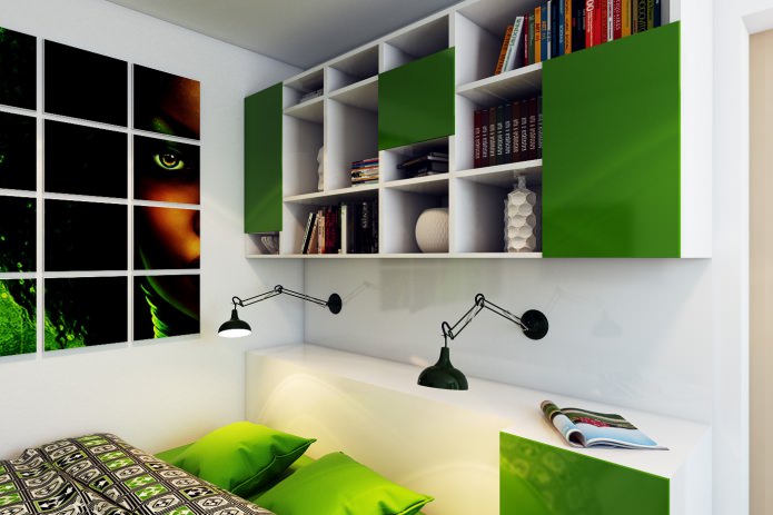
In the design of a two-room apartment in a panel house, bright, rich colors were used as accent colors, for example, in the bedroom it is a thick grassy green.
Green not only facades on closed shelves, but also curtains on the windows, and even an armchair. The poster on the wall above the bed and the bedspread are made in the same colors.
A working area is located along the window, above it there are pendant lights of different height, complicating the space and harmonizing its perception.
The role of bedside lamps is performed by black sconces, the location of which can be changed due to the hinged base. In addition, they look very decorative.
Bathroom
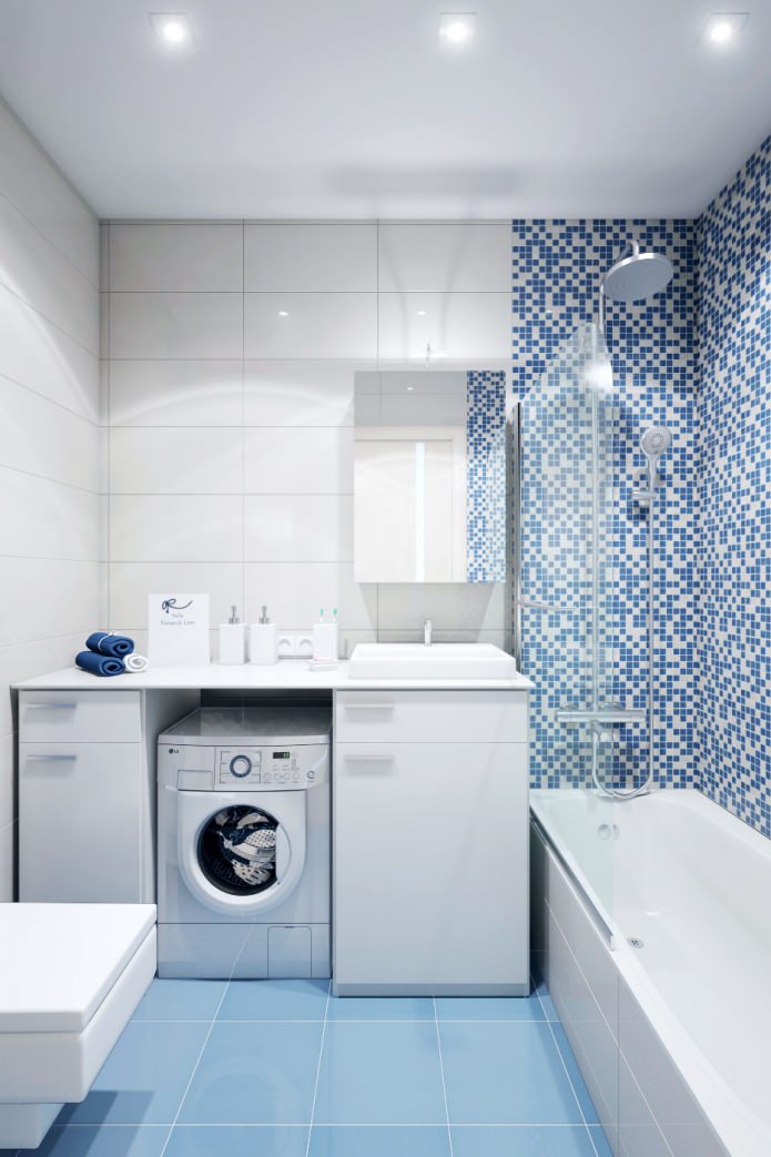
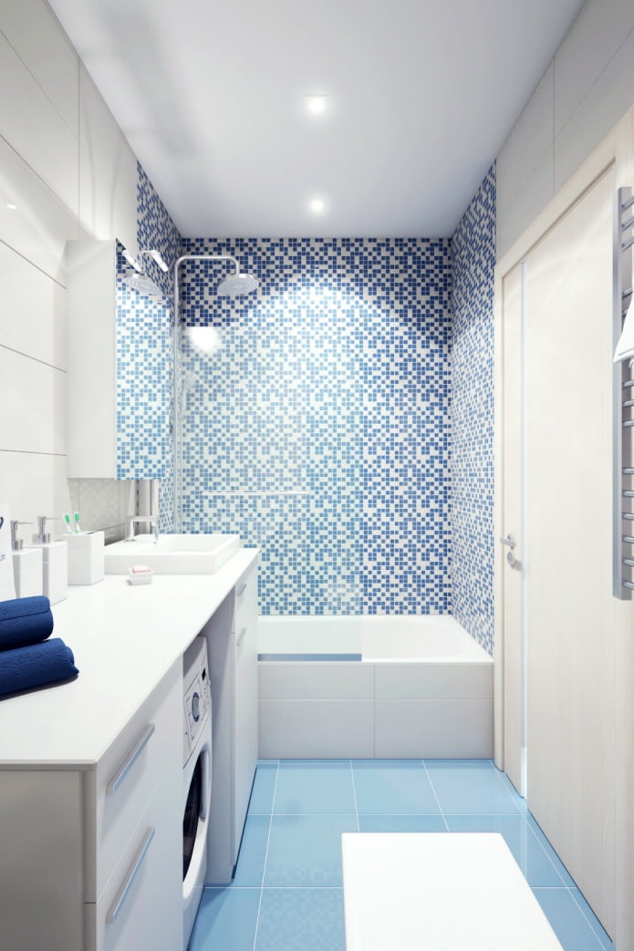
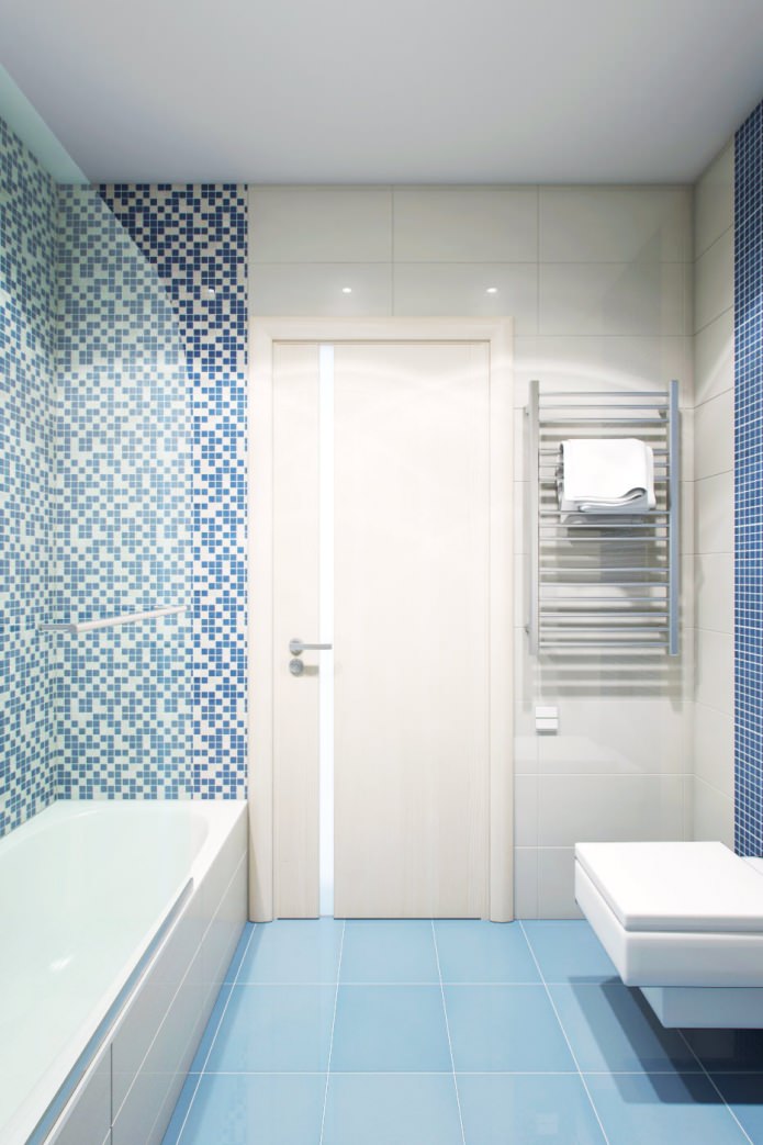
The design of a two-room apartment in a panel house provided for the combination of a toilet and a bathroom into a single whole. It turned out a room of sufficient volume to fit a washing machine there - its place is near the sink, and from above it is covered with a countertop that continues to the wall.
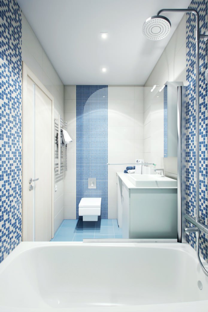
The soft blue floor perfectly matches the white walls and the “squeaky” pattern of the decorative tiles that line the walls surrounding the bathtub.
Behind the toilet, part of the wall is decorated with blue mosaic tiles. The theme of right angles in the design is supported by plumbing fixtures of an unusual shape: the bathtub, the sink, and even the toilet bowl here are rectangular!
Entrance area
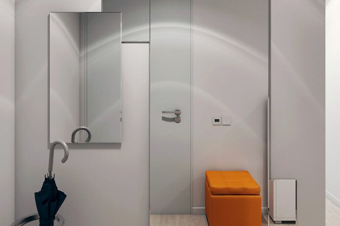
Acquaintance with the interior of a 2-room apartment starts from the hallway area. Immediately upon entering, guests are greeted by a bright orange pouf - the main and only decorative element of this zone.
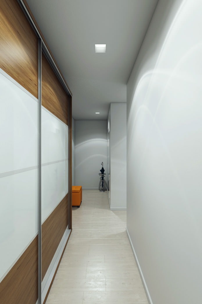
The gray surfaces of the walls are broken by mirrors of different sizes - this gives the interior dynamism. Since the floors in the hallway are experiencing the greatest stress, they were laid with porcelain stoneware tiles, but the pattern was chosen "under a tree" to give the room more warmth. The pattern on the tiles is in harmony with the finish of the cabinet. To save space, the door to the bedroom was made sliding.

 10 practical tips for arranging a small kitchen in the country
 12 simple ideas for a small garden that will make it visually spacious
 Design project kopeck piece in brezhnevka
 Modern design of a one-room apartment: 13 best projects
 How to equip the design of a small apartment: 14 best projects
 Design project of the interior of an apartment in a modern style
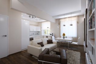 Design project of a 2-room apartment 60 sq. m.
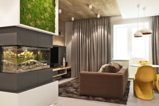 Design project of a 3-room apartment in a modern style