The interior palette is dominated by white color and natural, as if faded in the sun, colors. The layout has not changed much and includes a kitchen with dining area, living room, bedroom and bathroom with toilet.
Living room
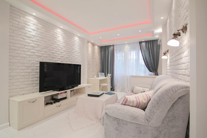
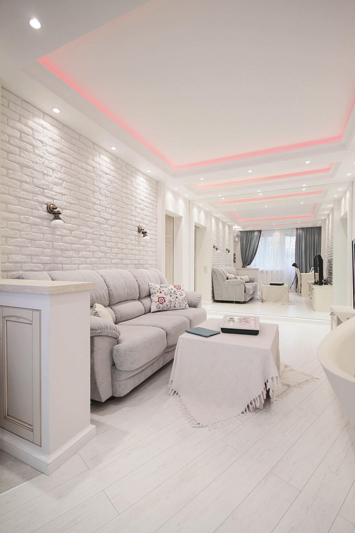
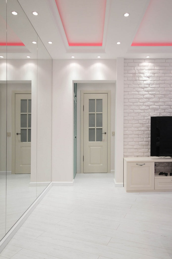
White painted brickwork texture - the main type of living room decoration. The relief is favorably emphasized by built-in lamps along the perimeter of the ceiling. A chic soft sofa is the main element of the furniture, which also includes a chest of drawers with a TV panel installed on it. In the center of the living room there is a table with a tablecloth reaching to the floor, and near the sofa there is a narrow curbstone that helps to separate the sitting and dining areas.
Easy interior zoning two-room Khrushchev made with the help of a ceiling, the complex geometry of which has niches with LED lighting. There is a workplace near the window, highlighted by wall decoration with an attractive patterned pattern.
The wall-to-wall mirror allowed visually enlarge the room, the interior of which is enlivened by brighter color accents - curtains, pillows.
Kitchen and dining room
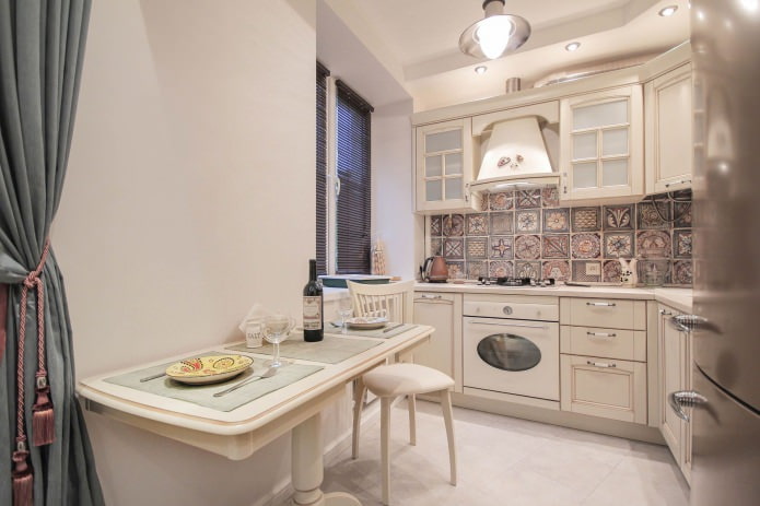
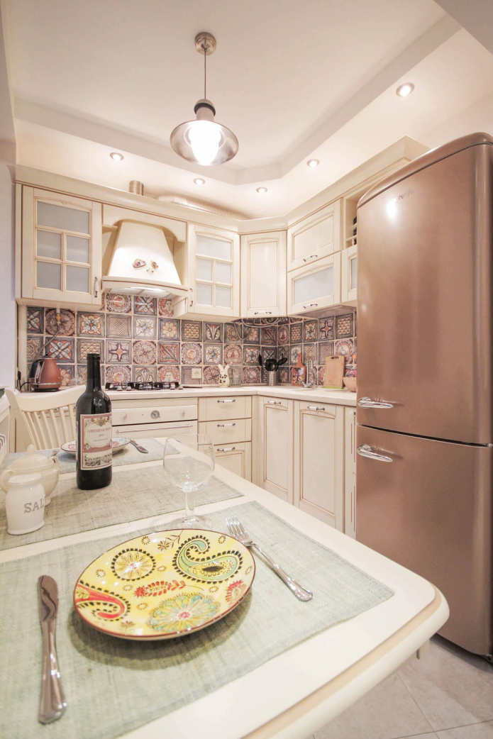
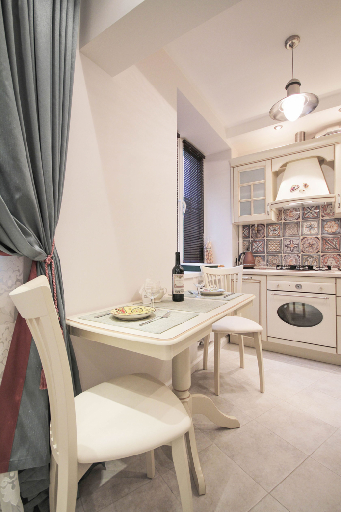
Compact corner set ivory color looks very elegant thanks to the shiny elements in the paneled facades, glass inserts, stand-out fittings. The interior is distinguished by the colorful decoration of the apron with patterned tiles, matching the color of the refrigerator.
Part of the ceiling above the working area is slightly lowered and equipped with lamps to illuminate it, and a suspension with an oval reflector serves for additional lighting of the dining area.
Considering small size of the kitchen in Khrushchev, the option of a dining table in the form of a console is chosen - with a wall mount and one leg.
Bedroom
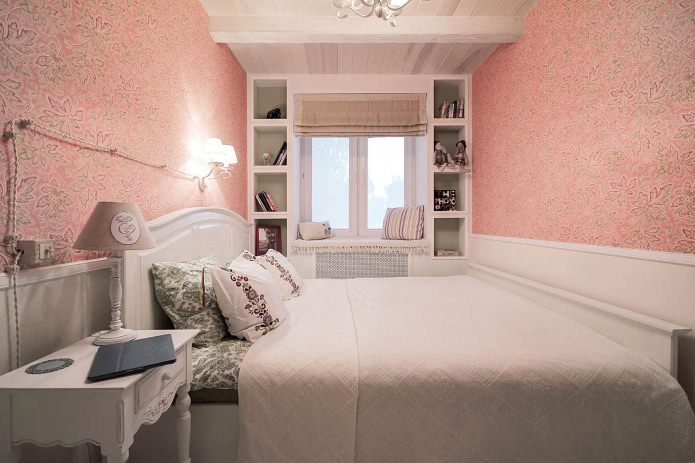
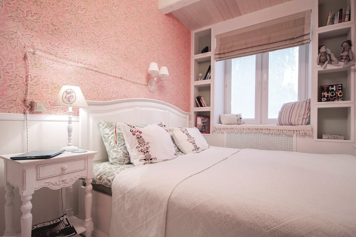
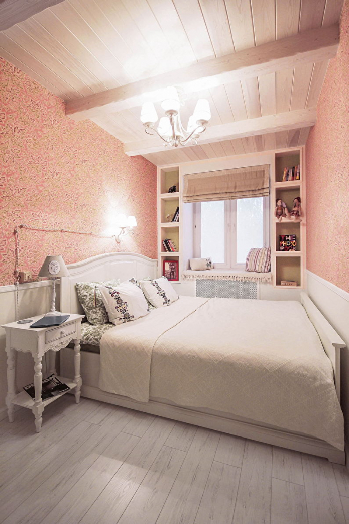
The interior of the bedroom is closest to rustic simplicity. Provence style... A wooden ceiling with beams, shelves around the perimeter of the window, pillows on the windowsill are the most interesting details of the cozy appearance of the room in Khrushchev.
Combined wall decoration with wallpaper and panels that extend to the window gives the bedroom a whole romantic look. For evening lighting it is used chandelier and a sconce, and a Roman blind serves to regulate the natural flow of light.
Bathroom
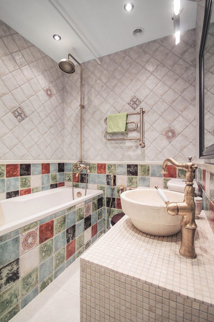
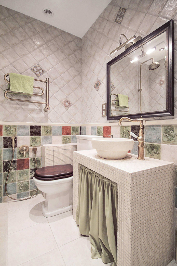
In the interior of Khrushchev, an unusual combination of two types of tiles was used to decorate the walls of the bathroom. In addition to a set of plumbing fixtures in a retro style, the room has a built-in wardrobe.

 10 practical tips for arranging a small kitchen in the country
 12 simple ideas for a small garden that will make it visually spacious

 Design project kopeck piece in brezhnevka
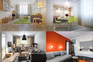 Modern design of a one-room apartment: 13 best projects
 How to equip the design of a small apartment: 14 best projects
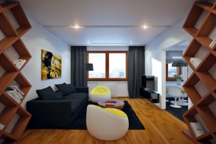 Interior design project of an apartment in a modern style
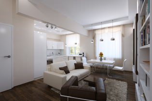 Design project of a 2-room apartment 60 sq. m.
 Design project of a 3-room apartment in a modern style