general information
Architects Dmitry and Daria Koloskovs worked on the design of the apartment. The living area is designed for one person or a married couple. The interior turned out to be comfortable and relevant at all times. Now it looks like a blank sheet, but over time it will acquire the characteristic features of the owners.
Layout
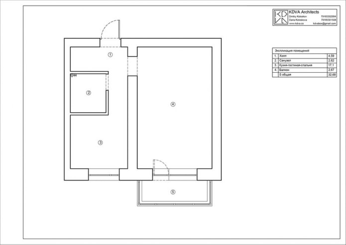
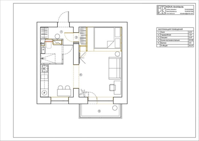
The area of the apartment is 33 sq.m. The height of the ceilings is standard - 2.7 m. The changes during the renovation can hardly be called redevelopment - only one opening was made in the load-bearing wall, connecting the living room-bedroom with the kitchen. Thanks to this solution, the one-room apartment has turned into a modern studio, but the space has been divided into clear functional zones.
Kitchen area
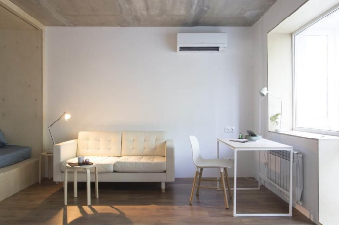
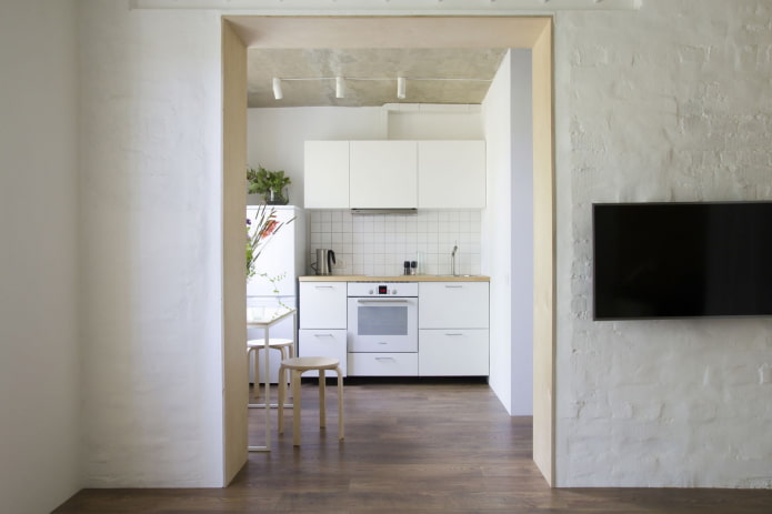
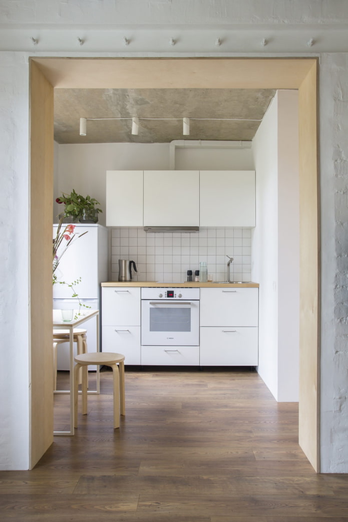
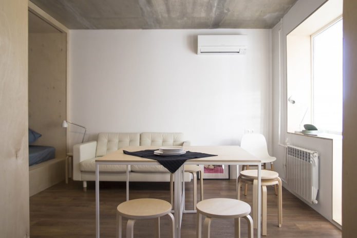
The whole atmosphere gives the impression of lightness, airiness, but at the same time austerity and brevity. Natural materials are used in the decoration - birch plywood, oak parquet, paint and plaster.
The ceiling in the kitchen was left concrete: its texture gives the space depth. The kitchen set from IKEA fits into the overall concept: white fronts, wood-like countertops, straight layout. The opening is decorated with plywood sheets, the end of which looks like a decorative element.
The project provides for two identical tables on a metal frame: to accommodate up to 8 guests in the kitchen, the structures must be moved together.
Living room-bedroom
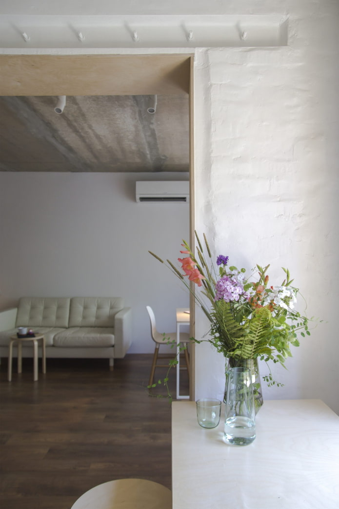
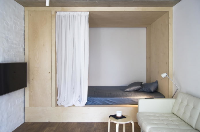
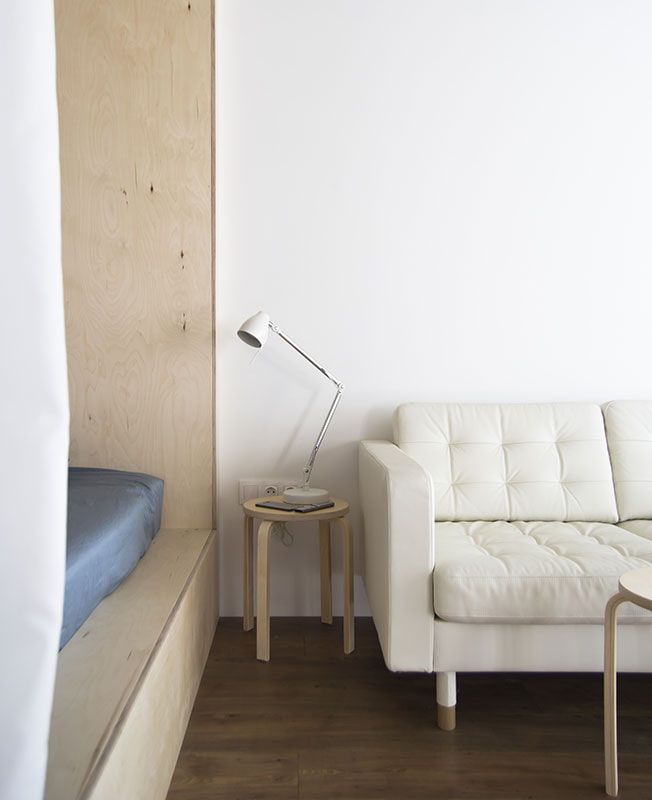
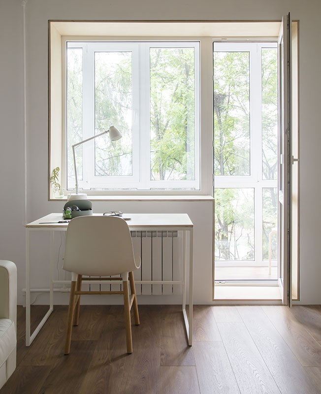
The plywood cube is custom made: it forms a double bed, a wardrobe and hidden storage boxes. The seating area is represented by a soft sofa and a TV on the wall, and a work desk is located opposite the window.
The walls are painted white. The second color used in the interior is a natural wood shade.
Corridor
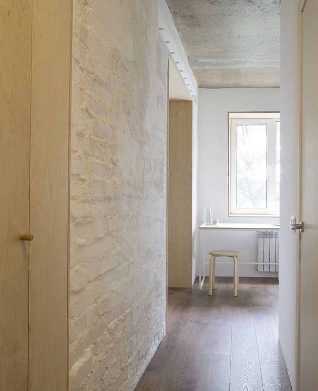
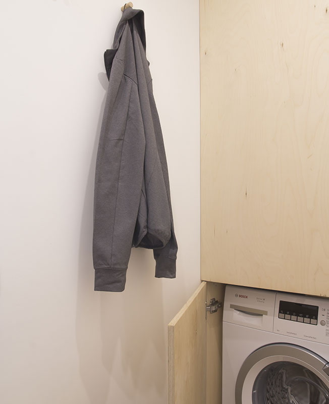
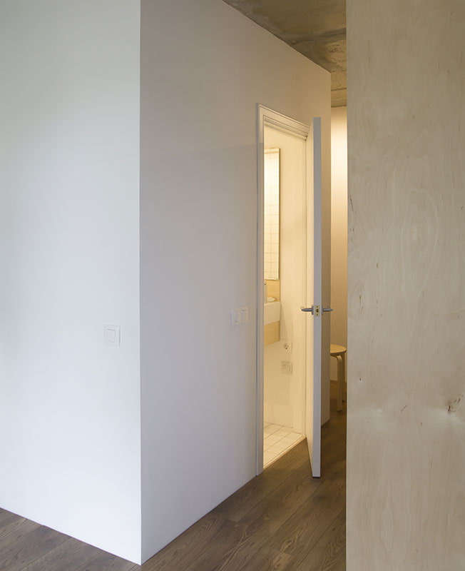
The plan shows how the designers have beaten the former doorway. Instead of the old door leading to the room, there were doors to the wardrobe. Also, a wardrobe was provided in the hallway, in which a washing machine and a water heater were placed.
The walls were partially plastered and painted, leaving the characteristic relief of the brickwork.
Bathroom
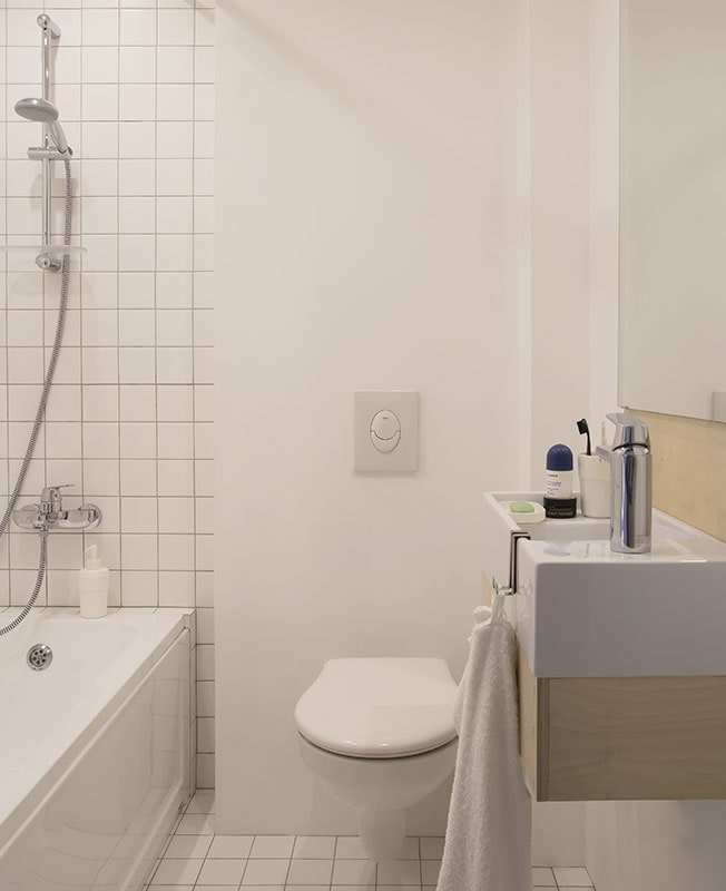
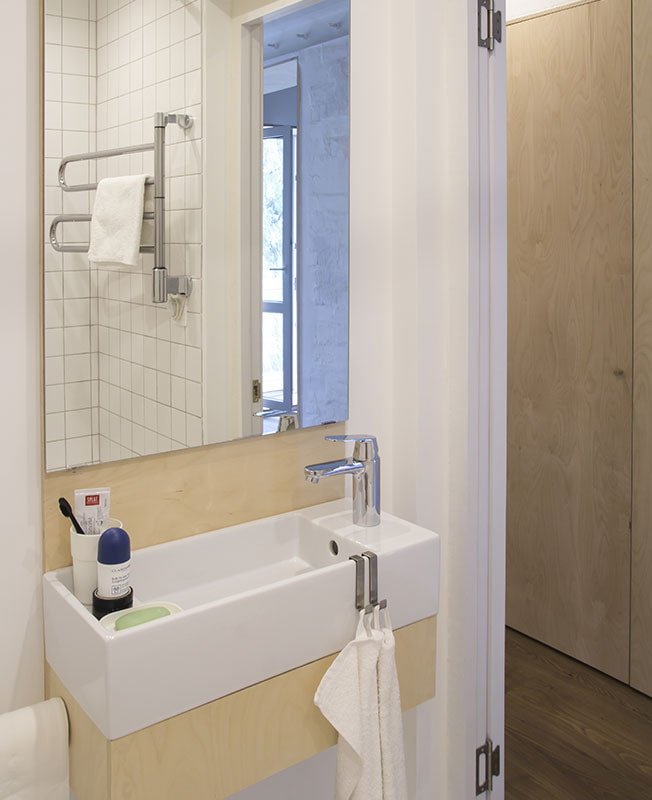
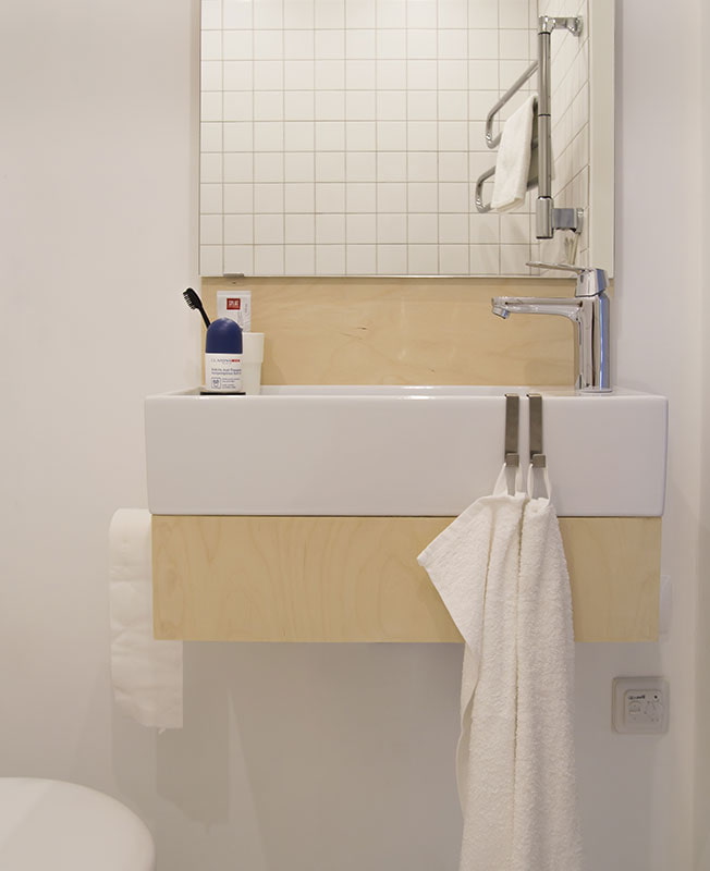
The bathroom, combined with a toilet, was decorated with Kerama Marazzi tiles. A wall-hung toilet with installation and a bespoke cabinet keep the interior laconic.
Despite the small area, the architects managed to create an interior that became an example of simplicity and absolute functionality.

 10 practical tips for arranging a small kitchen in the country
 12 simple ideas for a small garden that will make it visually spacious
 Design project kopeck piece in brezhnevka
 Modern design of a one-room apartment: 13 best projects
 How to equip the design of a small apartment: 14 best projects
 Interior design project of an apartment in a modern style
 Design project of a 2-room apartment 60 sq. m.
 Design project of a 3-room apartment in a modern style