Selection recommendations
Color combinations in the interior are both minimal and maximally contrasting. The color scheme is selected based on:
- Functional purpose of space... The color palette of the office, for example, will be radically different from the children's room.
- Personal preferences of residents... Some bright contrasting colors in the room seem cozy, others tend more towards shades. gray and other neutral palettes.
- Temperament of residents... All colors and their shades have their influence on psychology: some energize, others soothe. Choose the effect that is right for you.
Successful color combinations in the interior do not need to be invented from scratch. Colorists have long chosen and described color combinations in the interior, which can and should be used.
What schemes are there?
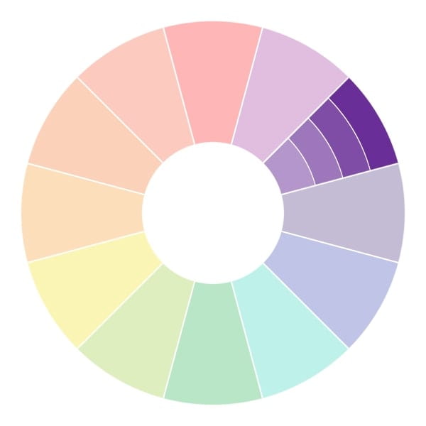
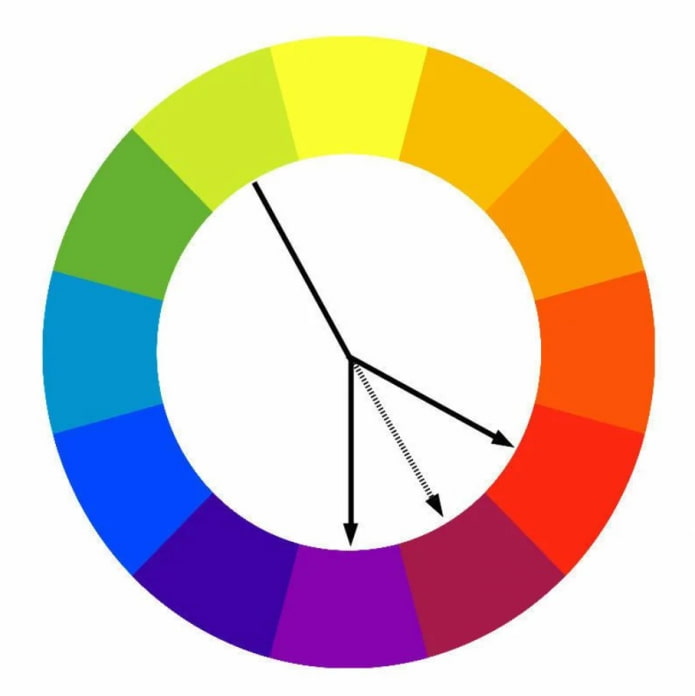
To understand the principles of color combinations, you need a color wheel and a little theory.
Before figuring out how best to combine colors, you need to understand the main differences between each one individually. Of everything exists 3 characteristics, the change of which leads to a change in color and its perception:
- Shade... Expresses the main name: green, blue, orange, white.
- Saturation... The "purer" the tone, the more saturation it has. In the case of yellow, for example, the most saturated will be lemon and canary, the least saturated shades - vanilla, straw, champagne. The criterion is influenced by the admixture of not only white, but also black: honey or mustard, for example, are also not considered saturated.
- Lightness or brightness... The indicator determines the closeness of the subtone to white. In the green range, light is considered mint, spring. The dark ones are khaki olive, coniferous, emerald.
When developing a combination, all 3 parameters should be taken into account, not just the shade. The easiest way is to choose tones that are the same in saturation and lightness: brown is combined with blue-black, and heavenly will look better in a pink frame.
Monochrome
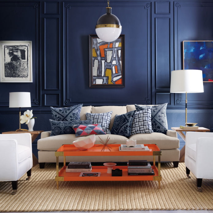
The easiest option available to everyone is to combine a color with shades from his own spectrum. For example, if the base is blue, then its companions will be tones from light cornflower blue, heavenly, to bright ultramarine, dark azure.
It is not necessary to combine the entire range from the lightest to almost black - it is enough to choose 3-4 tones. This is enough to create a dynamic, stylish interior.
There is no correct combination of colors in the interior: you can take shades close to each other (ruby + pomegranate), or as distant as possible from each other (vanilla + canary). In the first case, the difference will be almost imperceptible, in the second, it will be quite noticeable.
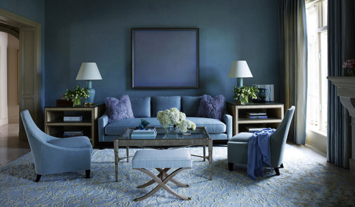
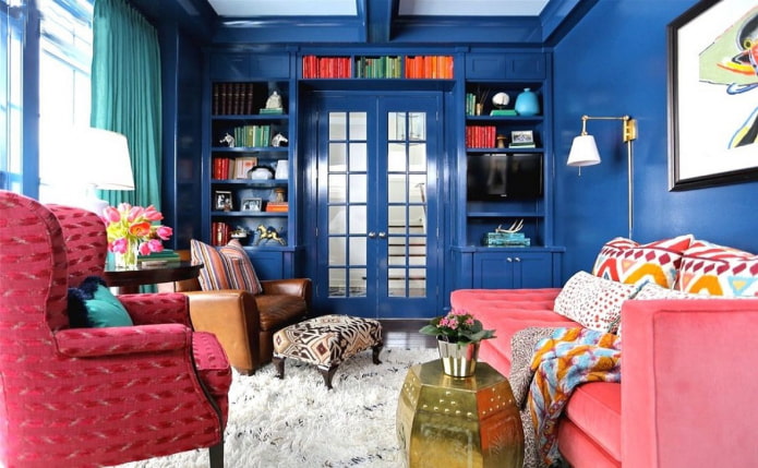
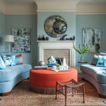
The photo shows an example of a living room in blue monochrome
Similar
Also has a second name - a harmonious combination of colors in the interior. This color scheme is based on two tones positioned to the side of each other.
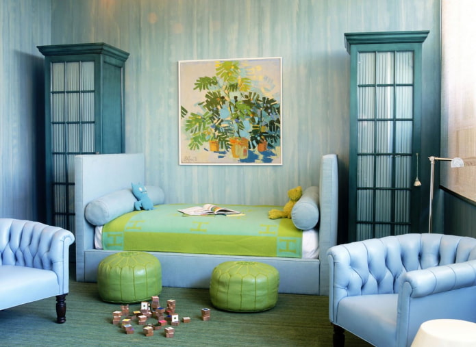
For example, lemon + orange, blue + turquoise. Such a duet looks richer in comparison with monochrome, but also more harmonious when compared with a contrasting scheme.
Due to the fact that such pairs are often found in nature, color combinations of similar tones in the interior are pleasing to the eye and do not cause irritation.
Complementary
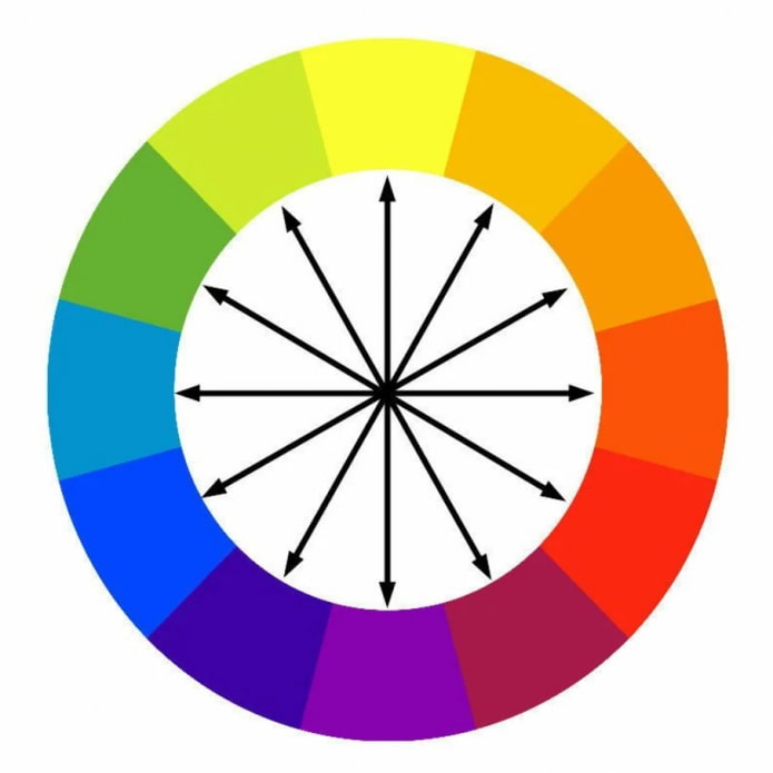
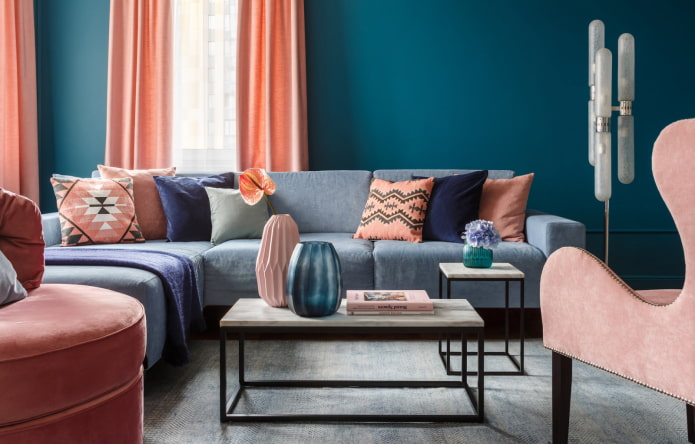
With the task of adding dynamics to the interior, reviving it and filling it with energy, contrasting pairs will do the best. In this case, one color on the Johannes Itten circle is combined with the opposite one.
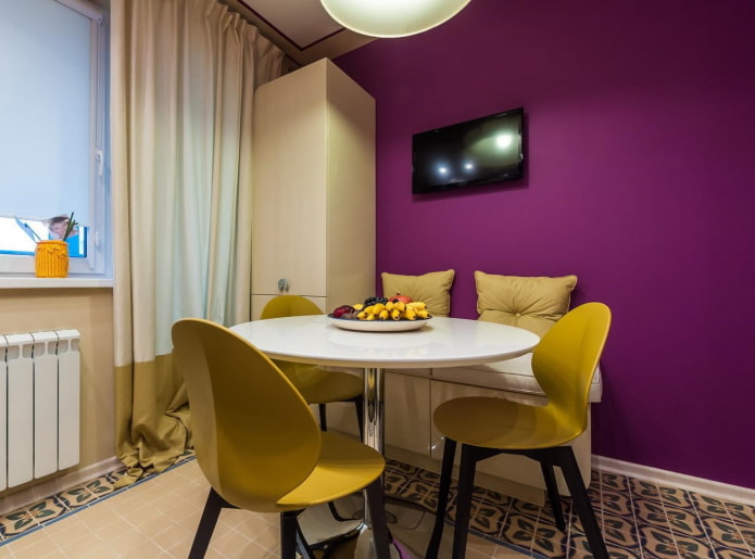
Example: scarlet + herbal, canary + purple, orange + azure. Keep in mind that the best color combinations in the interior are located in the same saturation plane. A rich red color needs the same bright green, and light lavender perfectly complements the champagne.
Such harmony is also close to nature: remember the sight of a flower field or a seashore.
Important! Polar combination of white and black is also considered complementary.
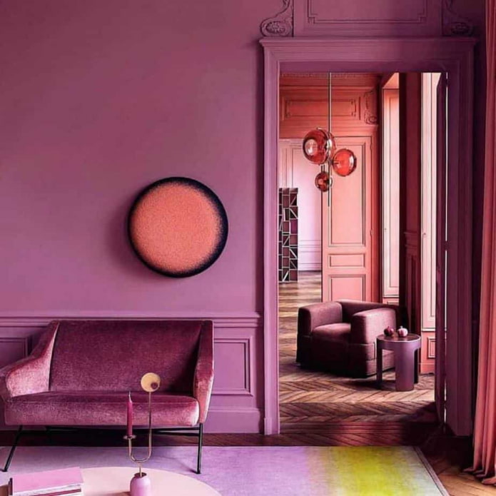
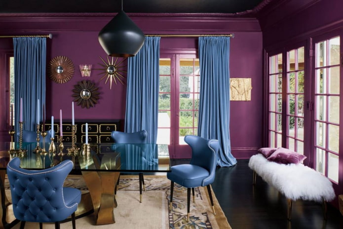
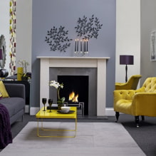
In the photo, a contrasting combination of yellow with pink-purple
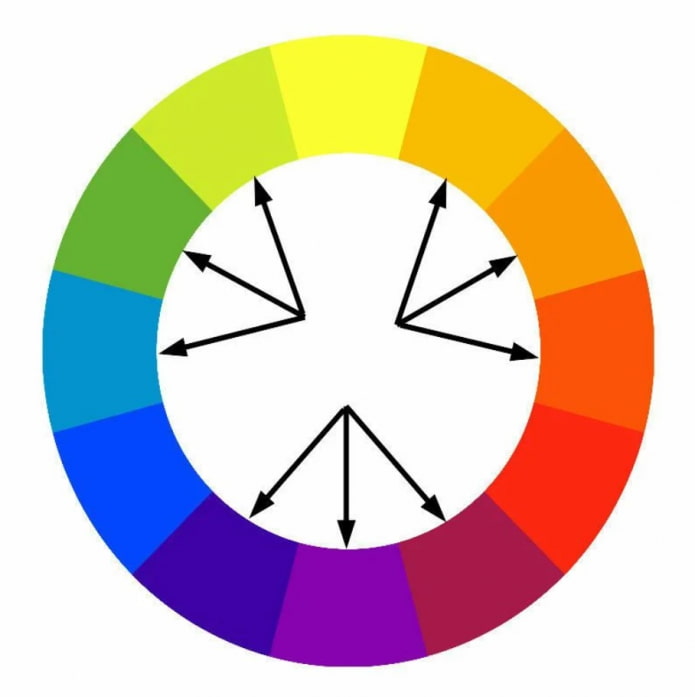
Triad
When implementing this idea of combining colors in the interior, not a duet, but a trio comes into play.
There are 2 options:
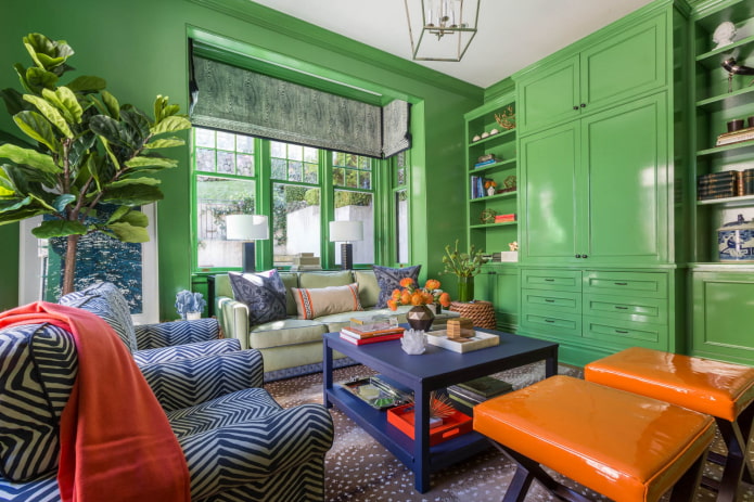
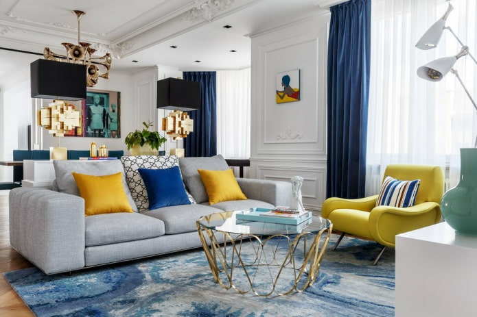
- Classical triad... Take three equally spaced shades (3 cells apart). Purple, salad, orange or heavenly, yellow, scarlet.
- Separate-complementary combination... The principle of complementarity is taken as a basis, but instead of one opposite, the chosen color is combined with the colors placed on the sides. Example: reddish purple, lemon, herbal.
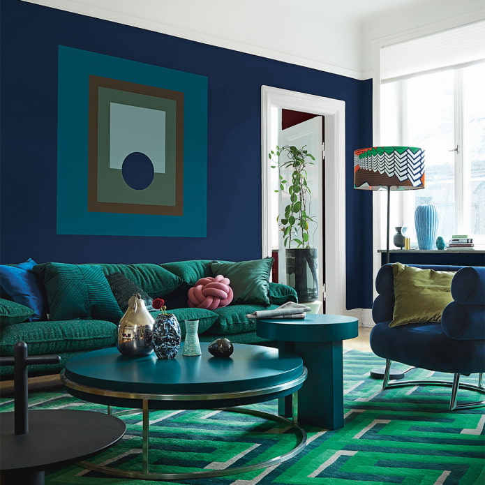
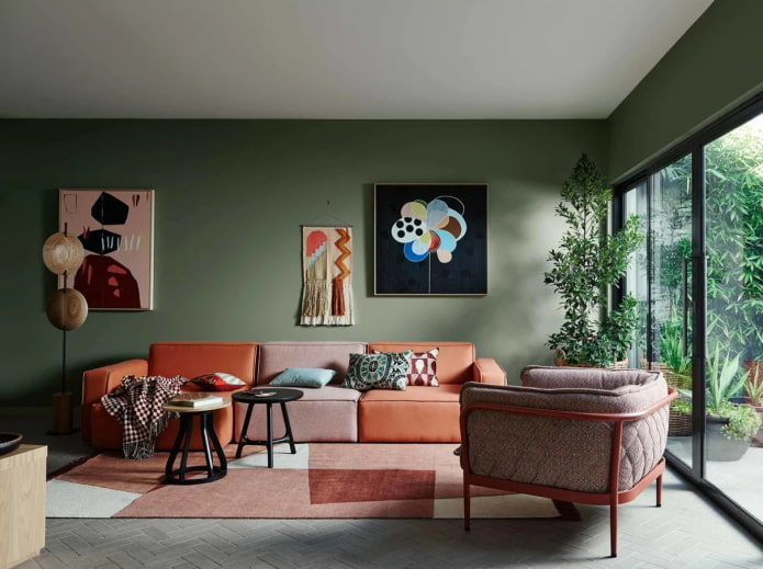
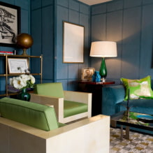
In the photo, green walls in alliance with blue-orange furniture
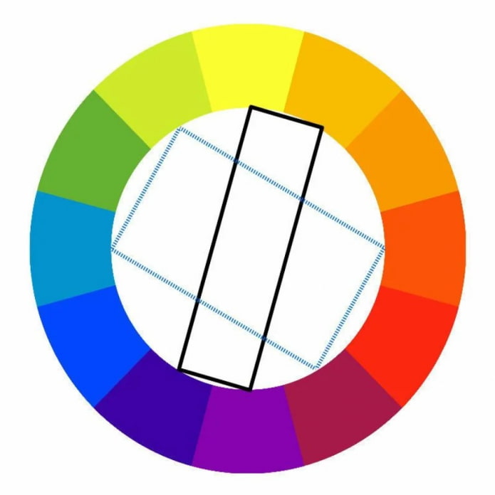
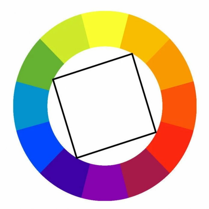
Rectangular
Tetrad - the most difficult version of the palette of color combinations in the interior. You need to connect 4 colors to each other, for this there are 2 ways:
- Classical tetrad (rectangle)... One shade acts as a base, two complement it, the latter is used to highlight small accents.
- Square. In fact, it is 2 complementary pairs. To avoid chaos, equal proportions should be observed, or one should be chosen as the leader, and the rest will act as accents.
Combination rules depending on the rooms
There are a great many options for combining colors in the interior: neutral and bright colors, cold and warm, light and dark, pastel and saturated. The choice of couples, trios or quartets primarily depends on the room being decorated.
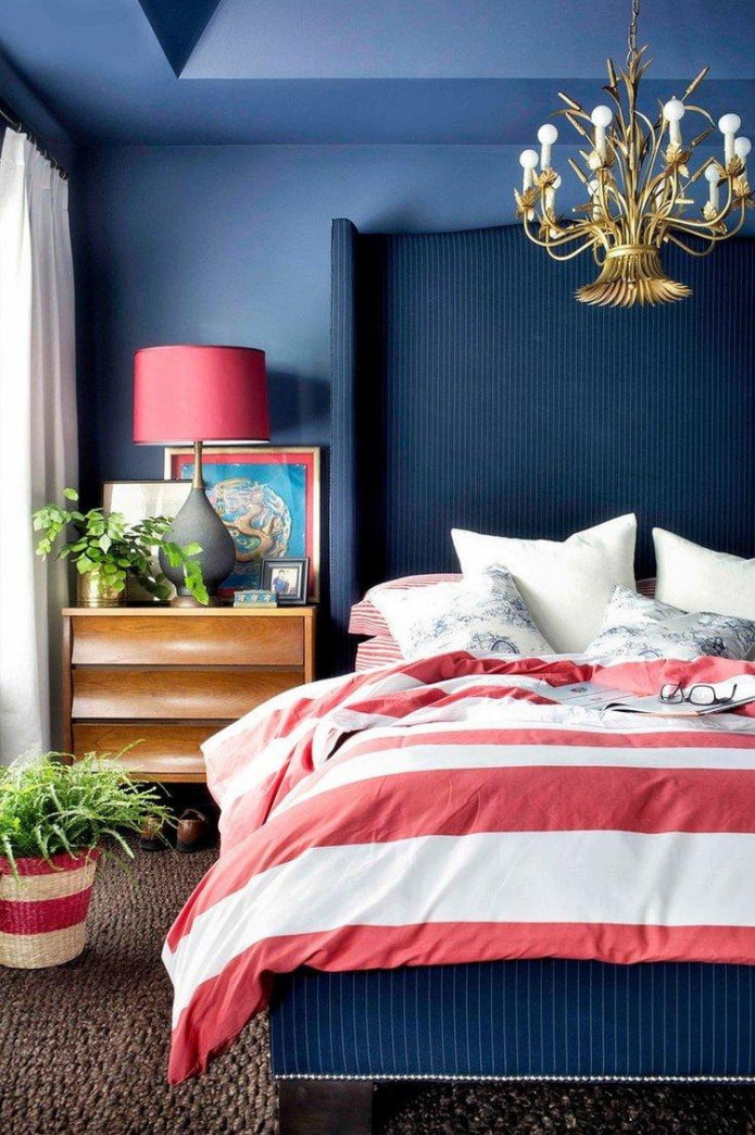
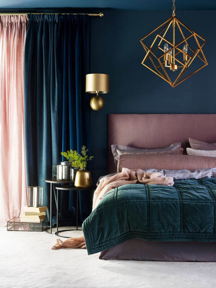
In the interior bedrooms, for example, you should give preference to more neutral colors: for example, you can make monochrome from Brown color... Or take a gentle pinkadding to it the opposite green - both shades perfectly relax, relieve stress.
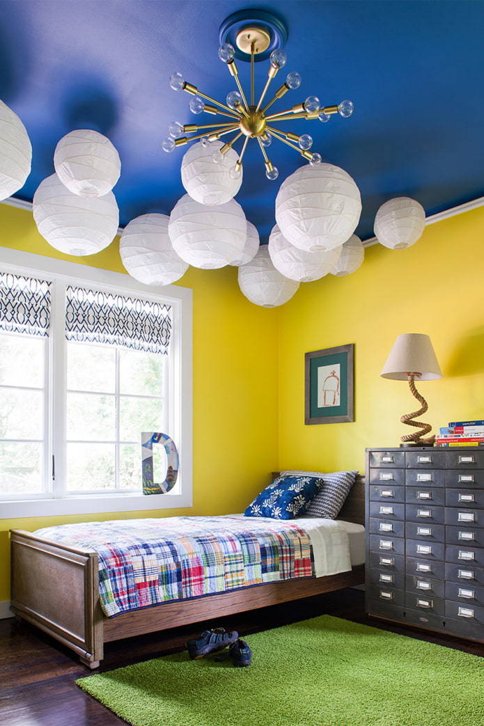
Registration children's the room primarily depends on the child himself living here. The calmer the baby, the brighter the background can be. And vice versa, the more active - the brighter and cooler you need to make the room. In the nursery, contrasting combinations work great, they energize and encourage creativity.
Selection of palette for bathroom - the process is individual. To relax here after work, choose a calming scheme, such as combining blue with gray. If the room is more often used for showering in the morning and setting the mood for the day, try the warm analog duo of yellow and orange.
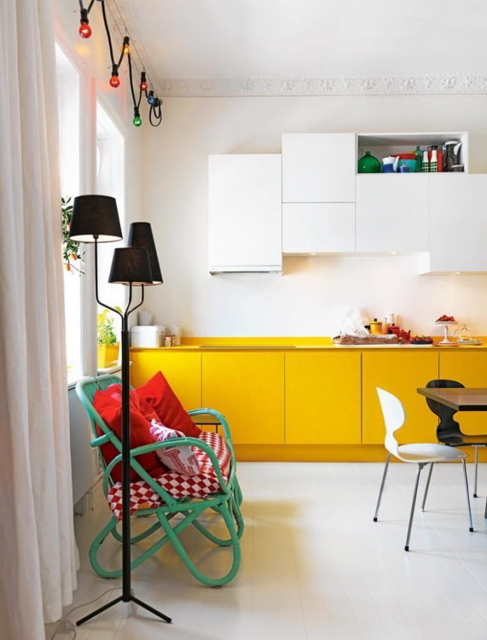
IN kitchen there is usually a lot of furniture and other items, so it is undesirable to use more than 2 tones here. If you are confident in your abilities, maximum 3. There are three standard solutions:
- Neutral walls, colored set + colored accents.
- Set in wall color + bright accents.
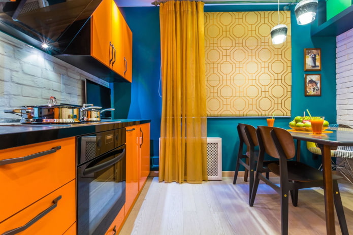
- Colored walls + colored headsets, shades to match the first or second.
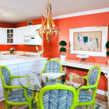
The photo shows a bright kitchen set and walls
Living room, unlike other rooms, it can be absolutely any. From light and neutral (for example, monochrome to beige color from floor to ceiling), to enchanting with bright contrasting accents. The main thing is that the room is comfortable: and what the walls, furniture, textiles and light will be like is up to you.
Combination table
Don't have time to select shades by color wheel? Use a simple table of color combinations in the interior. The first field indicates the base color, the second - options for completing it.
| Tone | Combination | Example |
| Blue | Snowy, ashy, ivory, pink, vanilla, scarlet, chocolate | 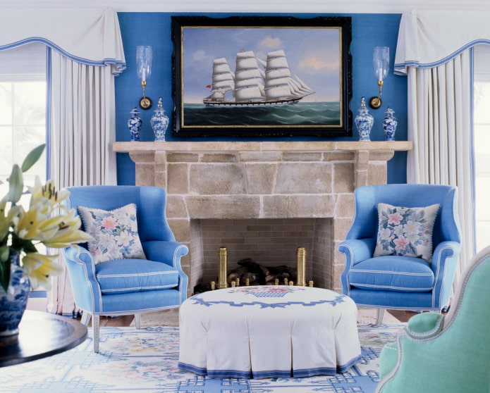 |
| Dark blue | Blue, emerald, graphite, coffee, red, tomato red | 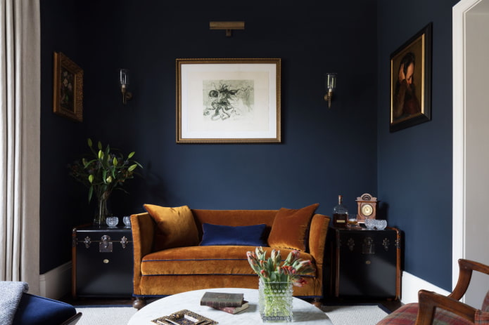 |
| Purple | Gold, canary, medium turquoise, mint, ginger | 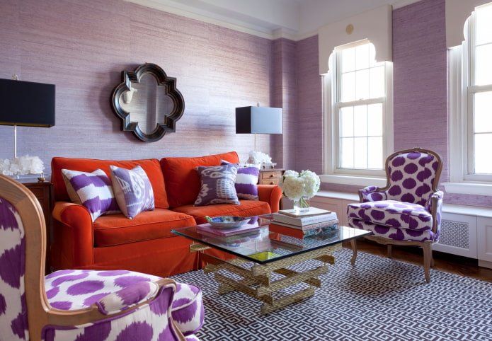 |
| Lilac | Olive, gainsborough, champagne, purple, ultra pink | 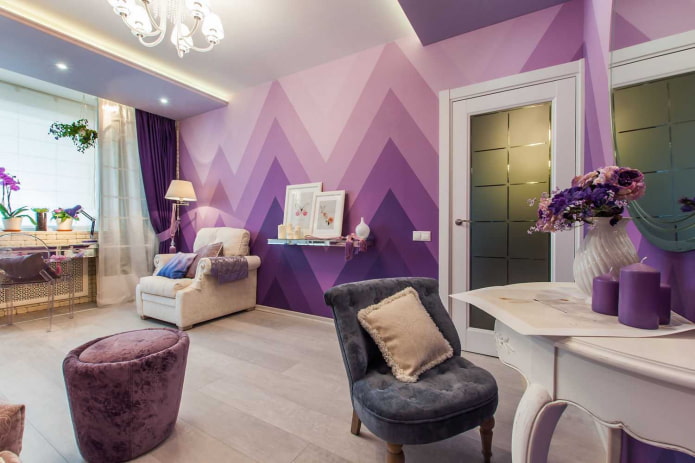 |
| Pink | Diamond, tiffany color, gainsborough, heavenly, olive | 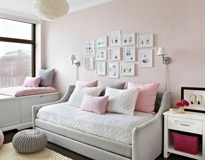 |
| Red | Snow white, charcoal, graphite, deep green, ultramarine | 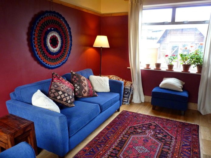 |
| Orange | Heavenly, dark blue, lilac, purple, yellow | 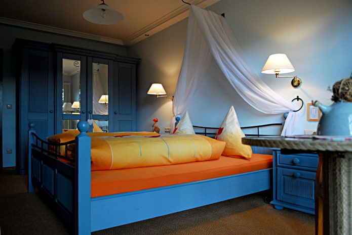 |
| Yellow | Azure, indigo, wet asphalt, black | 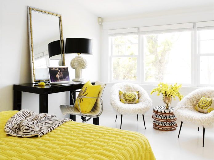 |
| Green | Chocolate, orange, warm shades of white, gray, beige | 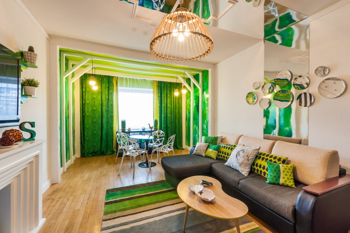 |
| Turquoise | Dark blue, cherry, purple, fuchsia, cream |
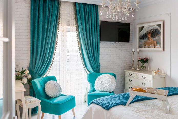 |
Separately, it should be said about neutral shades. They can be combined with any tones, but look best in the following combinations:
- The black: white, canary terracotta, scarlet, pink.
- White: ultramarine, blood red, black.
- Grey: scarlet, purple, pink, all shades of blue.
- Beige: white, brown, the black, Marsala, heavenly.
Beautiful examples in the interior
In addition to the pure shades themselves, there are many of their accents. In living quarters, bright, flashy tones, it is better to use dosed: in large quantities, they can strain and cause irritation.
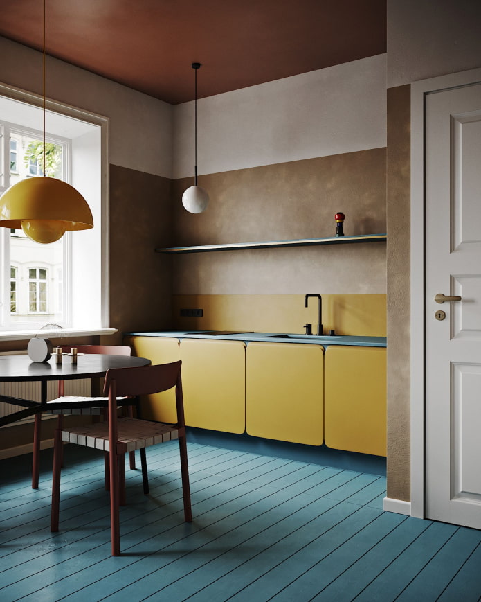
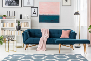
The impact on psychology is not the only thing to start from when choosing a palette. Another important nuance is the style of the interior. If a fusion advocates bright spots, then most modern trends, on the contrary, rely on a muted, even a little dusty palette. The basis of the range is made up of powdery pink, mustard, peach, gray-green, gray, denim.
Advice! The most harmonious design is obtained by mixing natural tones. Get inspired by your favorite views of nature and use cards with photos of your favorite places as a basis.
Natural combinations for example:
- Coast: yellow sand, azure sea, white foam, green palm.
- Poppy field: green leaves, red with black flowers.
- Peacock plumage: blue breast, turquoise feathers with brown spots.
- Autumn forest: yellow, orange, crimson leaves, green caps of conifers.
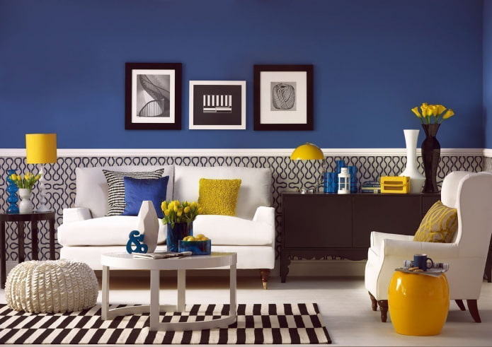
In the photo, a contrasting mixing of muted tones
Photo gallery
Do not be afraid to combine colors with each other: thanks to their combination, you can change the geometry of the room, increase its length or height, play with perception. The main thing is to do it competently and carefully: start with two colors, gradually adding additional ones to them.

 10 practical tips for arranging a small kitchen in the country
 12 simple ideas for a small garden that will make it visually spacious


 13 bad habits a good housewife shouldn't have
 24/7 home cleanliness - 4 secrets for the perfect housewife
 6 hotels in Sochi that will give odds to the promoted foreign hotels
 Top 10 interior design trends 2020
 Rating of cheap TVs with Smart-TV
 New Year's LED garlands on AliExpress - we disassemble while it's hot, so that it's bright at home