What should be considered when registering?
The walk-through living room differs from the usual hall primarily by two (or even three) doorways instead of one. The number of doors affects primarily ergonomics, arrangement of furniture: There is less room in the room to accommodate large objects such as a sofa.
Due to the large number of openings (at least 1 is added to one door + window) - they play an important role in the design of the walk-through living room. Everyone chooses the principle of their design for themselves.
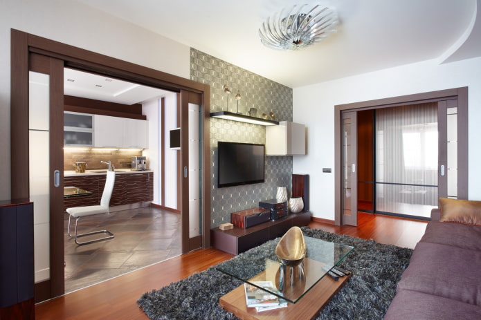
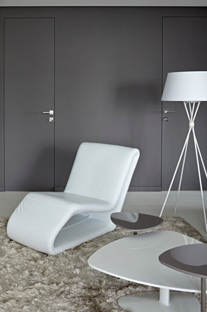
For example, doors are deliberately emphasized by choosing a wenge color for light walls, or contrasting for colored ones. Or they hide it: ready-made constructions of invisible doors are on sale, literally merging with the wall.
The first option in this case is better suited for large living rooms, the second - for tiny ones. Secret doors will not distract attention, visually divide the space.
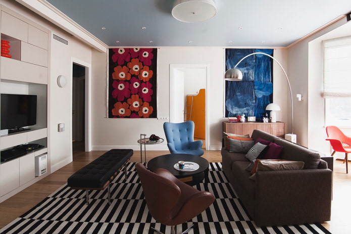
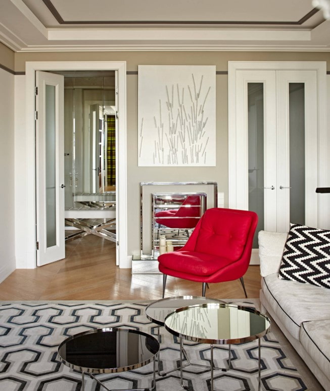
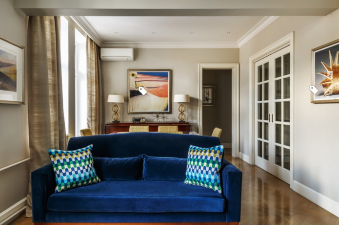
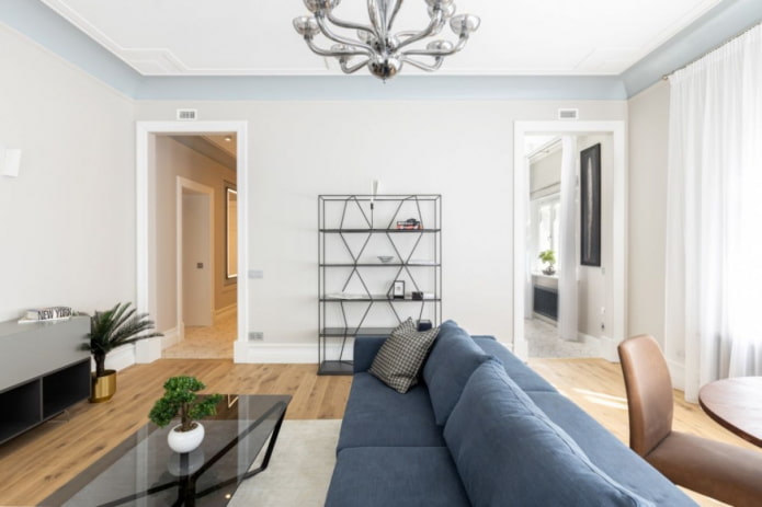
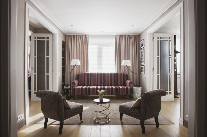
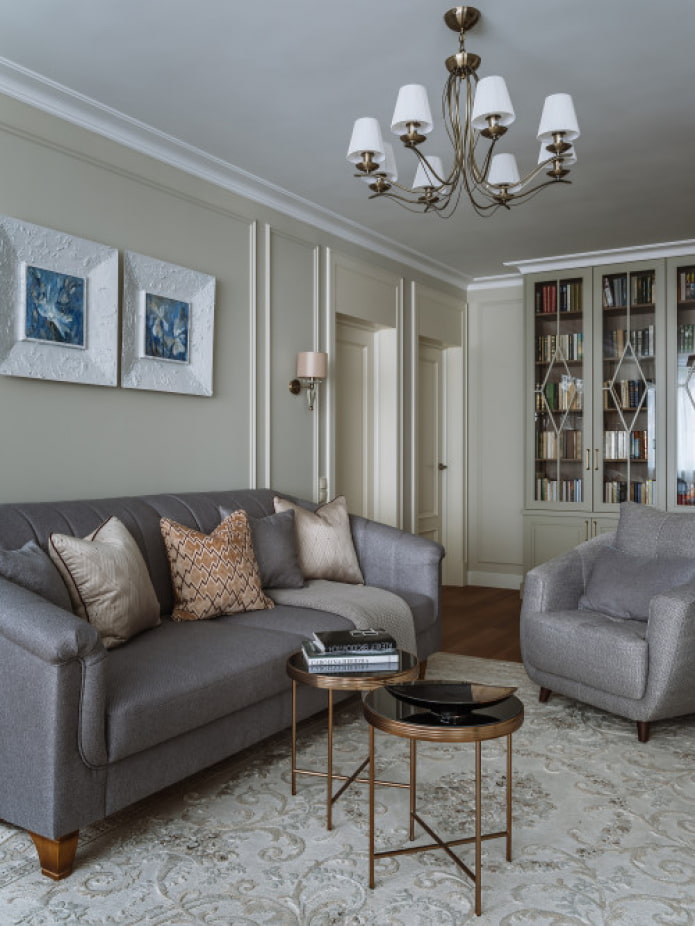
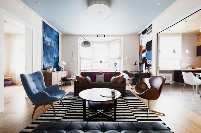
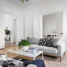
In the photo there is a sofa between parallel entrances
Since the entrances and exits affect the final layout, and the decoration of the windows, in turn, directly depends on the placement of furniture - we advise you to first draw up a clear plan of the room, only then choose a decor. That is, having placed a sofa or a desk under the window, you will have to abandon long curtains in favor of Roman curtains, blinds.
In the photo is a hall with high ceilings
Features of arrangement for the location of doors
To equip a walk-through room, you need to understand where, at what distance the doors are. There are 3 options in total.
Doors on one wall
Standard situation: the living room has 2 doors, one of which is the entrance to the hall, the second is a portal to the kitchen or to the adjoining bedroom. Layout advantages:
- 3 free walls remain, which significantly expands the possibilities of furnishing;
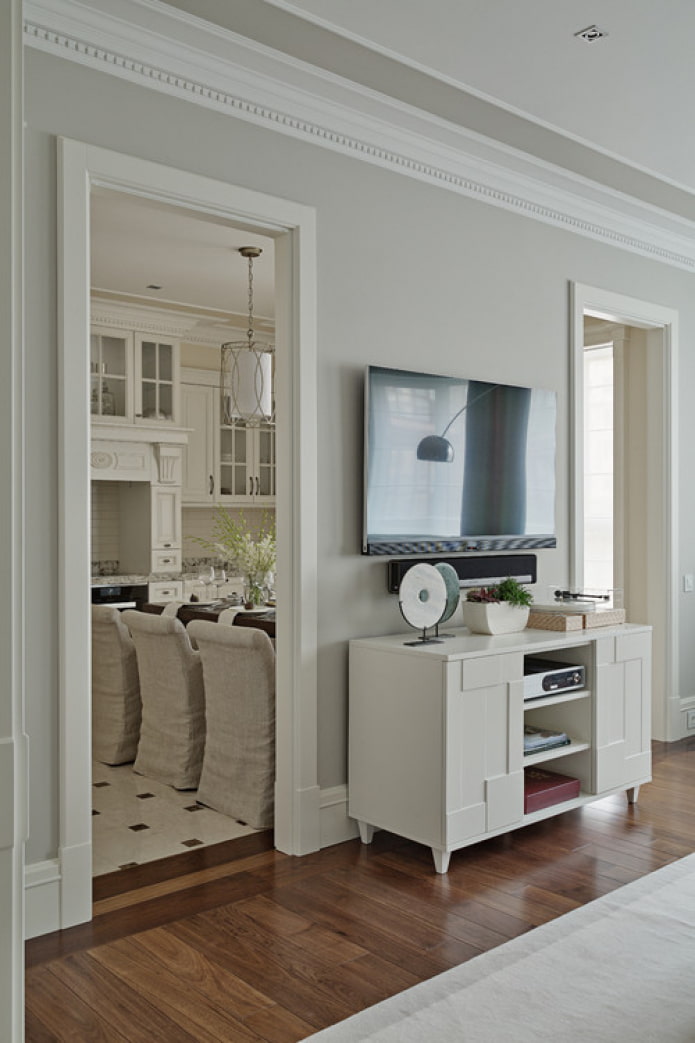
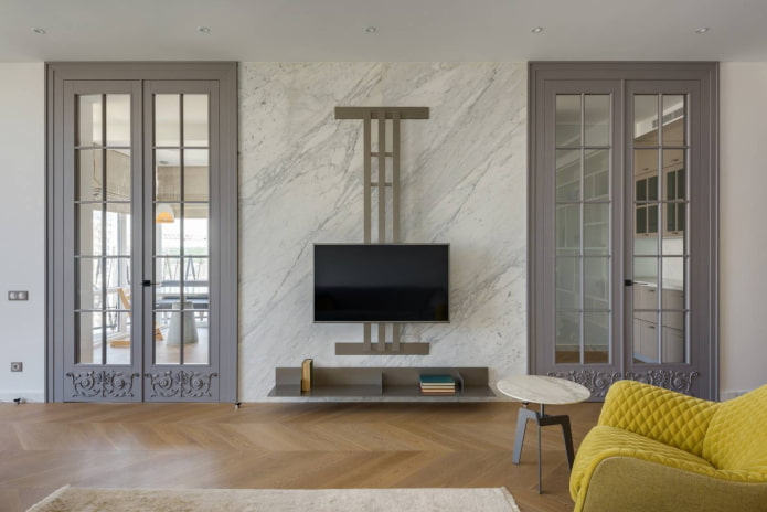
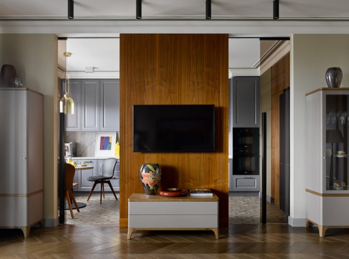
- the gap between the entrances is a great place to place a fireplace, TV, flat objects without using usable space.
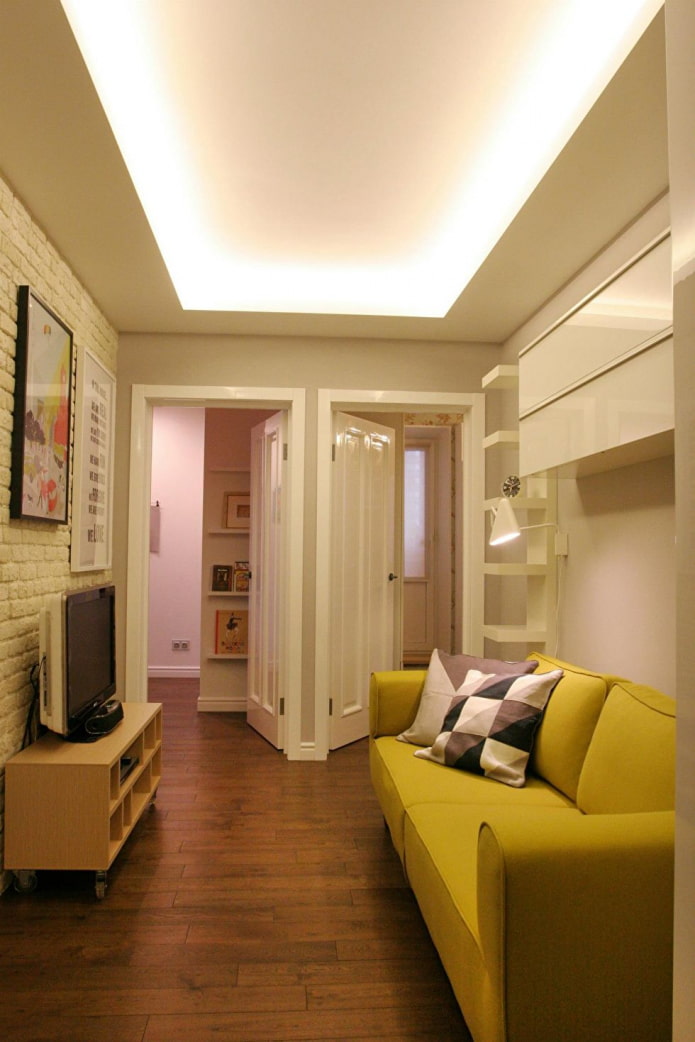
If there is a non-gasified kitchen behind one door, and a hallway behind the other, give up the paintings altogether, leaving only the boxes. Save room space by creating the effect of a large open space even in a small walk-through living room.
When one of the entrances leads to the bedroom, as is often the case in Khrushchev houses, you cannot refuse the door leaf.
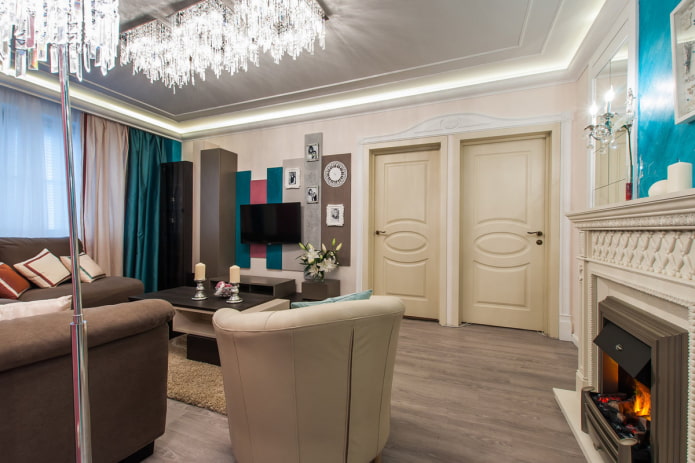
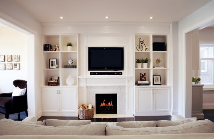
In the photo, a walk-through room with a fireplace
Doors on adjacent walls
You can be considered lucky if the openings of the passage room are cut close to each otheroccupy only one corner. It is not taken into account in the development of the design, decorating the free space as much as possible. floor vase or paintings on the wall.
When a little more spacethan for a vase, install an armchair with floor lampnail a shelf of books - a cozy reading area is ready.
Less ergonomic option - openings are cut in the center of the walls or in the far corners of adjacent partitions... To beat such a layout, use a diagonal zoning - they put a sofa in one corner, in the second they have any area - for work, reading, sports. Hang the TV on a bracket to a wall or ceiling.
Doors on opposite walls
Of great importance, again, is the location relative to each other. When doors are installed opposite on the far wall - the other 3 sides are used to arrange furniture. Place decor (paintings, tapestries) or a TV on the surface between the entrances.
Important! When installing a TV system between entrances, be prepared for the fact that family members can ply around the apartment, interfering with viewing.
Opposite openings in the center of the walls act as a natural zoning technique, dividing the walk-through living room in half. It remains to choose which side to place upholstered furniture with coffee table for meetings with friends, and with which - a work or dining area.
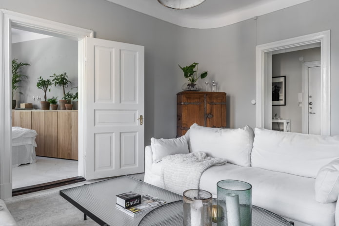
In the photo there is a passage hall without doors
Room zoning options
The design of a walk-through room in some cases involves its division into functional zones. In the living room, there is always an area for relaxation (sofa, TV area), the rest are added as needed: a desk, a dining room, a playroom for a child, a sports area for parents.
Thinking over the situation, the main thing to consider: objects should not interfere with comfortable movement between rooms. To understand where to leave the floor free, go into the hall from the corridor, go into the room - the shortest path must be taken into account in the arrangement of furniture.
IN living room with openings on opposite walls this path will become a dividing line (if it goes along a part of it, and not at the edge). In other cases, you will at least understand what space of the room remains free, you will be able to arrange pieces of furniture, based on the existing knowledge.
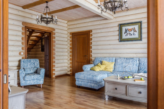
Pictured is a living room in a private house
How to arrange furniture?
The walk-through living room should not be cluttered, especially for small rooms: therefore, choose multifunctional products. For example, a transforming table instead of a coffee, folding dining table for guests. Or modular sofa, instead of a set of upholstered furniture.
The arrangement for the passage rooms is selected privately: the main thing is that the final picture looks harmonious, no detail interfered with free movement.
Design ideas
Having a walk-through room in the house does not need to despair! Use some helpful design tips to play with this feature:
- Give preference sliding or folding structures - they require less free space than undershirts.
- Build around the entrance cupboard... Store anything in the side sections, on the mezzanine, from books to clothes.
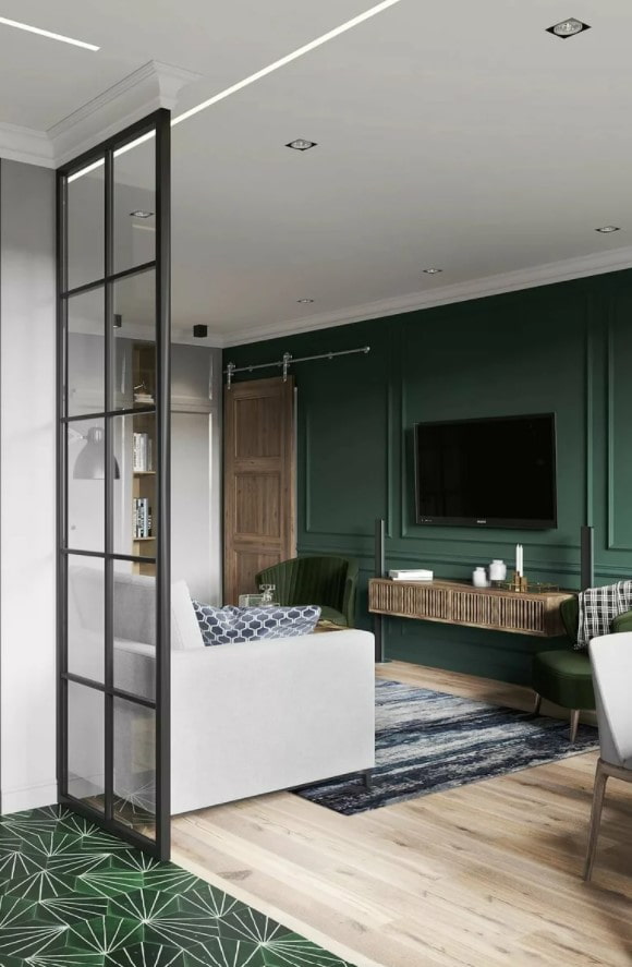
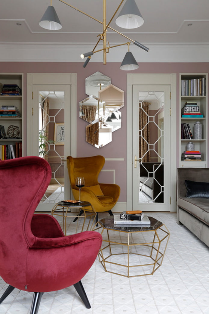
- Choose canvases with glass inserts for small living rooms... They look lighter, more airy than the deaf.
- Buy doors in the color of the walls or make a secret structure so as not to spoil the decor of the room.
Arranging a walk-through room is not an easy task. Follow our tried and tested tips to create a smart design!

 10 practical tips for arranging a small kitchen in the country
 12 simple ideas for a small garden that will make it visually spacious
 Choosing the best style of living room interior: 88 photos and ideas
 Curtains in the living room: 70 stylish photo ideas in the interior
 Wall decoration in the living room: choice of colors, finishes, accent wall in the interior
 White and black and white wallpapers in the living room: 55 photos in the interior
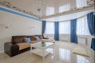 Stretch ceilings in the living room: views, design, lighting, 60 photos in the interior
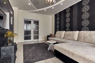 Wallpaper in the living room interior: 60 modern design options