Features of blue color
Each person presents his own picture of color: this is due to the fact that there are a great many shades of blue.
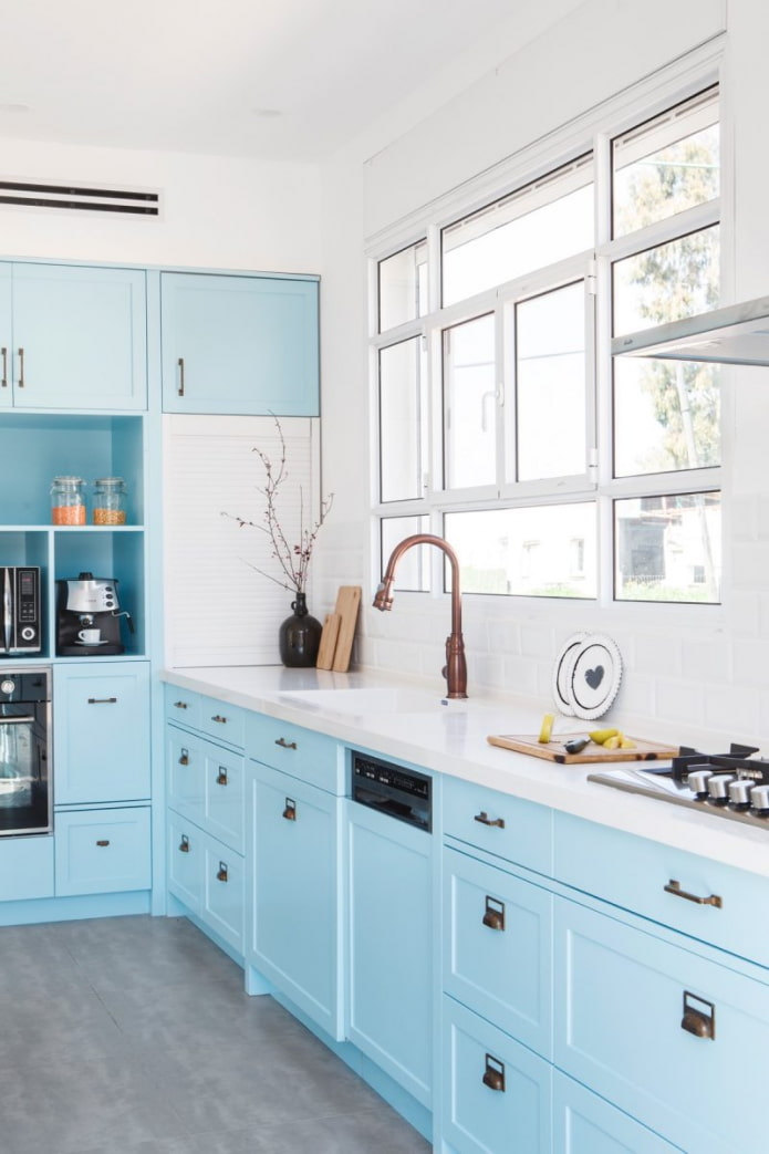
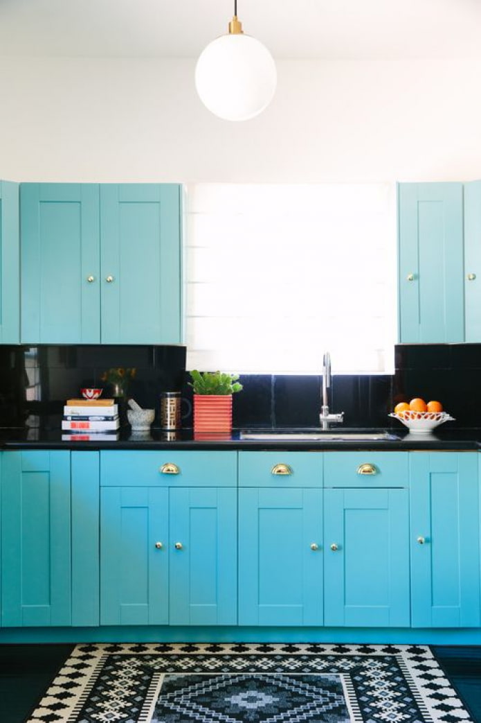
- If you strive for a pale blue kitchen, take a closer look at the heavenly, icy, cornflower blue, heavenly, turquoise.
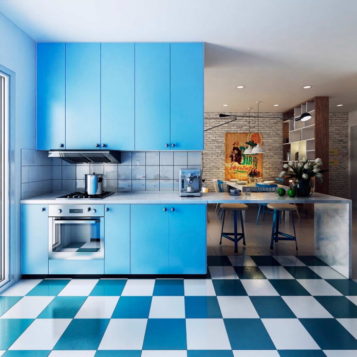
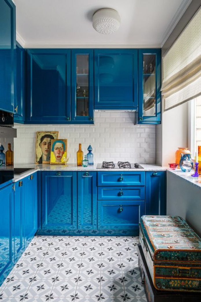
- Bright blue cuisine is obtained from aquamarine, azure, cobalt, sea wave.
The use of any color in the interior will help to achieve a feeling of coolness, spaciousness, and relaxation.
- The azure color tones, reduces pressure, soothes and even increases efficiency. In addition, it does not increase appetite, but even slightly lowers it, which is a bonus of blue cuisine.
It should be borne in mind that pastel shades of blue slow down a little, so they are not recommended for overly active people who need speed. However, if you dilute them with energetic tones (yellow, red, orange), the effect is leveled and the interior of the blue kitchen, on the contrary, will charge.
What colors go well with blue?
The blue kitchen in the interior looks different not only because of the main shade, but also additional ones. Next, we will find out what to combine blue with in order to get the perfect picture.
Beige and blue kitchen
Blue kitchens can look too cold, especially if they are facing west or north. To avoid lethargy in your design, dilute the foundation with a warm, neutral shade.
Despite the difference, beige goes well with pale blue, leveling its negative characteristics.
In the photo, beige shades in furniture and appliances
White and blue kitchen
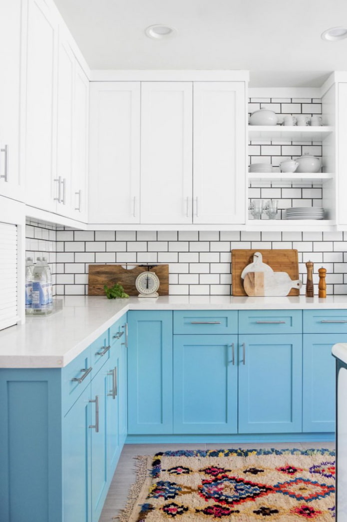
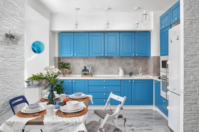
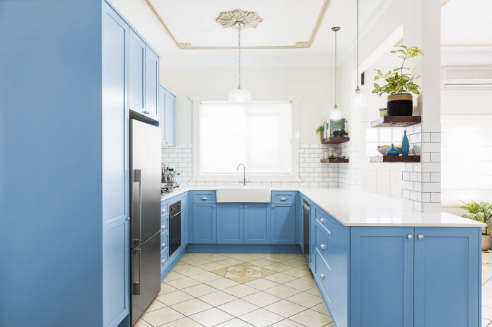
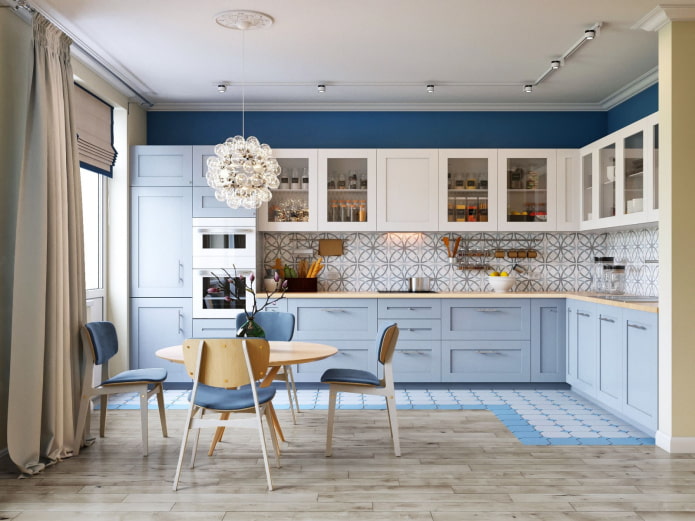
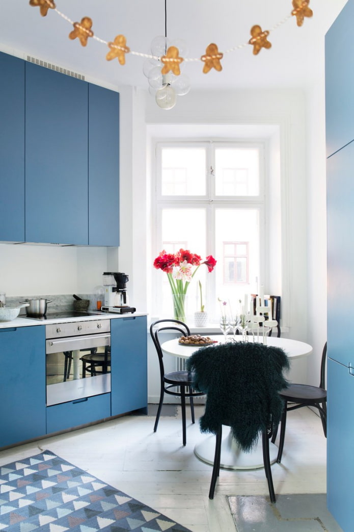
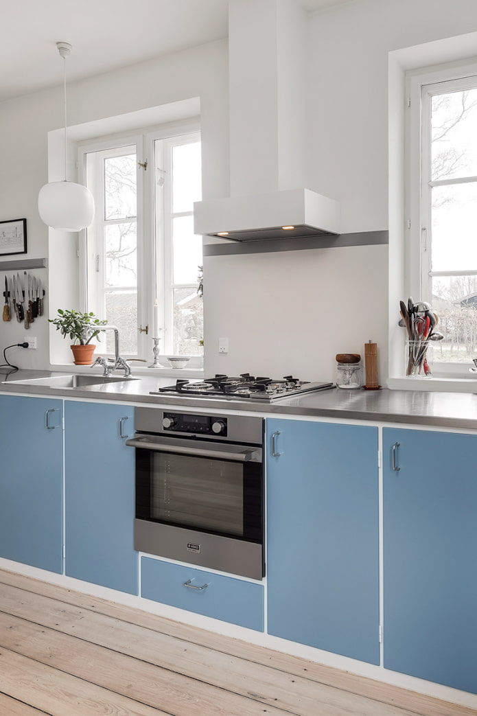
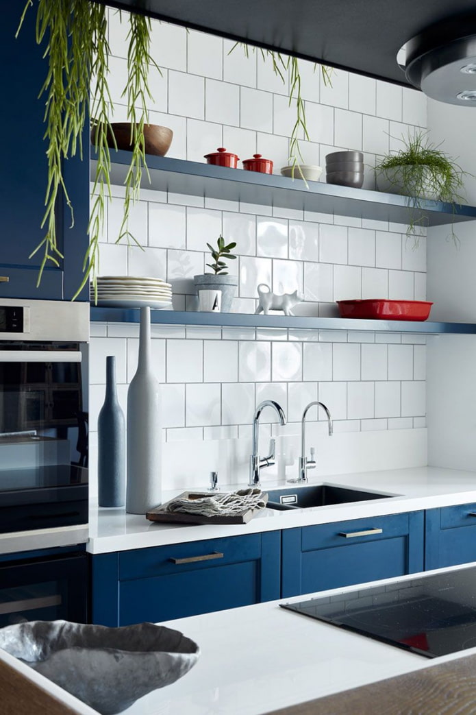
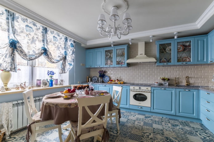
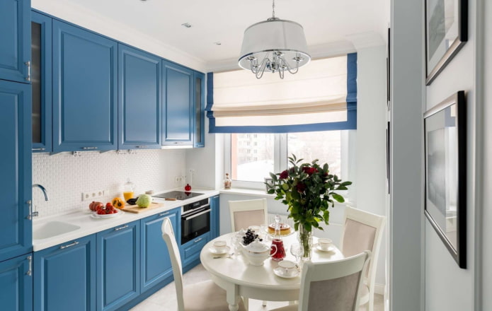
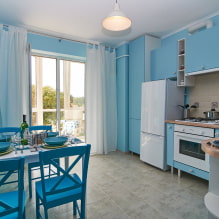
The combination of blue and white is the most classic possible. It is quite contrasting and fresh, so it will be an excellent option for a blue southern cuisine. There will be a lot of light in the room, but at the same time the desired coolness will remain.
Gray-blue interior
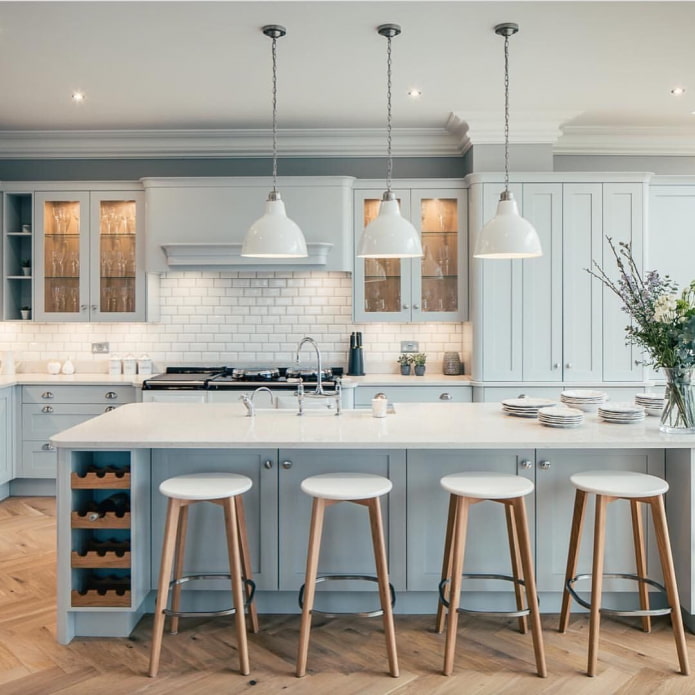
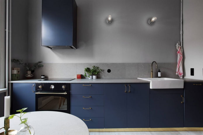
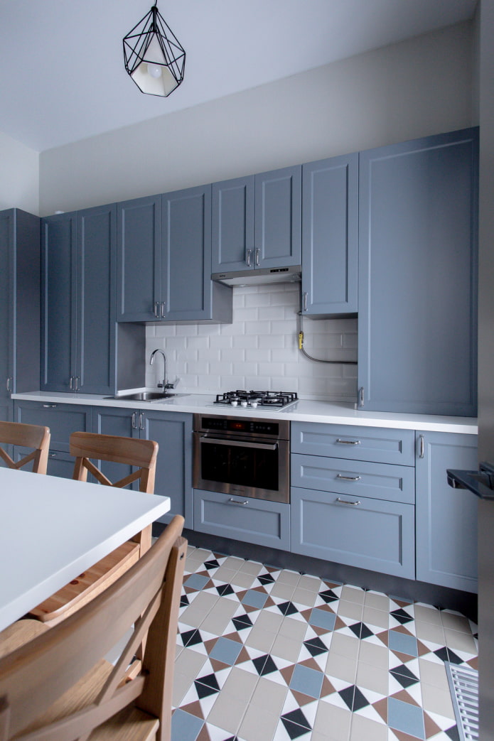
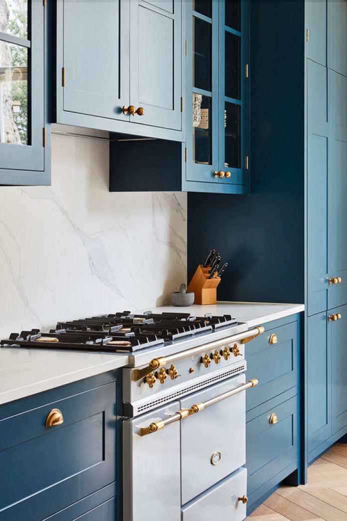
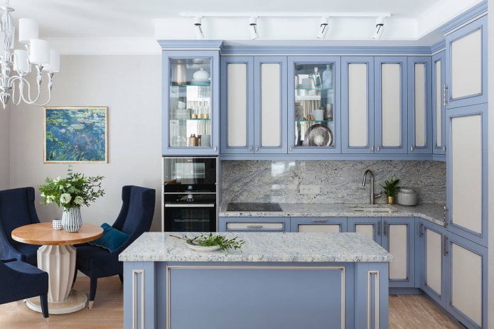
The ash-gray combination looks strict and restrained, the contrast of the combination is much lower than that of the symbiosis with white. To make blue-gray kitchens look harmonious, follow the rule: the lighter the blue, the darker the gray should be.
In the photo there is an apron in the color of the countertop
Blue-blue interior
A monochrome kitchen in blue tones is not suitable for everyone: an abundance of blue can overly affect the nervous system and cause apathy. But if you are constantly stressed and need maximum relaxation at home, then this combination will play into your hands.
In the photo there is a dark blue wall behind the furniture
Blue with bright accents
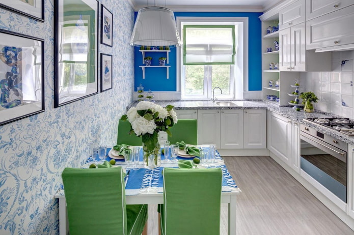
Bright colors in a light blue kitchen will relieve her melancholic mood and breathe life into the interior. It is often used in combination with green, but given the soothing relaxation of both, you should not count on a boost of vivacity every time you enter the kitchen space.
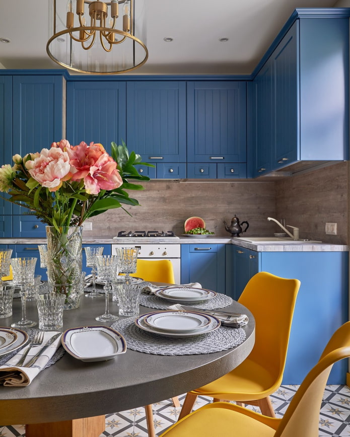
Yellow is another matter. The color of the sun and sky, sand and sea - such a union is dictated by nature itself! Heavenly extinguishes yellow a little and at the same time charges from it.
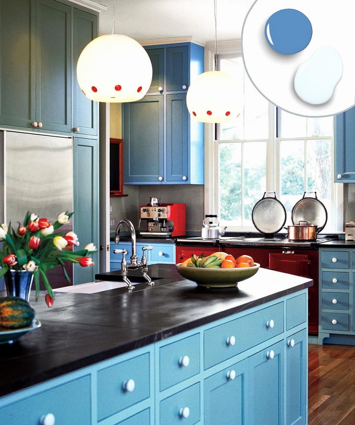
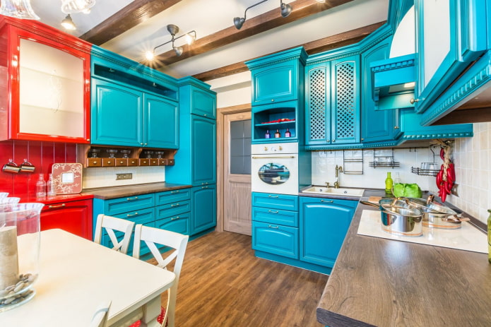
Active red also often used as a complement to blue kitchen designs. Thanks to the balancing action of the second, red does not turn into aggression, remaining just energetic and bright.
Advice! If red seems too contrasting to you, replace it with orange: it has the best features of yellow and red together.
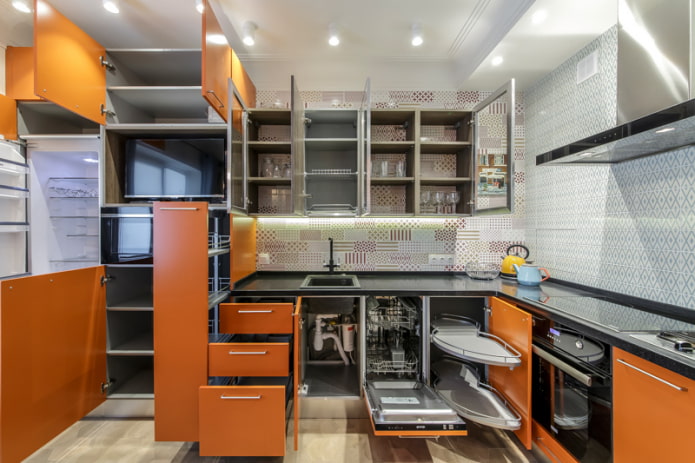
The photo shows a two-tone headset with bright modules
Renovation and finishing
The classic color of the ceiling is white. And the kitchen with blue facades is no exception. It is best to make a matte finish in a cold shade, with the exception of small rooms. They will visually increase the glossy tension cloth.
Vertical surfaces in a blue kitchen can be of two types:
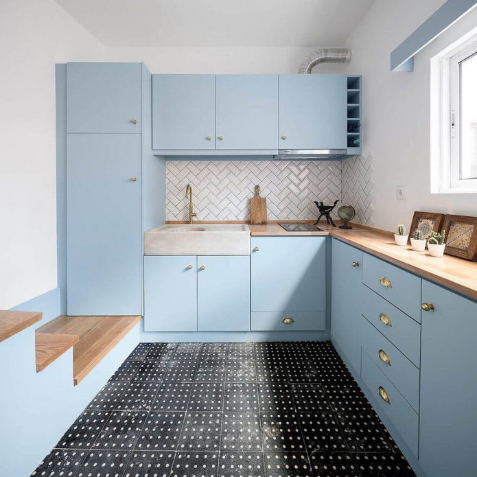
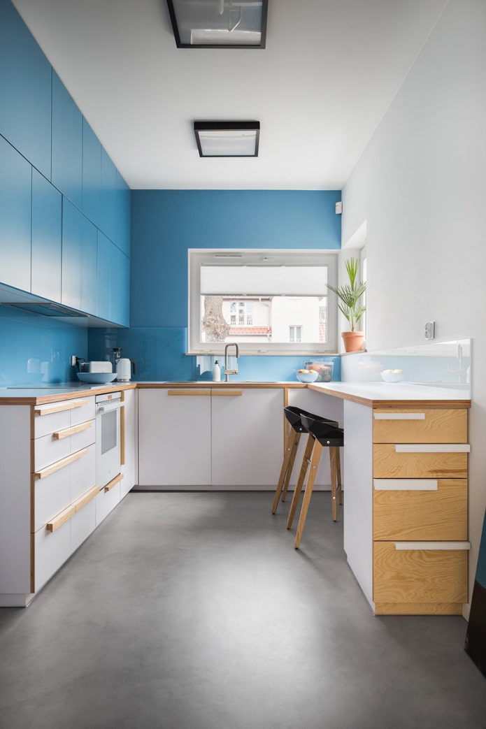
- Match the headset... Then the furniture will literally merge with the background and "dissolve" in it. This is a great solution for small kitchenwhere you need to hide bulky cabinets.
- Any other color... Basically, light colors are chosen as a background - white, gray, beige.
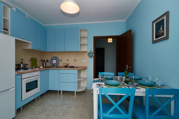
Blue walls in the kitchen combined with a white set will also create a cool mood. As for materials, choose based on practicality: washable wallpaper, paint, tiles.
The design of the floor should be approached with all seriousness: for the kitchen you need the most non-marking coating. Modern blue kitchens are in perfect harmony with monochromatic tiles, imitation of a tree (linoleum, laminate), PVC tiles with imitation stone.
Options apron also a few:
- Neutral... Performed to match the countertop or walls, for example white hog under white walls, coupled with blue doors, will look stylish.
- Accent... When choosing an active color scheme, do not forget about an apron: it alone can significantly change the entire design. For example, a yellow apron does not require support in the decor and completely changes the overall mood.
A kitchen with a blue backsplash is an option for minimalists who want to add a cool shade to their white or gray headset.
Selection of furniture and appliances
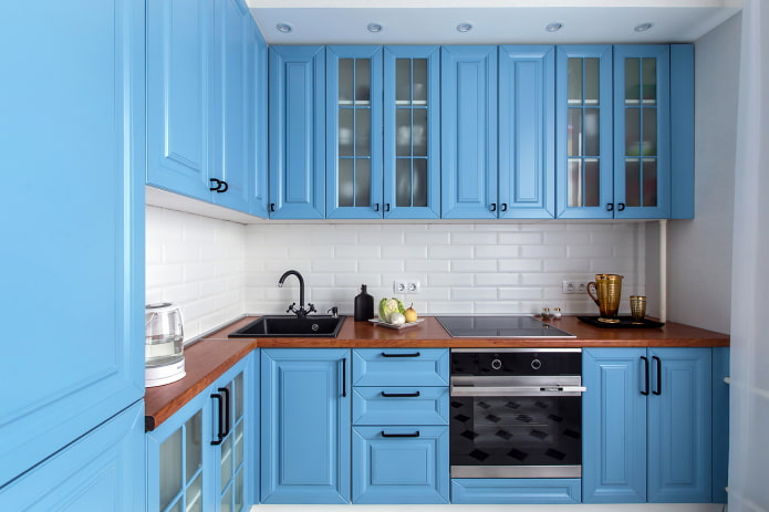
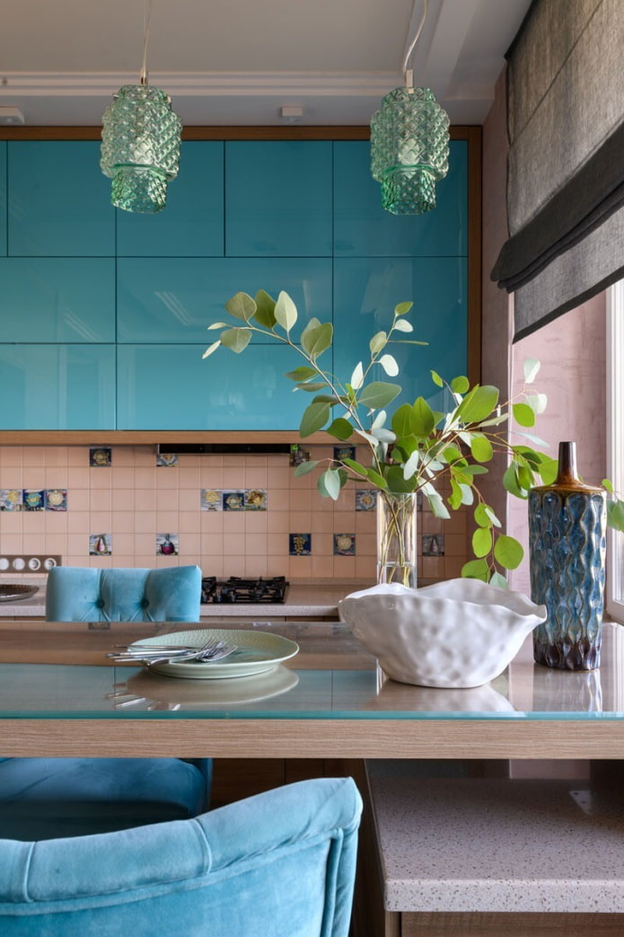
The main point when choosing kitchen furniture is facades... Blue gloss perfectly reflects light, visually expands the space. The matte smooth surface looks ultra-modern, but needs special care. Smooth, straight fronts are easy to maintain, milling and other decorations take time and effort to clean.
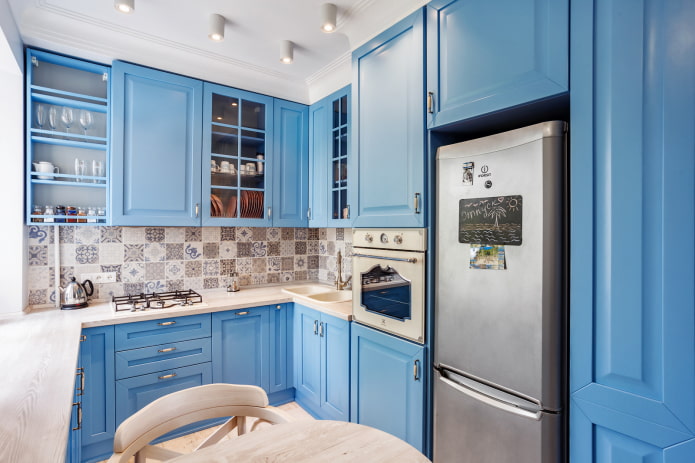
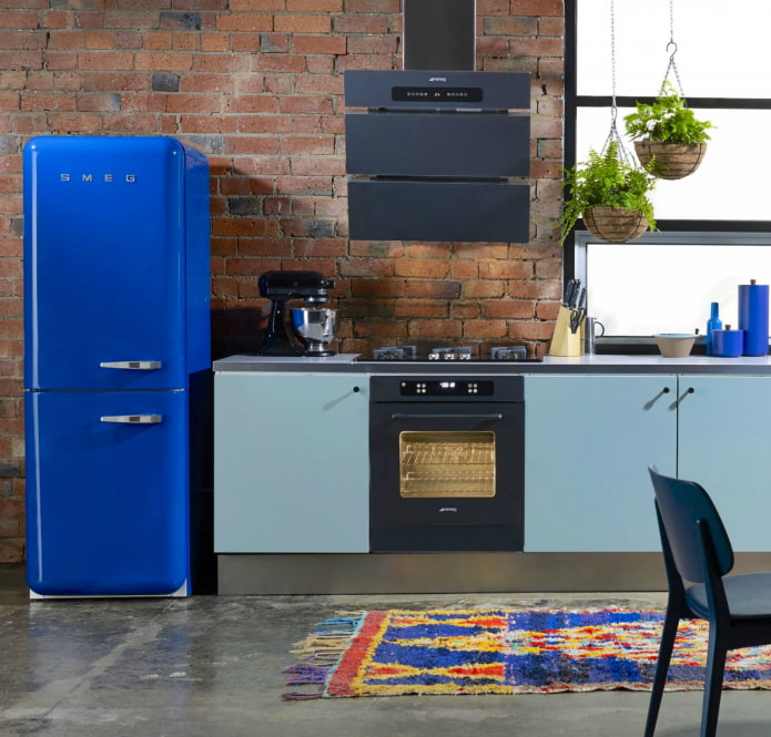
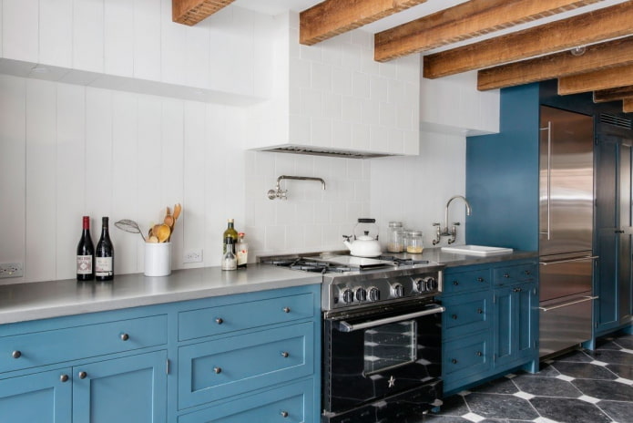
If the interior design of a blue kitchen is already overflowing with the main color, choose neutral household appliances: black will complement the modern style, white is suitable for scandi, cream will fit into the classics, steel will complement high-tech design.
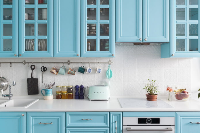
In a kitchen with blue accents, small appliances will be an excellent addition: a kettle, toaster, mixer of the desired shade is not difficult to find.
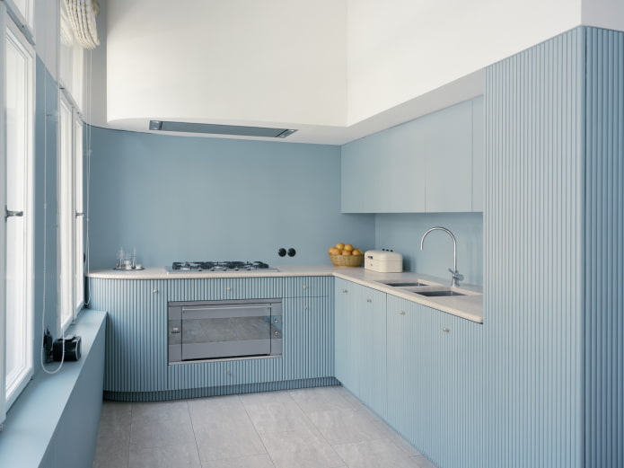
The photo shows a monochrome interior with textured facades
Which countertop is right for you?
The classic version of the surface for cabinets is by no means wood - plain white or gray countertops look the most neutral; imitation of stone is permissible.
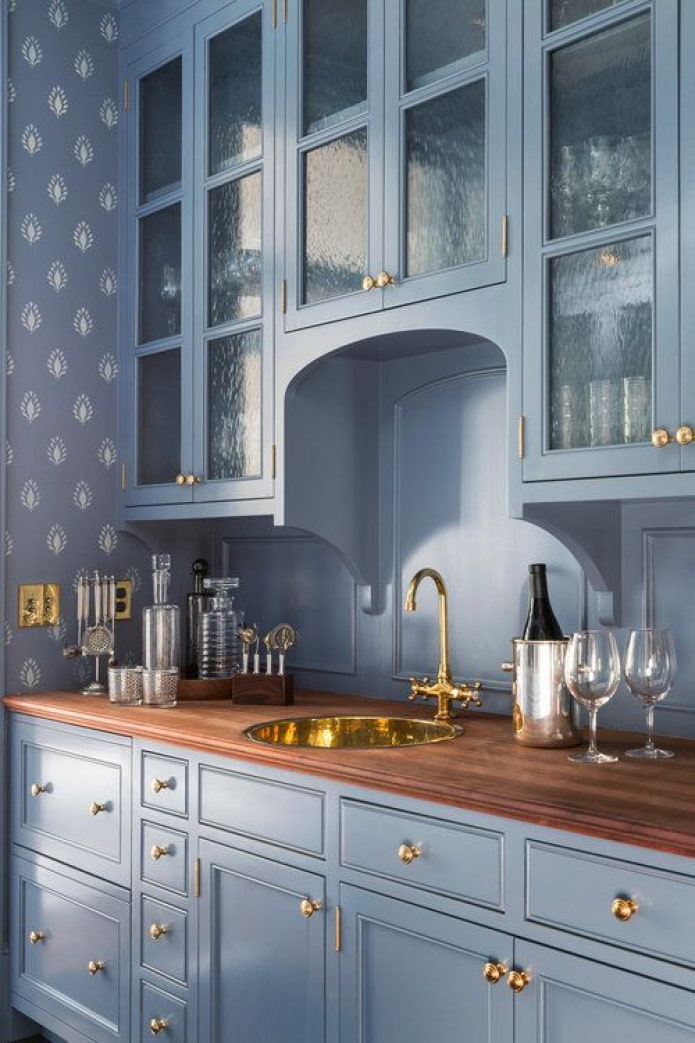
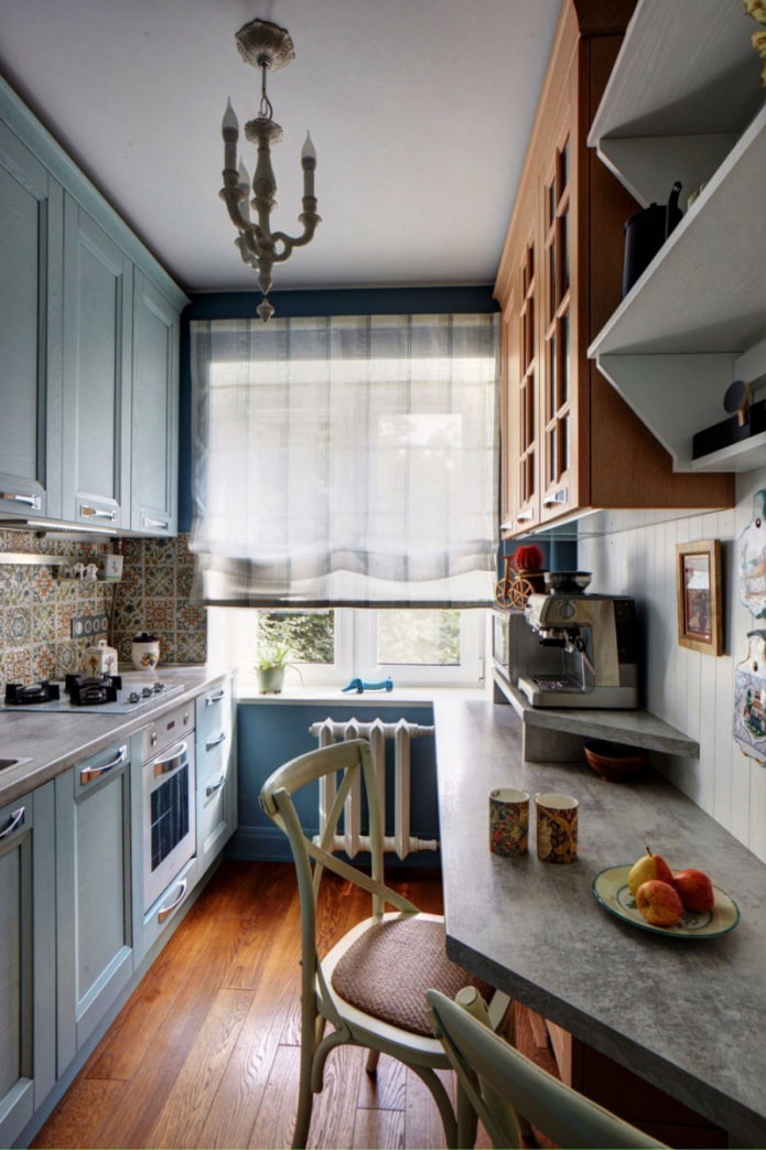
Wood will add a warm, natural touch, which is not needed in every space. But if you need to dilute the cold with something warming, add beige shades to the wood countertop in decoration or textiles.
What curtains to choose?
The right choice of textiles allows you to hide blemishes in decoration or furniture. Curtains can either distract from something or create a great background without attracting too much attention.
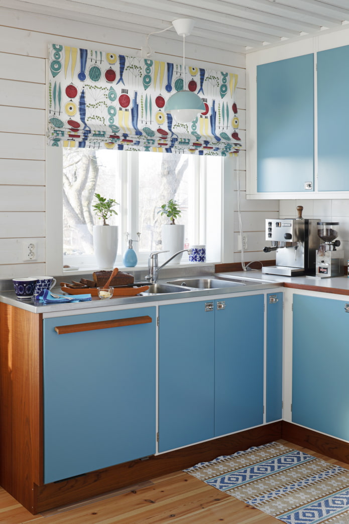
In the first case, choose contrasting fabrics with prints and patterns, draperies, layering. Short French curtains or cafe curtains will do.
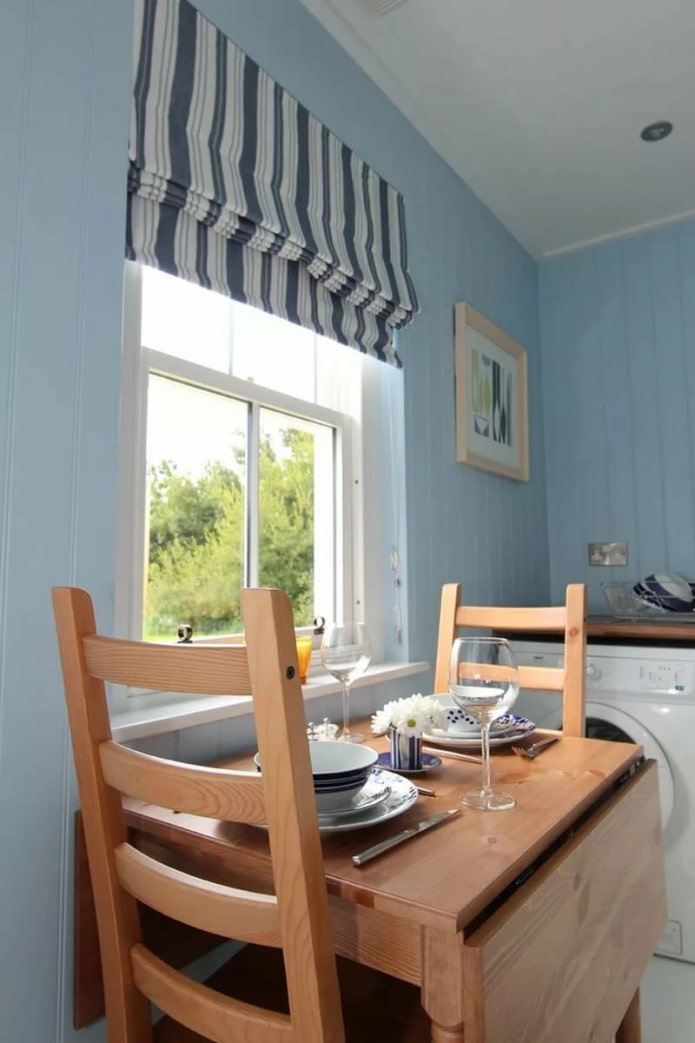
When you need to curtain a window with something invisible, rely on fabric to match the walls and straight lines. They will cope with the task roll or Roman models.
What decor is better to use?
Kitchen décor usually has to be functional and not just beautiful. Dishes will do just fine with this: beautiful plates, cups, pans and vases on open shelves.
To decorate the walls, choose paintings or posters that match the given style. Landscapes, still lifes and calm abstractions are the most popular.
Textiles, in addition to curtains, also play a role in the perception of the kitchen: beautiful towels, potholders, tablecloths, pillows on chairs are easy to replace, thereby changing the mood.
What style can you use?
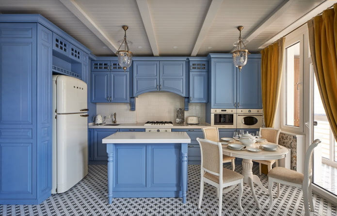
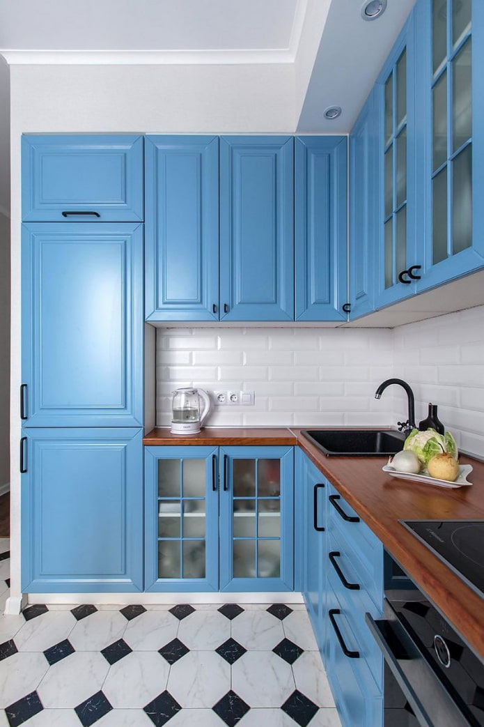
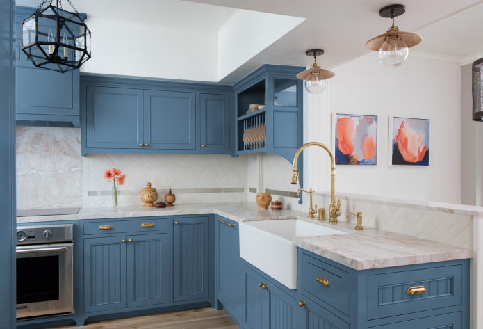
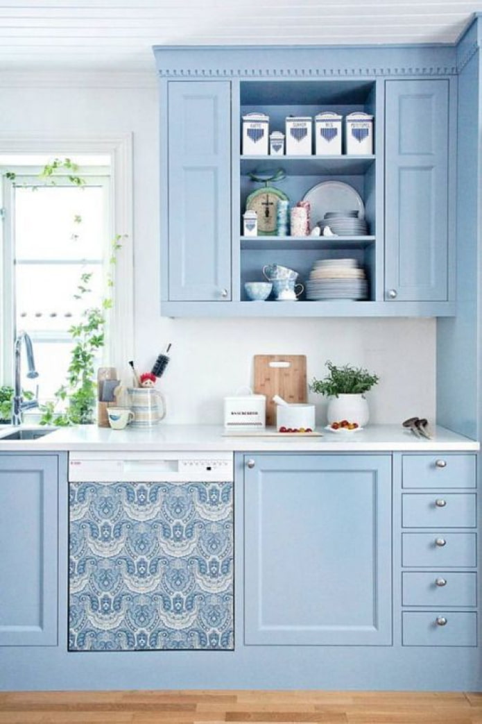
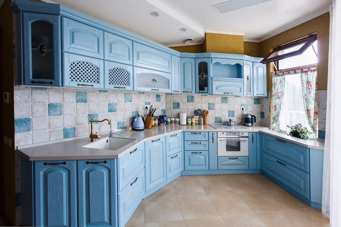
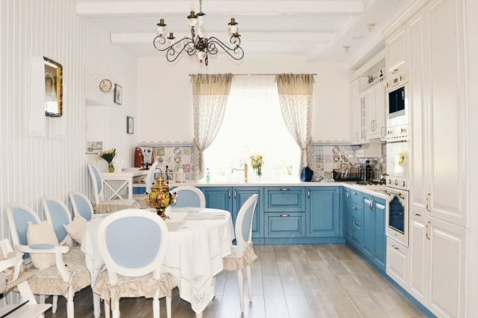
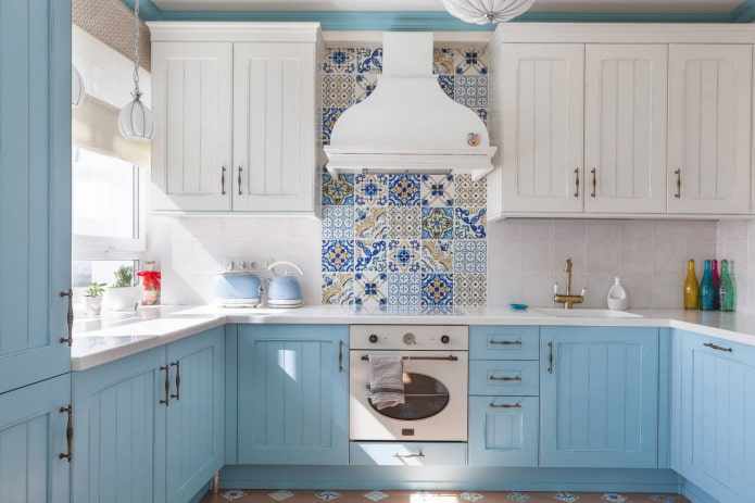
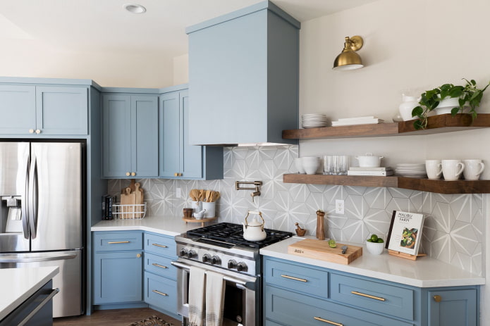
Previously, pastel shades were often used in style provence... Pale blue carved facades corner kitchen, in conjunction with wooden countertop, with floral textiles - before you is a classic picture of French country at home or in the country.
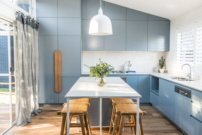
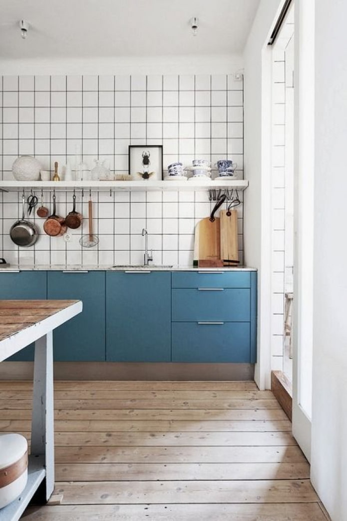
Blue-gray shades are often used in Scandinavian interiors: visually, the combination with white gives a truly Norman coolness.
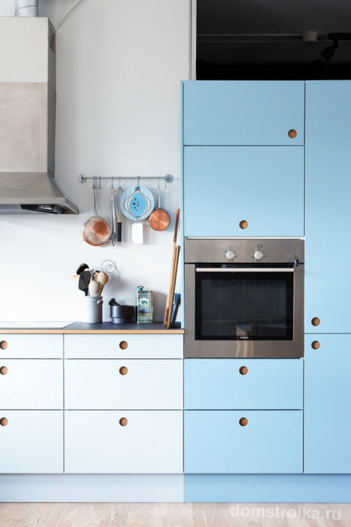
Real modern styles are abandoning milling and moving towards minimalism. Dusty matte surfaces are relevant here, lack of handles and uniformity of textures.
Photo gallery
The blue interior should look fresh, deciding on such an experiment, take care of maintaining this icy, cozy coolness.

 10 practical tips for arranging a small kitchen in the country
 12 simple ideas for a small garden that will make it visually spacious
 How to choose the color of your kitchen sink?
 White kitchen set: features of choice, combination, 70 photos in the interior
 Black set in the interior in the kitchen: design, choice of wallpaper, 90 photos
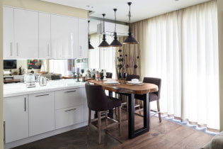 How to choose curtains for the kitchen and not regret it? - we understand all the nuances
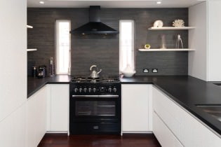 Design of a white kitchen with a black countertop: 80 best ideas, photos in the interior
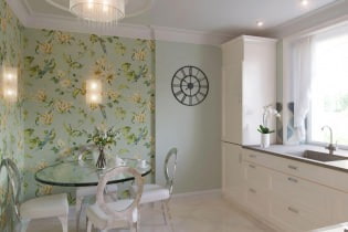 Kitchen design with green wallpaper: 55 modern photos in the interior