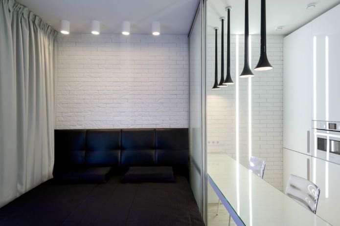
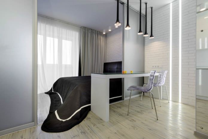
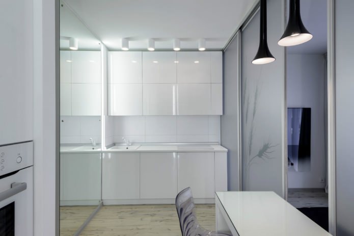
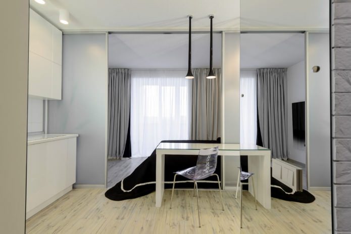
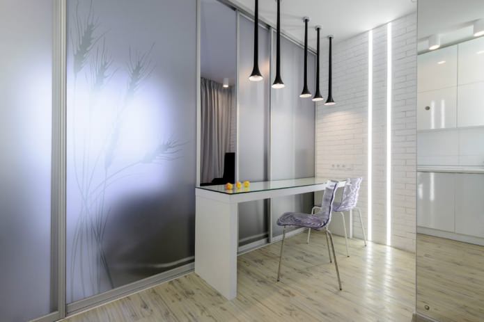
In this project, two combined zones: a kitchen-dining room and a bedroom-study were fenced off from each other with the help of glass sliding panels-doors. A single window thus provides access to daylight in all areas at once. At the same time, the bedroom does not lose its intimacy due to frosted glass. The kitchen and dining area is located so that guests can be received there without violating the privacy of the bedroom.
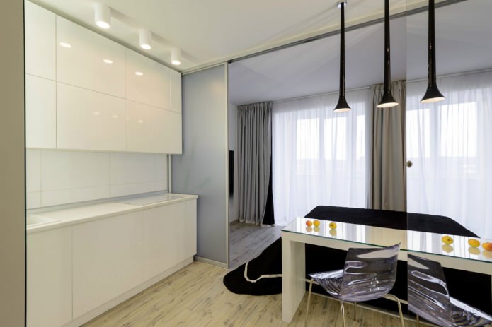
Kitchen-bedroom interior designed in a minimalist style, most suitable for small spaces. White color expands the space, the gloss of the kitchen fronts enhances this effect.
Backlighting helps illuminate the work area while adding volume to the kitchen. Everything you need and nothing more is the motto of this kitchen zone. The eye does not “cling” to anything, and the room seems much larger than its actual size due to the mirror that occupies the entire wall.
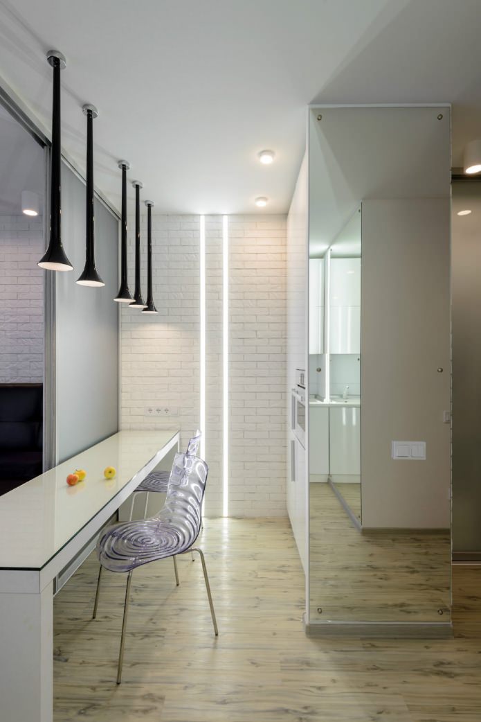
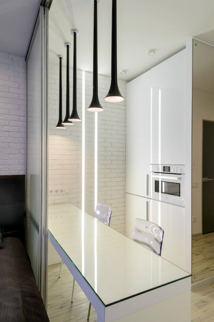
Kitchen and bedroom in one room do not interfere with each other. To the right of the entrance are storage systems, kitchen appliances and a table for meals. Cabinets have a fairly large storage capacity due to the use of the wall width. An additional decoration and a means of visually enlarging a small room is a backlight in the form of LED strips embedded in the wall.
INthe interior of the kitchen-bedroom the “mirror effect” is skillfully used: if one of the walls is completely covered with a surface reflecting light, for example, a mirror or polished metal, then this wall “disappears”, and the room immediately visually increases in volume almost twice.
Chairs serve as a spectacular decoration of a minimalistic kitchen - their seats have a pattern that resembles circles scattering on water. Plastic chairs are lightweight, transparent and do not clutter up the space. Neighborhood kitchens and bedrooms in one room can be convenient for a person living alone, because much less effort will be spent on cleaning.
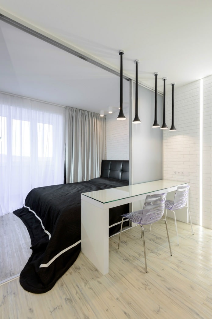
The dining area in the kitchen is distinguished by original black suspensions, which play not only a lighting, but also a decorative role. Even with the doors completely open, the visual boundary between the bedroom area and the kitchen area is preserved - it is clearly indicated by the line of suspensions.
The pattern on the glass of the partition-door is very light and is noticeable only when closed.
Kitchen-bedroom interior the sleeping area is very simple and resembles a loft. It has white painted brick walls that are typical of the loft. The floor is wooden, and also bleached. Against the background of white walls and floor, the absolutely black square of the bed stands out in contrast.
The headboard made of leather, also black, looks very decorative. To soften the rigid design a little and give it a romantic touch, the bedspread was decorated with a white strip, and lowered to the floor with lush folds.
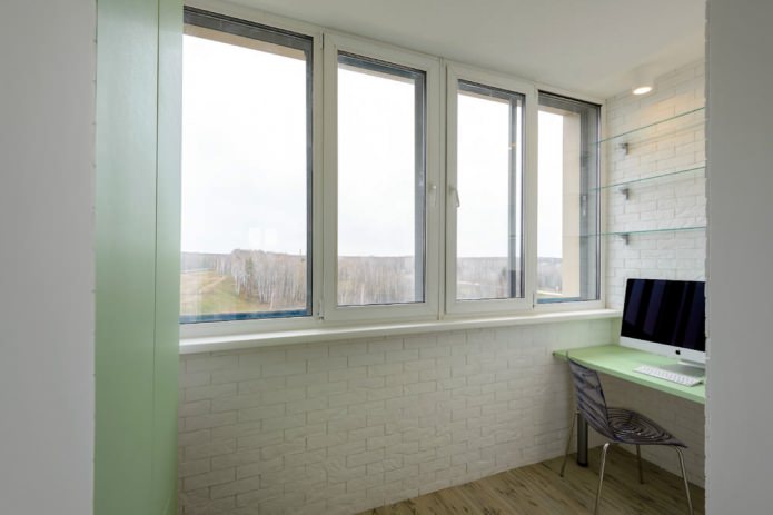
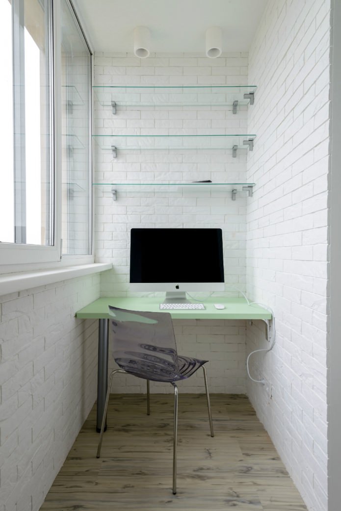
The office for work settled on the loggia. Glass shelves do not clutter up the space, which is already scarce here, and the green plane of the table top unites the office with the greenery outside the window.

 10 practical tips for arranging a small kitchen in the country
 12 simple ideas for a small garden that will make it visually spacious
 Wall design in the bedroom: choice of colors, finishes, 130 photos in the interior
 Bedroom design with gray wallpaper: 70 best photos in the interior
 Bedroom design in orange tones: design features, combinations, photos
 Stretch ceilings in the bedroom: 60 modern options, photo in the interior
 The choice of an orthopedic mattress: features, types of fillers, sizes
 Bedroom design for a girl: photos, design features