Mistake 1. Electrical planning at random
An electrician is the nervous system of your apartment. If you want to save your nerves, it's better to take care of her in advance.
What could go wrong?
When it suddenly turns out that the switch is behind the door, and the door opens inward, this is very inconvenient. To turn on or off the light, you have to go around the door and go behind it. And if there is no outlet next to the TV, you have to pull the cord across the room.
What do you need to consider?
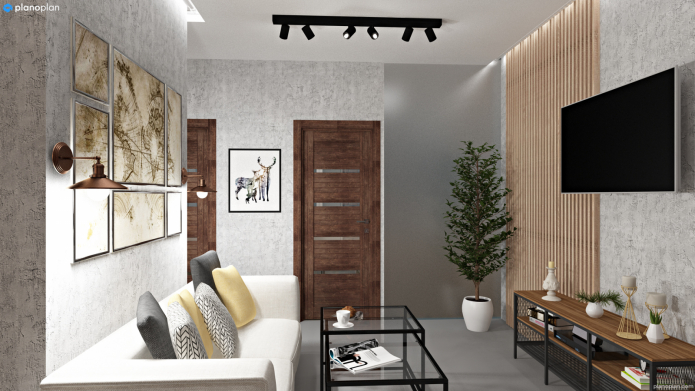
First, we plan the layout of the furniture, then the electricians, and after that we begin construction work. It is worth considering the location of sockets and switches, as well as choosing the right lighting: how much and in what rooms, at what height, etc. The easiest way to do this is in specialized programs created to create interior design. And then we work with the layout and make footnotes.
According to professional interior designers, the Planoplan 3D interior planner is a simple and affordable program for creating interiors. To do this, you need to decide on furniture, built-in appliances and workspaces. For example, if you do not want wires to lie somewhere, then even before you start finishing, you need to design the kitchen. According to your layout plan, the technicians will do the wiring.
There should be enough lighting.
- Think over the distribution of light by zones.
- Plan where there will be cabinets, workstations, mirrors and decorative items that can be highlighted.
- Consider the sockets in the kitchen for the hood, refrigerator, chopper in the sink, microwave, hob, oven, dishwasher, lighting. And also for small appliances on the work surface: kettle, grill, etc.
Approximate dimensions and distances
The height of the switches from the floor is 90-110 cm. From the door - 10 cm. The sockets are usually placed at a height of 30 cm from the floor. The distance from the outlet to the wet area in the bathroom is 60 cm. The best lighting above the kitchen table is a pendant lamp at a distance of 46-48 cm from the surface of the table to the bottom of the lamp.
Wall mounted lamps in the kitchen - at a height of 80 cm from the work surface. Between the spotlights on the ceiling 30-40 cm and 20 cm from the wall.
The number of luminaires is calculated depending on the power, area and purpose of the room.
Mistake 2. Dysfunctional kitchen
The kitchen is the first place for preparing food. It is corny, but this is sometimes forgotten. When repairing, it is necessary to provide free surfaces and the necessary space between objects.
An example of the competent distribution of kitchen appliances.
What could go wrong?
You can think of beautiful kitchen with a barthat you can proudly show your guests. And then to find out that there really is nowhere to beat off the meat.
What do you need to consider?
Here you need to consider everything in advance. A detailed plan will help you create a functional space. Consider the minimum distances for distributing kitchen appliances. They will allow you to use it comfortably.
Approximate dimensions and distances
| Name | Distance |
|---|---|
| Height of the work surface in the kitchen | 85-90 cm |
| The height of the bar counter top from the floor | 110-115 cm |
| Distances between cabinets (aisles between furniture) | 120 cm |
| Between the wall and the furniture | 90 cm |
| In front of the dishwasher (for unloading and loading dishes) The dishwasher is located next to the sink. |
120 cm |
| Distance in front of the drawer cabinet | 75 cm |
| From the hob to the sink | at least 50 cm |
| Distance from the table top to the bottom edge of the hanging cabinet | 50 cm |
Mistake 3. Not enough space
Strike a balance: remember first of all about functionality of furniture... When it is comfortable to use it, you will praise yourself more than once.
What could go wrong?
You saw in the store large canopy bed and realized that all my life they dreamed of sleeping like a king! After the bed was in the room, it turned out that it was close to the bedside table. It does not come out royally.
What do you need to consider?
Not only all sizes up to a centimeter, but also the direction of the doors. Where does the door rest when you open it? And the doors of the wardrobe and nightstands? Will it not turn out that they are generally difficult to open?
An example of what is given narrow corridor door opening is provided inside
Pay special attention to your workplace so as not to spoil your posture and vision in the future. Figures to help:
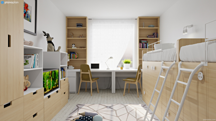
Workplace: table height - 73.6-75.5 cm, depth - 60-78 cm.If there is a screen, then the distance from the eyes to the display is 60-70 cm.If there are two work tables next to it, then the minimum distance from one monitor to the other - 120 cm.
Mistake 4. Location "along the wall" and empty center.
The Russian habit of arranging all furniture along the wall originates from Khrushchev's layouts, in which it is simply impossible to put a sofa in the center of the room. Modern layouts give room for imagination.
What could go wrong?
Nothing bad will happen, of course. But the interior can become more harmonious if you drop stereotypes.
What can be done?
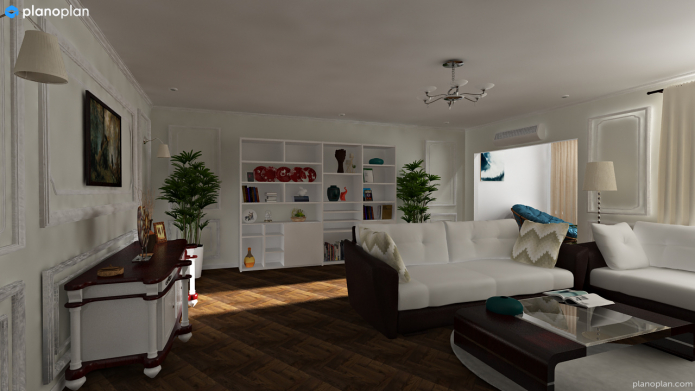
Large rooms without a filled middle look uncomfortable, and furniture seems to be scattered. If space permits, do not place all furniture against walls. In the center there may be both a table at which everyone will gather, and a couple of armchairs or a sofa.
By the way, furniture can be used for zoning space: it might just come in handy in studios from 30 sq.m.
An example of using the entire area of the room.
Mistake 5. The fastening of curtains is not thought out
Before starting construction work, decide on the curtains. Not with color (although you can decide with it), but with type of cornice... The curtain rod can be ceiling-mounted, in a niche or, as usual, wall-mounted.
What could go wrong?
You planned a finish, and then it turned out that such a finish is not suitable for a cornice in a niche. Change everything again!
How to choose?
It all depends solely on your taste. The main thing is to decide at the very beginning. If you want to make niches, consider them at the start of construction work. If you want a ceiling cornice, do not forget about it during the installation of the ceiling. The wall is hung after the repair. But you must know what it will be in advance.
If you design in 3D planner, you simply don't have a chance to forget to plan the curtain rod. However, like many other details that are not at all trifles and can radically change the repair process. The program will visually make sure that these errors were not made.
Mistake 6. Online shopping
It's perfectly normal to explore different sites and see what furniture you like. But not everything is reasonable to buy online without "trying on".
What could go wrong?
You took a sink in one store, a cute bathroom cabinet in another, and then it turned out that they did not fit together at all. And what's more - of different quality.
What, absolutely impossible?
We live in the 21st century and we understand that it is difficult and unnecessary to completely abandon online shopping. The main thing is to approach him very responsibly: to measure and estimate everything carefully.The same planner can become an assistant in online shopping - here you can fit a specific item into the interior and see how it will look in the room in 3D.
Mistake 7. Thinking that everything will go according to plan
Even if you have thought of everything, surprises are bound to happen. This does not mean that you do not need to plan anything. Make the most detailed plan, think over the interior and visualize. And then set aside a little more contingency budget. Most importantly, enjoy the fact that you are creating a new chapter in your life.

 10 practical tips for arranging a small kitchen in the country
 12 simple ideas for a small garden that will make it visually spacious
 How to position a washing machine in a small bathroom?
 How to remove plaque from the bathroom curtain?
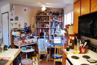 7 common mistakes in small apartment renovation that eat up all the space
 Wallpaper for the bathroom: pros and cons, types, design, 70 photos in the interior
 Modern bathroom interior: 60 best photos and design ideas
 Bathroom curtains: types, materials, fastening methods