general information
The owners of the Moscow Khrushchev turned to Buro Brainstorm for help, so that the specialists equip the apartment for rent. The house was bought for a growing daughter, who is still too early to live on her own. The owners wanted an interior "for all time" - laconic, stylish, comfortable.
Layout
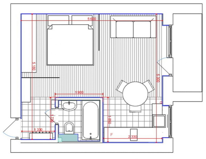
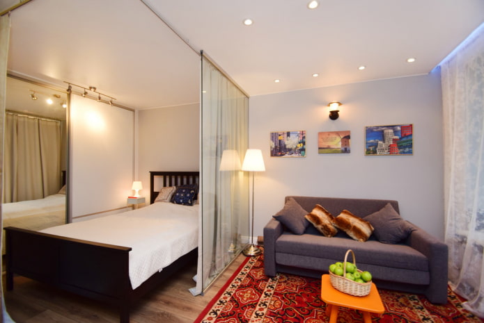
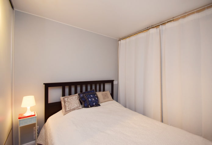
In addition to the living room, the designers created a private bedroom, separating it with a glass partition. Kitchen and room combinedby fixing a special bar in place of the former wall - if desired, the wall can be erected without affecting the stretch ceiling.
Hallway
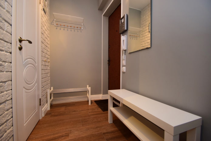
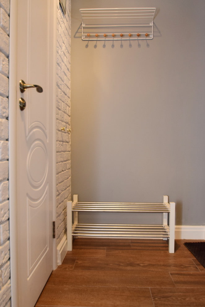
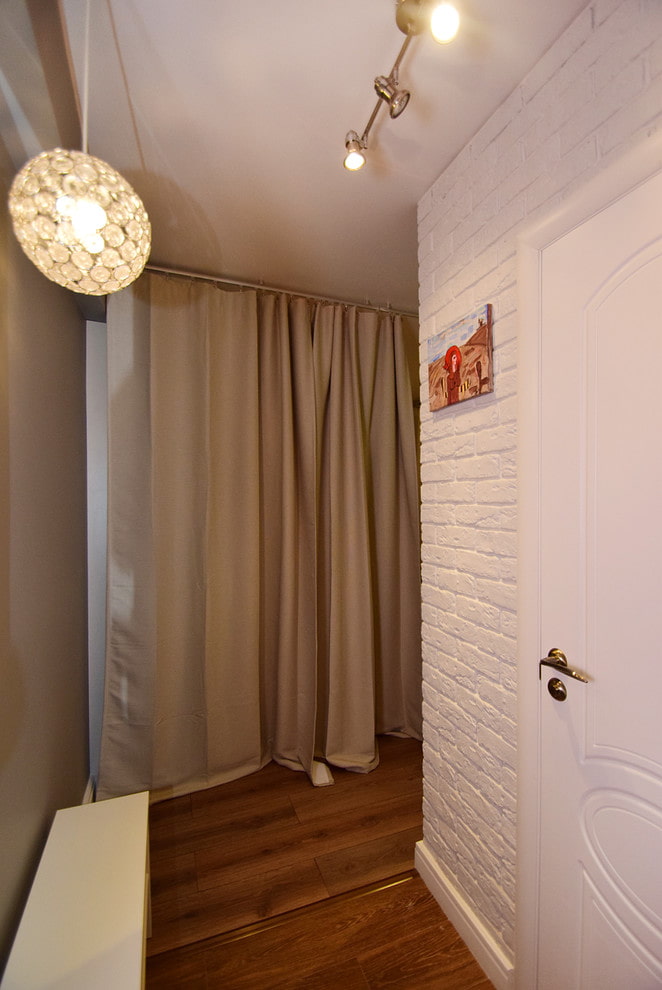
Corridor occupies only 3 sq. m. In the entrance area there is an open hanger and shoe rackthat do not clutter up the space. On the contrary doors decorative wall is framed: gypsum tiles are painted white and slightly widen narrow space. Under it are wires and communications. The masonry is justified as the house is brick-built.
Kitchen
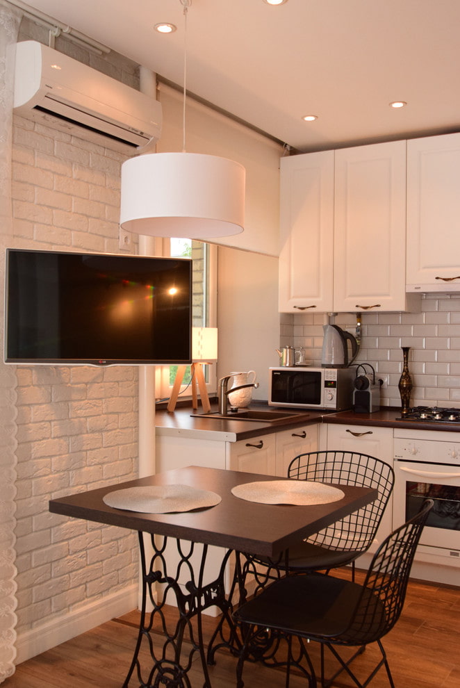
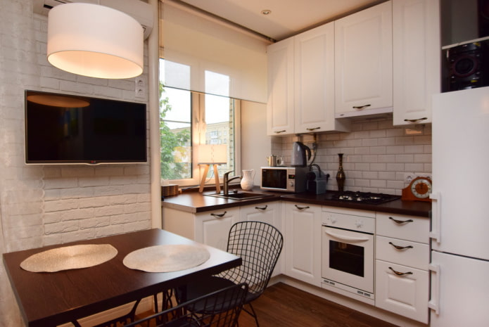
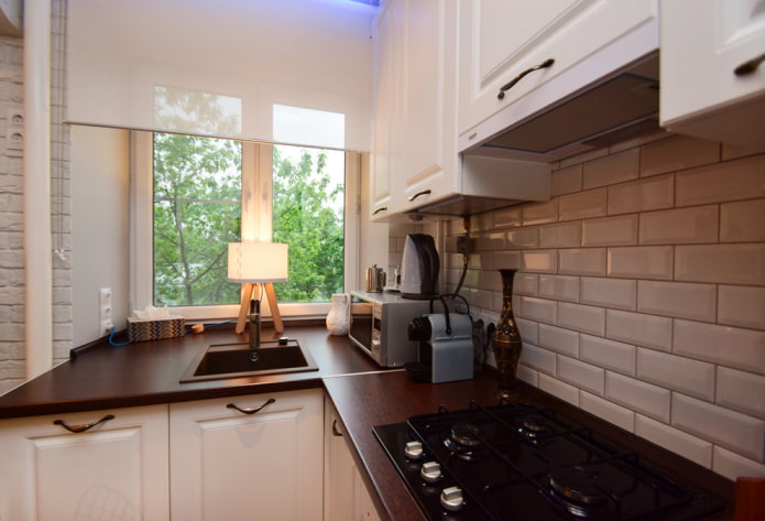
Area kitchen - 6 sq. m. The most difficult thing in its arrangement was the transfer and installation shells near the window. But the designers managed to save space and create a spacious corner kitchen.
The refrigerator and the stove are built-in, the upper cabinets are made to the ceiling: this allows the headset from the furniture factory "Stylish Kitchens" to look whole and harmonious. Apron lined with white "hog"Metro Equipe is practical, easy to clean and goes well with bricks.
One of the interesting details of the kitchen is the Moove lamp, designed especially for small spaces. Its lampshade can be moved over the dining table, helping to realize different scenarios.
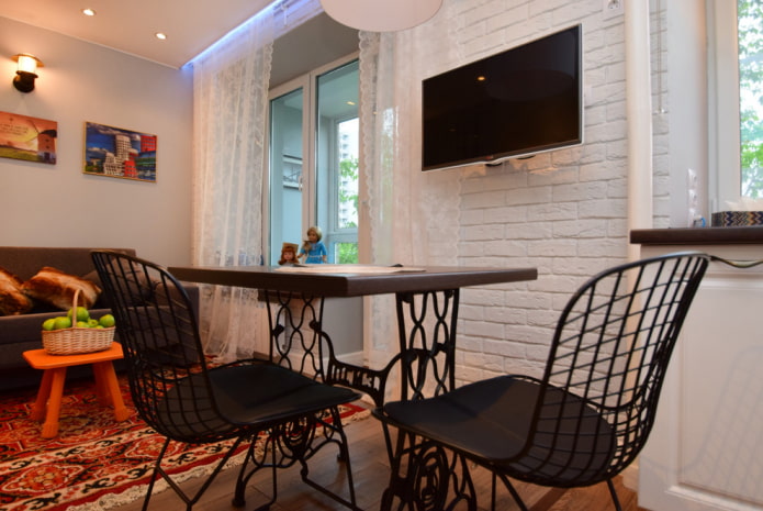
A TV is fixed on the partition between the windows: a swivel arm allows you to watch programs while cooking, and sitting at the table, and while in the living room. Lunch group makes up a table made from a Soviet sewing machine and modern Bertoya chairs.
Living room with sleeping place
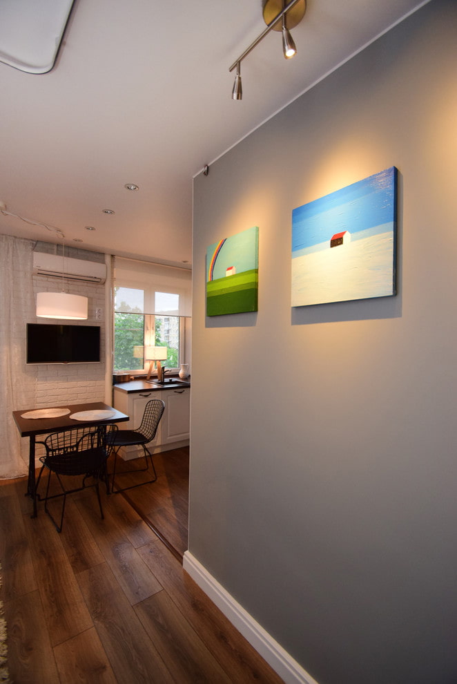
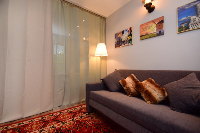
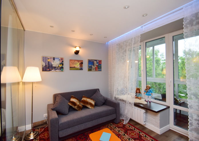
The room is 18 sq. m. The main color used in the design is modern and never out of fashion gray. The walls are painted with washable Dulux paint and are easy to maintain.
Various decorative elements are perfect for gray, and any bright objects serve as accents - here they are colorful paintings, an orange table of the Fatboy brand and a Soviet carpet with patterns.
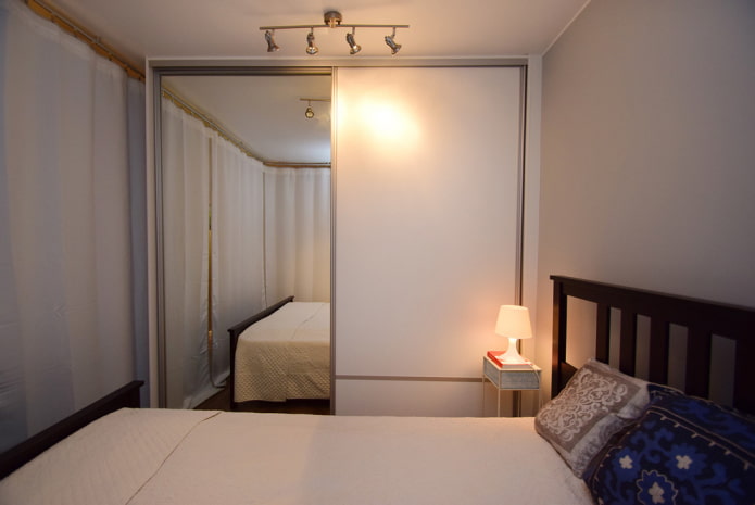
The main feature of the room - a cube bedroom, separated by a glass partition. A full double bed fits inside bed from nightstand, as well as closet.
The choice is dictated by the economy of space: sliding doors do not "eat up" the space, and the mirrored facade, on the contrary, visually expands it. The second white sash merges well with the wall.
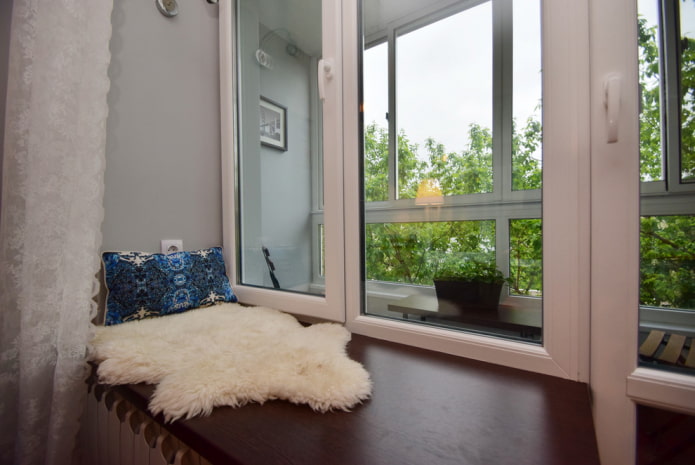
If desired, the bedroom can be curtain blackout: just a couple of moves, and the living room becomes a separate room. A comfortable sofa was bought from IKEA, textiles from Zara Home. Window sill the room is understated - thanks to this technique, the ceilings seem higher, the room is brighter, and a cozy place for reading has appeared by the window.
Bathroom
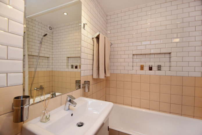
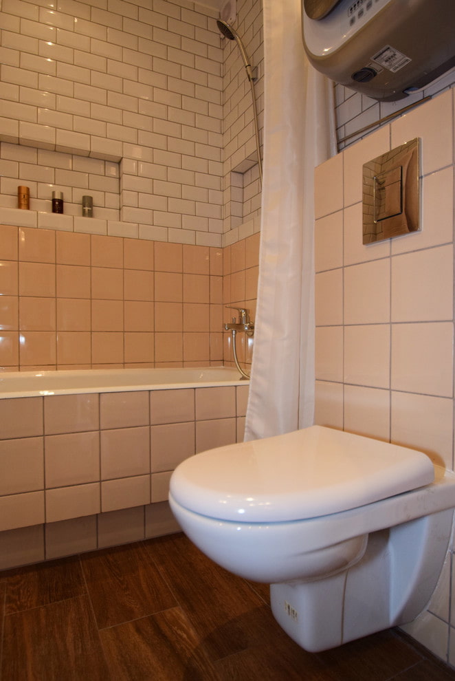
Area bathroom - 3 sq. m. The same tiles are used here as in the kitchen. The ROCA cast iron bathtub is installed on short legs, which makes it easy to get inside.In addition, there is a convenient foot recess at the bottom.
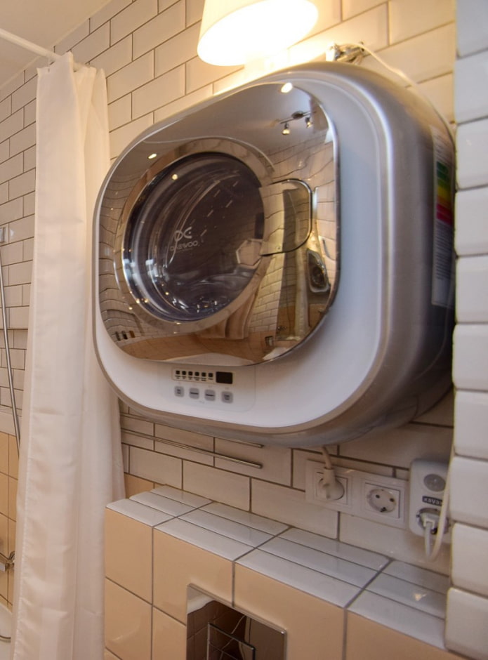
Instead of shelves, designers have provided many niches. Mirror chose overall - so it reflects more light and visually enlarges the bathroom. A washing machine was placed above the wall-hung toilet with the installation.
Loggia
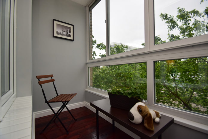
Another decoration of the apartment - balcony with an area of 3 sq. m. It was re-glazed, lowering the level of the parapet. Nearly panoramic windows let in more sunlight into the apartment, which makes it seem more spacious. The windows offer a beautiful view of green trees and a picturesque church.
Thanks to the professionalism of the designers, the small apartment has become visually larger and much more functional. Experts have implemented several basic ideas that have become key in the formation of a useful and comfortable interior for life.


 10 practical tips for arranging a small kitchen in the country
 12 simple ideas for a small garden that will make it visually spacious

 Design project kopeck piece in brezhnevka
 Modern design of a one-room apartment: 13 best projects
 How to equip the design of a small apartment: 14 best projects
 Interior design project of an apartment in a modern style
 Design project of a 2-room apartment 60 sq. m.
 Design project of a 3-room apartment in a modern style