Layout
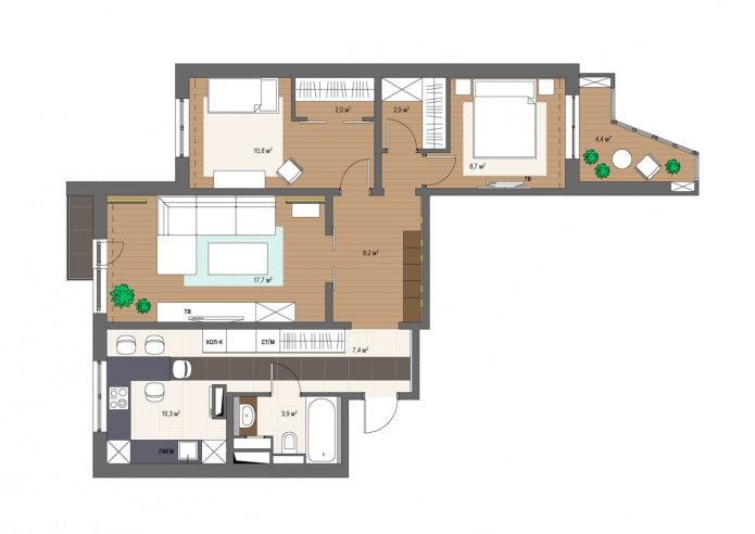
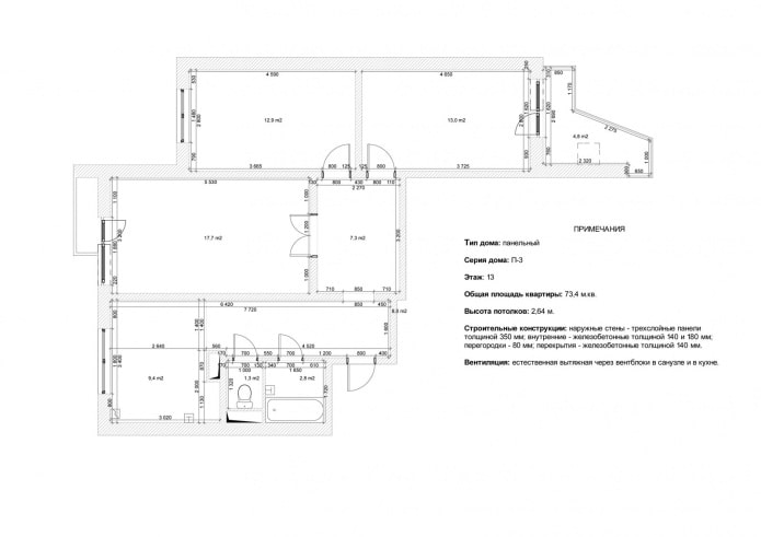
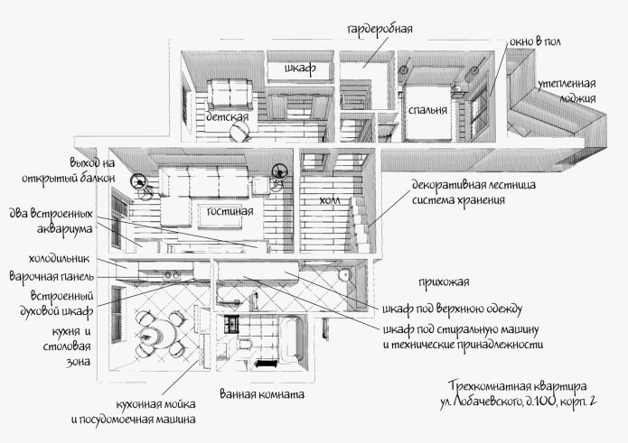
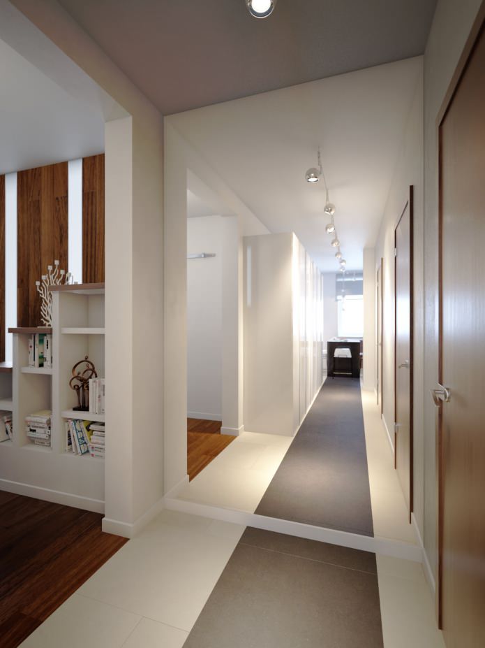
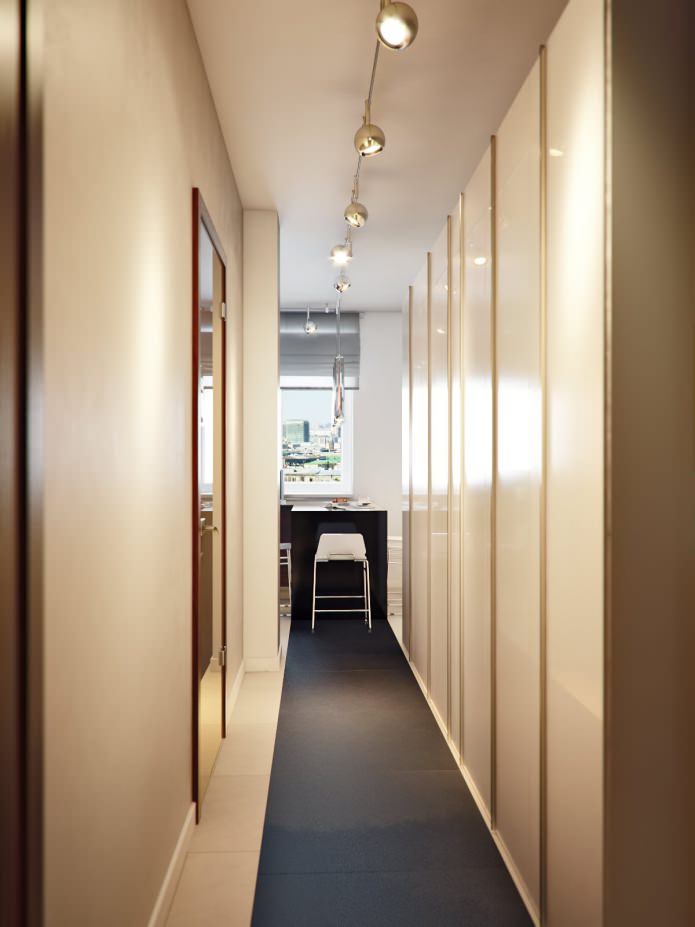
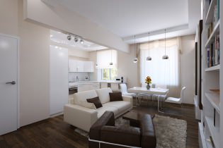
Various options for redevelopment were considered using an opening in the wall, which was provided for technological needs. The kitchen, which in the initial version was supposed to remain isolated, as a result lost the partition, which allowed daylight to penetrate the corridor and, reflecting from the mirror, increase its illumination.
Living room
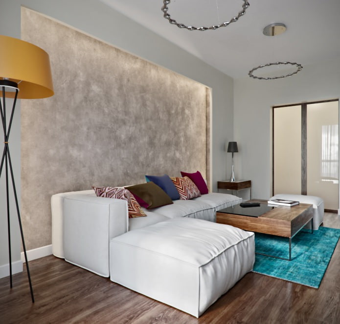
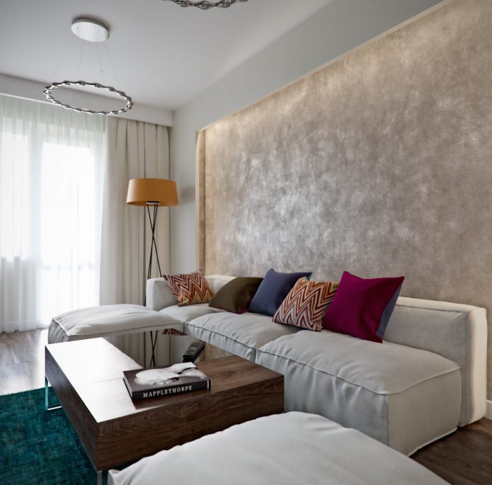
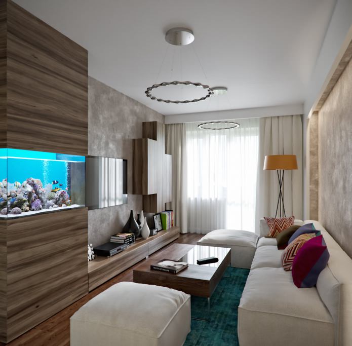
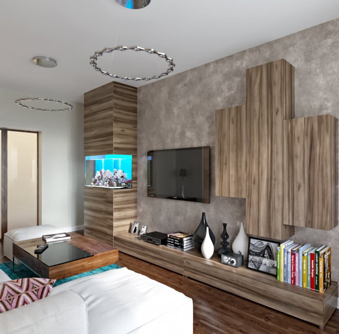
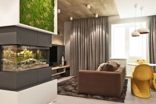
The passage from the hallway to the living room is through sliding doors with frosted glass inserts. The main item in the living room is a large sofa assembled from separate modules. It stands next to a wall finished with MagDecor decorative plaster. In order to emphasize its beauty, a cornice was laid around, behind which the lighting was hidden. Opposite the sofa there is a storage system in which a large aquarium is integrated - the owners of the apartment are fond of fish breeding.
Kitchen
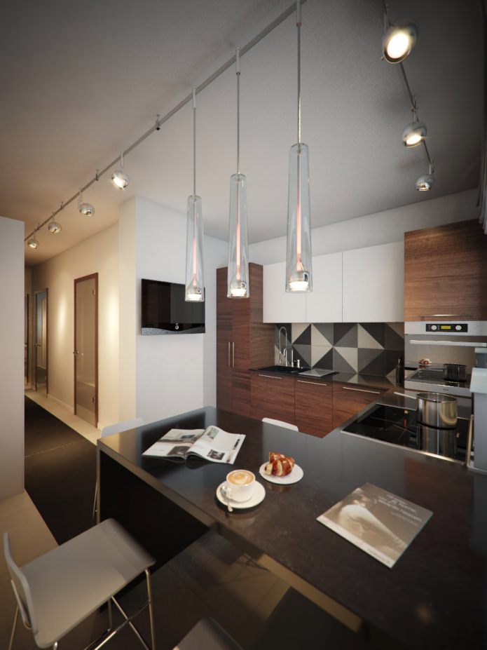
The layout of the kitchen is very ergonomic: a work surface with a sink on top and a dishwasher under it - in the center of the wall, on the sides - two high columns for appliances and storage. The lower tier of cabinets and columns are in golden cherry color, the upper tier is white, glossy, which makes the kitchen brighter and visually larger.
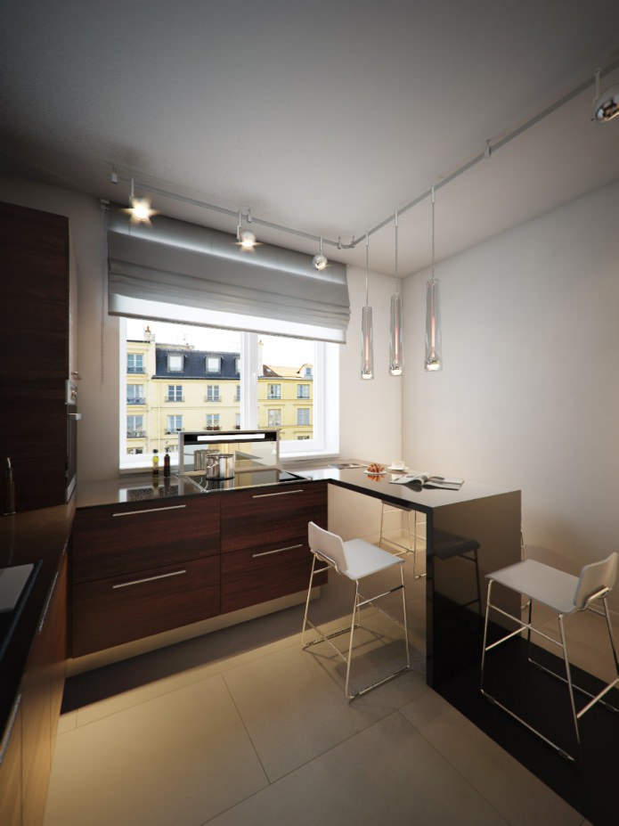
Along the window is another work surface. It is quite wide, with a built-in hob and extractor hood, which can be easily removed inside the table if there is no need to use it. The work surface ends with a bar counter adjoining at an angle of 90 degrees. It can easily accommodate four people. The floor of the kitchen area, as well as the apron on the wall above the work surface, are tiled with Italian tiles from the Base collection of the Fap Ceramiche factory.
Bedroom
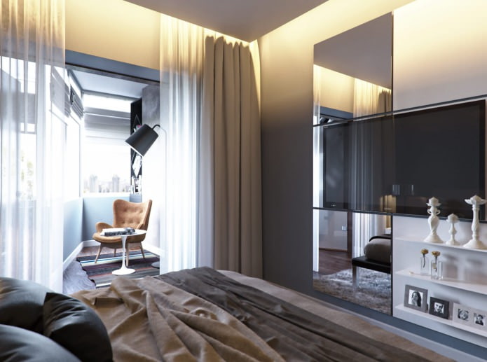
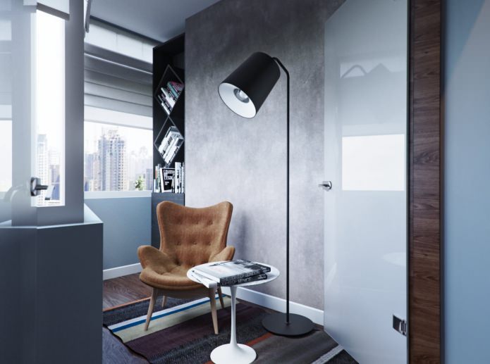
The loggia adjacent to the parents' bedroom was insulated, and a place for reading and relaxation was organized there - a cozy armchair, a floor lamp and original shelves for books. In addition, a spacious dressing room appeared next to the bedroom - 3 sq. m.
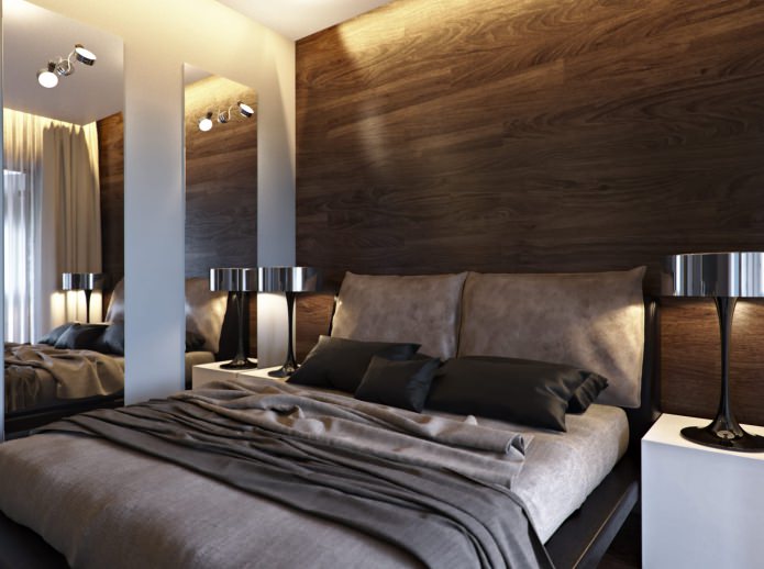
The head of the bed is flanked by a wood-trimmed wall, just like the one on the floor. The lighting is hidden behind the suspended ceiling. On the next wall there are two tall mirrors, on top of each of them - a sconce: such a scheme allows you to increase the illumination and create the illusion of expanding the space.
Children
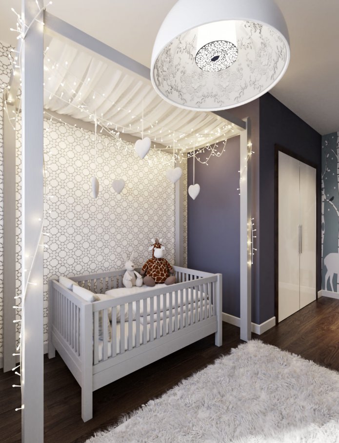
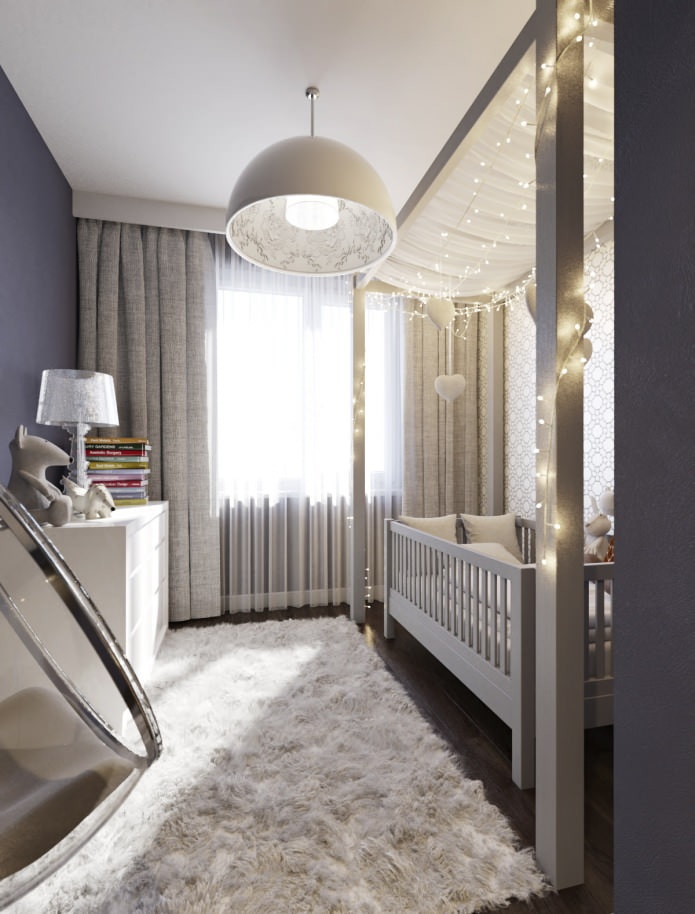
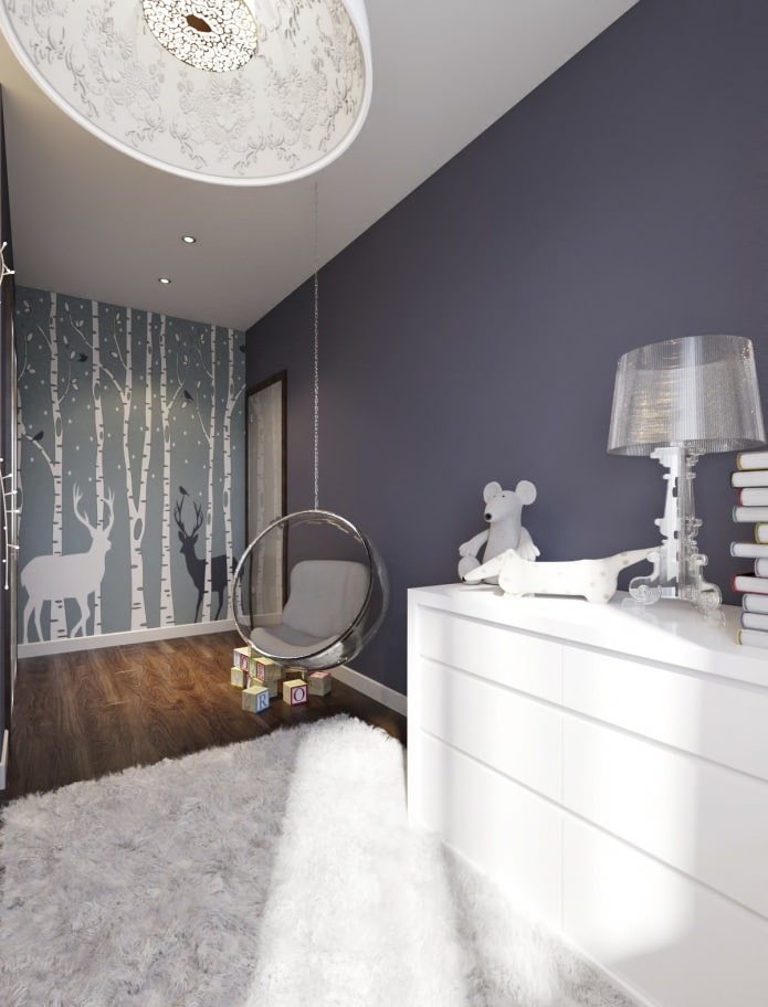
The design of a 3-room apartment provides for a separate nursery with its own storage systems - a large wardrobe and a spacious chest of drawers. The crib for the baby was made to order, as was the wooden frame above it - a light canopy was fixed on it and decorations were hung.
The lighting in the play area is carried out with spots built into the ceiling, the center of the room is marked by the Skygarden suspension, designed by Marcel Wanders - very romantic and delicate, in the form of a hemisphere, with stucco inside. A large long-piled carpet gives a child's comfort and warmth.
Hallway
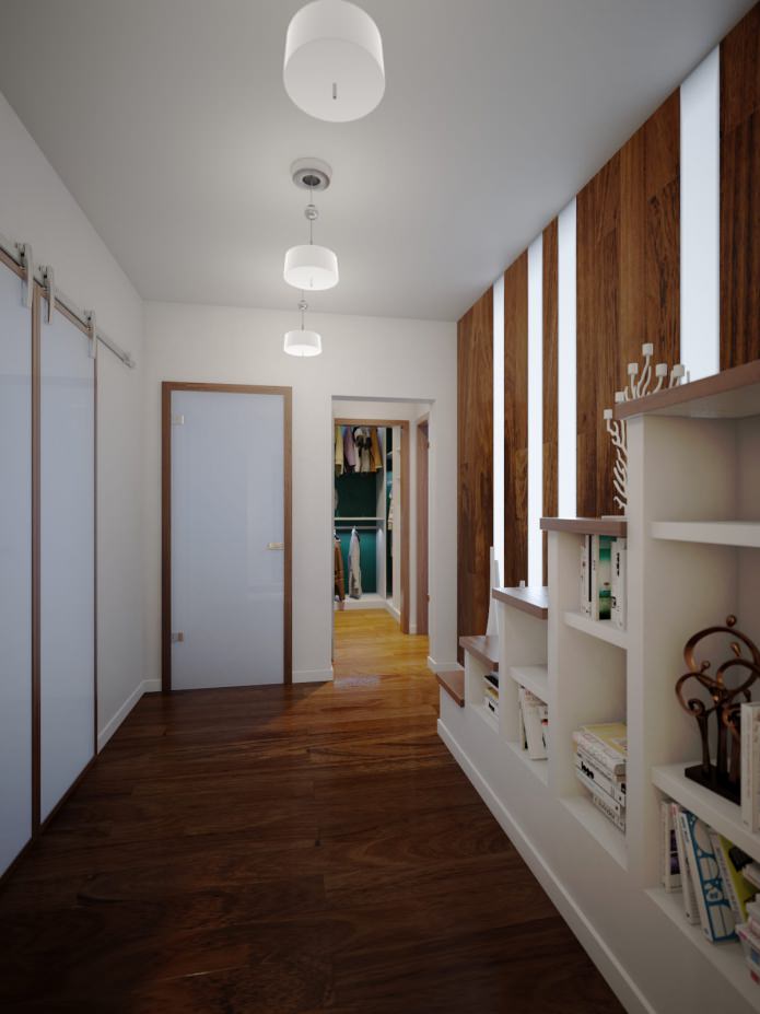
A large wardrobe, which houses a washing machine, a refrigerator, as well as compartments for storing clothes, shoes, and household items, has become a unifying element of the design of a 3-room apartment.
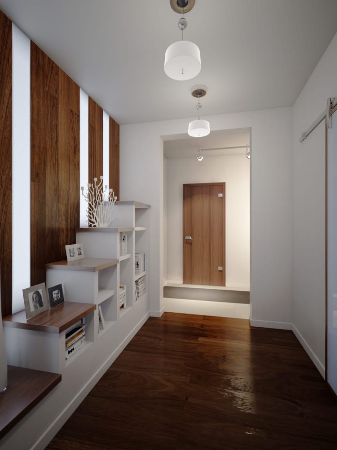
An interesting rack has appeared in the entrance area, imitating a staircase to the second floor. In its open shelves, you can put books, magazines, small decor items, and larger ones, for example, vases, can be put right on the steps. Both the floor and the wall behind the false staircase are made of the same wood species. There is a built-in backlight between the wall panels.
Bathroom
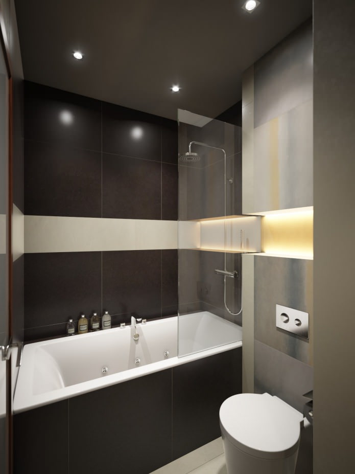
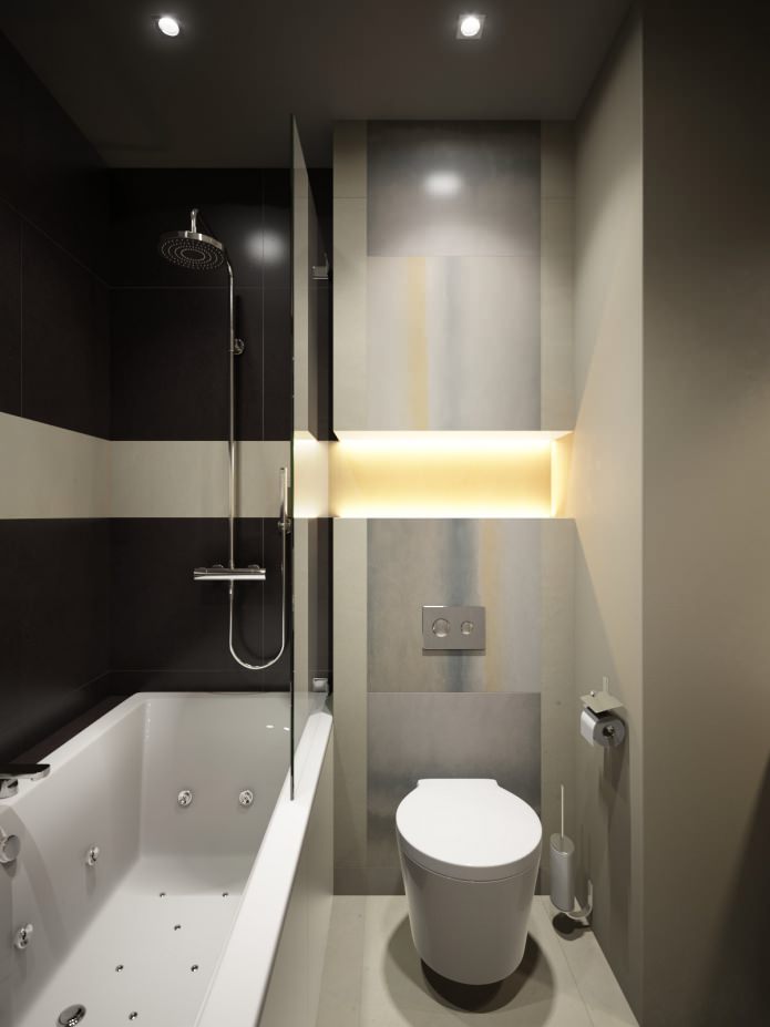
Bathroom finishes are austere and discreet, in two colors: ivory and dark brown. Wall and floor covering - Italian tiles FAP Ceramiche Base. The toilet is suspended, above it there is a false box, equipped with lighting. It is finished with tiles from the same factory. The wall behind the washbasin is completely mirrored, which complicates the space and makes the bathroom visually larger.

 10 practical tips for arranging a small kitchen in the country
 12 simple ideas for a small garden that will make it visually spacious

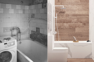 Design project kopeck piece in brezhnevka
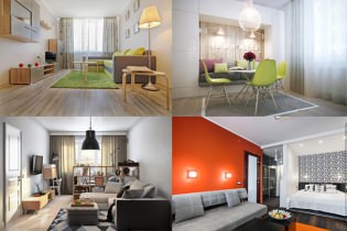 Modern design of a one-room apartment: 13 best projects
 How to equip the design of a small apartment: 14 best projects
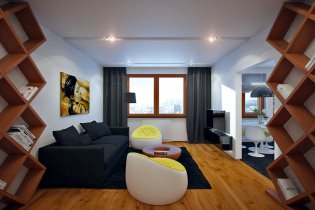 Interior design project of an apartment in a modern style
 Design project of a 2-room apartment 60 sq. m.
 Design project of a 3-room apartment in a modern style