general information
The area of the small-sized apartment is 28 sq.m, the ceiling height is 2.7 m. The designer Svetlana Kuksova selected author's prints for her interior and used natural materials, saving a lot of money. The apartment is owned by a creative family: over time, the housing should turn into an art workshop, but for now the owners plan to live in it.
Layout
The apartment is divided into several functional areas: an entrance hall, a place for cooking and eating, areas for work, reading and sleeping.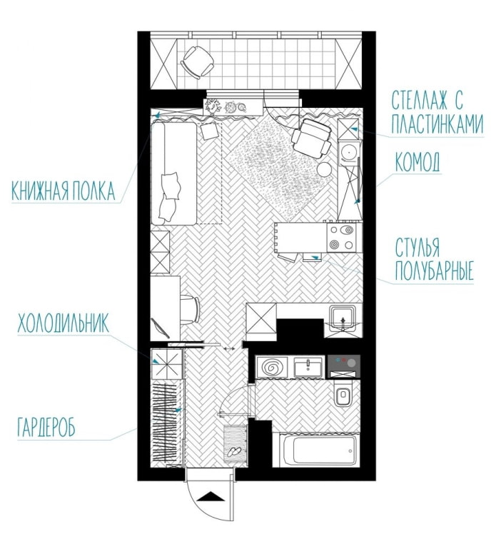
Hallway
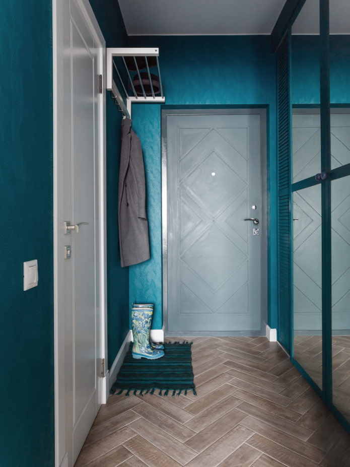
The entrance area is decorated in rich emerald blue colors. An open hanger is used for temporary storage of clothes, and a wardrobe for permanent storage. Mirrored facades on it help to optically expand a narrow room and increase the amount of light.
A fridge is hidden behind a jalousie sliding door, the neighborhood with which in the "bedroom" confused the owners from the very beginning. For the floor, as well as for the entire apartment, Kerama Marazzi porcelain stoneware was chosen, similar to wooden parquet. Such a floor covering is easier to wipe off the paints with which the designer's husband draws. Svetlana decorated the front door from the developer with her own hands.
Kitchen area
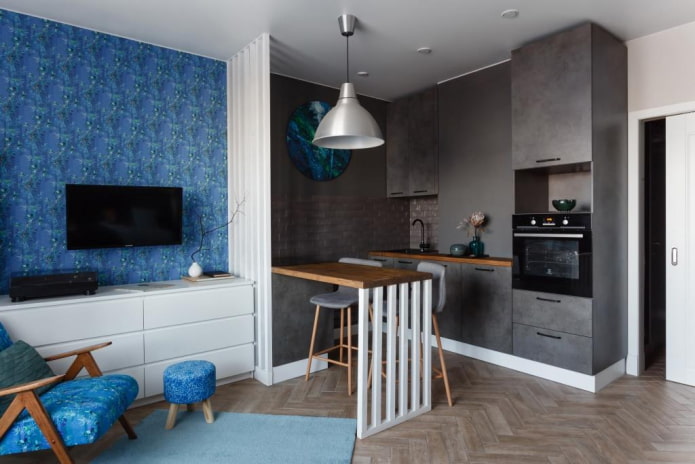
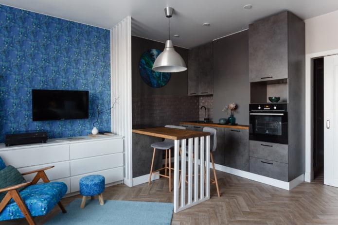
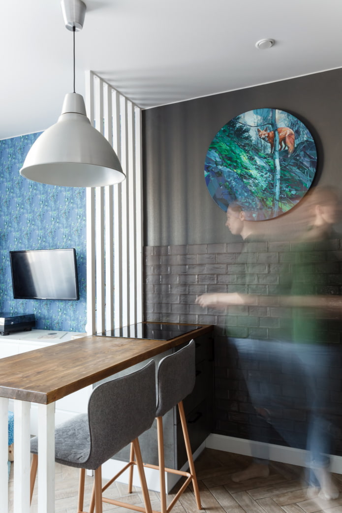
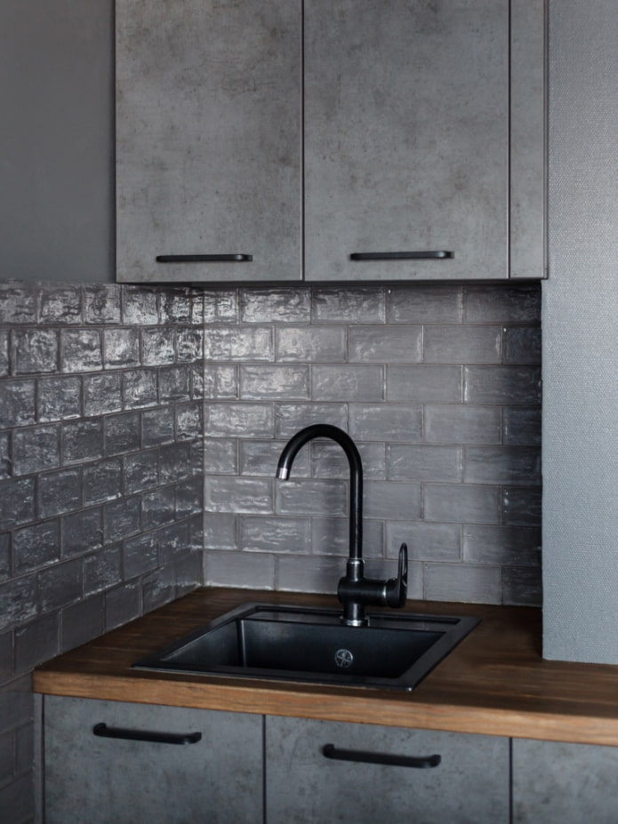
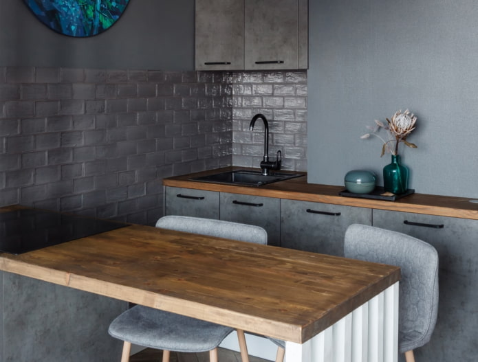
The kitchen was successfully integrated into the overall style of the apartment. Facades with gray "concrete" texture and built-in appliances do not attract attention, merging with the walls painted by Tikkurila. The apron was made from APE ceramics. Zoning is organized not only with the help of color, but also with a light slatted partition.
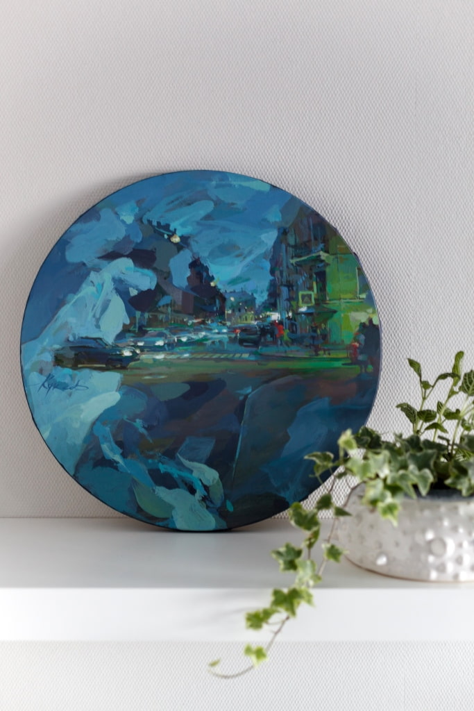
The painting by Denis Kuksov, written specifically for the apartment, collects all the shades used in the interior. The window sills and countertops of the bar counter and the kitchen set are made of solid pine from the hypermarket, treated with oil and stain. This budget solution made it possible to blend natural wood into the environment and add coziness and warmth.
Recreation area with workplace
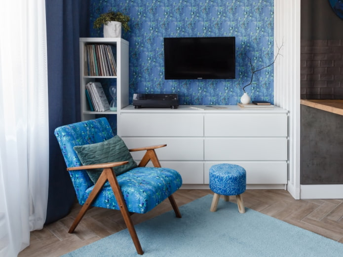
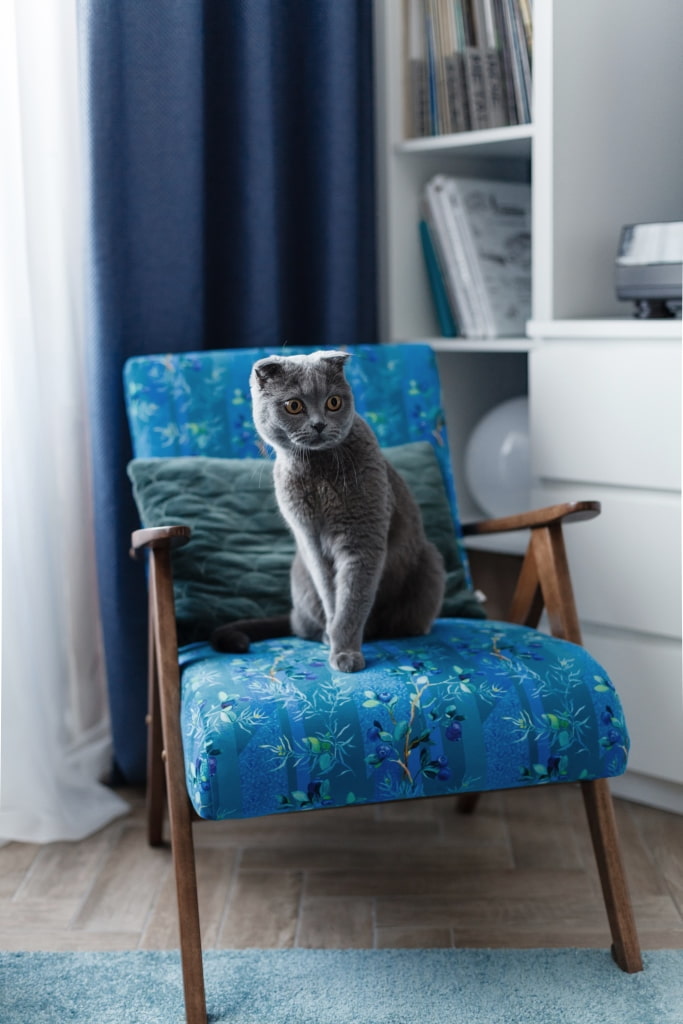
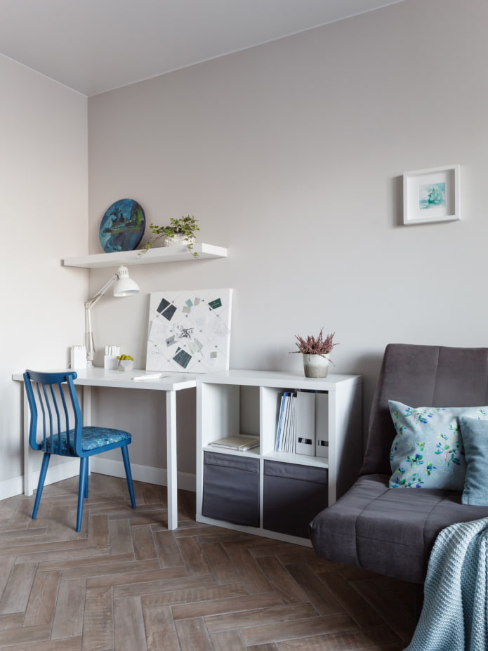
The accent wall is decorated with wallpaper with the author's print KUKSOVA art wallpapers. The pattern echoes the fabric of the Please Sit Down chair, and the color echoes the shade of the chair in the work area. They were going to throw it away during the design of one of the projects, but the hostess saved it and restored it.
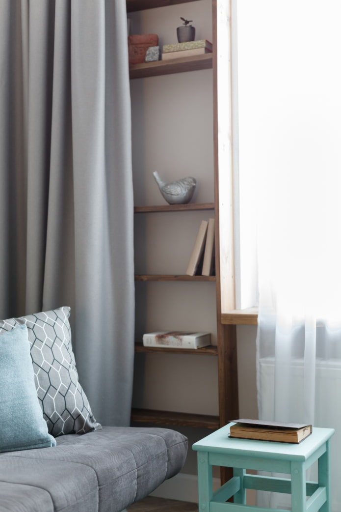
White furniture (dressers, shelving and a table with a shelf) were purchased from IKEA. The gray sofa folds out and serves as a sleeping place. In color, it is in harmony with the kitchen.
An interesting solution was the arrangement of a small shelving in the wall by the window: the owners of the studio dreamed of a library, but wanted to arrange the books so that they would not clutter up the situation. Now books are hidden behind a thick curtain and are always at hand. The lower shelves are used to store small items while sleeping.
Bathroom
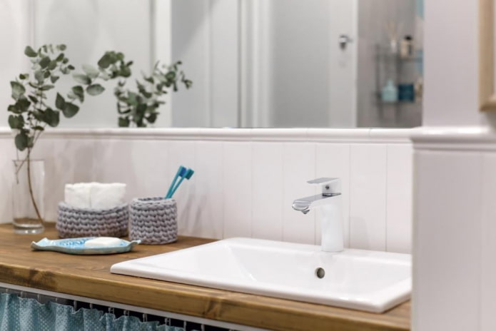
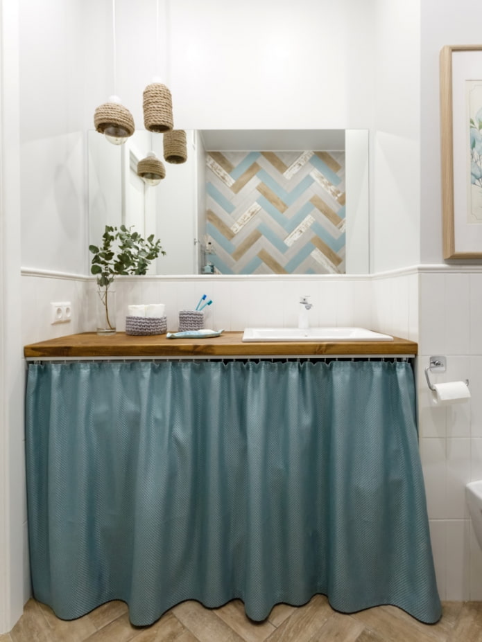
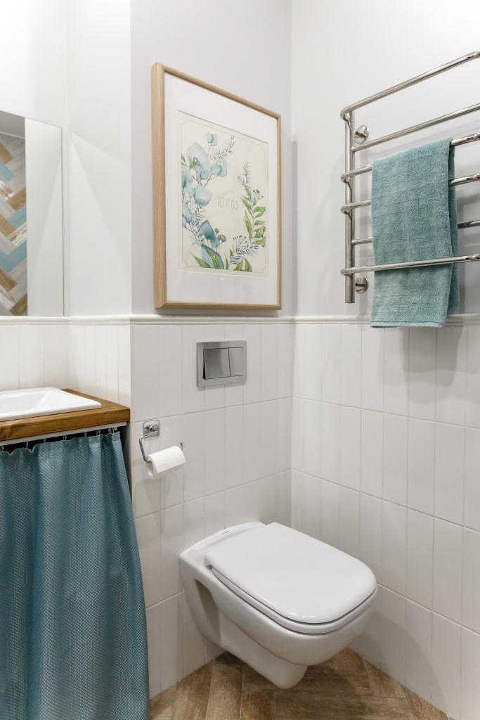
The designer spared no expense for plumbing by choosing a faucet from Roca, but she saved on decor. Svetlana designed the pendant lamps herself, and disguised the washing machine behind a textile curtain. The owners hung another painting above the toilet, but here it not only unites the interior, but also serves as a hatch, hiding the collector.
The small area and budget did not become a hindrance for creative people. The studio apartment turned out to be cozy, stylish and thoughtful.
Photographer: Natalia Mavrenkova.

 10 practical tips for arranging a small kitchen in the country
 12 simple ideas for a small garden that will make it visually spacious

 Design project kopeck piece in brezhnevka
 Modern design of a one-room apartment: 13 best projects
 How to equip the design of a small apartment: 14 best projects
 Interior design project of an apartment in a modern style
 Design project of a 2-room apartment 60 sq. m.
 Design project of a 3-room apartment in a modern style