general information
The area of the object is 45 sq.m. - a young couple with a cat lives here. Favorite style of apartment owners - practical minimalism... Designer Evgenia Matveenko, head of the FlatsDesign design bureau, created the interior, for the implementation of which 1 million rubles were spent. Photo of the apartment was provided by Dmitry Chebanenko.
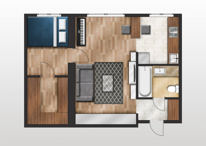
Layout
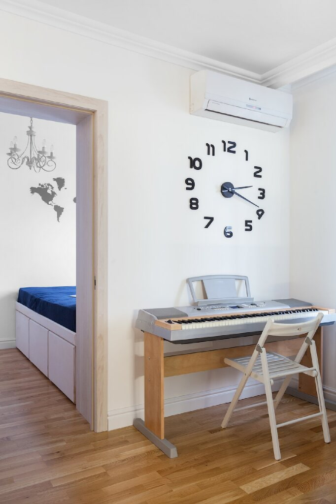
The narrow carriage room is divided into two parts by a plasterboard wall. Thus, it turned out to organize a full-fledged dressing room and a small but cozy sleeping area.
Living room
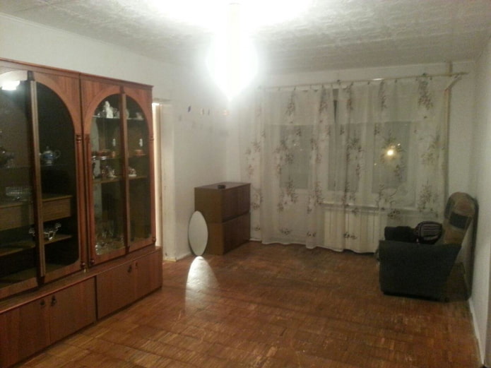
The previous owners put logs and plywood on the old floor, and on top put linoleum... After dismantling the "archaeological" layer, the floor leveled out and the new owners gained 15 cm of height.
The main expense item was finishing work. To save time, the builders used a dry floor and erected drywall partitions... The walls are not perfectly aligned, but they don't look worse. Tikkurila washable paint was used to decorate the walls, and inexpensive Alpen parquet boards were installed on the floors of both rooms.
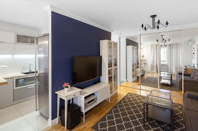
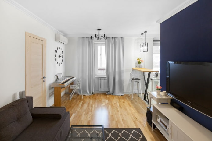
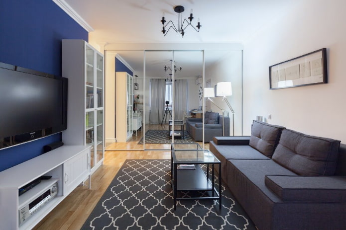
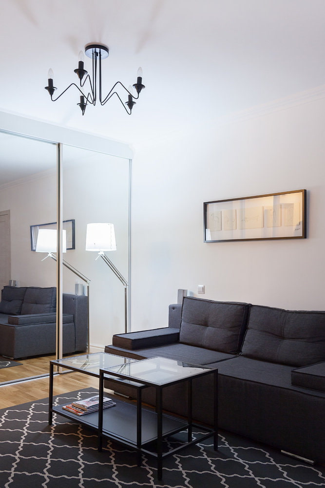
The hosts love to receive guests, so a spacious Hoff sofa was placed in the large room. One of the walls was occupied by a wardrobe with mirrored doors: placed opposite the window, it visually increases the space and the amount of light.
The owners of the apartment approached the choice of furniture in a practical way - there are no open shelves that accumulate dust, so cleaning does not take much time. Glass and mirror surfaces are diluted with cozy textiles from IKEA. Luminaires were purchased from OBI hypermarket.
Kitchen
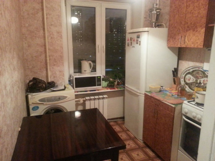
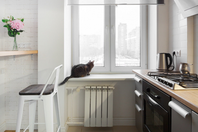
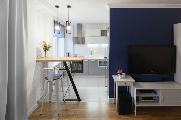
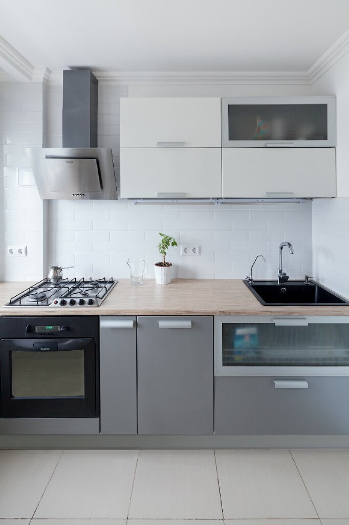
The floor in the cooking area is paved with large porcelain stoneware tiles. A laconic kitchen set from Stylish Kitchens does not take up much space - the owners are not used to storing unnecessary utensils.
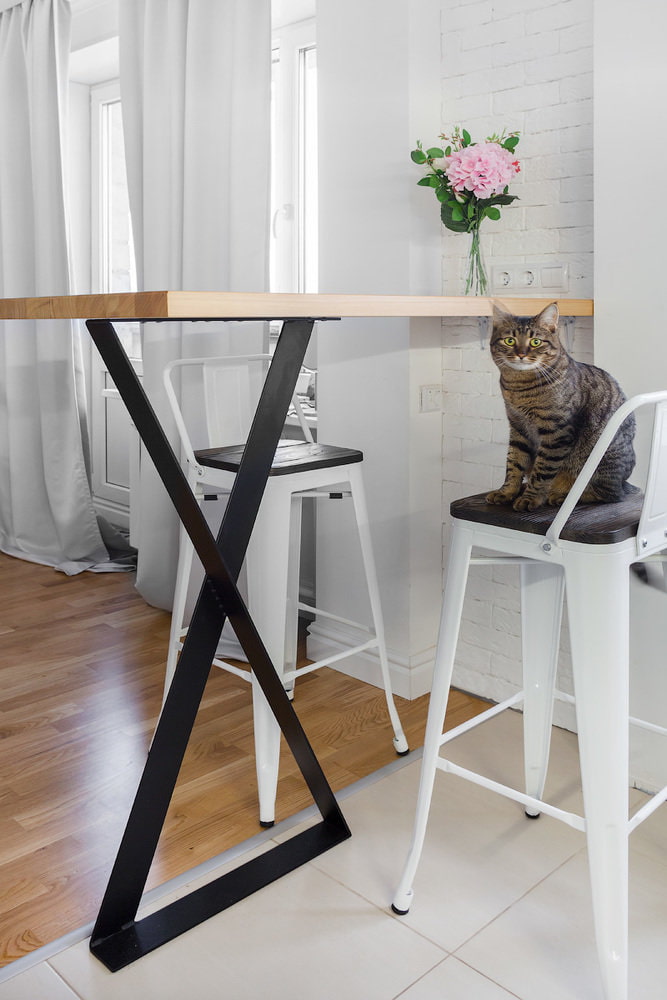
The refrigerator is hidden behind a partition and does not attract too much attention. The kitchen and living room are zoned by the bar counterplaying the role of a dining table. The whole environment is designed in light colors, which is why small kitchen looks more spacious.
Bedroom
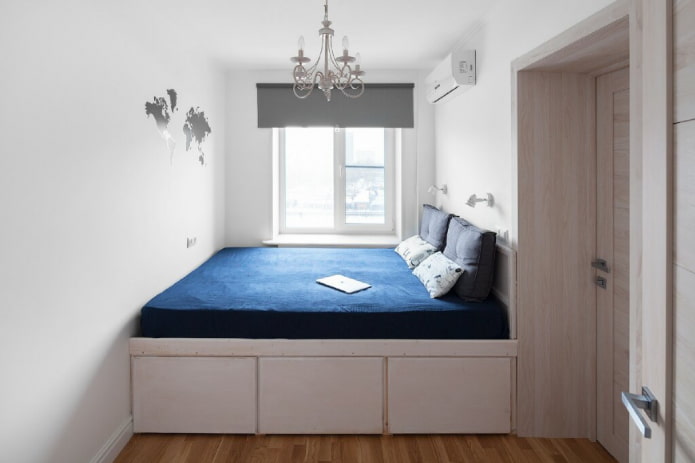
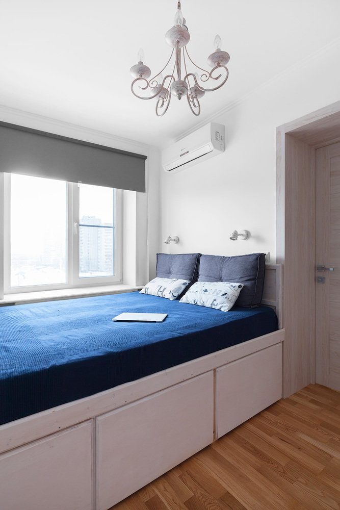
Double podium bed, custom-made, gave the elongated room more regular features. At the bottom there are spacious drawers. This design came out cheaper than a freestanding bed and proved to be much more functional.
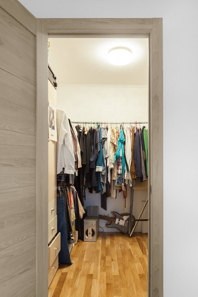
The second half of the room is occupied by wardrobeconverted from a pantry. The owners will change the internal filling to make it more ergonomic.
Bathroom
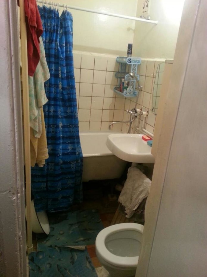
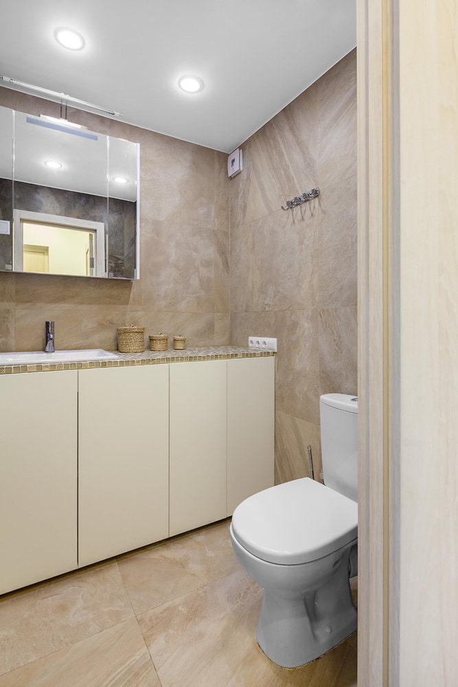
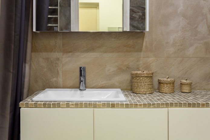
Combined bathroom in sand tones, enlarged by the corridor, it includes a large bathtub, toilet bowl and cabinets, behind the facades of which you can hide a washing machine. There is a mirror with a wall cabinet above the sink.
Wall tiles Italon Magnetique Beige and porcelain stoneware Italon Magnetique Petrol Dark are used as finishes. Vitra plumbing, Ecola lamps.
Despite the desire to save money, the interior of a typical apartment turned out to be aesthetic and comfortable.

 10 practical tips for arranging a small kitchen in the country
 12 simple ideas for a small garden that will make it visually spacious

 Design project kopeck piece in brezhnevka
 Modern design of a one-room apartment: 13 best projects
 How to equip the design of a small apartment: 14 best projects
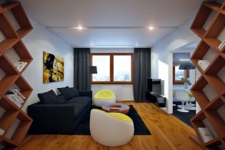 Interior design project of an apartment in a modern style
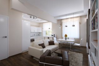 Design project of a 2-room apartment 60 sq. m.
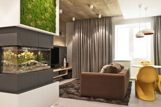 Design project of a 3-room apartment in a modern style