general information
The project was developed by Maxim Tikhonov. The budget was limited, but the client gave the architect creative freedom. The area of the apartment is only 30 sq. M, the ceiling height is 2.7 m. The house was built in 1960. Every centimeter in the resulting interior is used as functionally as possible, so a small studio looks spacious and comfortable.
Layout
The owner got the apartment in a deplorable state. First of all, the designer got rid of the dilapidated finish, demolished the partitions and dismantled the plank floors: the height of the ceilings increased by 15 cm. He cleaned the walls of plaster, leaving the relief of the brickwork.
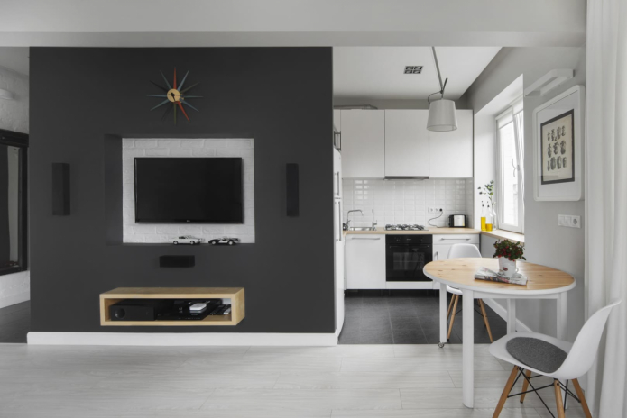
As a result of the redevelopment, the odnushka turned into an open and bright studio with three windows.
Kitchen area
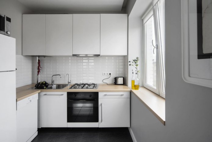
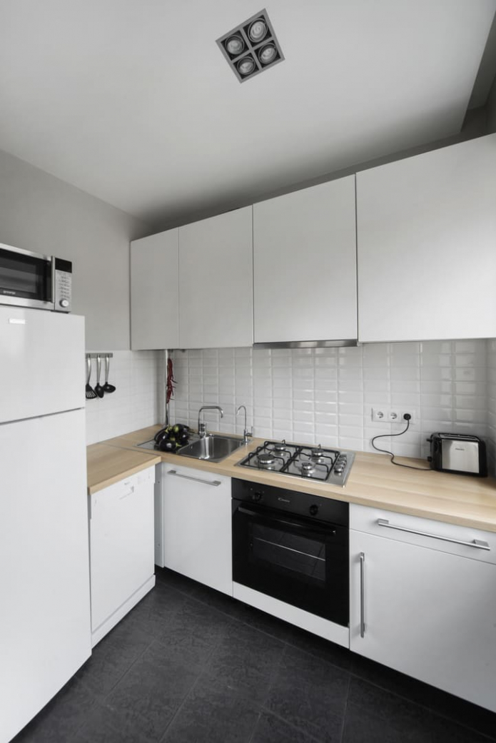
The main color used by the designer is warm gray. Dark details and wooden furniture are accents. The floor is tiled with porcelain stoneware.
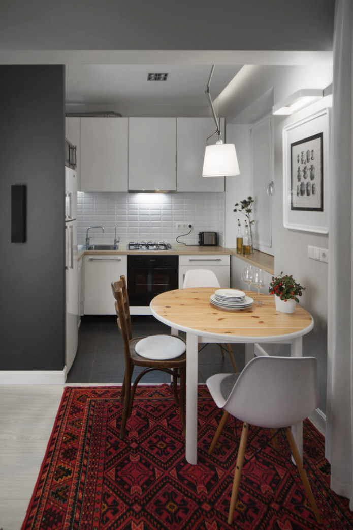
The kitchen occupies 4 square meters, but all the necessary elements are located in it:
- a stove with four burners and an oven,
- washing,
- Dishwasher
- and a refrigerator with microwave.
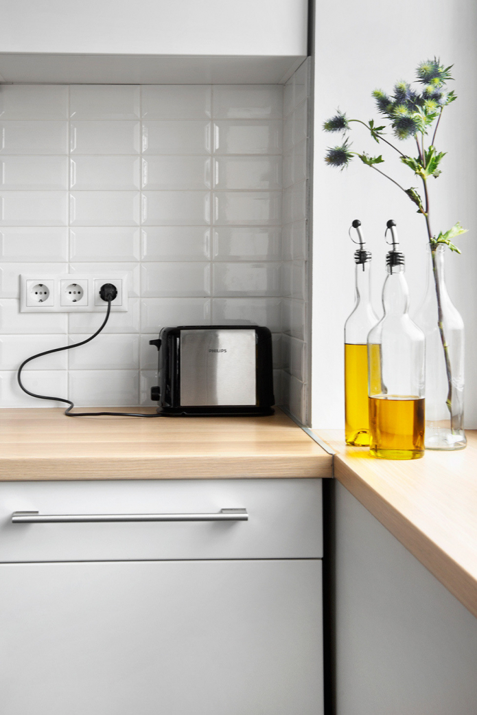
The window sill has become a continuation of the countertop, so there is enough space for cooking. The frame of the kitchen set is made to order, and the facades were purchased from IKEA.
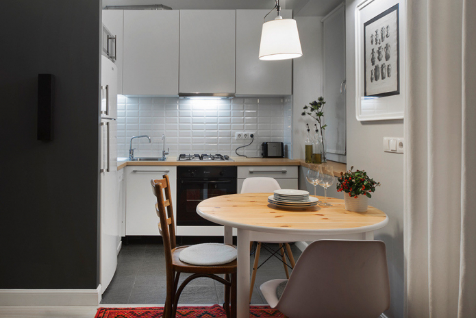
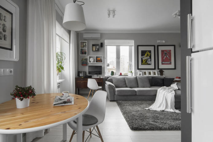
The cooking area blends seamlessly into the dining area, featuring a round table with wood top and Eames Wood designer chairs. Modern furniture is diluted with a retro chair and an ornate rug, giving the atmosphere a coziness. A pendant lamp is located above the dining group, zoning the space with light.
Living room-bedroom with work area
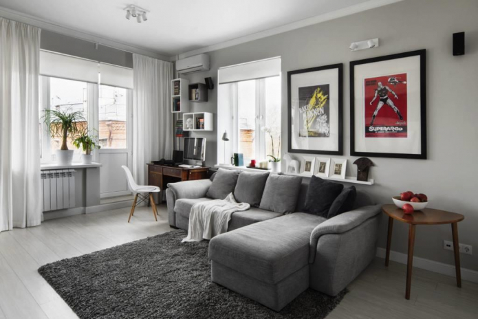
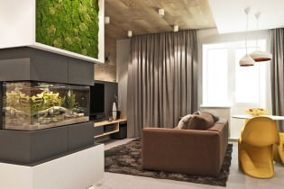
The main accent around which the whole composition is built is a dark gray "cube". There is a TV zone and a door leading to the bathroom. The TV and bedside table are mounted on the wall, so they do not take up much space and create the impression of free space.
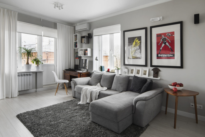
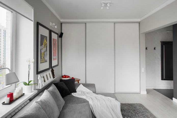
The central element of the living room is a corner Italian sofa that folds out and turns into a bed.
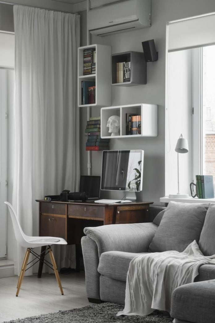
There is a workplace between the entrance to the balcony and the window. A Romanian writing desk from the 60s looks great in a modern interior. Above the table are shelves where books are stored, as well as an air conditioner.
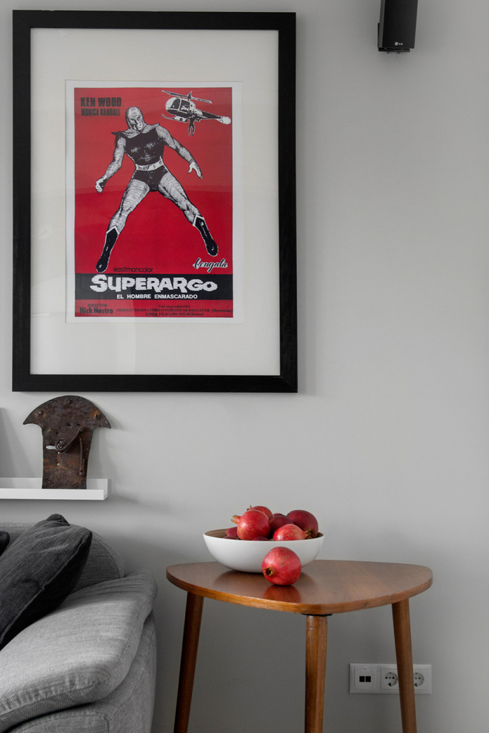
The living room-bedroom is decorated with unusual items from flea markets and bright movie posters. Clothes are stored in a built-in wardrobe with sliding doors, which blends in with the decor thanks to the white fronts.
Bathroom
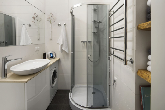
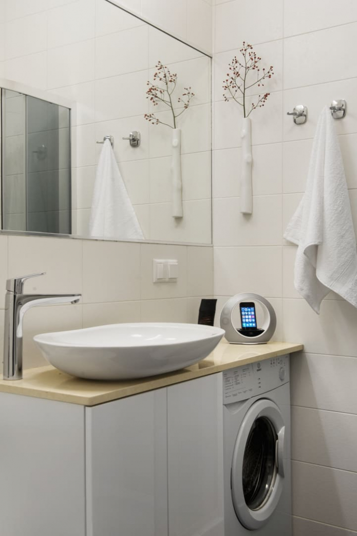
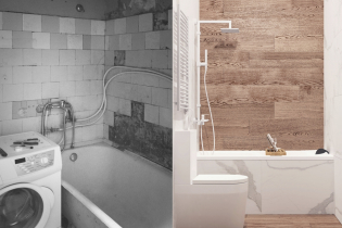
The bathroom and toilet continue the light theme of the entire interior. To save space, the bath was replaced with a corner shower. Drawers for storing household supplies and a washing machine were placed under a single countertop with a sink.
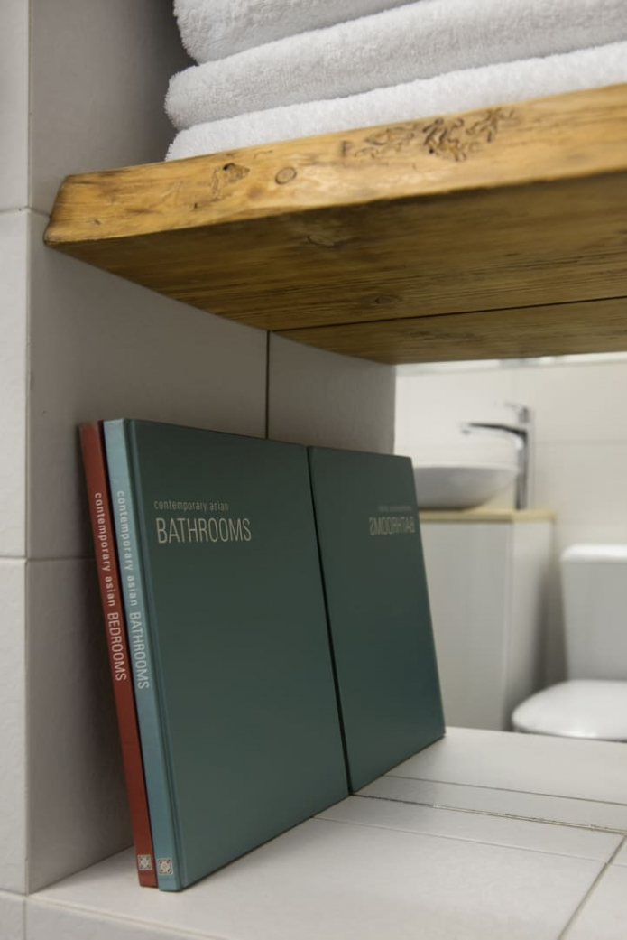
The niche above the toilet, resulting from the camouflage of communications, is played up with wooden shelves with mirrored inserts.
Balcony
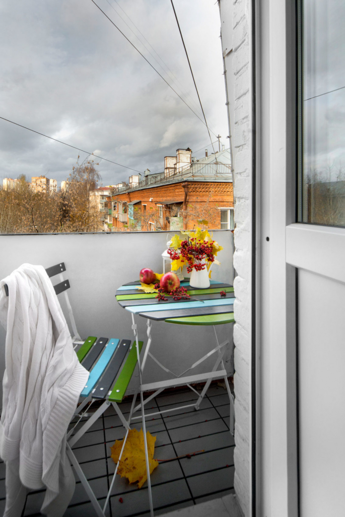
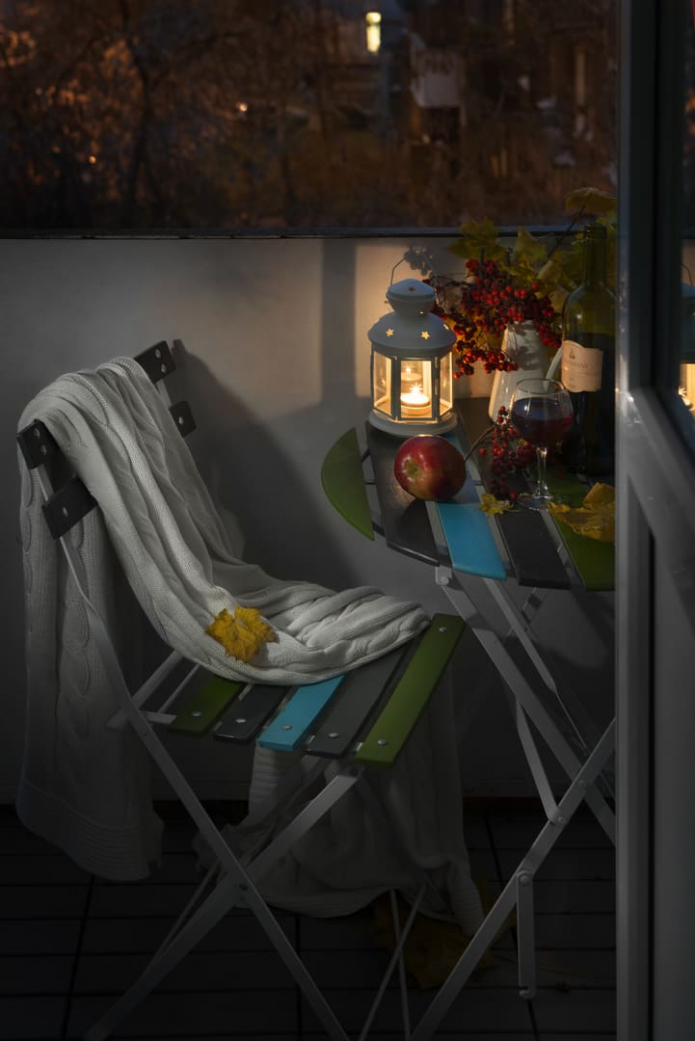
The small balcony adjacent to the room was redecorated: the partition was painted and the floor tiles were laid. Outdoor furniture is foldable: it is not afraid of moisture, but if necessary, the table and chairs can be easily folded and removed.
Hallway
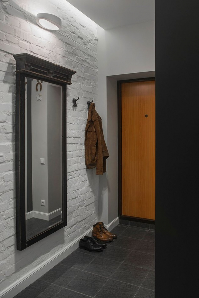
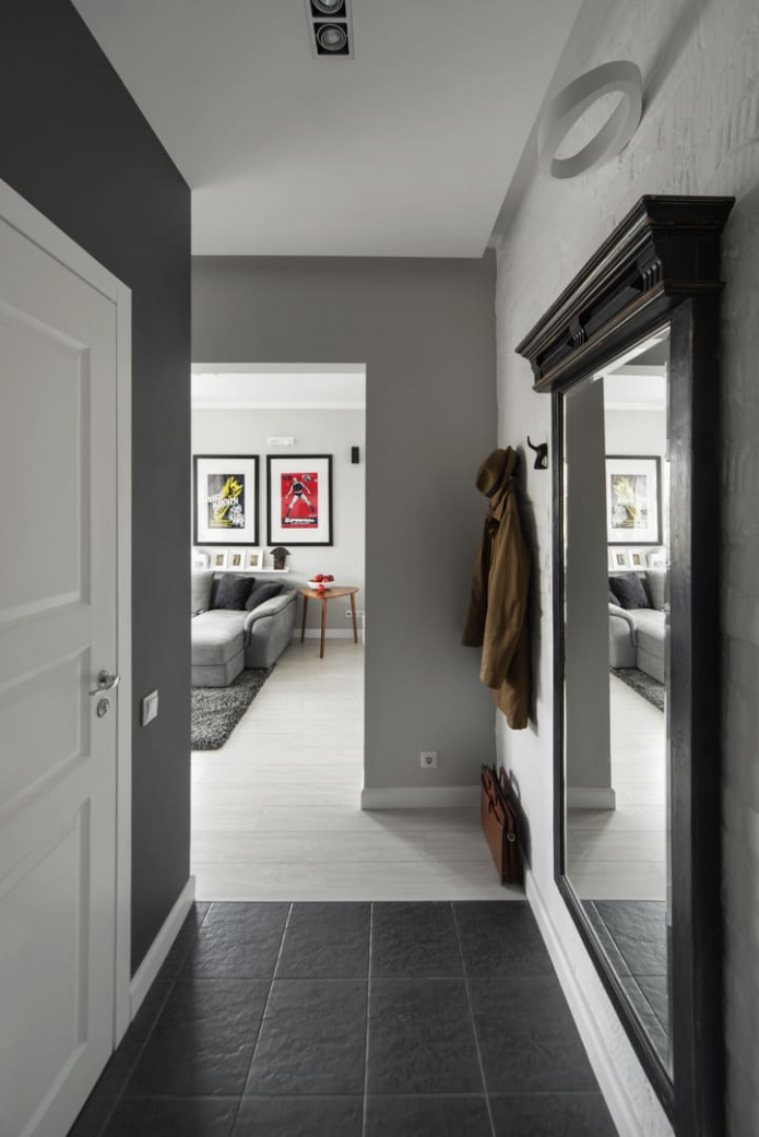
The floor in the entrance area is tiled with the same tiles as in the kitchen: they are wear-resistant and non-slip. The walls are decorated with a brick relief.Open hangers for outerwear, as well as an antique mirror, fit into a small space.
It was originally planned that the owner of the apartment would rent this apartment, but after the renovation he moved there himself. It is not surprising, because the finished apartment is distinguished not only by its comfort and presentable view, but also by its special character.

 10 practical tips for arranging a small kitchen in the country
 12 simple ideas for a small garden that will make it visually spacious

 Design project kopeck piece in brezhnevka
 Modern design of a one-room apartment: 13 best projects
 How to equip the design of a small apartment: 14 best projects
 Interior design project of an apartment in a modern style
 Design project of a 2-room apartment 60 sq. m.
 Design project of a 3-room apartment in a modern style