general information
The apartment is located in Kiev, its owners are young spouses. They bought their first home immediately after the wedding and turned to designer Anton Medvedev for a project.
While studying in the last year of the institute and doing freelance, the guys needed not only a comfortable workplace, but also a full-fledged bedroom. Anton solved this problem in a non-trivial way, creating an interior where every centimeter is used to the maximum, and the furniture changes its position and plays different roles.
Layout
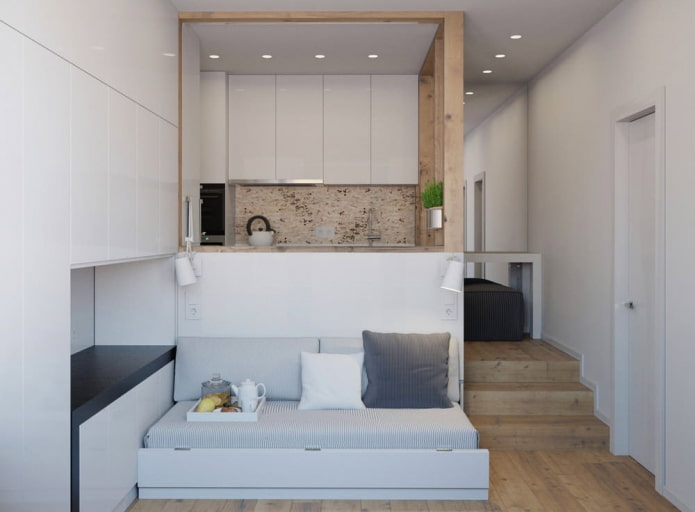
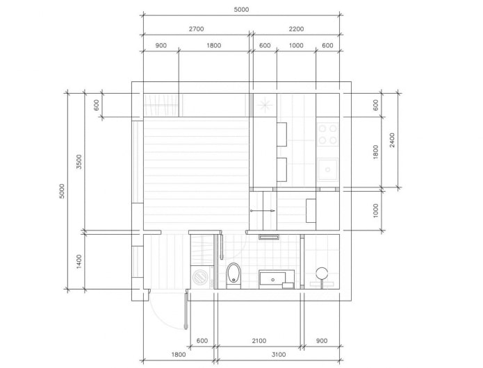
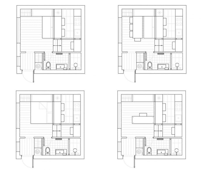
Thanks to the high ceilings, the designer managed to design a spacious podium, which became the basis of transformation. The room was divided into two parts - living room and kitchen. The storage system was placed along the wall and in the corridor. The bathroom was left combined.
Take a look how to competently equip a studio of 25 sq..
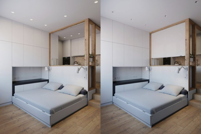
Transformation scheme
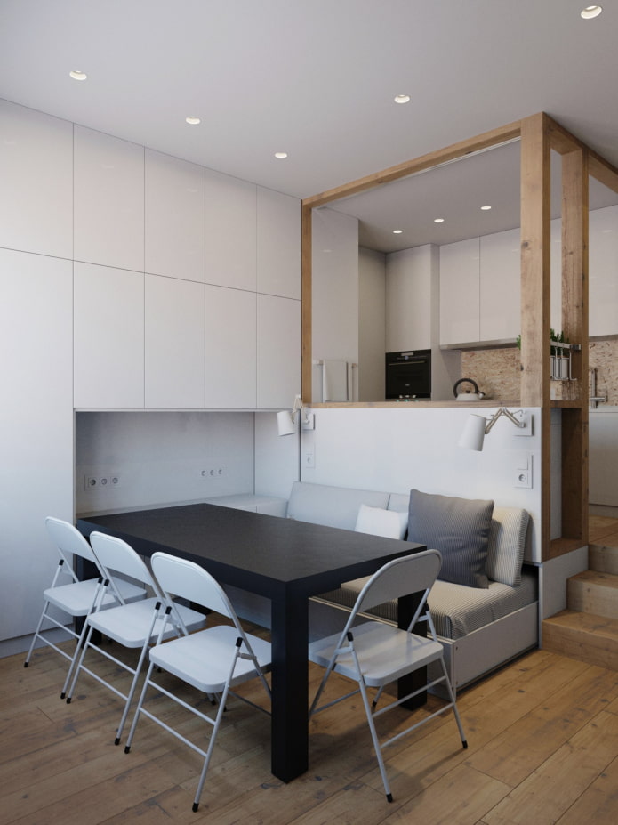
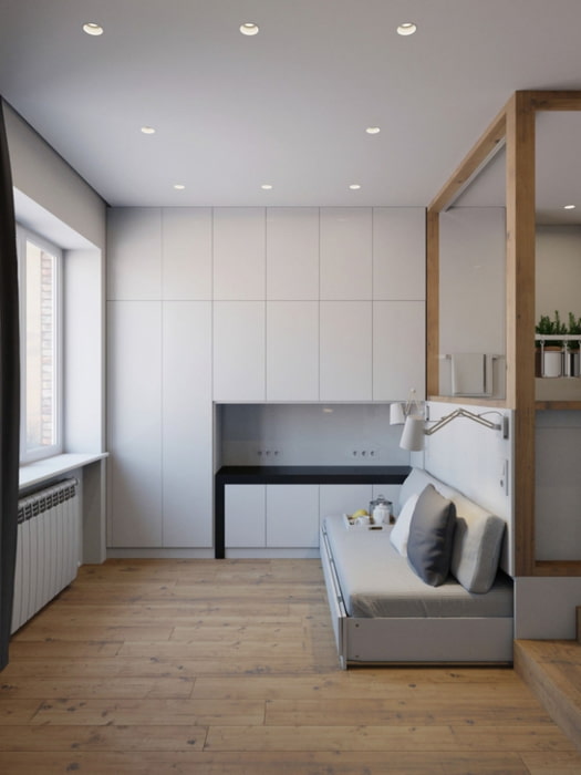
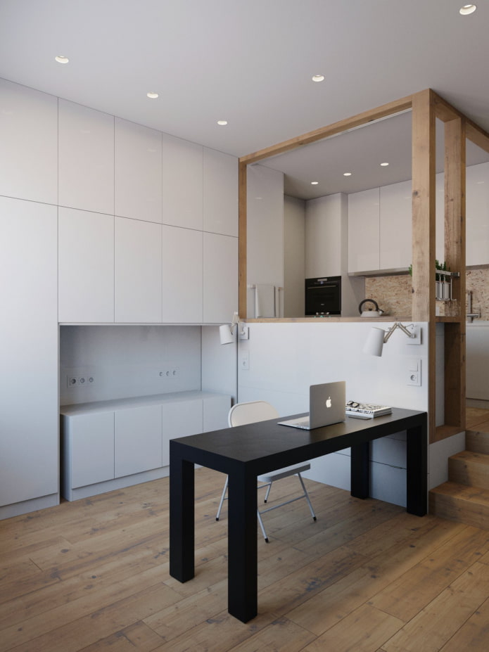
The half-extended bed plays the role of a sofa, and at night it takes up almost the entire floor area, acting as a sleeping place. Next to the sofa, you can put a table that slides out of the built-in system. It serves as both a working and dining place, and folding chairs are included in the set.
Read also about bed in the wall.
If necessary, the furniture is removed into the closet and pushed into the podium - and the studio space is completely freed up.
Kitchen
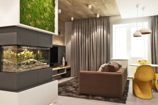
The entire apartment is designed in neutral colors. The interior is laconic. The coldness of light walls is diluted with woody textures and house plants. If desired, the design can be enlivened with colored curtains and pillows.
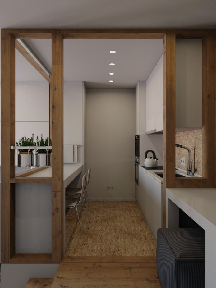
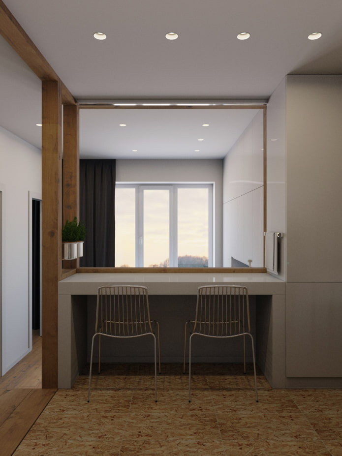
The kitchen and living room are separated not only by a white table, but also by a light-proof screen: if you lower it, one family member can work in the kitchen, and another can relax in the living area.
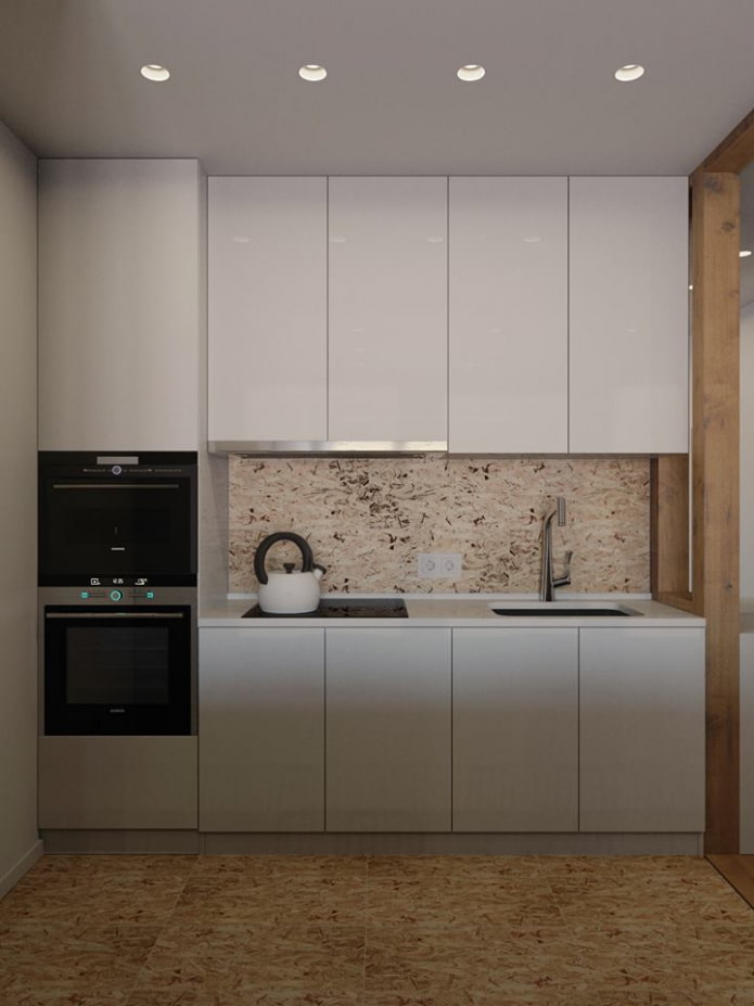
The kitchen set was made minimalistic - with smooth facades without handles... Hanging cabinets reach the ceiling, refrigerator and large appliances are built-in. To the right of the kitchen there was even a place for a dressing table.
Bedroom, workplace and recreation area
In the daytime, the double bed is hidden in a niche podium, and at night it turns into a comfortable place to sleep and rest. IN headboard luminaires are provided that act as working lamps during the day. The black table serves bedside table.
The long wall in the room is completely occupied by wardrobes: there you can store clothes, books and personal items. Thanks to the light color scheme and the absence of handles, the system does not look bulky.
Read also: Where to put the ironing board if there is little space in the apartment?
Bathroom
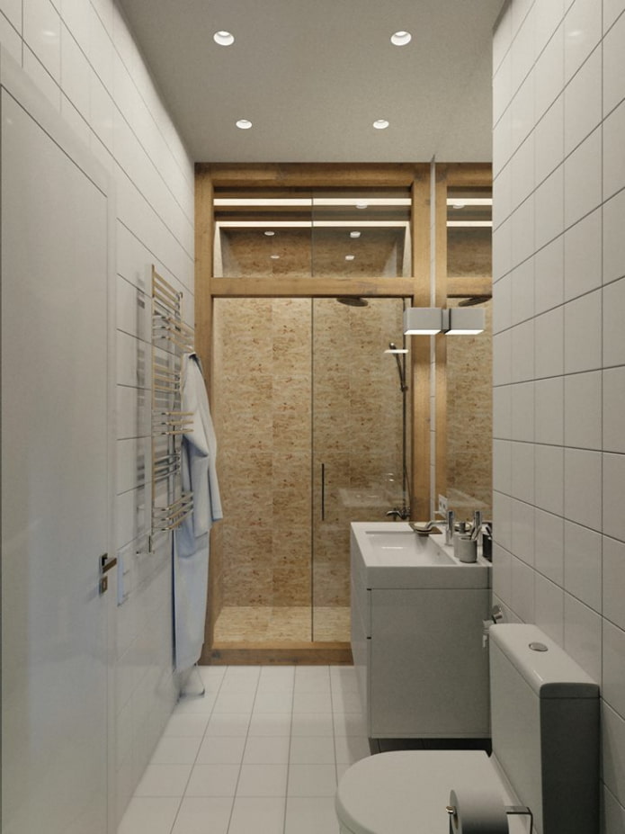
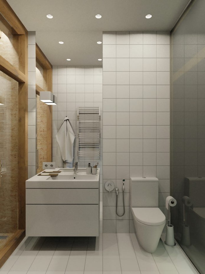
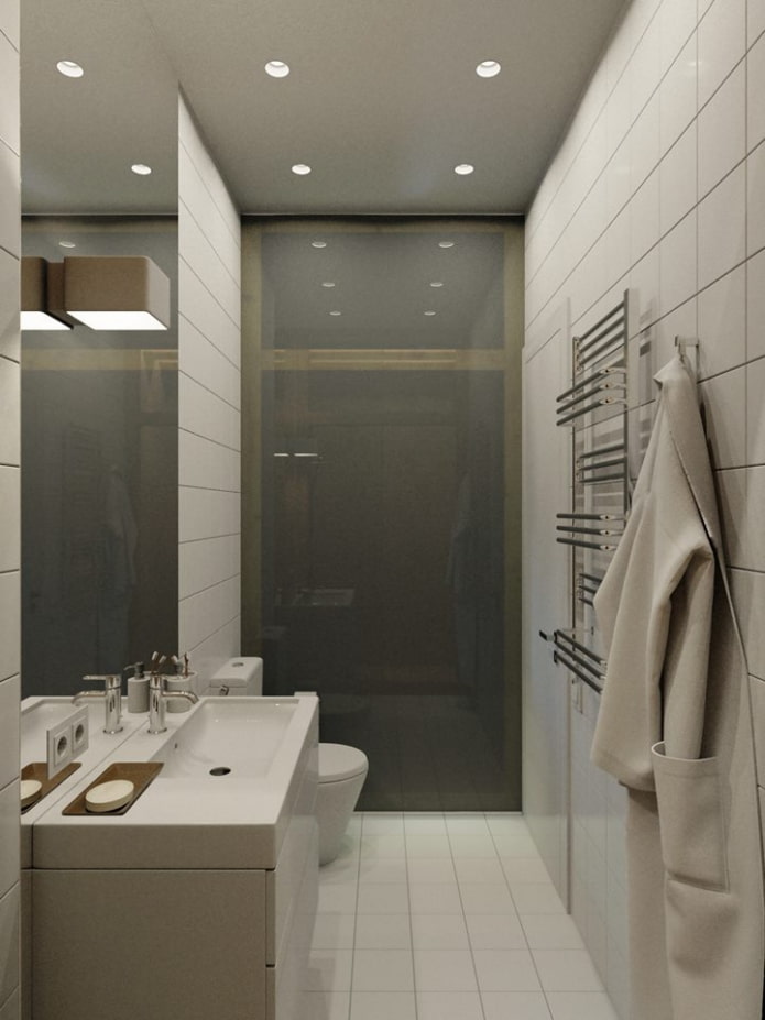
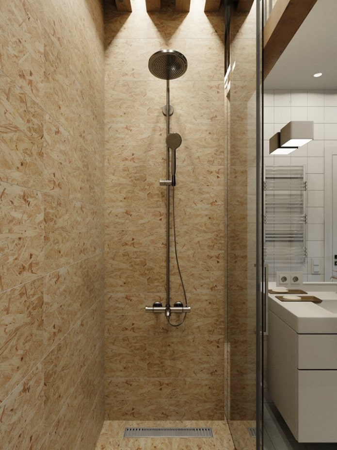
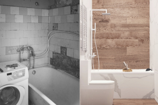
To allow natural light from the corridor to enter the room, the bathroom was separated by a frosted glass partition. The bathtub did not enter the tiny room, so the designer designed shower cabin... The main accent is porcelain stoneware with an unusual texture under OSB slabs.
The space looks wider and lighter visually thanks to the hinged vanity unit - the room seems less crowded. A ceiling-to-ceiling mirror sheet adds light and visually increases the area.
Hallway
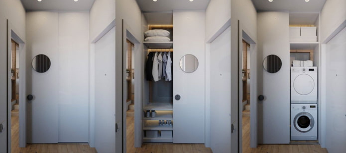
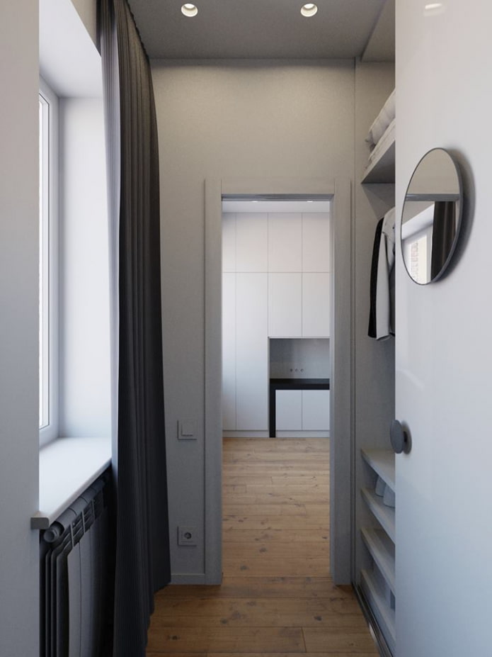
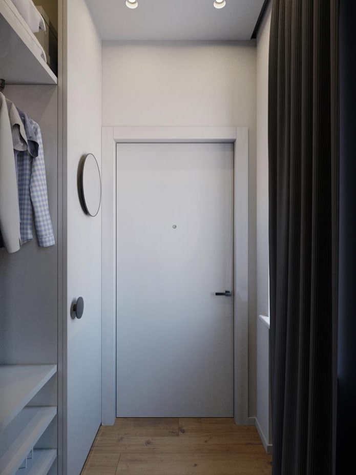
Since there was no room in the small bathroom for a washing machine and an automatic dryer, they were moved to the hallway.
The units were hidden behind sliding compartment doors, reducing the storage area, but not depriving it of the mezzanine.
Designer Anton Medvedev coped with the task set before him perfectly, creating a modern, comfortable and multifunctional interior.

 10 practical tips for arranging a small kitchen in the country
 12 simple ideas for a small garden that will make it visually spacious
 Design project kopeck piece in brezhnevka
 Modern design of a one-room apartment: 13 best projects
 How to equip the design of a small apartment: 14 best projects
 Interior design project of an apartment in a modern style
 Design project of a 2-room apartment 60 sq. m.
 Design project of a 3-room apartment in a modern style