Long corridor
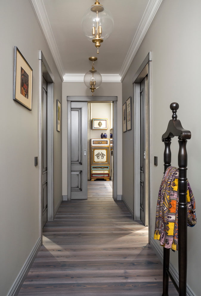
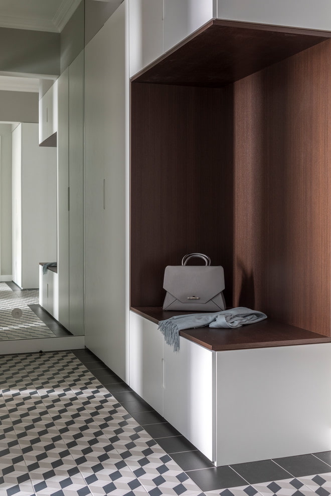
If there are several rooms in the apartment, the doors of which open into a narrow passage, the resulting corridor creates a gloomy impression: there is little light in itand "useless" space is difficult to use. You cannot put a full-fledged closet here - it will eat up a significant part of the area and make the passage even narrower. There are several ways out of this situation.
If redevelopment is possible, attach the corridor to the rooms - many people like open spaces, because they give a feeling of spaciousness and air, making the interior visually more expensive.
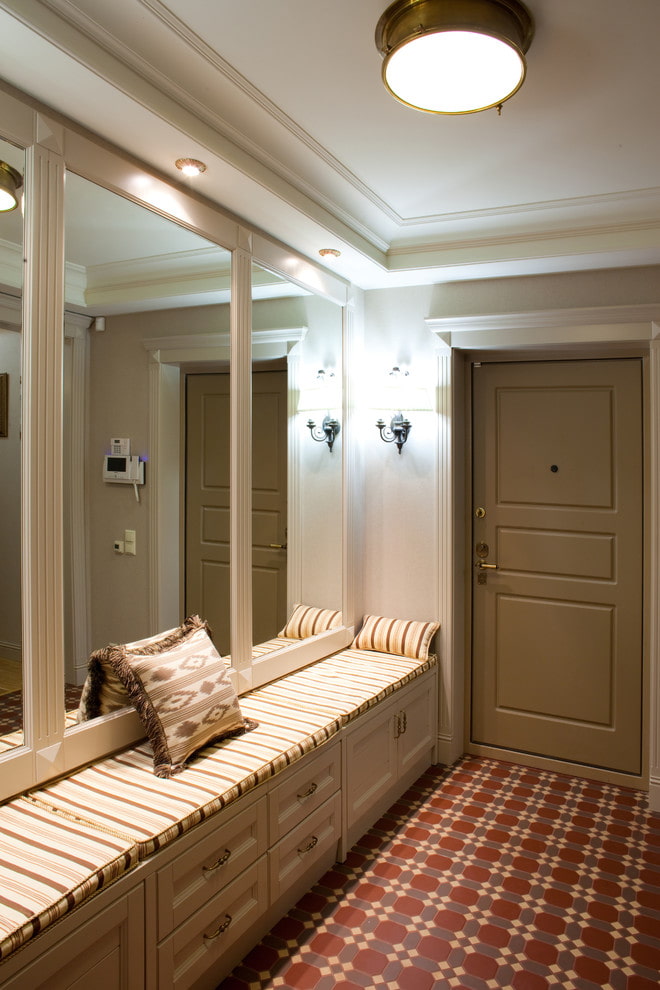
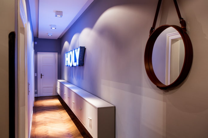
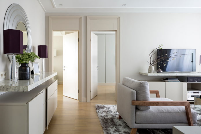
Less expensive way - hang a large mirror on one of the long walls, placing the lamps closer to it. An optical illusion will visually increase the passage as well as the amount of light.
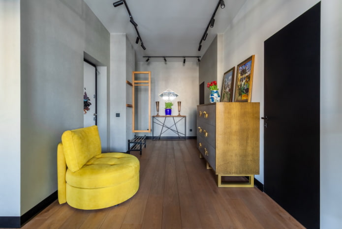
Do not put bulky furniture in a narrow corridor: only relevant here small mezzanines and clever shelving for storing books and beautiful boxes of things. Say "yes" to the decor - on the walls you can place an entire art gallery with paintings, photographs and drawings. Also fit photomurals expanding the space.
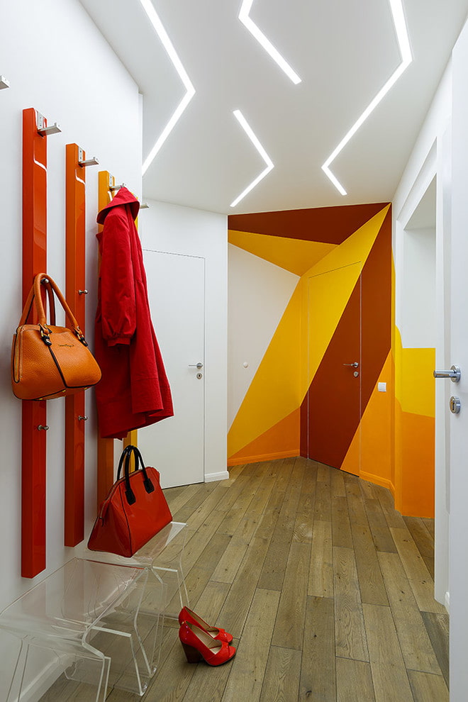
Lay laminate or parquet flooring transversely or diagonally: this will help to visually expand the corridor. Try to play with geometry by painting long and short walls in different colors - a monochromatic design will only emphasize the irregular shape of the passage.
Huge hallway
The opposite of a narrow corridor, but almost as ill-conceived and often useless. Such ceremonial halls of 16-20 sq. m look spectacular, but they bring unnecessary worries to their owners - few people like to pay for unused footage.
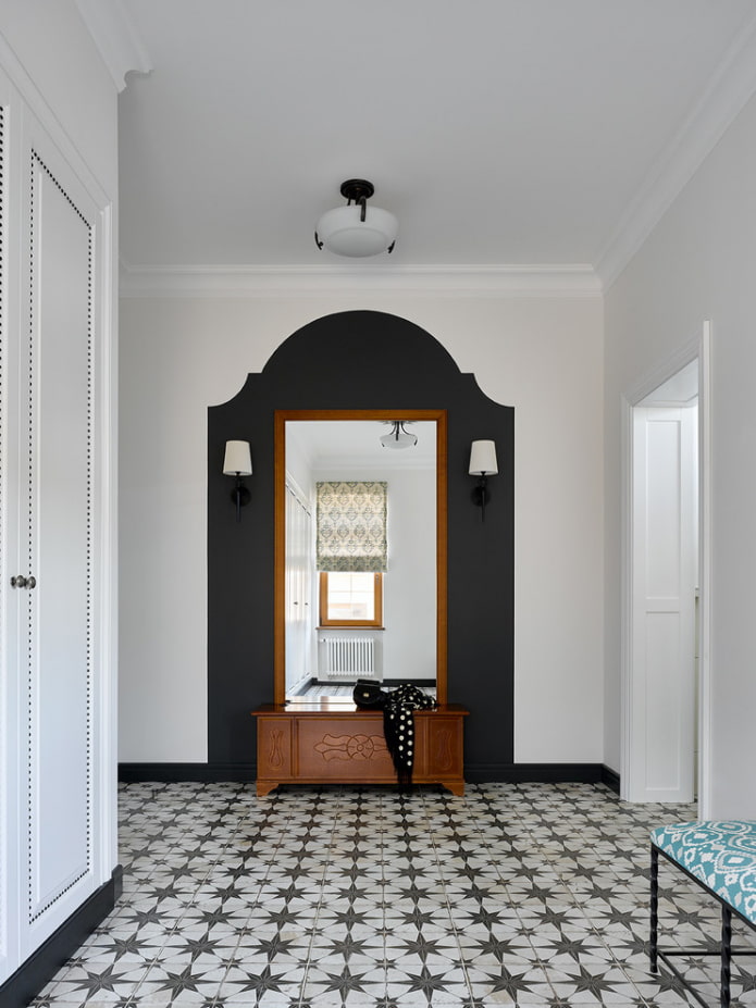
Disguise the empty space by choosing more "solid" pieces of furniture: an ottoman instead of an ottoman, a dark wardrobe of a complex shade, a large mirror in a carved frame. You can also turn the hall into a room by adding a small sofa, chest of drawers and decor.
"Load" the center of the room - floor or ceiling - with a carpet of tiles, contrasting paint, or a tiered chandelier to displace the focus from empty spaces. Play with colors, textures and custom furnishings to enhance your space.
Narrow room
If a arrange furniture in a pencil-box room along the walls, the room will resemble a carriage. You can adjust the proportions using a built-in closet on a short wall or even a walk-through dressing room: this is the most rational use of space bedrooms, which will allow you to remove all large things and clothes.
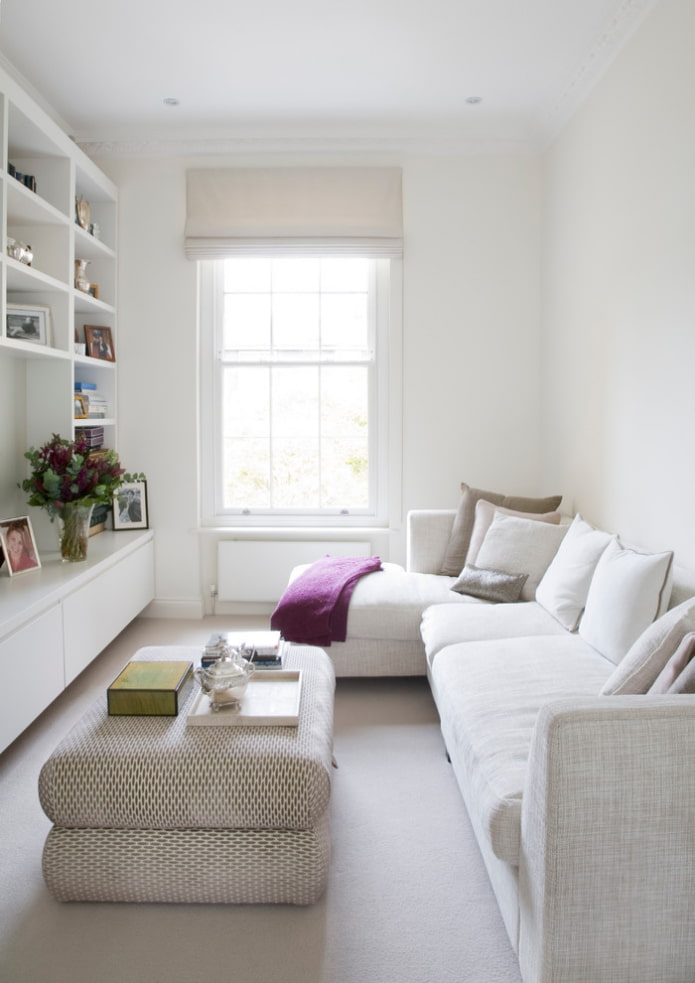
It is reasonable to divide the long room into zones: for the living room, this is a place for communication and a TV zone, a workplace by the window, a mini-library. To compensate for the lack of seating, it is reasonable to put a light corner or elongated sofa: with it, the room will seem less narrow.
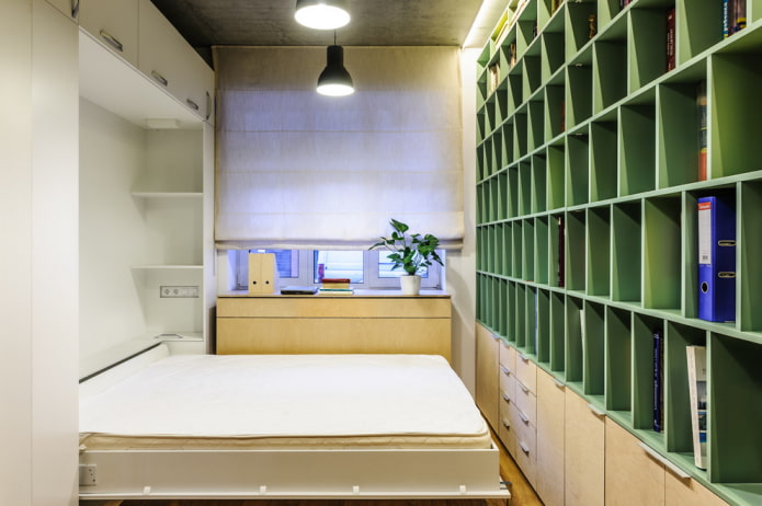
Items on thin legs, hanging bedside tables, dressers, shelves will help to "expand" the room. Transformers are appropriate: folding bed, table, sofa.When the floor is clearly visible, it gives the impression of a free space.
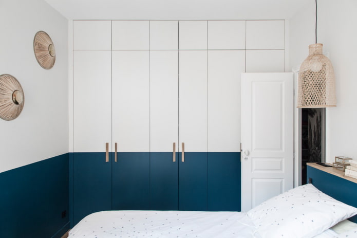
Do not write off light partitions either: open shelving, shelves, trellises with flowers, translucent walls. They split the long "pencil case" into two squares, making the space more harmonious. Another design trick: painting the lower half of the wall in a contrasting color.
Cramped kitchen
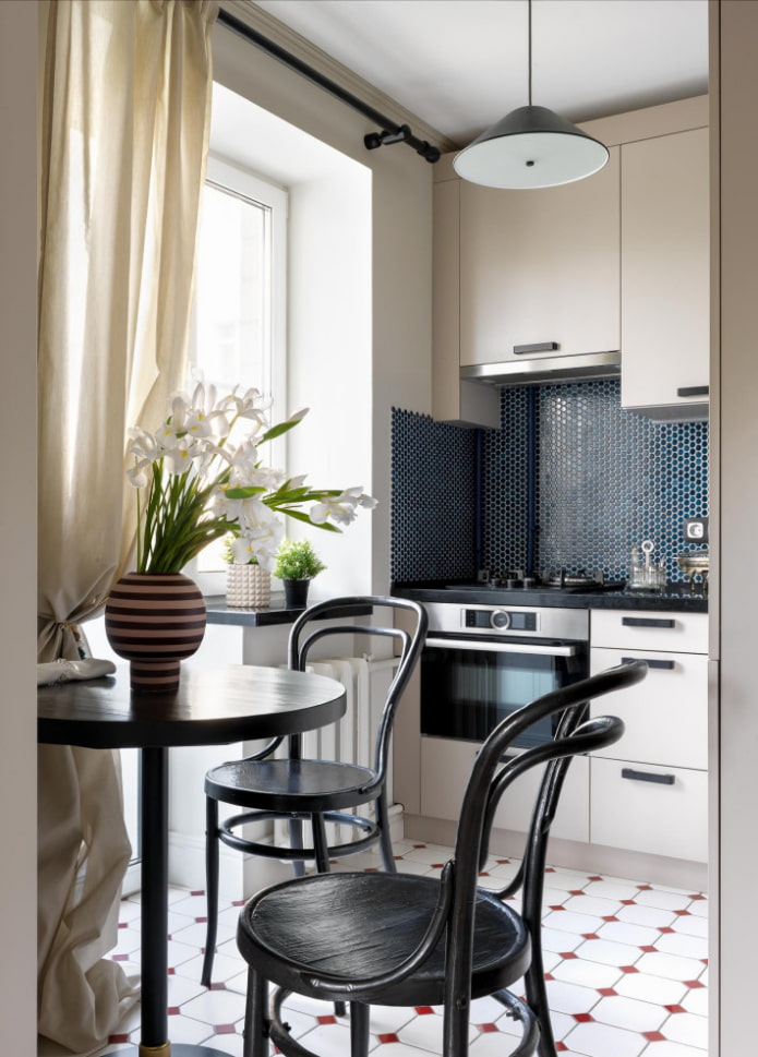
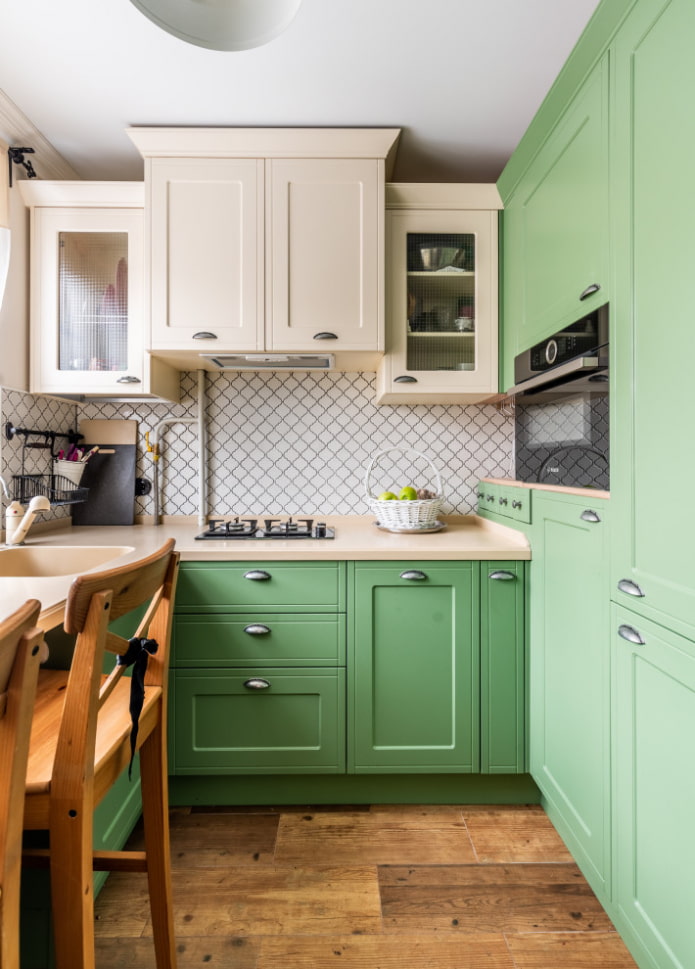
The optimal kitchen area is about 10 sq. m, but in typical Khrushchev it is half that. To make the room more convenient and free up space for a full-fledged refrigerator or table, many owners attach the kitchen to the living room, expanding the space.
But if this option is not for you, use the maximum of tricks to increase the usable area and free up all possible surfaces.
Costly ways:
- clever custom kitchen with a single worktop and high lockers to the ceiling;
- transfer of the sink to the windowsill;
- built-in furniture and appliances;
- "highlighting" all surfaces with wallpaper, tiles and paint.
Budget methods:
- reorganization of space, putting things in order: the less visual noise, the more spacious the kitchen seems;
- getting rid of wall cabinets (solution for minimalists);
- window decoration with roller blinds instead of curtains;
- the use of folding furniture, a small round table, stools instead of chairs.
Walk-through room
If you don't need a walk-through space, make a redevelopment by separating part of the room into a small corridor and creating two isolated rooms. The transfer of the door and the construction of the partition will have to be coordinated.
If this is not possible, use shelves, wardrobes and curtains to separate the privacy area - this is especially true for families with children or couples whose lifestyles do not match. Put sliding doors instead of swing doors to save space.
Do not place furniture around the perimeter of the walls so as not to take up all the free space. It is good when the sofa is the zoning element. And to add comfort to the room, install a false fireplace.
Few windows
An unsuccessful layout is expressed not only in uncomfortable rooms, but also in a lack of light. If the windows are small or there are not many of them, work on artificial lighting: install LED lamps that are almost identical to the light of the sun - their color temperature is 3800-4000K. Halogen or yellow incandescent bulbs are depressing, exhausting or not bright enough.
Get rid of dark walls and dark window frames - light surfaces reflect light. White frames "dissolve" in space and let in the maximum amount of light. For walls, not only white colors are suitable, but also blue, sand, pink, gray shades.
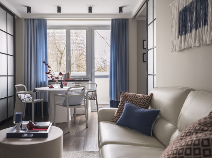
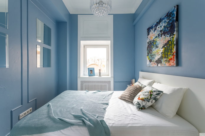
If the window is adjacent to the loggia, give up heavy curtains and dark curtains. Please select for light flooring, which will reflect the ceiling light and will expand the space not only during the day, but also in the evening. Another interesting technique with painting the walls near the window can be seen in the second photo.
Incorrect room shape
If you have purchased an apartment with asymmetrical walls, an unusual window or semicircular rooms, your home looks original, but now it is difficult for it to choose suitable furniture and rationally use meters.
Large items will have to be placed along flat walls, which limits the options for arranging furniture. The way out of the situation is to make suitable designs to order, but they cost more than finished products. It is possible to correct the interior space by mounting, moving and extending walls, as well as combining rooms, but the process requires cost, time and coordination.
You can hide the problem by arranging the paired furniture symmetrically (armchairs, table with chairs), or by drawing attention to the brighter elements of the furnishings (stained glass window, luxurious mirror).Organize a built-in storage system if the bathroom is irregular.
Don't be afraid to use bright colors to smooth out or even out corners, or, conversely, to emphasize unevenness. Another effective technique is to hang the curtains so as to hide the asymmetry.
Sometimes "wrong" is desirable and there are no problems with it, because with a competent approach, a disadvantage turns into a virtue.

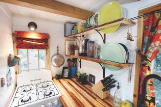 10 practical tips for arranging a small kitchen in the country
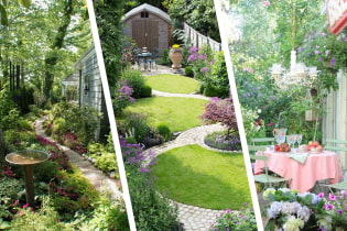 12 simple ideas for a small garden that will make it visually spacious
 13 bad habits a good housewife shouldn't have
 24/7 home cleanliness - 4 secrets for the perfect housewife
 6 hotels in Sochi that will give odds to the promoted foreign hotels
 Top 10 interior design trends 2020
 Rating of cheap TVs with Smart-TV
 New Year's LED garlands on AliExpress - we disassemble while it's hot, so that it's bright at home