Pros and cons of light design
Benefits bathroom in light colors:
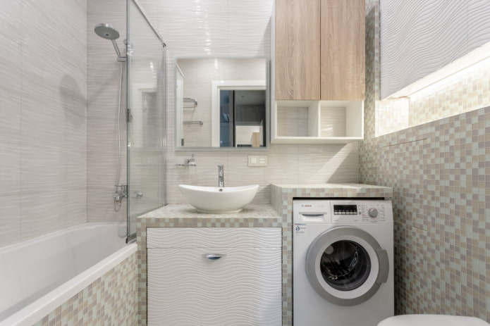
- Visual increase in space... The fact that white makes them look fat is more a plus than a minus for the walls. White and other unsaturated shades are a godsend for tiny bathrooms.
- The interior is timeless. Having looked at the photo of light bathrooms, it is usually difficult to say in what year the renovation was carried out here, because such decoration does not go out of fashion.
- Replacing natural light... Bathrooms usually do not have windows - this drawback is compensated for by light colors and glossy, light-reflecting finishes.
- The perfect backdrop for decorative accessories... If you like to transform the interior, the easiest way is to do it on a neutral color background: white, beige, gray.
- Feeling clean... A cold light palette is associated with sterility and neatness, which will never be superfluous in the bathroom.
disadvantages bright bathroom:
- Hospital room effect... For many, white is associated with the operating room and the bathroom may seem uninhabited. You can solve the problem with the right decor.
- Easy-care light floor... If you do not want problems with cleaning, choose a floor covering of medium saturation: unlike walls and furniture, it is almost impossible to clean white tiles on the floor.
The question of the overall practicality of a room in light colors is controversial. It all depends on the chosen color and material. For example, light non-porous surfaces (glazed tiles, glossy facades) are much easier to care for than dark ones. In addition, dust is not visible on them. And matte, porous can accumulate dirt, it is difficult to clean.
Important! A bathroom in light colors can be of any size, but for compact rooms this color scheme is almost mandatory.
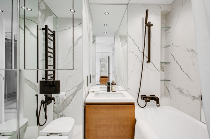
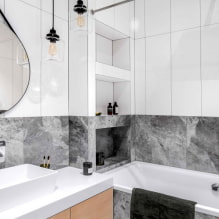
The photo shows a combination of marbled walls with black plumbing
What color range should you choose?
So that the design of a bright bathroom does not associate with a hospital, we recommend that you dive into the study of the light palette: you will be amazed at how rich it is.
For example, the usual white has a huge number of shades:
- antique - resembles light beige;
- floral - with a touch of pink;
- snowy - gives off blue;
- biscuit - warm unsaturated orange;
- smoky - very light gray.
Such an abundance of undertones allows a room in bright colors to look boring when using white alone.
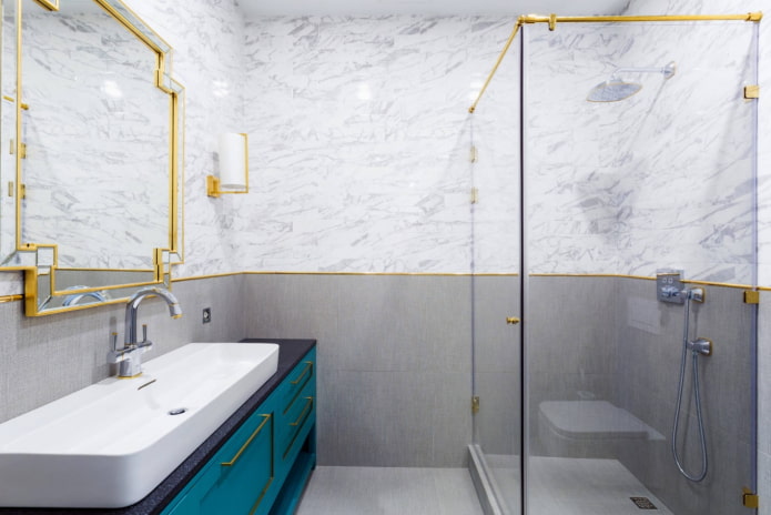
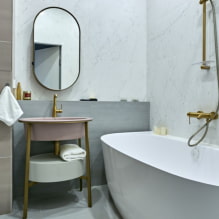
In the photo there is gold fittings in the bathroom
If the option does not fit, there are two at least universal alternatives:
- Sand... Warm beige gives an uncomfortable cold bathroom a touch of comfort. Thanks to the use of cream, wheat, linseed, you can create a great place where it will be pleasant to lie down and relax after a hard day.
- Grey... Despite the richness of colors, the color is mostly cold. Depending on the saturation, it can be either almost white, or pearlescent or silver - while remaining light.
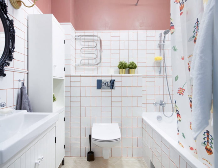
In the photo, a combination of snow-white with pink
To dilute the base shades or replace them altogether, use pastel... Most popular shades:
- peach;
- purple;
- mint;
- blue;
- ashen;
- taupe.
And other colors, the name of which begins with the prefix pale or light (pale yellow, light pink).
What is the best finish to use?
Repair in a bright bathroom is not much different from any other: finishing materials must be waterproof, not afraid of chemicals, easy to clean. Suitable options for walls: tile or porcelain stoneware, waterproof paint, PVC panels, decorative plaster... In a large bathroom outside wet areas, you can glue vinyl wallpaper.
If the bathroom is tile from floor to ceiling - give preference to smooth, glossy surfaces (if we are talking about walls - gloss is traumatic on the floor!). They are easy to clean, besides, they reflect light and visually make the room more spacious.
The panels can be matte, especially if the size of the bathroom does not need to be increased. Glossy plastics often look cheap, and as for paints and varnishes, you should not save on them. Choose trusted manufacturers (Dulux, Tikkurila, Dufa) - their lines already have compositions for kitchens and bathrooms that are resistant to moisture and washing.
The advantage of paint is its extensive tinting possibilities: this is convenient if the walls must be combined with already installed doors, for example, or purchased furniture.
For floor, as we already said, it is better to choose something brighter: for example, lurid tiles with a geometric or oriental pattern. A medium contrast wood-like flooring is also suitable.
When renovating a bathroom in light colors, do not forget about ceiling... There are 3 main options - paint (also waterproof), tension or rack (PVC panels). The second and third methods are relevant if you need to install several light sources and hide the wiring.
How can you dilute the interior?
To make a bright bathroom look more interesting, use small color accents. You can dilute the interior with bright or dark tones - it all depends on the chosen style and personal preferences of the household.
Important! Accents should not come to the fore, their task is to dilute, but not prevail.
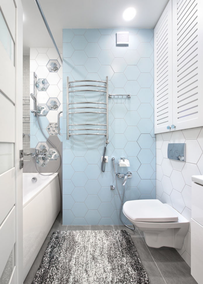
The photo shows the interior of a bright bathroom with blue details.
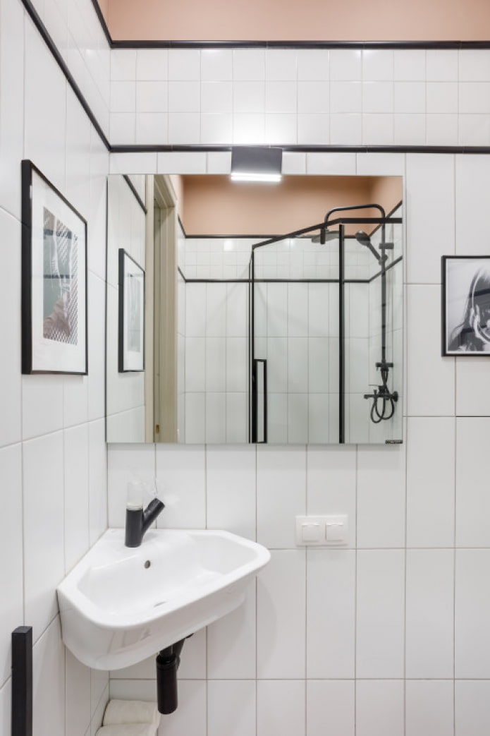
Classic black and white the combination, for example, looks contrasting, but not everyone likes it. However, when creating a minimalist light bathroom, take a look at the black plumbing fixtures.
Beige is diluted with brown, light gray with graphite. By focusing on one color, the result is a bathroom design in modern style... But do not forget about the proportions: light - 70%, medium - 20%, dark - 10%.
Bright yellows, reds, blues, greens in an approximate ratio to the base 1:10 are a great way to set the right mood for the interior. They can be in the form shutters, laundry baskets, rugs - then changing the boring design in the future will not take much time and money.
In what style is it better to arrange?
Depending on the chosen direction in design, bathrooms in light colors will look different.
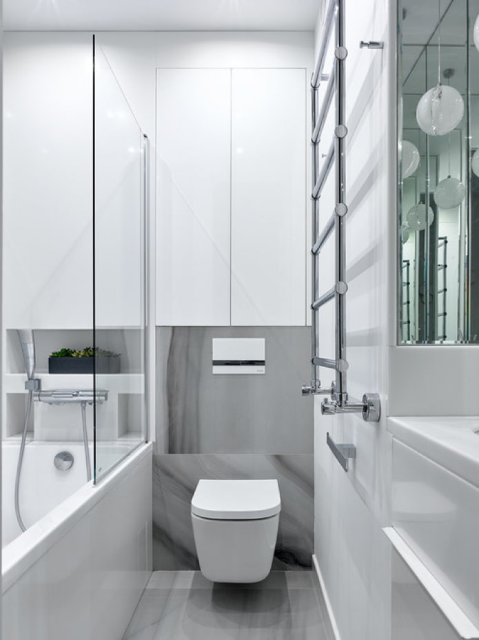
- For example, ultra-modern high-tech relies on a boiling white bath, sink and toilet, and they should be combined with metal, glass surfaces and mirrors.
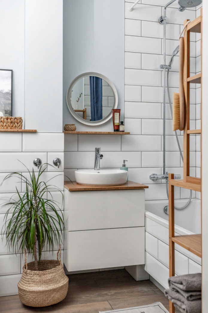
- Cozy scandi prefers a white or gray background, but dilutes it mainly with wooden furniture and wicker accessories (baskets, rugs, mats). The decoration is appropriate not only for a glossy hog, but also for a square mosaic, monochrome or colored tiles with oriental patterns, hexagons and other unusual shapes.
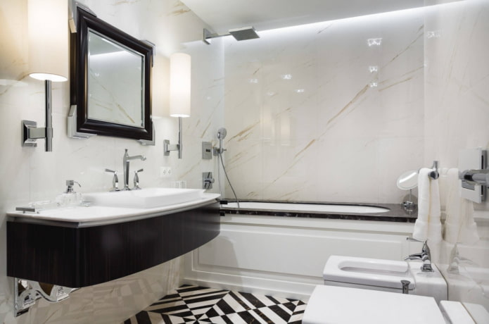
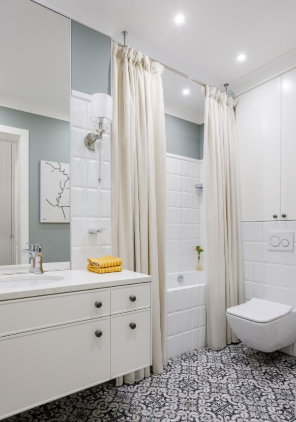
- Classic prefers a warm range: sand, ivory, almond, peach. It is better to combine with platinum or gold details. The accent can be made on a massive ornate chandelier.
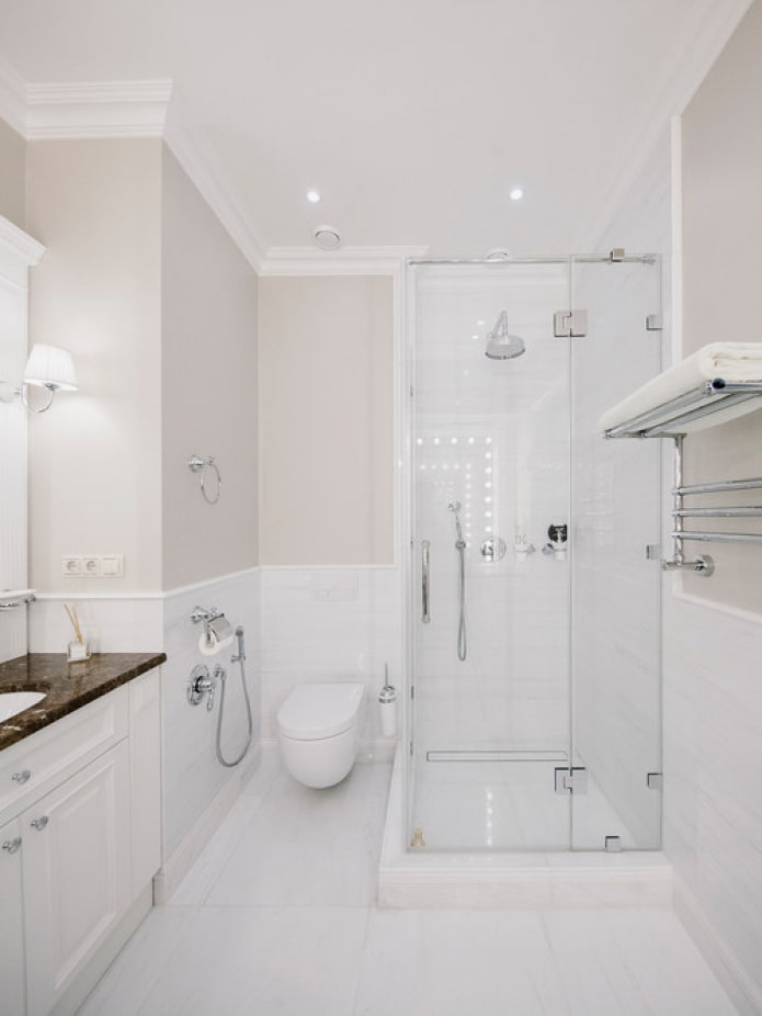
The photo shows the interior in a classic style
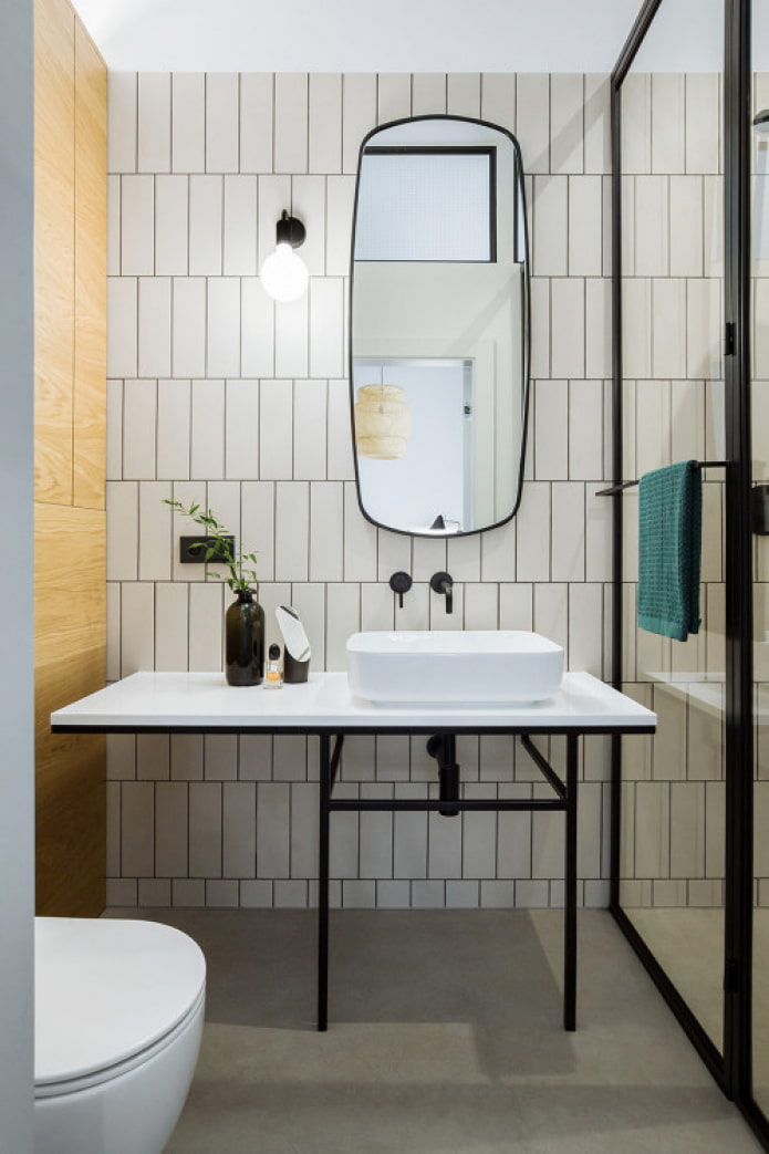
- Minimalism relies on clear lines and straight shapes. It also requires closed storage systems: the countertop and other surfaces must remain empty, any jars will create unnecessary visual noise.
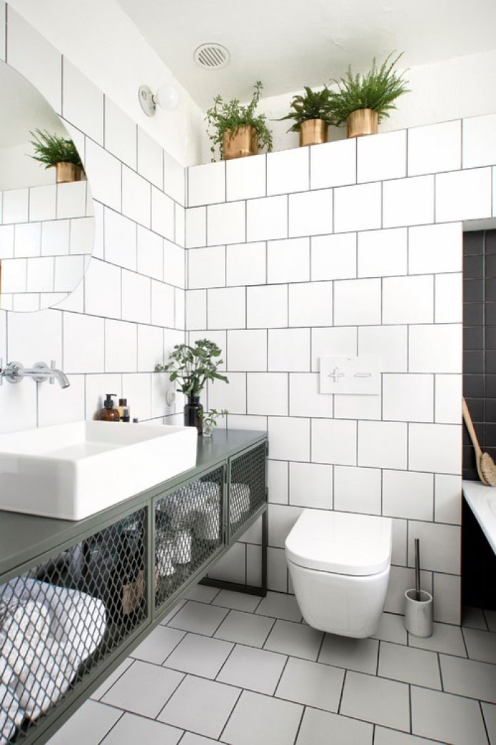
- Loft, oddly enough, it can also be light: the walls are made of concrete (tiles or microcement), and metal furniture is chosen instead of laminated chipboard.
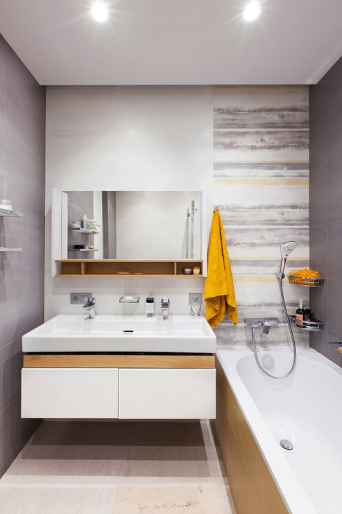
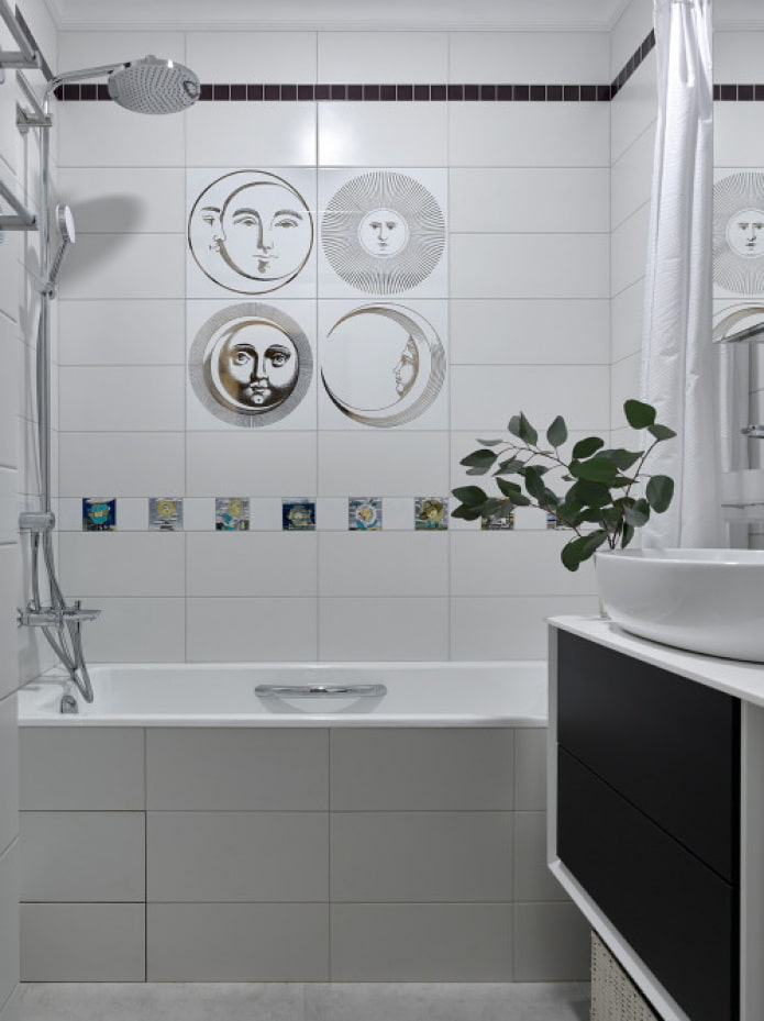
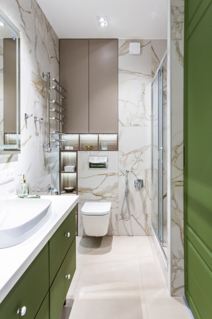
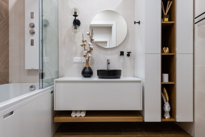
Photo gallery
A light finish is a great option for those in doubt. It will act as a "blank sheet" on which you can depict whatever your heart desires: from neutral design to bright and flashy.

 10 practical tips for arranging a small kitchen in the country
 12 simple ideas for a small garden that will make it visually spacious
 How to position the washing machine in a small bathroom?
 How to remove plaque from the bathroom curtain?
 7 common mistakes in small apartment renovation that eat up all the space
 Apartment layout: how not to be mistaken?
 Wallpaper for the bathroom: pros and cons, types, design, 70 photos in the interior
 Modern bathroom interior: 60 best photos and design ideas