Color matching rules
To choose the right bathroom color, there are many factors to consider. The very first and simplest is the size. Everyone has long known that a dark tone can make a small space even smaller, and using light colors you will visually expand any room.
Next, we recommend paying attention to the style of the apartment or the bathroom itself. Each direction has its own base of suitable shades:
- classical - warm white, beige, gold;
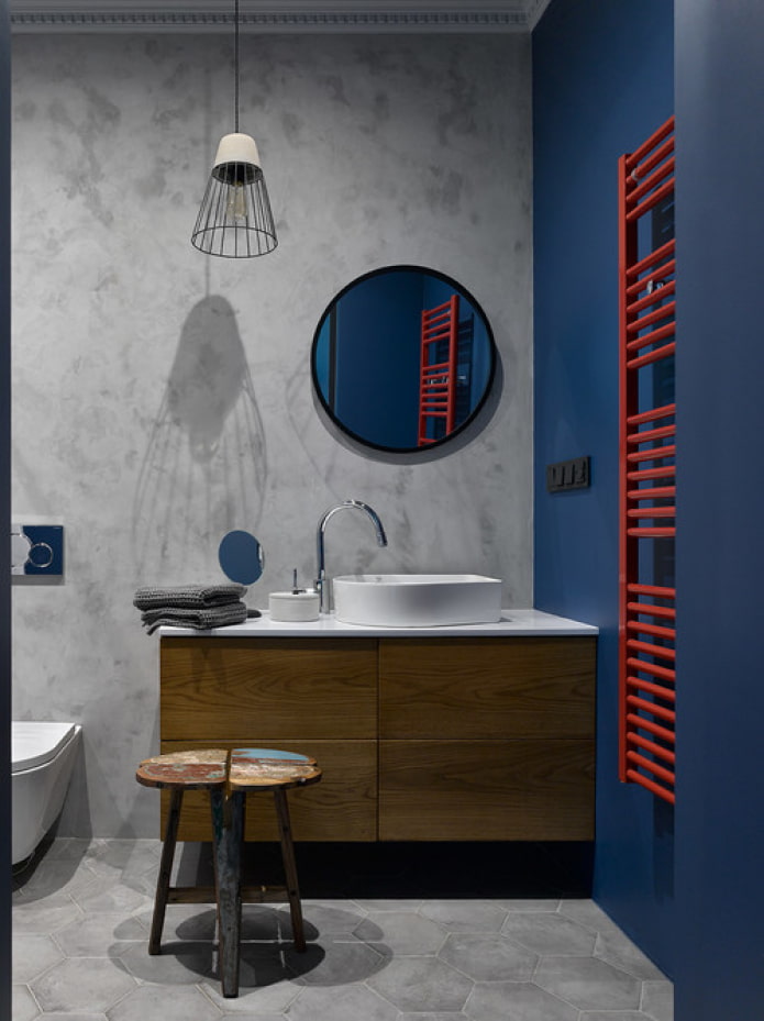
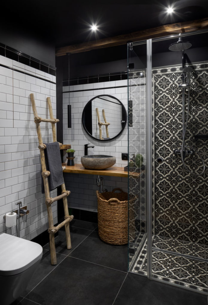
- loft - black, gray, red;
- Scandinavian - white, gray, beige;
- provence - pastel shades;
- chalet or country - warm dark brown scale;
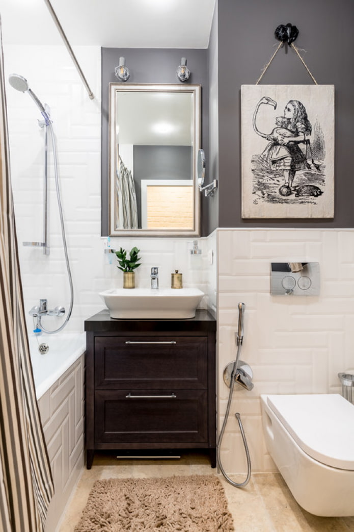
- modern - muted matte colors.
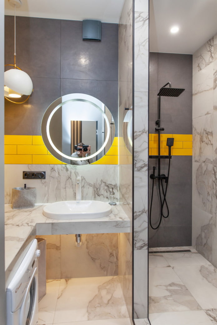
Aspect # 3 worth paying attention to: psychological impact of color and your personal feelings from it. In a yellow bathroom, for example, it is impossible to relax before bed. BUT combination of black and white does not give a charge of vivacity and energy in the morning. Think about when and under what circumstances the room is used more often.
Do not forget about the characteristics of the color itself:
- Saturation... Orange, for example, uplifts and energizes, peach helps to relax, rusty brings comfort and warmth.
- Temperature... Cold shades have a calming effect, giving a feeling of cleanliness and sterility. Suitable for people who are too active and need some peace of mind in the bathroom. Warm color palette looks more cozy, makes you feel comfortable standing in the shower or lying in the bath.
- Lordship... Everything is simple here - the more white there is in the color, the “lighter” it will look.
Don't forget that the colors of the bathroom finish include more than just walls: there is also a ceiling and a floor. The classic color scheme is a white or very light ceiling, and the floor is several shades darker than the walls. But there are other ways to decorate a bathroom - we'll talk about them in the following sections.
What are the most popular colors?
Color in the bathroom interior really plays a decisive role: to be convinced of this again, we suggest considering the 5 most popular shades and finding out their differences.
White
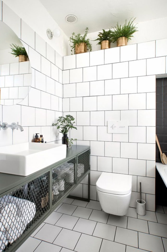
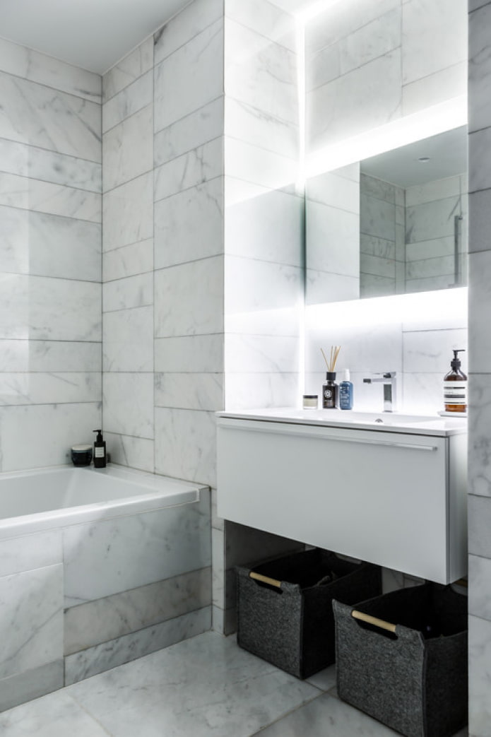
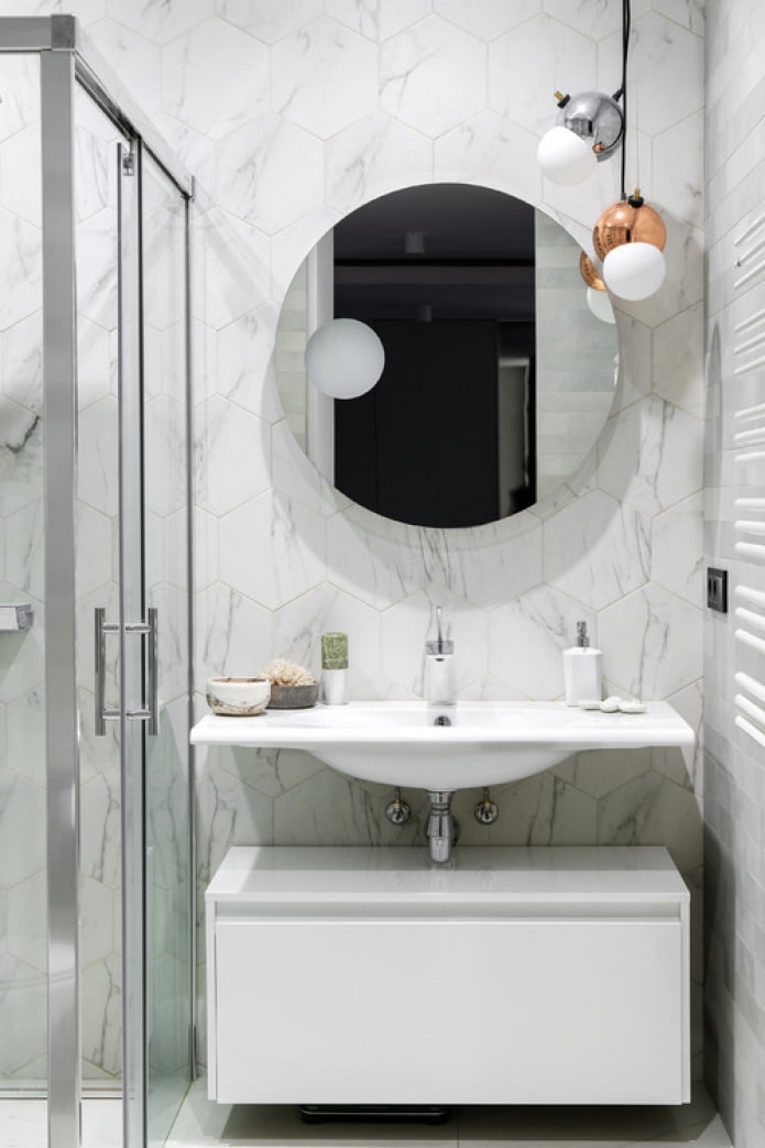
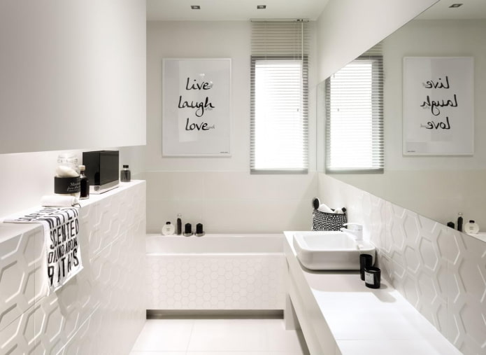
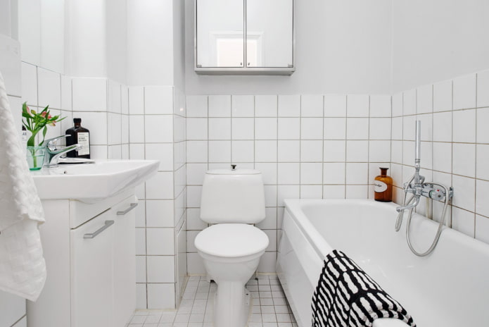
White color - a synonym for cleanliness and sterility, which is why it is practically irreplaceable in the bathroom. In addition, all standard plumbing also has exactly white color: in combination with the same walls and ceiling, it will give an effect visual expansion of the room.
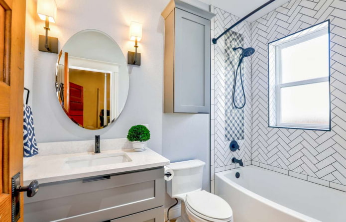
If the task of enlarging the bathroom is not worth it, create a combination with one of your favorite shades. Here another advantage of white opens up: it can be combined with anything. From standard black or gray to bright pink or serious blue.
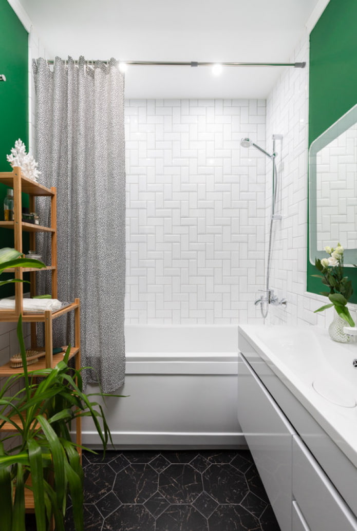
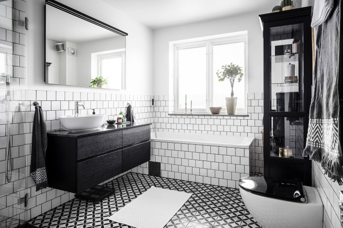
In the photo there is a white bathroom with black accents
Black
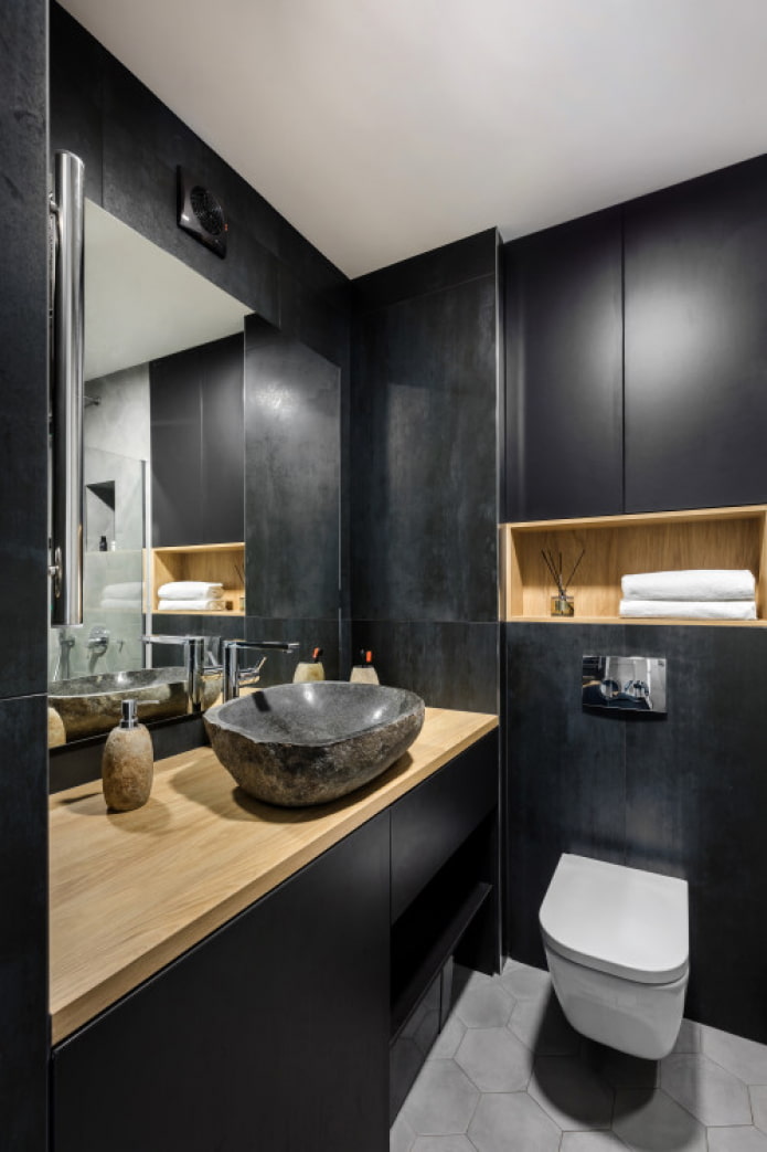
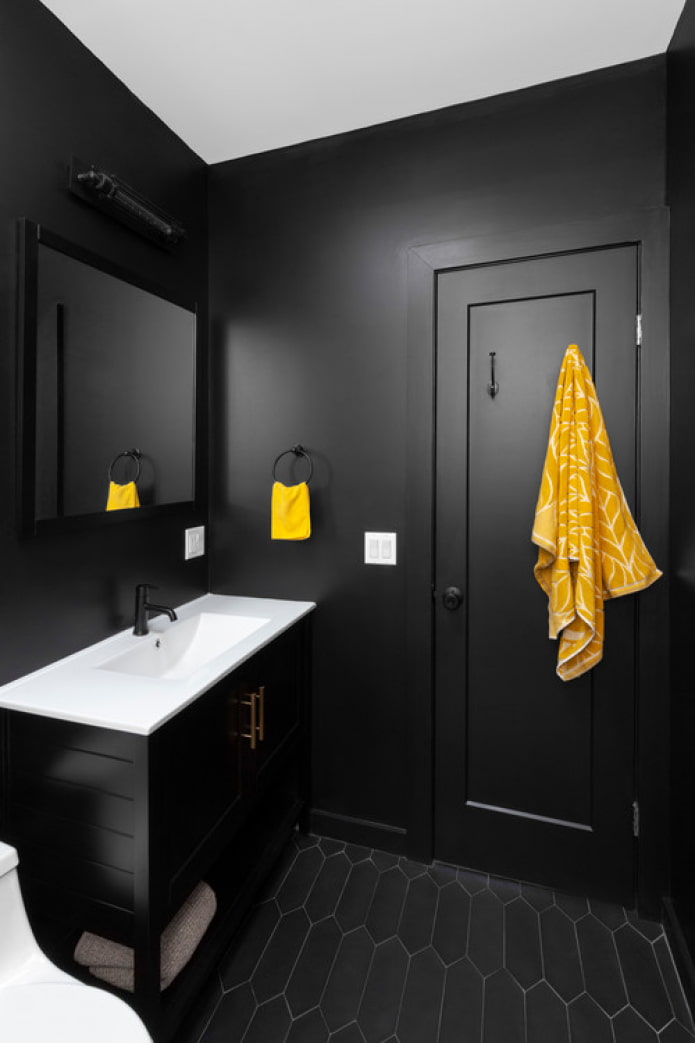
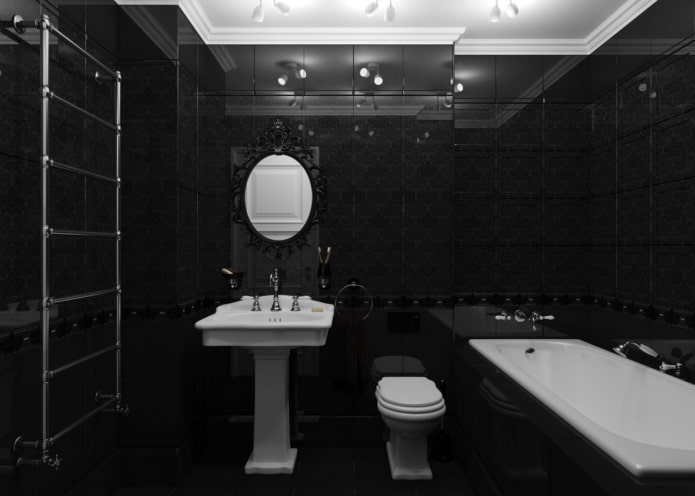
While the white bathroom is considered a classic, with black everything is exactly the opposite. The combination with white sanitary ware seems to many to be contrasting, and the shade itself is dramatic and even mournful.
Another reason for rejection is the widespread belief that black hides space.But this does not mean that various charcoal undertones cannot be used in a small bathroom: by combining it with other shades and using it as additional elements, you can achieve the desired contrast and dynamics in the interior.
Beige
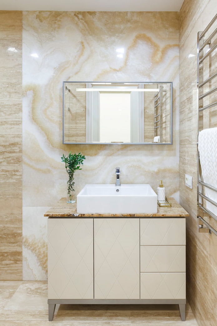
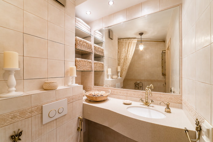
Perhaps the second most common color after white is cream! It is believed that it gives a cold bathroom a bit of coziness, makes it warmer and more comfortable.
If customarily decorated in beige bathrooms are already on edge, don't use it alone. In combination with green, blue, yellow, beige will open on the other side and serve as an excellent backdrop for a flight of fantasy.
The photo shows the interior in a classic style
Blue
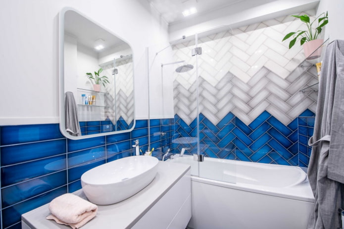
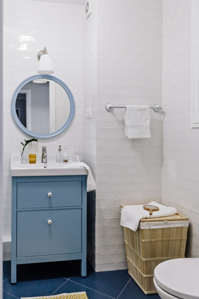
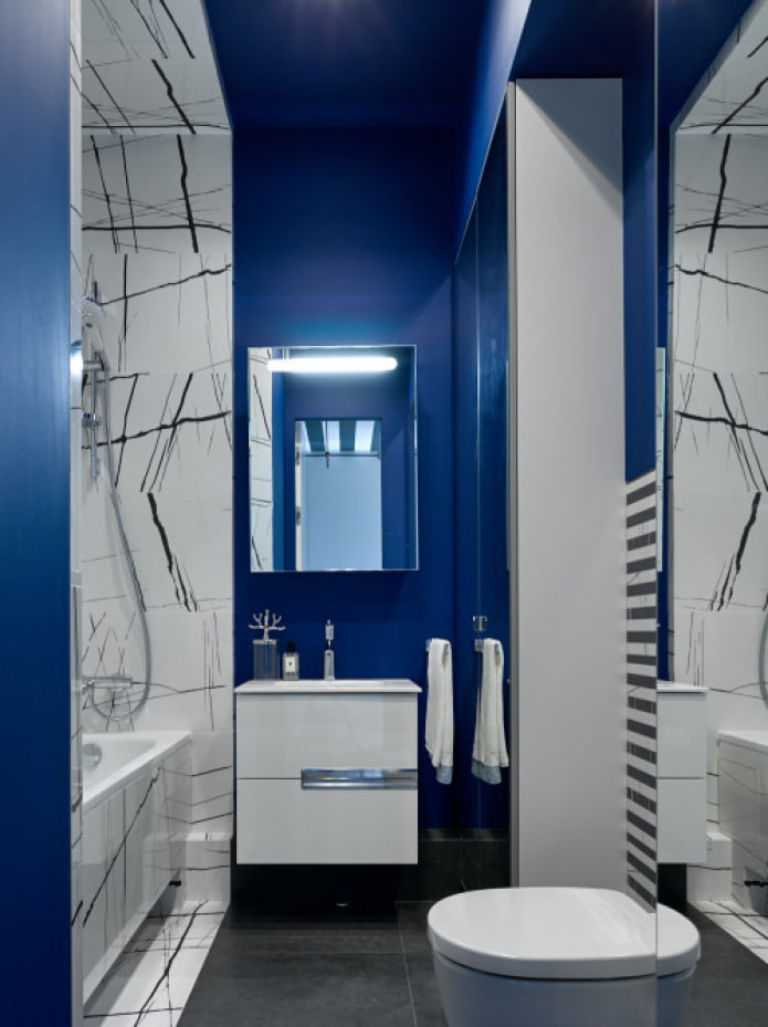
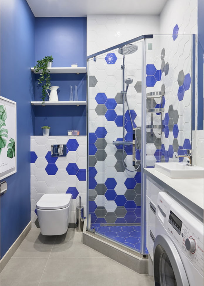
Blue symbolizes water and it makes sense to use it in the wettest room at home. Color is often used in monochrome designs: this will require three, four shades of blue (from heavenly to indigo or cobalt). Two undertones combined with white or gray will also give the desired volume.
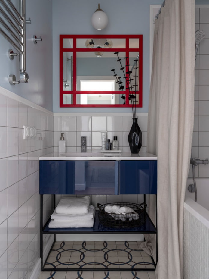
To create a bathroom with a twist will help the use of a complementary combination: dark blue contrasts with yellow, blue - with red.
Red
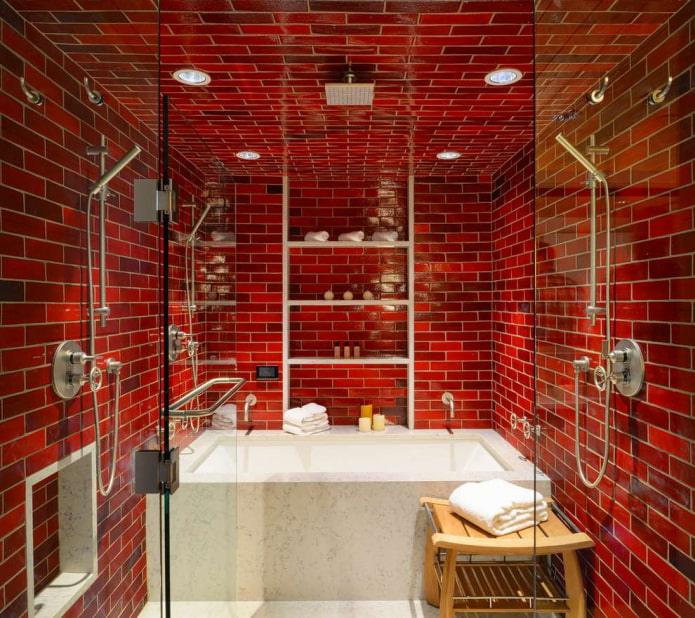
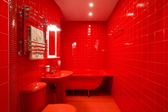
Red scale, although used less often than others, makes an indelible impression upon meeting. It may seem that scarlet is not made for the bathroom, just as fire is not made for water. But the union of opposites attracts, although it suits only the daredevils.
Important! The dominant red is only suitable for bathrooms that are used for short periods: washing, showering. It will be uncomfortable to lie in such a bath.
The combination with white sanitary ware looks spectacular, but in the lines of individual manufacturers there are also scarlet products - from a bath, to a sink and a toilet bowl.
The best combinations
Solid interiors are rare, so bathroom color combinations should be explored.
To put multiple colors together easier, start with one thing: choose a base color. You can push off the wall or floor tiles, or from the curbstone, which was looked after in the store.
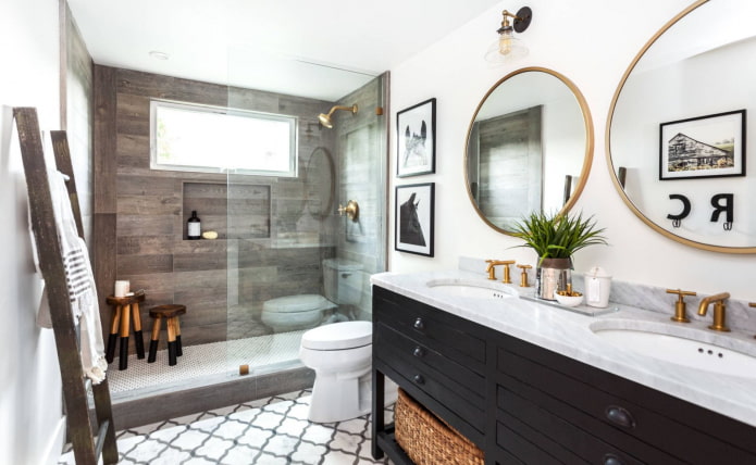
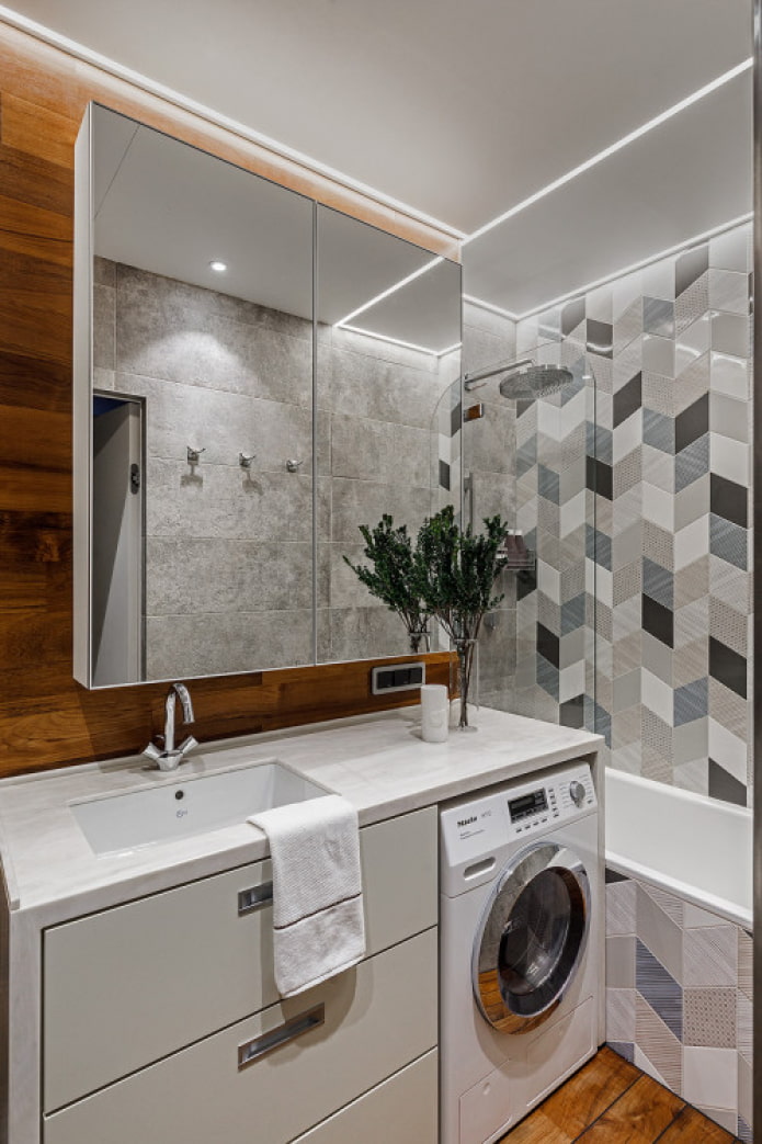
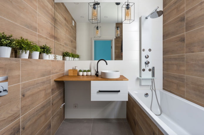
In the photo, the finish of the shower wood effect tiles
Now we select 1 or 2 additional shades for it. There are color rules (color schemes) that make it easy to find the perfect match:
- Monochrome... A combination of tones of the same color - vanilla + canary + lemon, mint + herbal + emerald.
- Similar... Union of 2-3 colors located side by side on Itten's circle: yellow + green, red + Orange.
- Complementary... It is contrasting - a combination of opposite shades. Blue with orange, for example.
- Triad... Analog combines 3 equally spaced shades, contrasting - any tone with two opposite ones.
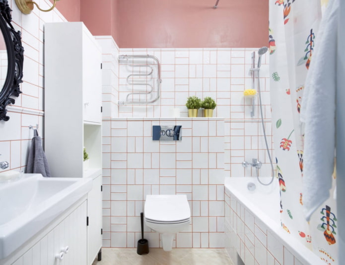
On the picture grout in the color of the walls
Last step - decide which color will be the main one (for large surfaces), and which ones (1-2 tones), highlight various accessories and decor.
Recommendations for small bathrooms
Unfortunately, not everyone is lucky enough to have a spacious bathroom, but limited space can look cozy too.
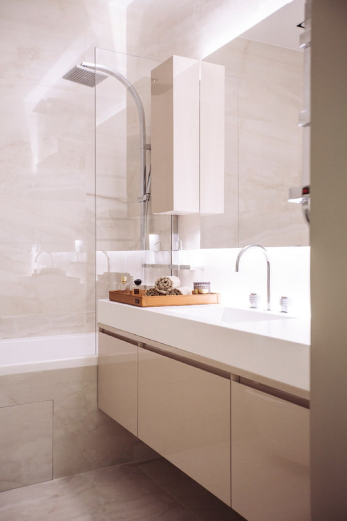
For this, a light shade is always taken as a basis: snow-white, beige, gray, pastel. It is recommended to use it on walls, ceilings, plumbing fixtures, large objects (wardrobe, cabinet).
The color of the floor is usually average in saturation, but its design should be chosen wisely: transverse stripes, for example, can push apart a too narrow elongated room.
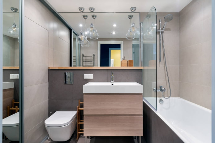
Another way to visually enlarge - reflection. In bathrooms, a variety of mirrors, glossy furniture fronts, stretch ceiling.
Advice! Lighting from different points visually expands the space: replace one central chandelier with several spots.
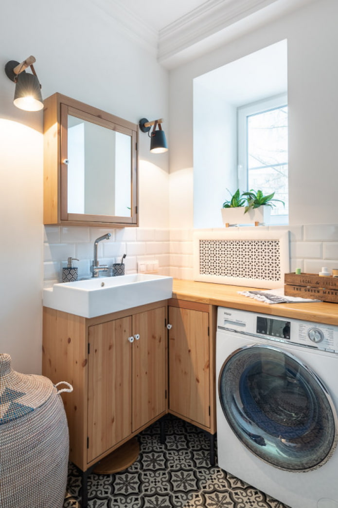
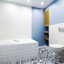
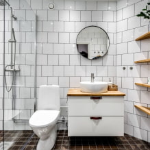
In the photo, a combination of white with wood
Ideas for inspiration
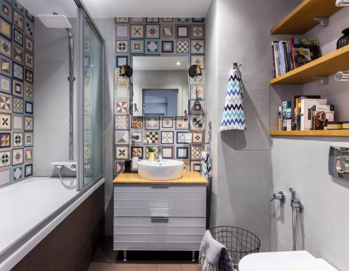
Is it difficult to combine shades? Take as a basis a bright tile with a print: it already has all the colors that can later be used on other surfaces to achieve color harmony.
If the room is supposed to use a wooden texture, on the contrary, so as not to miscalculate, give preference to monochromatic monochrome shades: white, beige, gray, black.
Photo gallery
Last tip: bathroom renovations are done for at least 5 years, so there is no point in chasing changeable trends. Choose the color scheme that you like: then you will definitely not need to change the finish in the near future.

 10 practical tips for arranging a small kitchen in the country
 12 simple ideas for a small garden that will make it visually spacious

 How to position the washing machine in a small bathroom?
 How to remove plaque from the bathroom curtain?
 7 common mistakes in small apartment renovation that eat up all the space
 Apartment layout: how not to be mistaken?
 Wallpaper for the bathroom: pros and cons, types, design, 70 photos in the interior
 Modern bathroom interior: 60 best photos and design ideas