Redevelopment
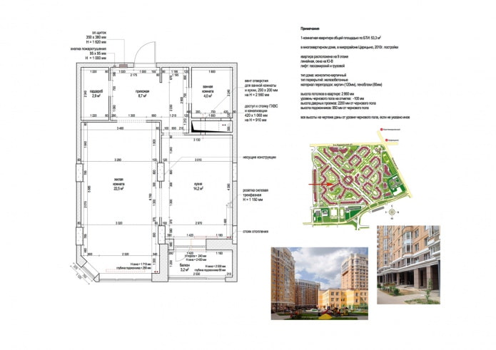
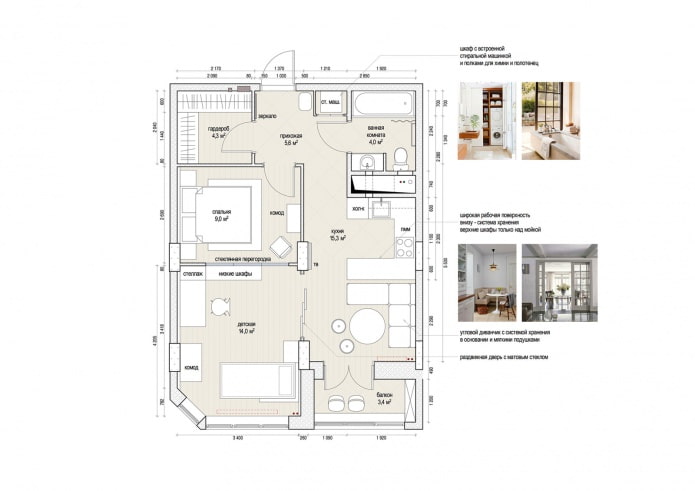
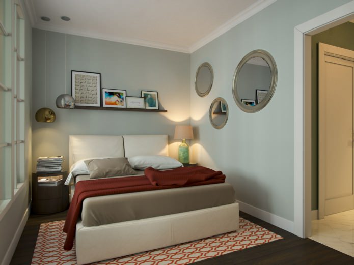
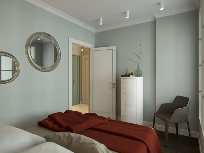
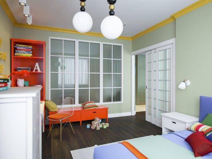
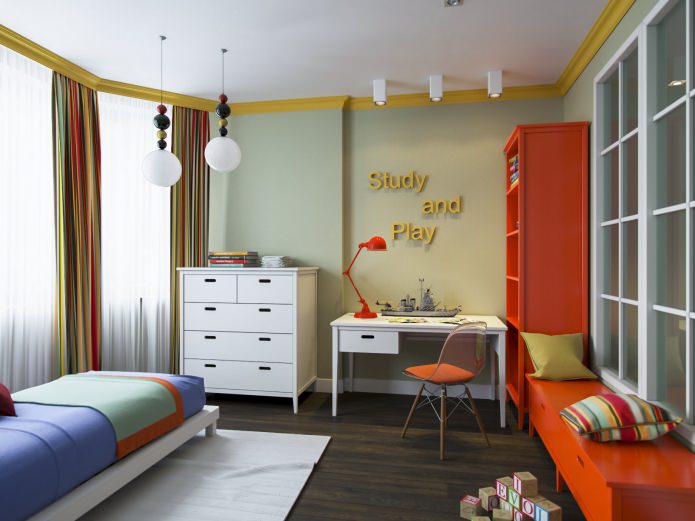
Initially, the area of the only room was 22.5 sq. m. The designers increased it by adding a part of the corridor, and divided it into two parts using a stationary partition. We got two isolated bedrooms: for parents - 9 sq. m., for a child - 14 sq. m. The partition has a large glass "window" - the glass in it is frosted, so that the privacy of both rooms is respected, and at the same time, natural light is provided to the parents' room.
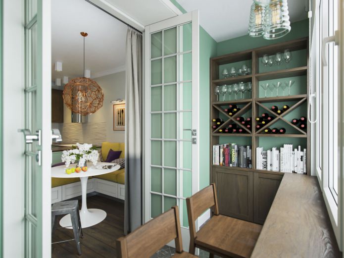
Despite the fact that the windows of the apartment face south, the daylight in the kitchen is quite weak - the light is obscured by the loggia. Therefore, the designers removed the window block, replacing it with a swing glass door "to the floor".
Kitchen-living room
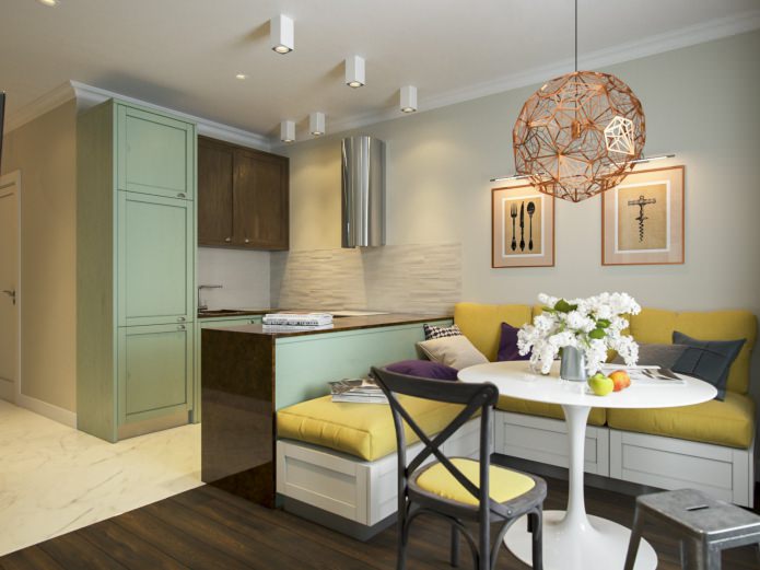
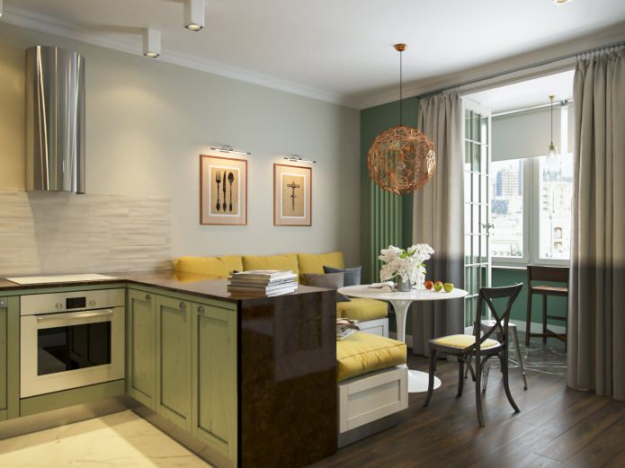
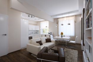
The kitchen and living room were combined in one room. The working area of the kitchen is made in the shape of the letter P. On one side there is a sink, drying and refrigerator, on the other - an oven with a dishwasher, and on the third - a work surface and cabinets. The wall-mounted hood has no outlet and is equipped with a charcoal filter.
Combination in the design of an apartment of 53 sq. m. living room and dining room in the same room did not affect their functionality in any way. Both the kitchen and the living room are compact but comfortable.
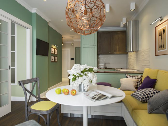
In the living area there is a corner sofa with drawers hidden under the seats. Sofa cushions in a warm mustard shade serve as an accent color in the interior of the room.
The dining area features a sleek single-legged white Tulip round table and is accented by an Etch Web bronze pendant light (Tom Dixon). It is a transparent spherical structure assembled from thin carved metal sheets. The window sill on the loggia has turned into a bar counter, next to it there are two high wooden chairs.
Almost all the furniture for this project was made to order in Moscow and St. Petersburg. The general lighting is the responsibility of the Centrsvet LED surface-mounted ceiling luminaires. The same lamps are used to designate and delimit various zones, in particular - the working surface of the kitchen area, which separates the kitchen and the living room.
Bedroom
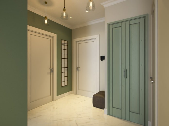
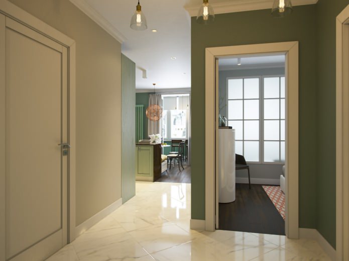
The design of the apartment is 53 sq. m. natural colors are used, mainly green and beige. The tones are juicy, deep. In the living area, as well as in both bedrooms, the floors are covered with very durable Coswick Como ash planks.
Children's room
The entrance to the nursery is from the kitchen side, through the sliding doors of a high and wide (1800x2400 mm) opening. Three wooden doors have French-style glazing, and the entire opening is framed by a wide platband.
Hallway
The floors in the walk-through areas - the entrance hall, the kitchen work area, the bathroom and the wardrobe - were laid with marble-like tiles (Atlas Concorde) of a large size, while the sills were not used. It gives the impression of natural marble slabs.
Bathroom
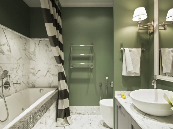
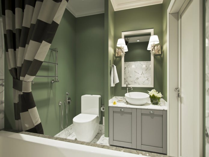
In the bathroom, an additional partition was built along one of the walls. On one side of it they put a toilet bowl, and on the other, they got a niche for the washing area. There is a cabinet in it, on the tabletop of which there is a washbasin bowl, above this structure there is a large rectangular mirror, on the sides of which there are two classic sconces.
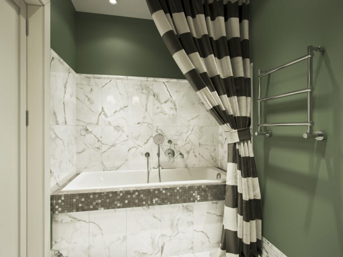
On the left wall there is a towel holder. The niche for the built-in bathtub is lined with the same marbled tiles, which are lined with the floor - it does not reach the ceiling a little.
Roca and Villeroy & Boch sanitary ware, as well as Hansgrohe taps from the Talis Classic collection, are designed in a modern classic style.
In order not to clutter up a small bathroom, the washing and drying machines were placed in the hallway, having built a tall cabinet for this, which also has shelves for storing towels. This decision required additional waterproofing of the floors throughout the apartment and the installation of an aqua-stop system.

 10 practical tips for arranging a small kitchen in the country
 12 simple ideas for a small garden that will make it visually spacious
 Design project kopeck piece in brezhnevka
 Modern design of a one-room apartment: 13 best projects
 How to equip the design of a small apartment: 14 best projects
 Interior design project of an apartment in a modern style
 Design project of a 2-room apartment 60 sq. m.
 Design project of a 3-room apartment in a modern style