general information
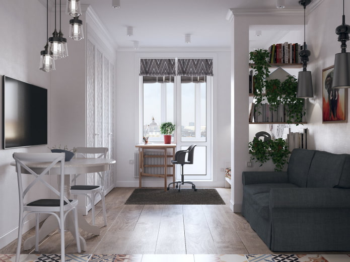
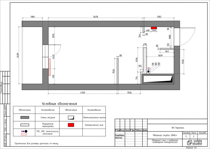
The area of the apartment in St. Petersburg is 28 square meters. Ceiling height 2.73 meters. Designers Daniil and Anna Shchepanovich equipped a kitchen with a dining area, a sleeping place for parents, an office and a corner for a child.
Hallway
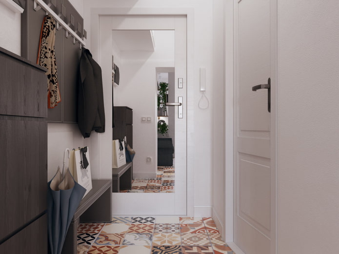
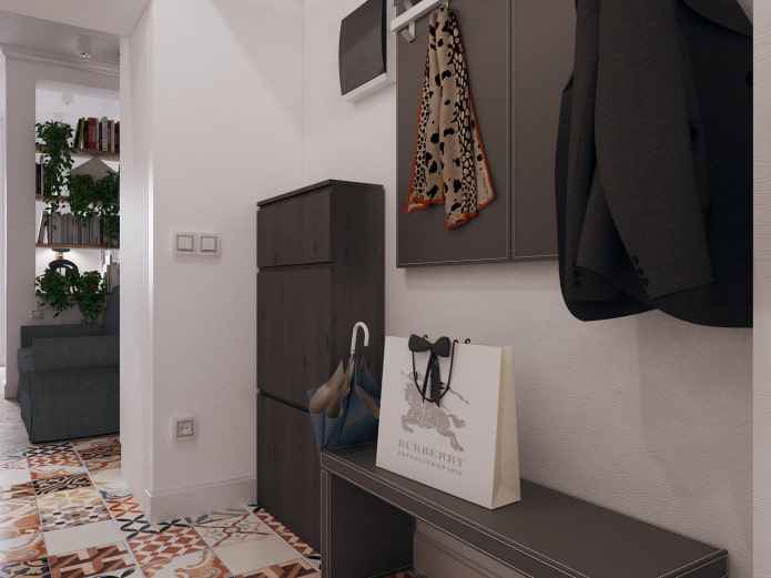
The bright corridor begins with the front door, on which a full-length mirror is fixed. An open hanger looks simple and unobtrusive, a comfortable bench under it serves as a place for temporary storage of bags and packages. The entrance hall, like the rest of the apartment, is designed in Scandinavian style. The floor has bright Halcon Moments Mix tiles. A spacious mezzanine has been designed for sports equipment. The walls are decorated with Dulux paint.
Kitchen
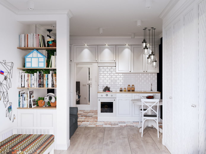
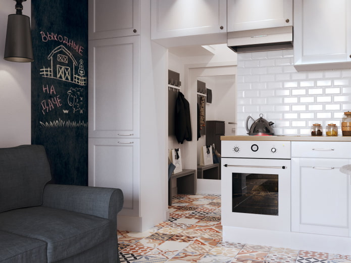
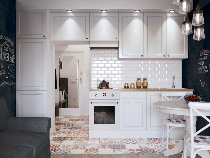
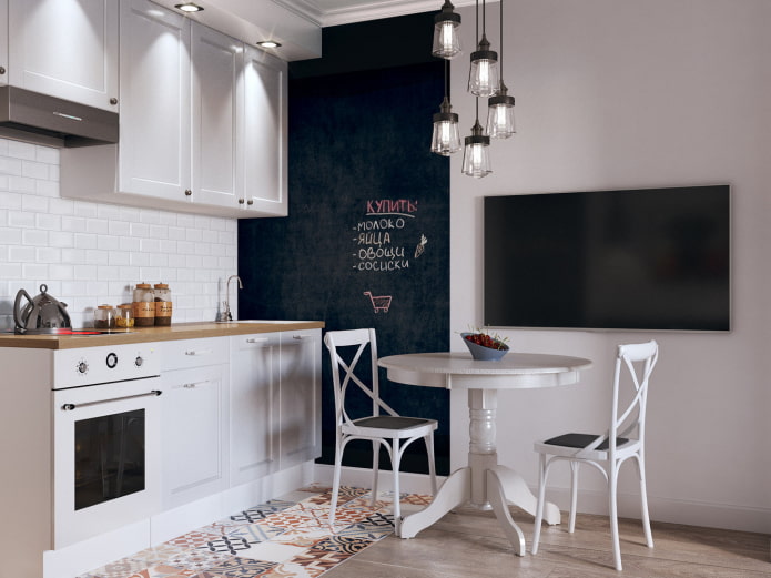
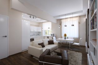
Throughout the room, the designers adhered to the principles of the Nordic style: white background, black contrasting elements and laconicism. The owners wanted to do without the bar counter, so the designers achieved zoning using lighting: lighting the headset and countertops, as well as Verre suspensions above the dining group. The decoration also contributes to the visual separation of the kitchen and living area: Tikkurila slate paint and floor tiles.
Thanks to the linearly located kitchen, which occupies the entire wall from floor to ceiling, it was possible to place all the necessary utensils and food in the cabinets and cabinets. The refrigerator was made built-in. The dining group consists of a Red Black table and Etagerca chairs. Biselado Classictau Ceramica tiles were used for the apron.
Sleeping place
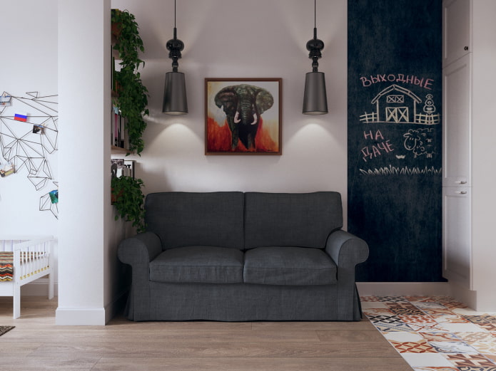
The bed for the parents is an IKEA folding sofa, which is separated from the children's area by a plasterboard rack. On its shelves are books and houseplants. The design looks light, but it does its job well. Above the sofa are Josephine Jaime Hayon pendant lights.
The whole room is decorated with Dulux white paint, which visually expands the space and does not overload it: this is very important in a small area. The flooring is Goodwin parquet board.
Children's area
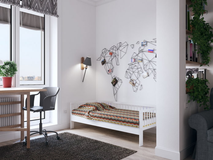
A baby cot from IKEA is located between the window and the rack. Enough space is left here to eventually purchase and put a larger bed. The children's area is equipped with laconic white spots that give a lot of light, but do not attract attention.
Workplace
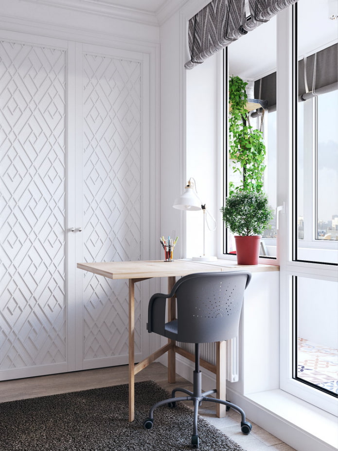
A folding table for a mini-office is made to order and is a continuation of the window sill. There is a place for study here. In the same area there is a built-in wardrobe for storing things. The structure, painted white, seems to dissolve against the background of the walls, but has interesting facades with geometric patterns.
Bathroom
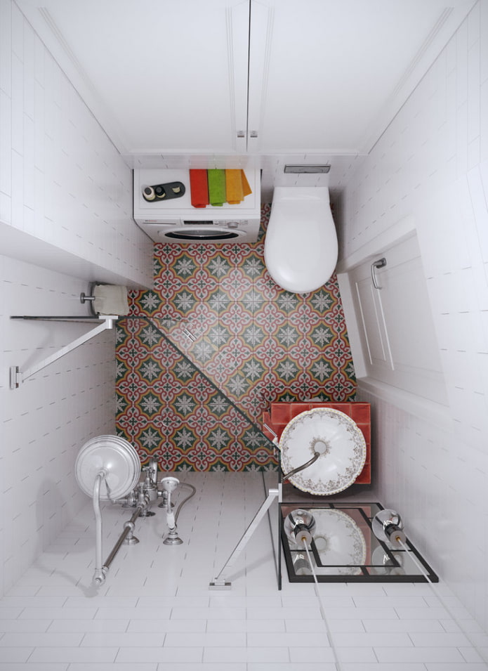
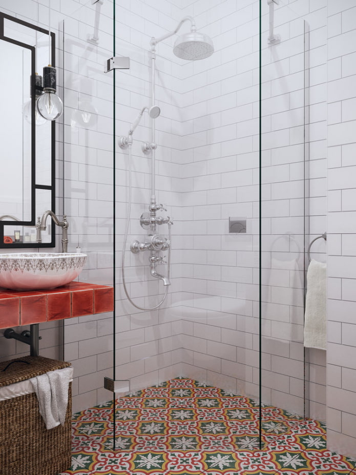
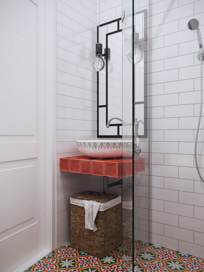
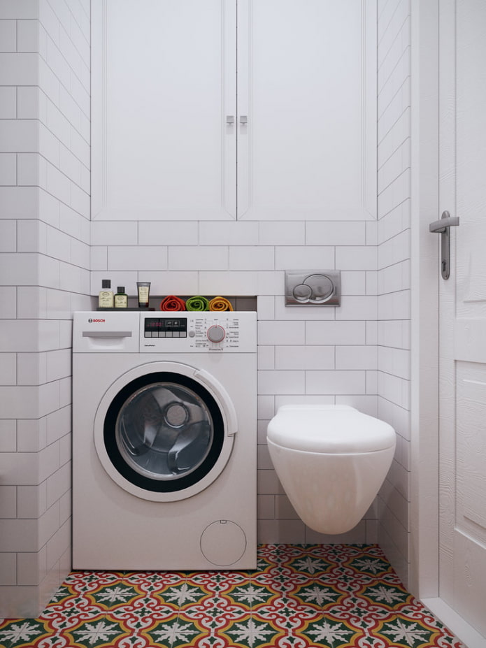
The small bathroom includes a corner walk-in shower, wall-hung toilet and Roco sink. The designers also managed to integrate a washing machine into the sanitary closet. Additional storage space is provided behind the toilet. The walls are decorated with Victorian brick tiles. To make the space look dull, the floor is covered with bright Voltare-Sommar Klassiska Marrakech Design tiles and the red Base Rojo Antiguo Onda tiles are used for the countertop cladding. A wicker basket for dirty linen was placed under the sink.
Balcony
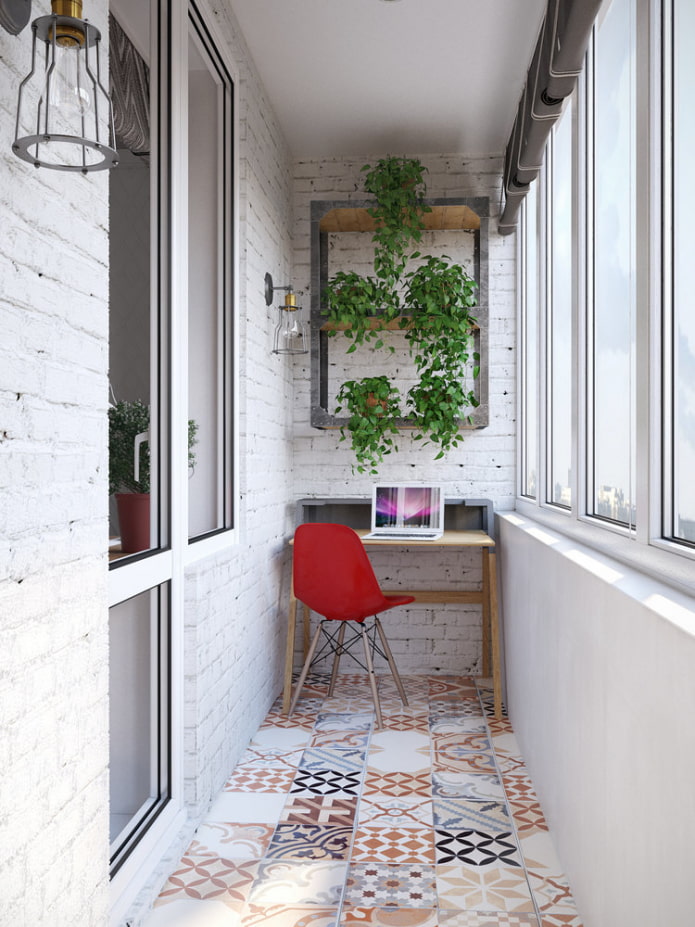
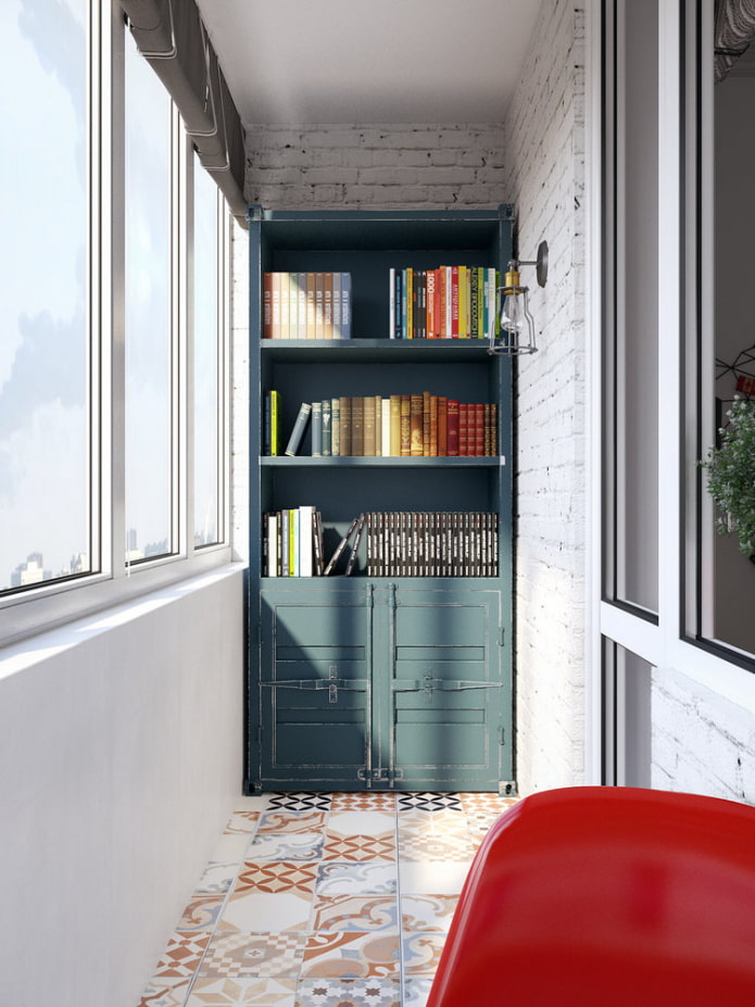
An office with a library is equipped on the insulated balcony - here you can retire for rest or work.The same tiles were laid on the floor as in the hallway. The unusual blue Sea Container cabinet fits perfectly into the narrow space and has become a bright spot in the interior. The Idea table and Eames chair, located at the opposite end of the balcony, act as a comfortable corner for working at the computer.
Layout
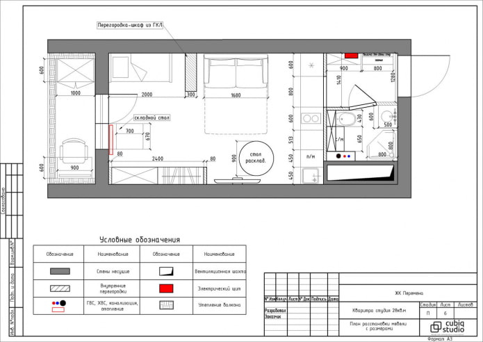
The 28 square meter apartment is divided into 7 functional areas. Everything you need for life is placed here, several lighting scenarios have been created, there is storage space.
The furnishings of a small apartment are thought out to the smallest detail. Thanks to comfortable and light furniture, built-in wardrobes and light design, the interior looks stylish and allows a family of three to comfortably accommodate.

 10 practical tips for arranging a small kitchen in the country
 12 simple ideas for a small garden that will make it visually spacious

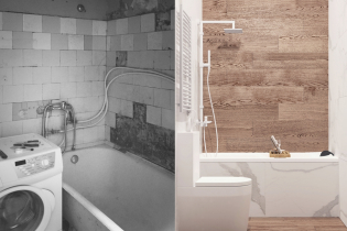 Design project kopeck piece in brezhnevka
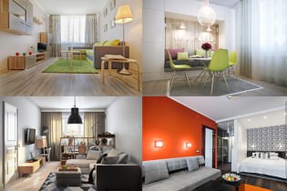 Modern design of a one-room apartment: 13 best projects
 How to equip the design of a small apartment: 14 best projects
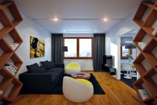 Interior design project of an apartment in a modern style
 Design project of a 2-room apartment 60 sq. m.
 Design project of a 3-room apartment in a modern style