general information
The area of the Moscow apartment is 49 square meters - this is quite enough for the comfortable life of the hostess and her teenage daughter. The building was last renovated about 15 years ago. Having decided to turn to the designer Natalya Shirokorad, the owner of the apartment wished for dark walls and a strict loft, but in the end Natalya limited herself to introducing elements of an industrial style, turning the old interior into a bright and comfortable space.
Layout
Because of the load-bearing walls, the redevelopment was minimal - the designer combined a toilet and a bathroom. The purpose of the rooms in the apartment has been preserved: a bedroom with access to a loggia for the hostess and a nursery for her daughter. The owner of the apartment receives two or three guests in the kitchen, and organizes meetings with a large number of friends in a cafe, so the living area was not supposed to be.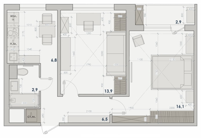
Kitchen
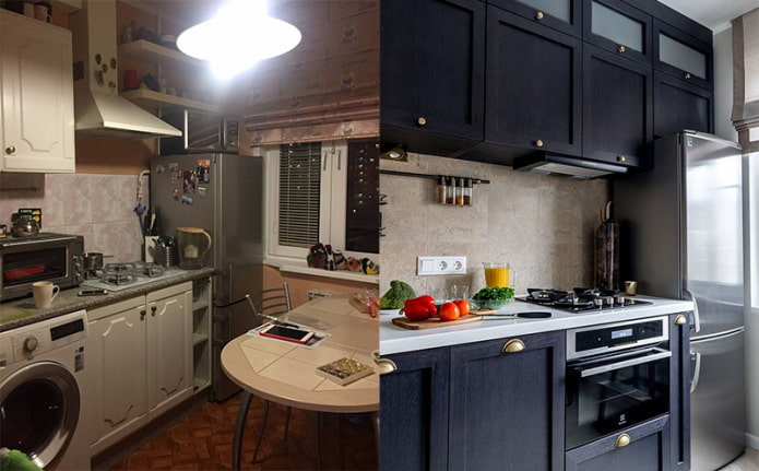
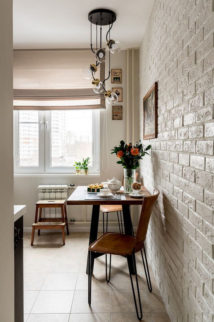
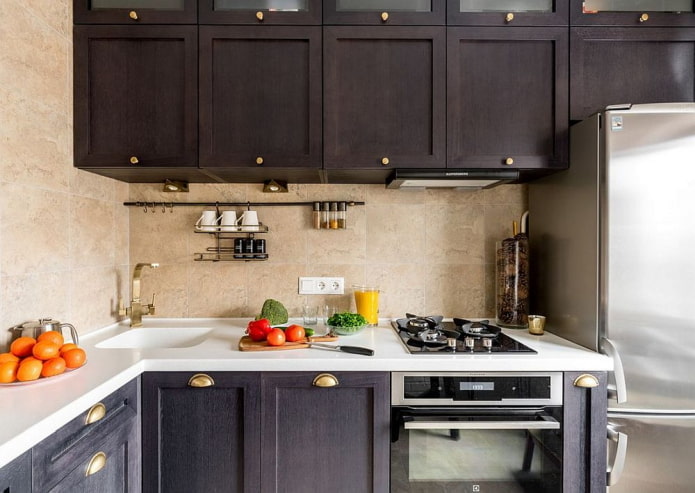
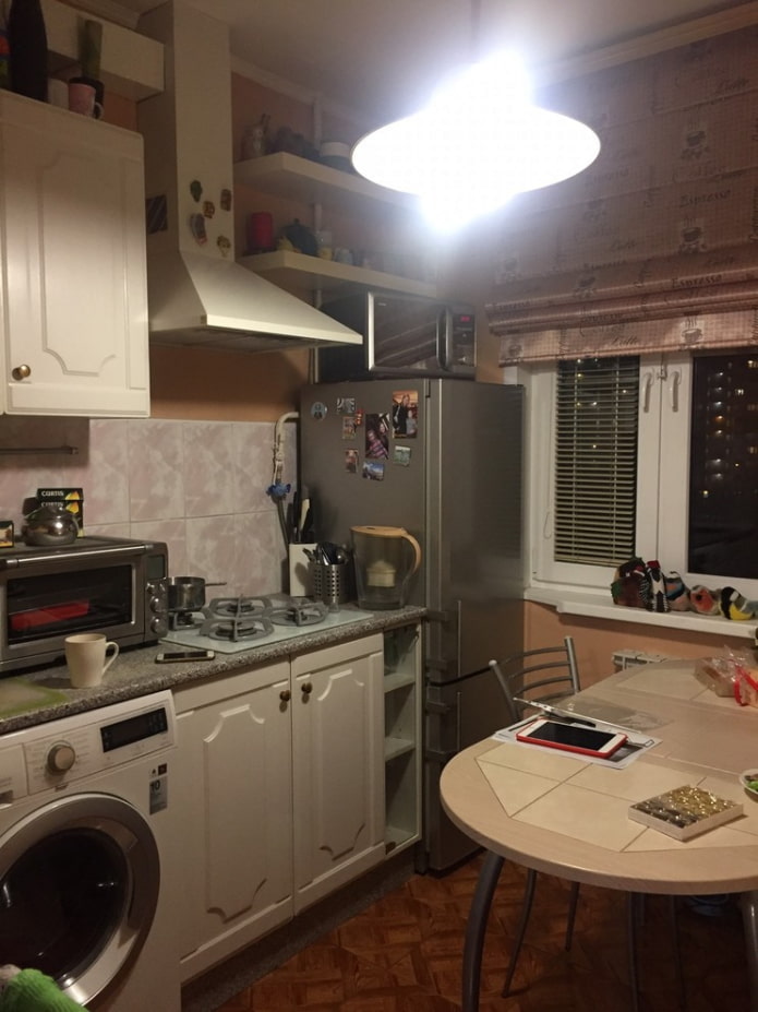
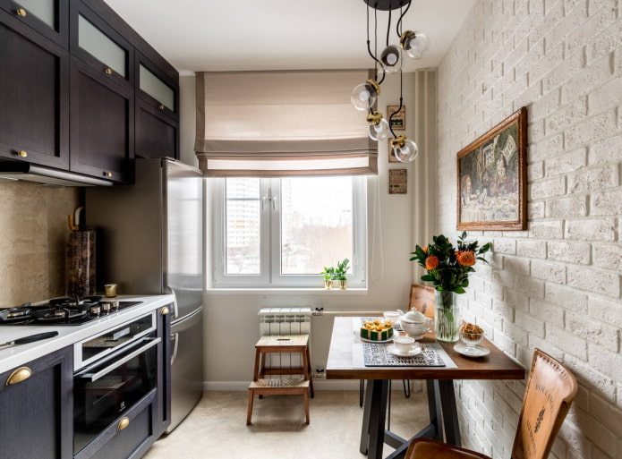
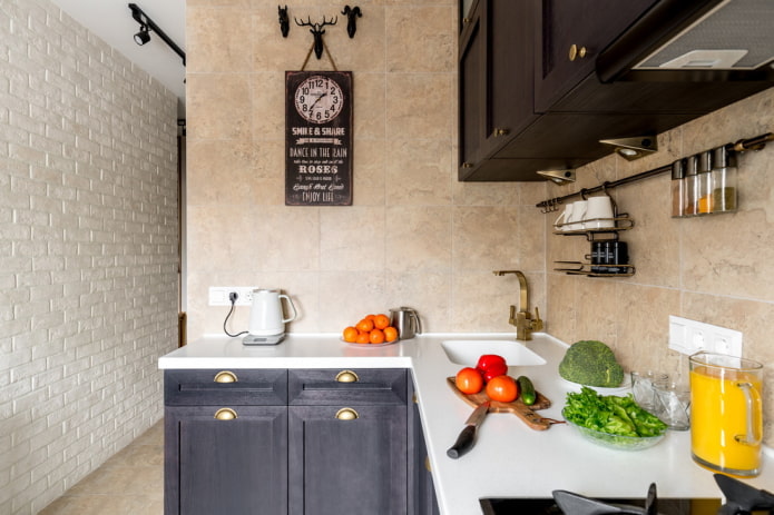
Everything that could be redone in the kitchen was redone: the old coverings were removed, the furniture was replaced. Bright finishes and new lighting make the kitchen look more spacious. The black corner set is made to order, hanging cabinets to the ceiling make the kitchen more spacious and minimalist: everything that was previously kept in plain sight is hidden behind the facades. For easy access to things, a stool-ladder is provided.
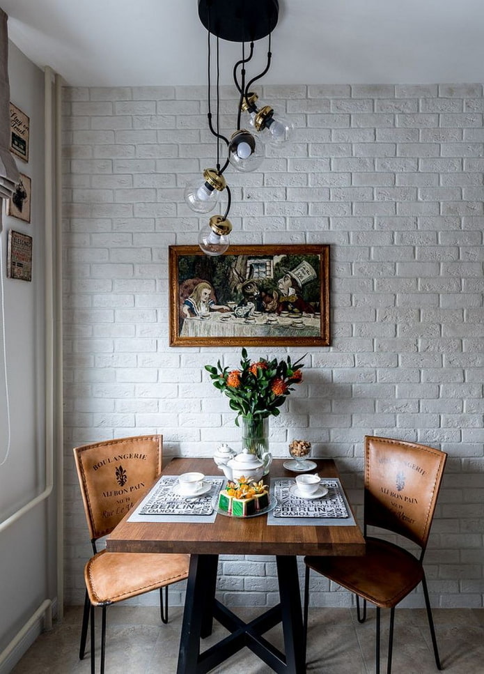
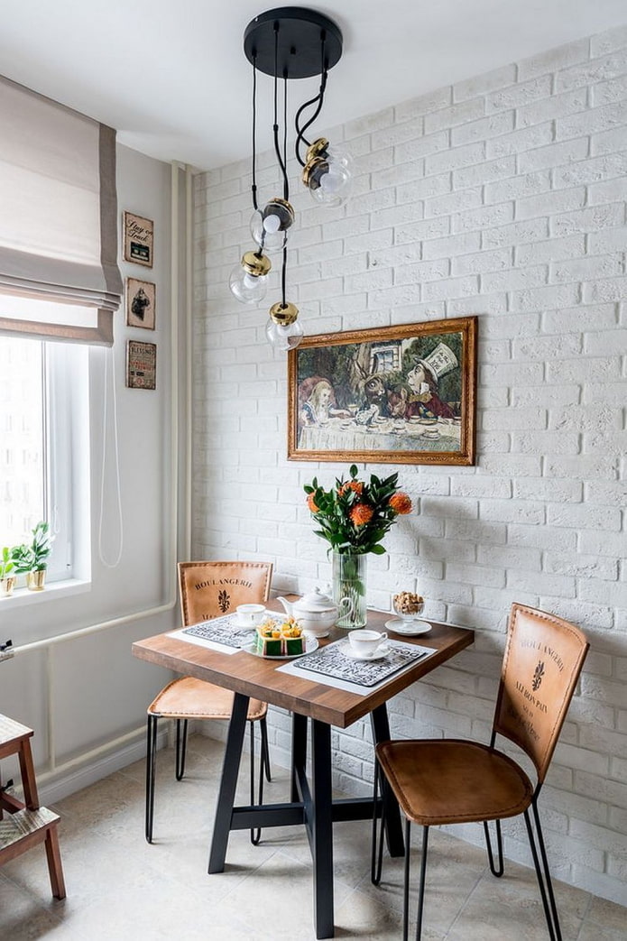
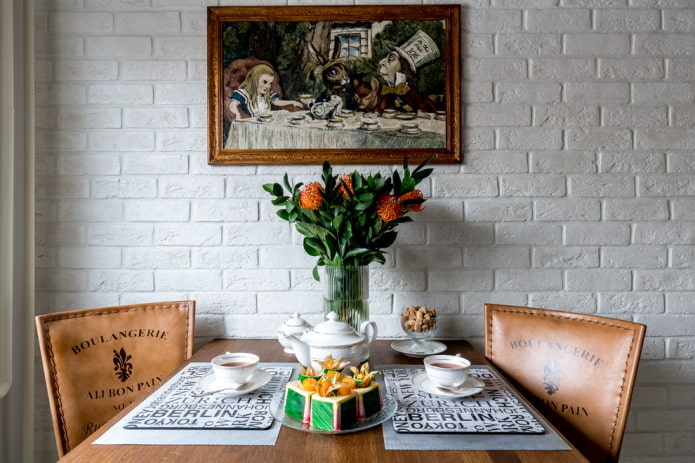
The wall near the dining area is tiled with brick-like tiles: if damage appears on the surface due to contact with furniture, they will not be noticeable. The apron is finished with stone-effect porcelain stoneware.
An oven with microwave function is a great addition to a small kitchen: it is suitable for both heating food and baking. Its compact size allows for a storage box underneath.
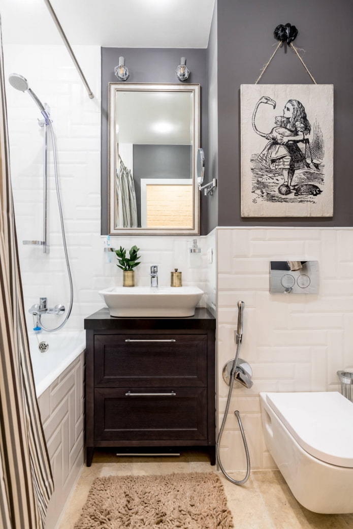
The designer intended to hang a poster over the dining table, but the hostess asked to place an illustration from her favorite fairy tale - "Alice in Wonderland".
Children's room
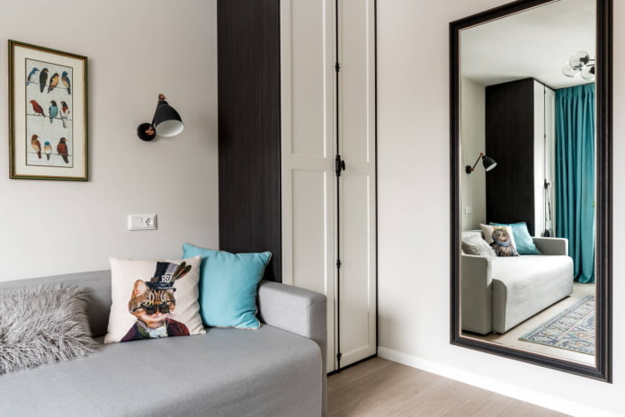
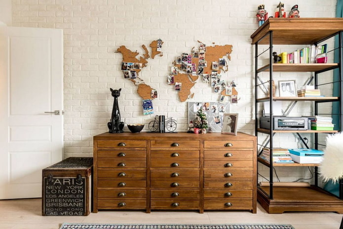
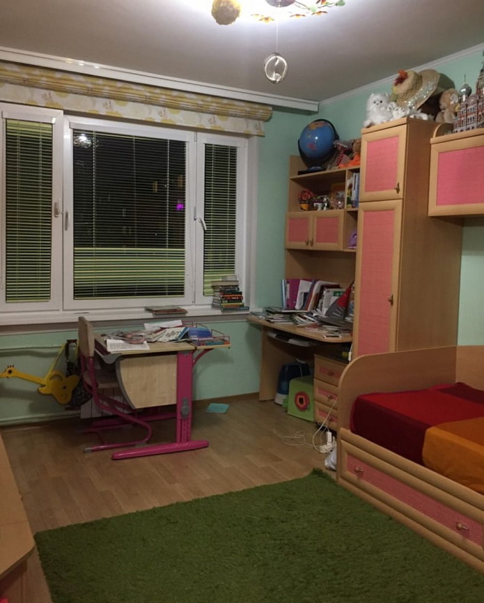
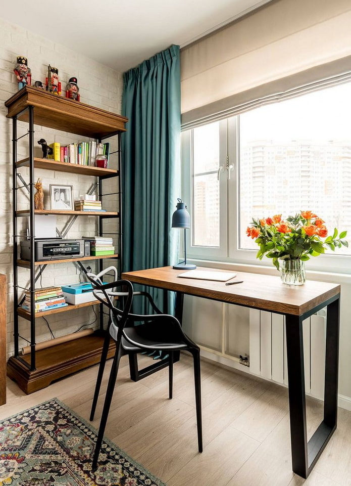
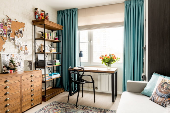
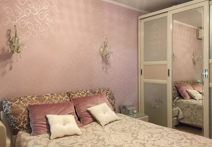
The customer's daughter has already grown out of the pink room. The designer turned the interior into a stylish and functional space for relaxation and study - a white room with turquoise accents and loft elements is much more suitable for a teenager. The partition adjacent to the kitchen is also decorated with plaster clinker tiles - this creates the effect of an authentic brick wall. The workplace is located opposite the window, and the sleeping sofa is placed between two tall wardrobes that create a cozy niche.
Bedroom
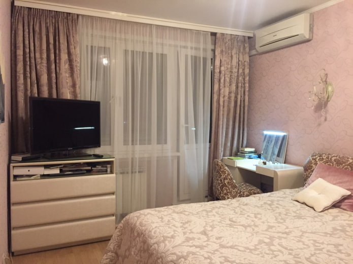
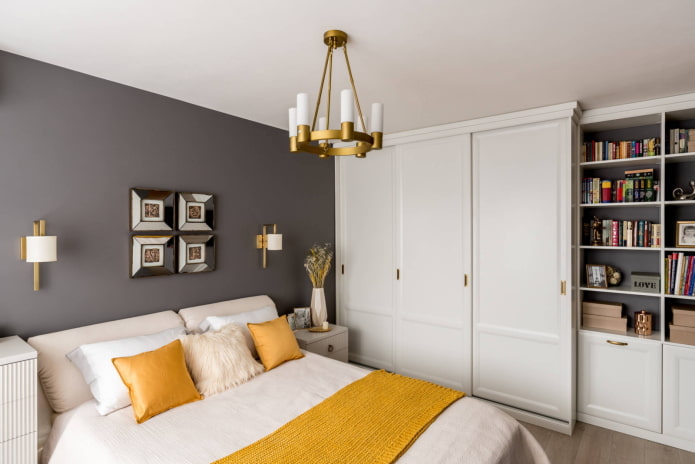
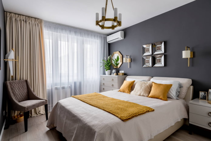
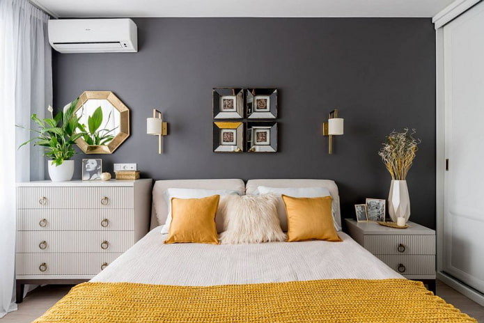
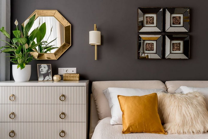
Only the bed remains from the old room in the new interior. The wall at the headboard is painted with dark gray paint: this technique visually adds depth to the room. On the sides of the bed are a custom-made chest of drawers and a sideboard.
The white built-in wardrobe fits perfectly into the bedroom environment without overloading the space. Some of the sections were taken for clothes and large items, and less spacious narrow shelves next to the entrance - for books.
Bathroom
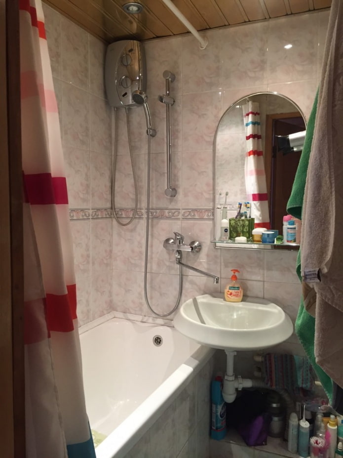
Instead of pink porcelain stoneware, the designer chose white hog tiles for the bathroom. It was laid out with a herringbone, and the upper part of the walls was painted gray: this is how the interior looks complete. The curbstone contains all the hygiene items, so the bathtub looks neat and expensive. The curtain has two layers - the outer textile side serves aesthetic purposes, and the inner one protects against moisture.The access hatch above the toilet is disguised with another image from Alice in Wonderland. It is applied to a waterproof base.
Hallway
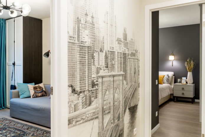
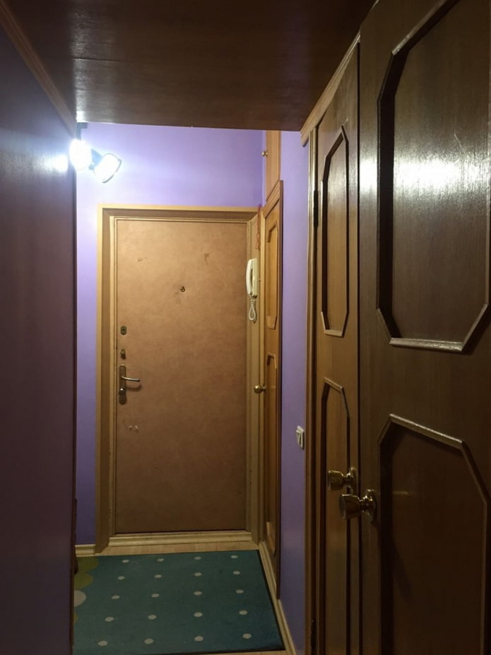
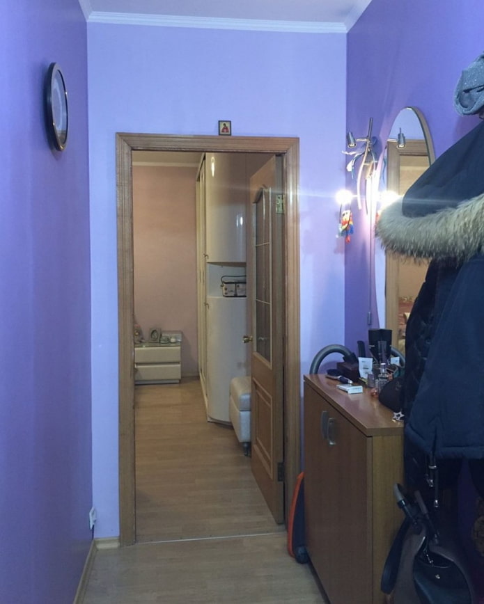
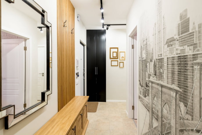
The purple hallway has also changed beyond recognition, becoming white. Its main decoration is art painting in the form of a city landscape, pushing apart the narrow space.
Open hangers are provided for outerwear: they are based on a structure of wooden slats. The shoe cabinet is custom made and the mirror was bought at a sale. The empty wall was decorated with a composition of golden frames. There is a mini-laundry next to the front door: the washing machine is hidden in a niche.
Loggia
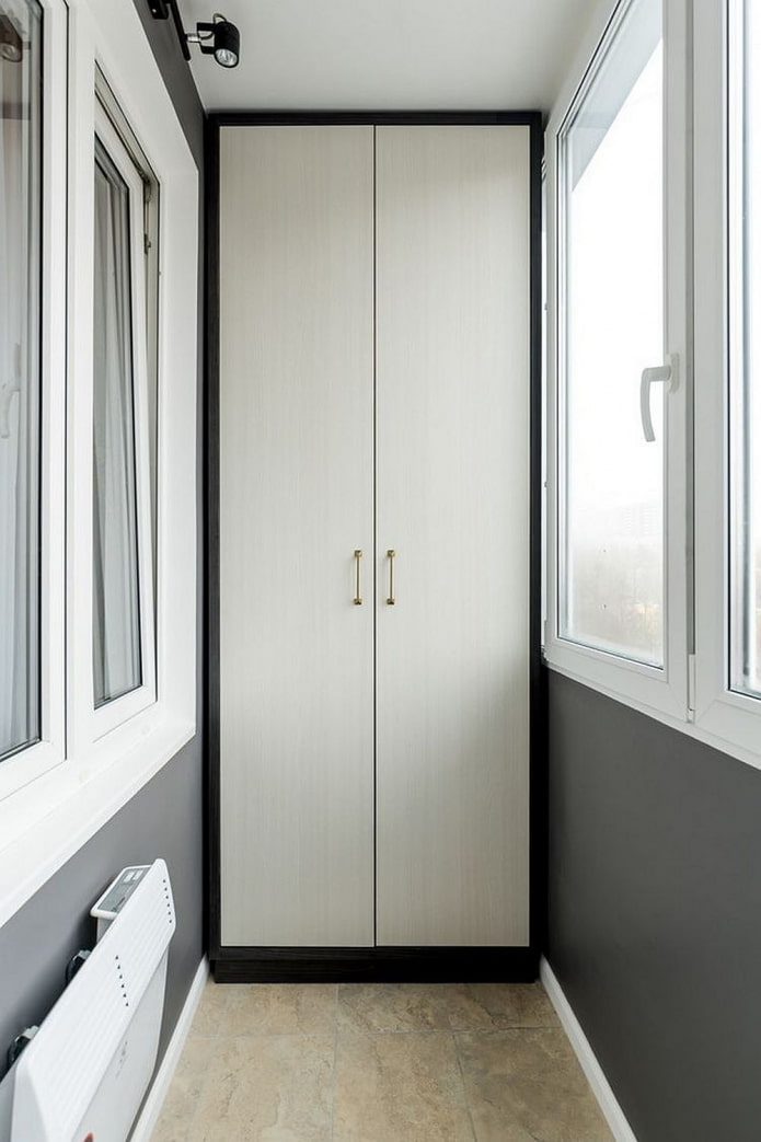
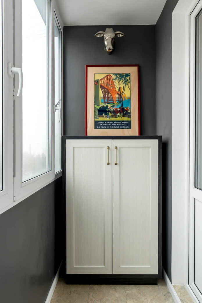
Only cosmetic repairs were made on the loggia: they used the same paint as for the entire apartment, and also installed a high cabinet. A chest of drawers was placed opposite him for storing things. A poster found its place on it, which was supposed to decorate the dining area in the kitchen.
The main finishing elements were budget materials: neutral tiles, light laminate and paint, but the thoughtful design turned a typical brezhnevka into a comfortable apartment where it is pleasant to cook, relax, study and receive guests.

 10 practical tips for arranging a small kitchen in the country
 12 simple ideas for a small garden that will make it visually spacious



 Design project kopeck piece in brezhnevka
 Modern design of a one-room apartment: 13 best projects
 How to equip the design of a small apartment: 14 best projects
 Interior design project of an apartment in a modern style
 Design project of a 2-room apartment 60 sq. m.
 Design project of a 3-room apartment in a modern style