general information
The designers Daniil and Anna Schepanovich from Cubiq Studio had two tasks: to create a sleeping place for three people and to place a comfortable desk for their daughter. Experts have achieved these goals by using every centimeter as ergonomically as possible. The result is a stylish and functional studio interior, which will be rented out in the future.
Layout
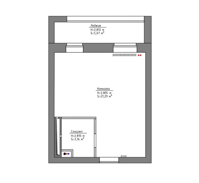
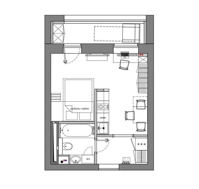
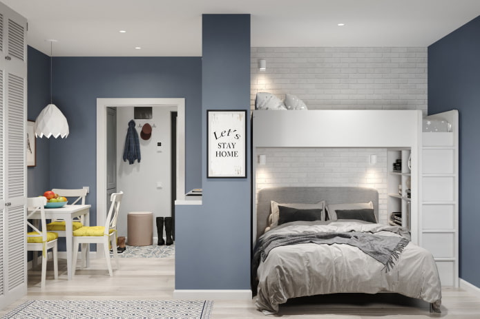
The designers delimited the apartment into zones: a small entrance hall is separated by a partition, behind it there is a kitchen, and in a niche there is a sleeping place. A fairly spacious balcony is used as a living space.
Kitchen area
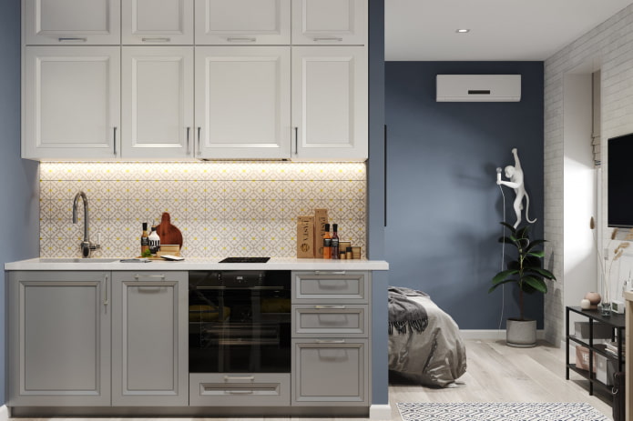
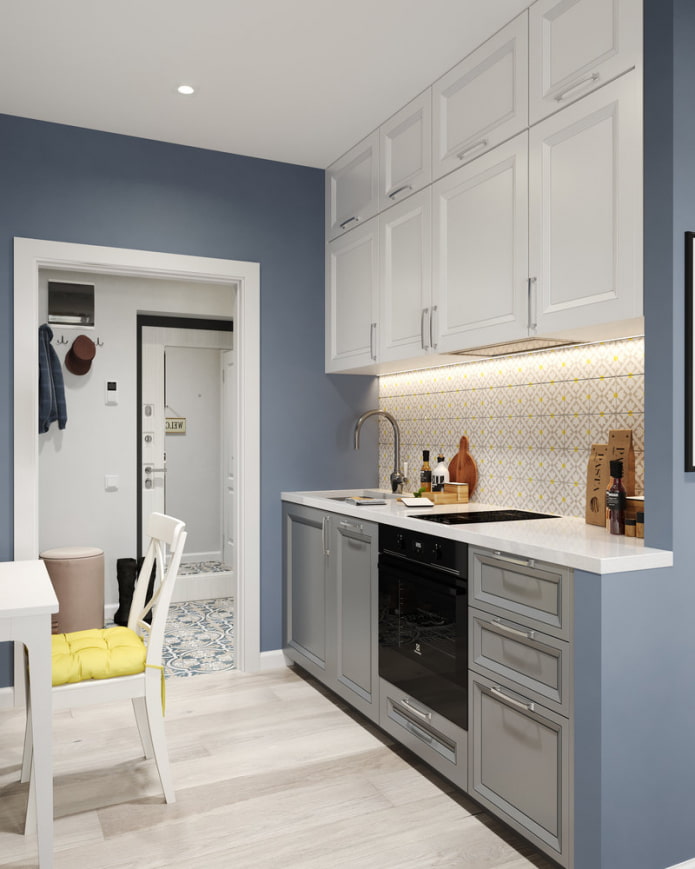
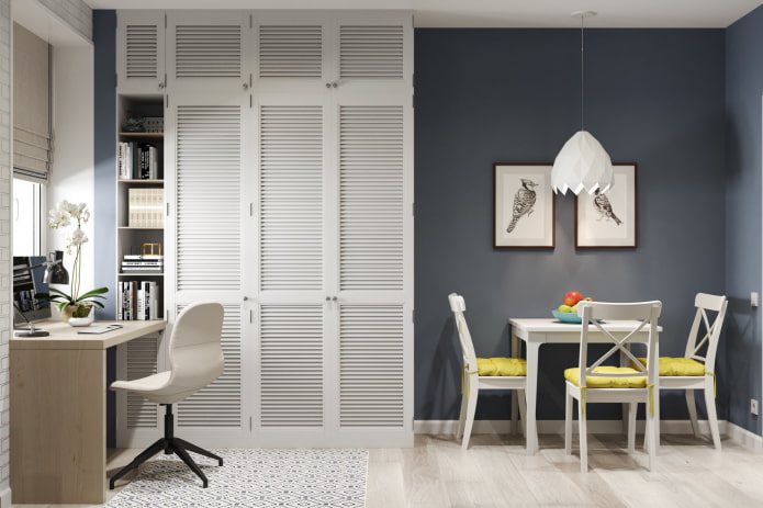
The kitchen, like the entire room, is painted in a blue-gray shade: in unlit areas of the walls, it gives the room a visual depth and goes well with white accents. The backsplash is made of tiles: the yellow details in the ornament echo the brightly colored cushions on the chairs, which enliven the setting. The wall cabinets of the custom-made headset take up space up to the ceiling: the design allows you to fit more dishes and food.
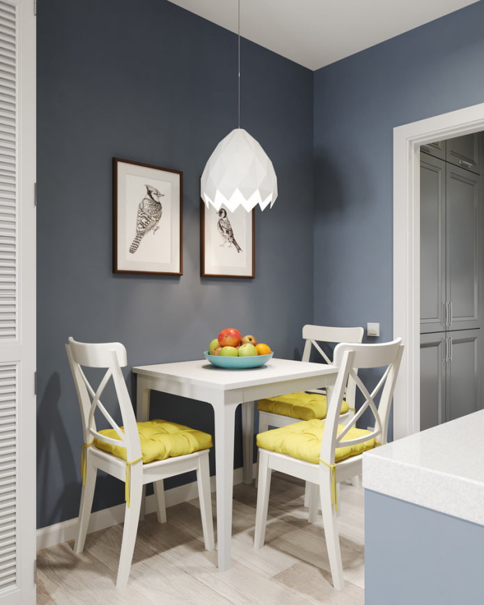
The dining group is located in the entrance area, but it looks very cozy. Furniture for her was bought at IKEA. Wall paint - Little Greene, apron tiles - Vallelunga.
Living room-bedroom with work area
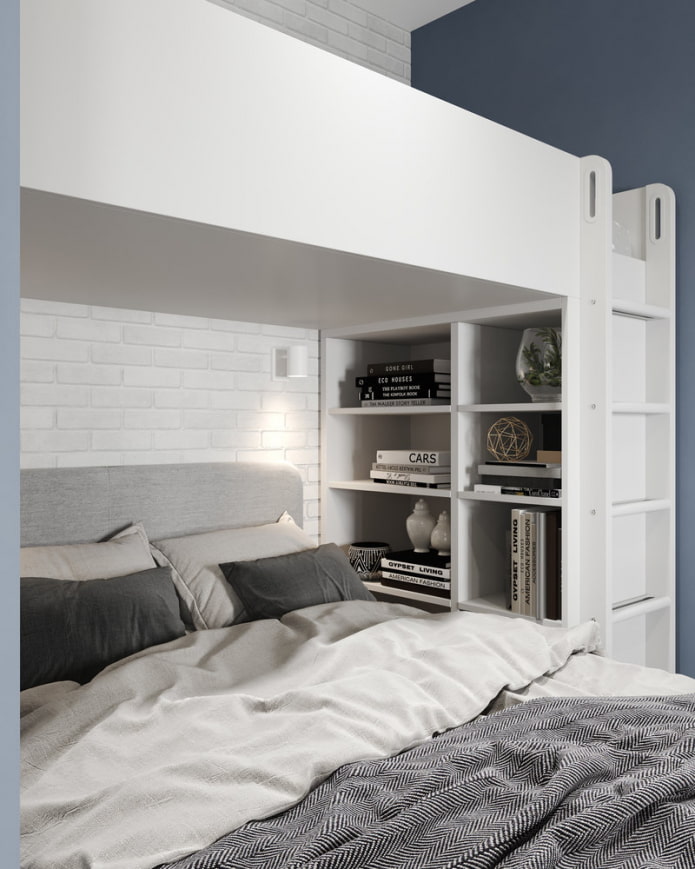
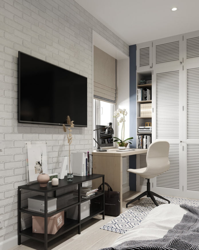
Since the repair budget was limited, only part of the furniture was made to order: storage systems and a work area. Built-in furniture is durable and takes up all the space allotted to it. The height of the ceilings (2.8 m) made it possible to install a loft bed for a child in the niche, and place a sleeping place for adults and a small bookcase under it. The study table was placed near the window.
Pixel wood tiles imitating brickwork were used for the walls, and the practical and durable Fine Floor quartz vinyl served as the flooring. Furniture and lighting - IKEA.
Bathroom
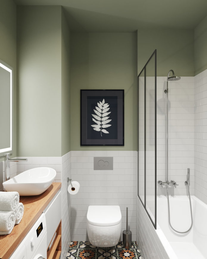
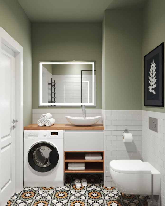
The bathroom, decorated in gray-green tones, stands out in color. Upon entering the bathroom, the gaze rests on a contrasting poster covering the inspection hatch. The toilet is mounted suspended - on a modest area, such models look especially organic, moreover, they simplify cleaning. The sink and washing machine are located in a niche and are combined by a table top.
Vives tiles were used for the flooring. Plumbing - RAVAK and Laufen.
Hallway
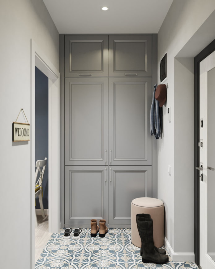
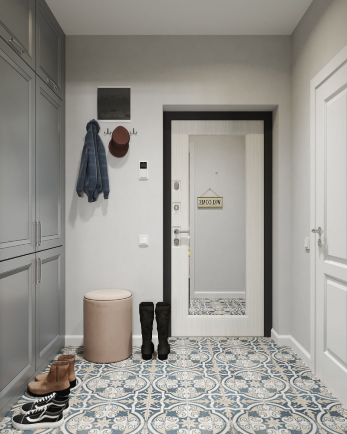
To the right of the entrance, there is a wardrobe for outerwear and bulky items. Hooks are suitable for temporary storage of jackets and become invisible after cleaning clothes in a closed wardrobe.
The dirty area is framed with Peronda porcelain stoneware, which is easy to maintain. All LEDs used in the apartment are purchased from Arlight.
Balcony
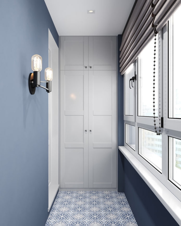
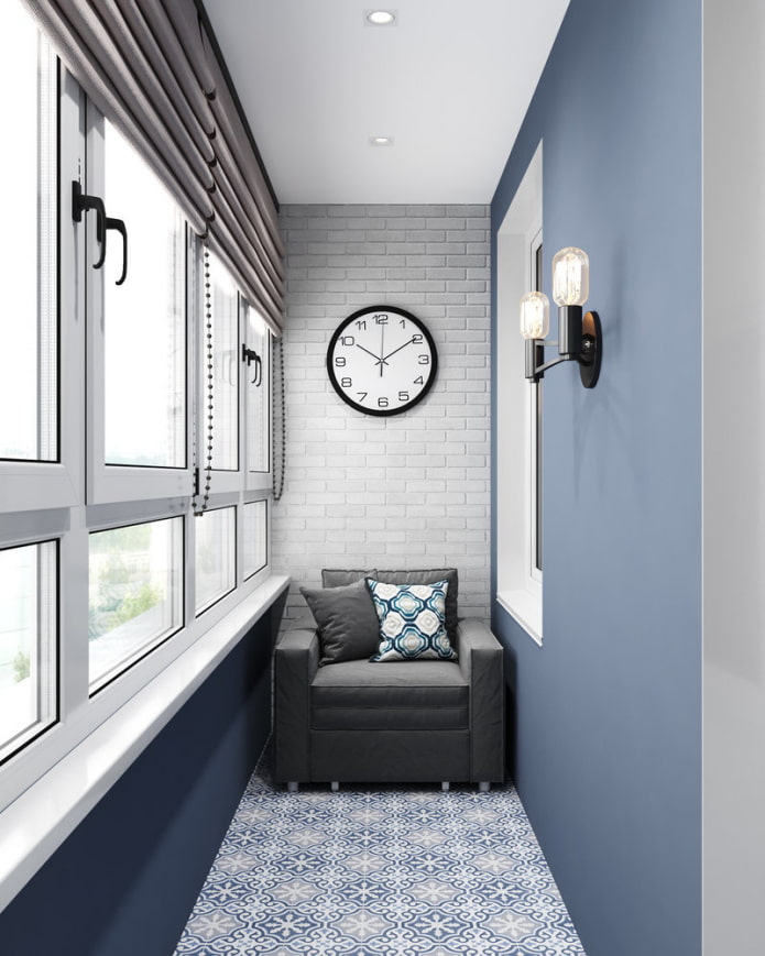
After warming, the spacious loggia turned into a separate corner for relaxation and privacy.
A compact folding chair from IKEA is used, in the opposite corner from which a deep and spacious wardrobe is erected. The floor is tiled with Dual Gres porcelain stoneware.
Thanks to the resourcefulness of the designers, the small studio has become cozy and ergonomic. Most of the ideas presented can be successfully used when arranging small-sized premises.


 10 practical tips for arranging a small kitchen in the country
 12 simple ideas for a small garden that will make it visually spacious
 Design project kopeck piece in brezhnevka
 Modern design of a one-room apartment: 13 best projects
 How to equip the design of a small apartment: 14 best projects
 Interior design project of an apartment in a modern style
 Design project of a 2-room apartment 60 sq. m.
 Design project of a 3-room apartment in a modern style