general information
The apartment in Maryina Roshcha is intended for renting. Designers Anna Suvorova and Pavel Mikhin arranged it as ergonomically as possible.
Professionals wisely saved on furniture by ordering it from Russian manufacturers and found many materials on sales. Thanks to the gray color scheme with warm splashes, the interior looks calm and cozy.
Layout
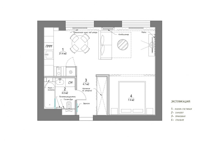
The living room initially pleased with a good square, but the kitchen seemed small and uncomfortable to the owners. As a result of the redevelopment, the living room was combined with the kitchen, and the sleeping place was arranged in a niche with an area of 7.4 sq. m. The storage system was designed in the corridor.
Kitchen
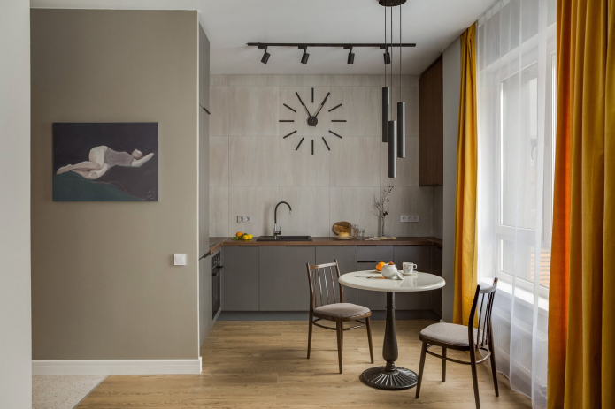
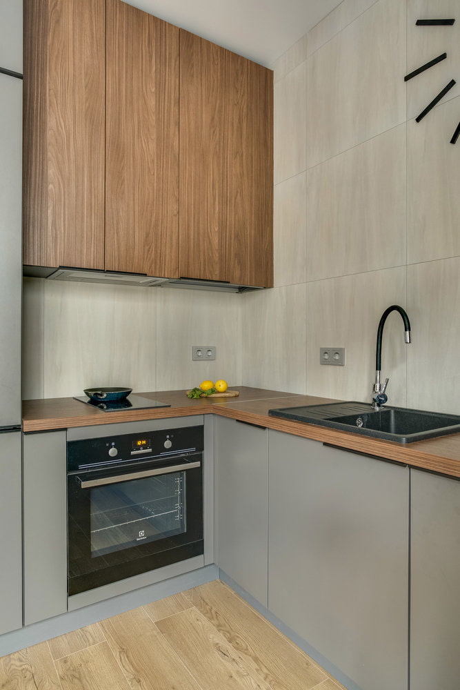
The inconvenient load-bearing column next to the window did not allow making the kitchen straight, but this drawback was turned into a plus by building in a more spacious U-shaped headset... The place for cooking turned out to be laconic and convenient, despite lack of top lockers in the main area. Thanks to this technique, the space looks less busy, and therefore more spacious.
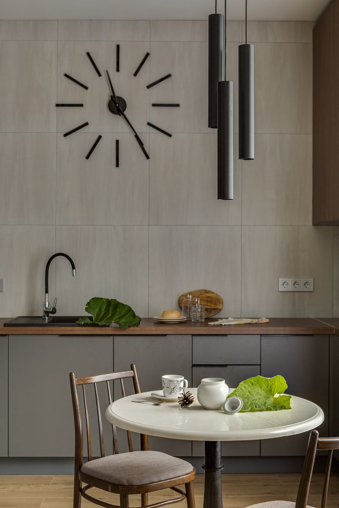
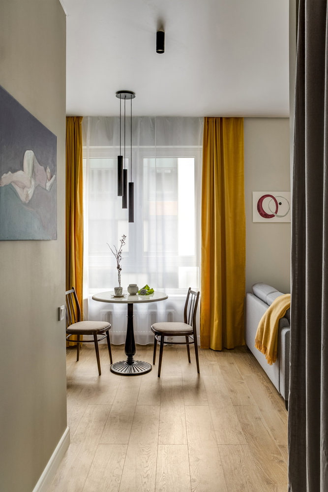
A round dining table with a stone top and an elegant cast-iron base was purchased immediately after the restaurant closed, and the Soviet retro chairs were restored and the upholstery was replaced.
The refrigerator is hidden in a gray tall cabinet, the hood is hidden in wall cabinets, and the hob has only two burners. These frankly "kitchen" elements do not attract attention, which makes it possible to more harmoniously fit the cooking area into the room atmosphere.
The designers did not split the floor with different floor coverings: they used a moisture-resistant laminate "imola oak". The wall was lined with MEI gray porcelain stoneware, and all other surfaces were covered with Dulux paint.
Living room
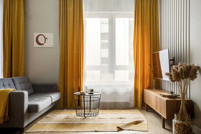
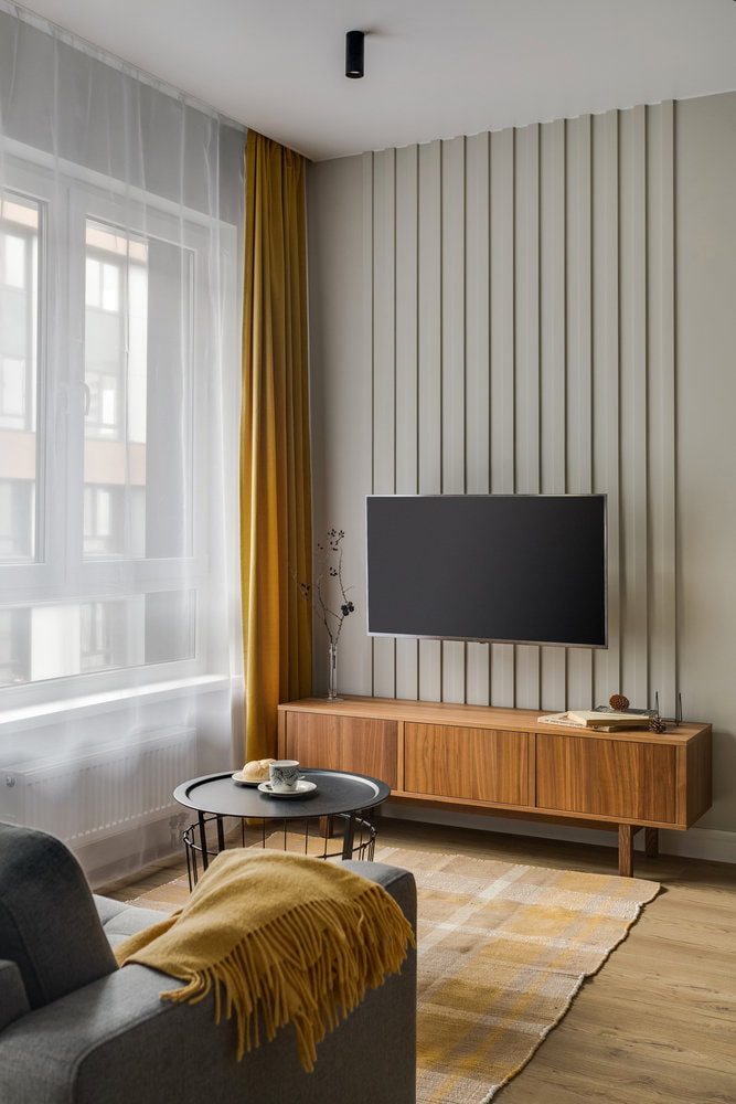
The owner of the apartment chose velvet curtains from IKEA even before the renovation: they served as an excellent accent for a neutral background. They selected a carpet from Zara Home and headboard beds.
For zoning they did not use any tricks, except for the most obvious - a folding sofa from Divan.ru, turned with its back to the dining room, serves both as a partition and as a place to rest.
TV area managed to make it more expensive using ordinary polyurethane foam moldings, painted in the color of the walls. Thanks to them, the room looks higher and more voluminous.
To enliven the atmosphere, they wanted to decorate the living room houseplant, but due to doubts about caring for him, they decided to be content with an alternative - dried flowers in a glass pots. Such an object can be easily created at home.
Sleeping place
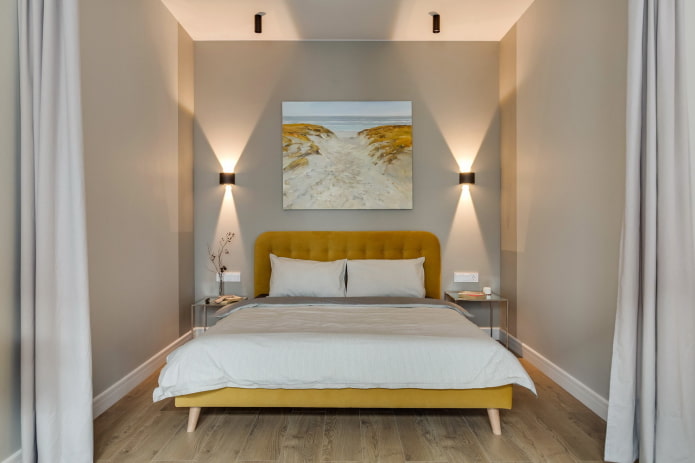
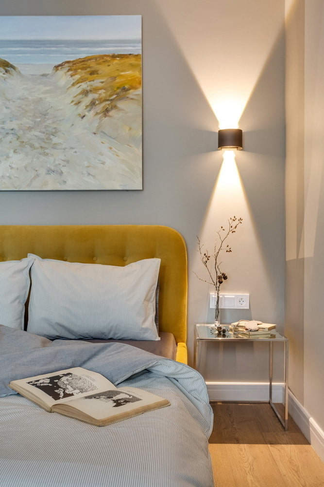
Another interesting technique that allows you to increase the space is the use of two shades of paint. One, lighter, is used on the walls near the window, and a darker one is used in the far corners.
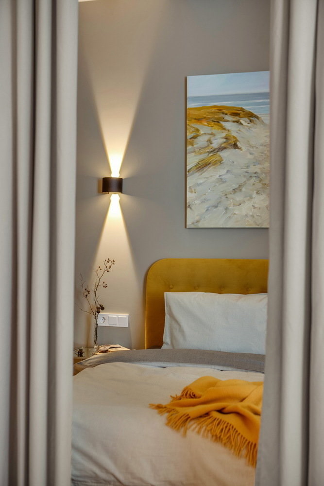
The niche for the bed is fenced with thick curtains - if desired, the bedroom can be made more private. Thanks to the soft rounded headboard, the structure looks noble, and the legs give it airiness.
A landscape painting with a perspective from Galina Ereshchuk from ARTIS GALLERY also works to visually expand the room, and the sconces create a chamber atmosphere in the evening.
Hallway
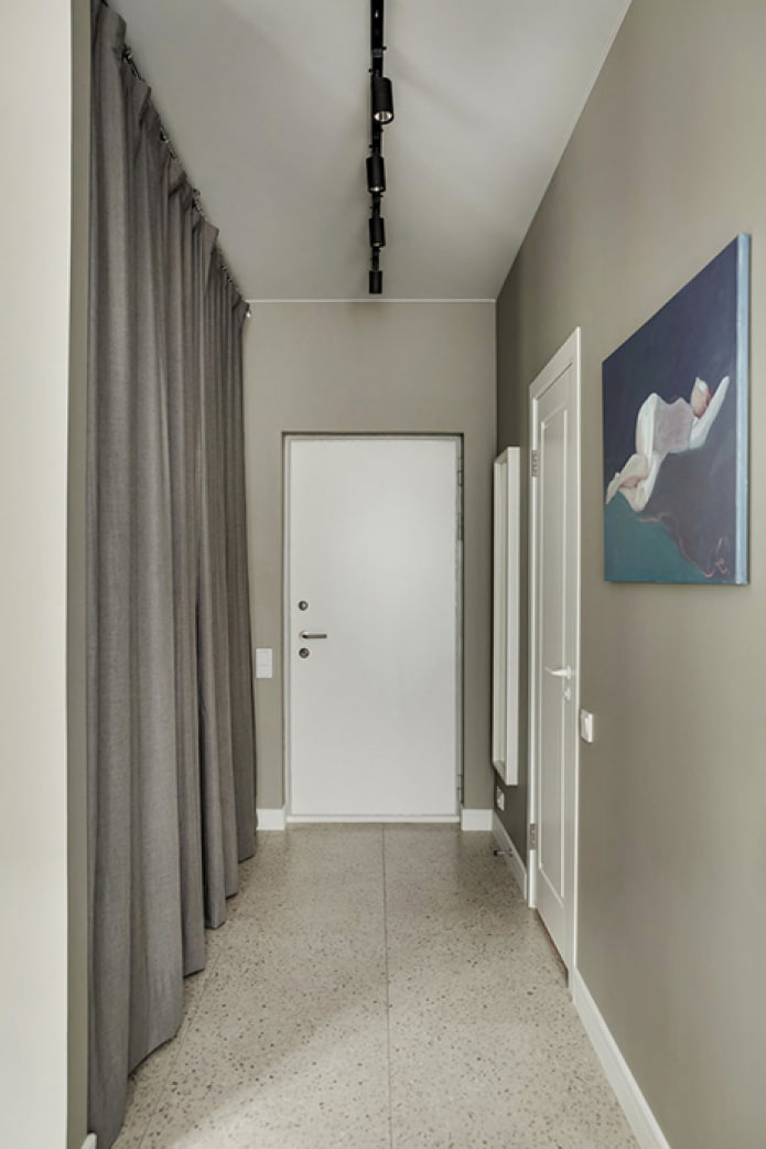
A wardrobe with shelves and baskets was placed along the entire length of the corridor. To save the budget, instead of doors, they used practical Hoff curtains that can be washed. In case the customer wishes to install facades, mortgages are provided in the ceiling.
The storage system hides not only clothes and shoes, but also an ironing board with a dryer. There are sockets for ironing clothes in the hallway. The floor is covered with Kerama Marazzi porcelain stoneware and joined to the laminate with a metal T-shaped profile.
Bathroom
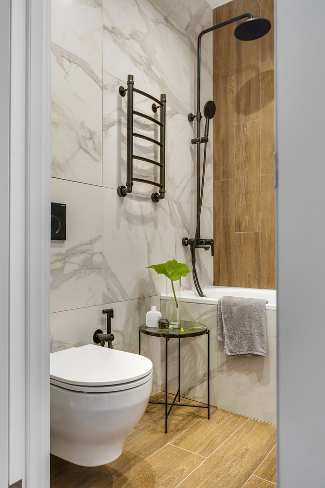
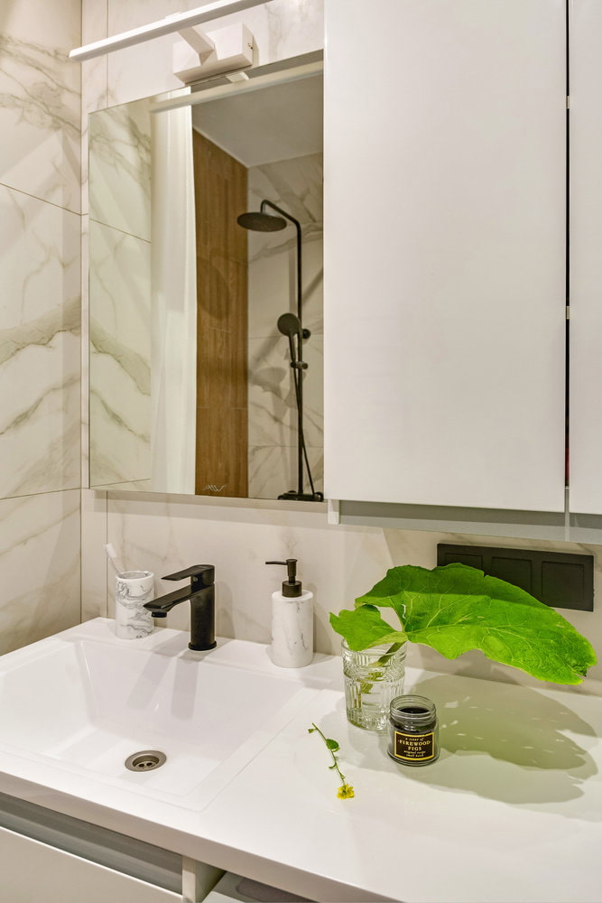
The bathroom is tiled with large-format Kerama Marazzi marble tiles, and underfloor heating was installed for comfort. A water heater was placed behind a hidden hatch.
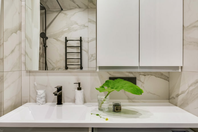
The washing area is functional and laconic: above the tabletop there is a wall cabinet for small items, and under it there is an Alavann cabinet and a washing machine. Woody textures add warmth, while black bathroom fixtures add contrast.
A wall-hung toilet and a glass table, purchased from Zara Home, add lightness to the bathroom interior.
Despite the fact that the designers tried to save money on repairs, the apartment turned out to be refined and modern. A high-quality color scheme, the absence of unnecessary decor and neat finishing work played a special role.

 10 practical tips for arranging a small kitchen in the country
 12 simple ideas for a small garden that will make it visually spacious


 Design project kopeck piece in brezhnevka
 Modern design of a one-room apartment: 13 best projects
 How to equip the design of a small apartment: 14 best projects
 Design project of the interior of an apartment in a modern style
 Design project of a 2-room apartment 60 sq. m.
 Design project of a 3-room apartment in a modern style