general information
How did the history of this repair begin and how did it end? The customer turned to the designer Elzbieta Chegarova for a project for her elderly parents.
In a Moscow apartment with small kitchen, a long corridor and a rectangular room had to fit two berths and enough storage cupboards.
The designer named her project "Blueberry Pie", and the client herself took care of its implementation (repairing and buying furniture).
Layout
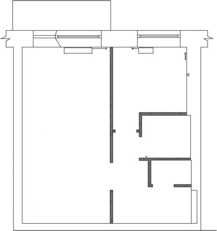
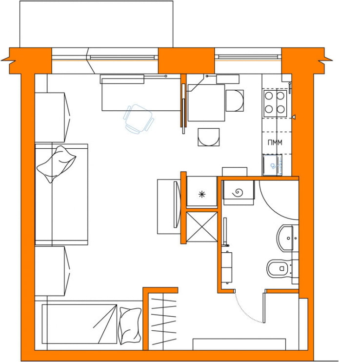
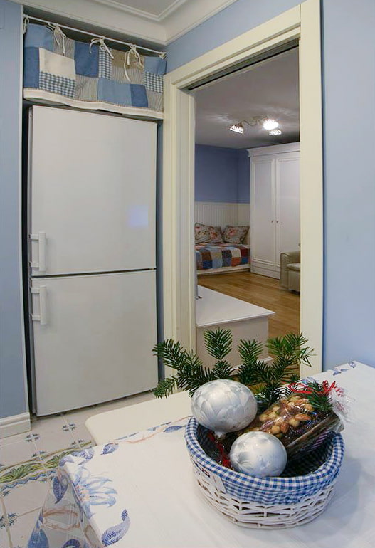
Elжbieta made good use of the corridor space by building in two cupboards on the side of the hallway and a refrigerator on the side of the kitchen. Toilet and bathroom were combined into one combined bathroom. The living room and kitchen could not be combined due to the gas equipment, but the designer found a way out using a sliding door.
Hallway
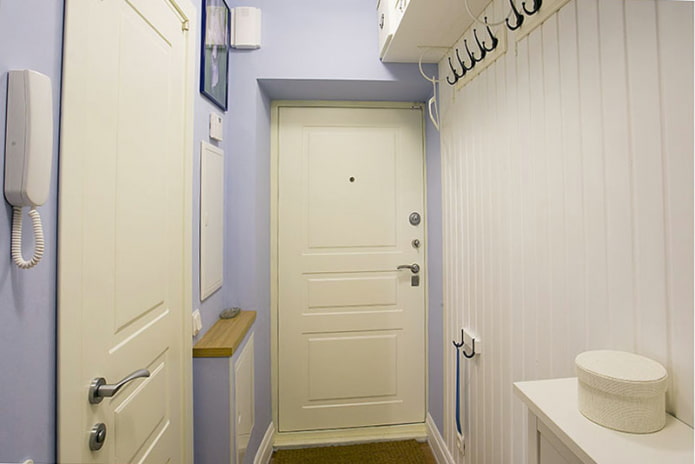
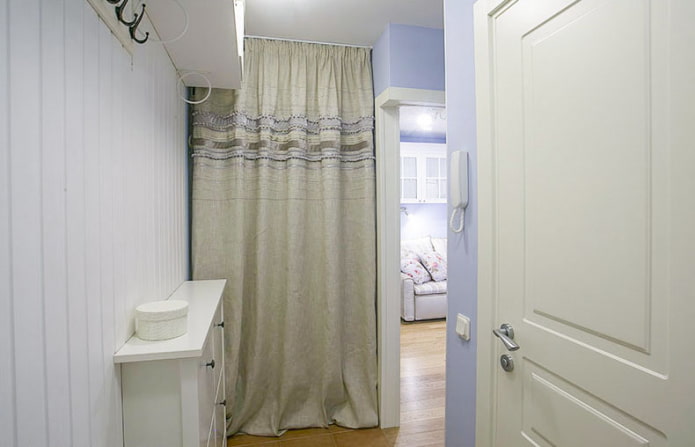
The bright entrance area with open hangers and shelves above them is laconic and airy. Narrow shoe rack from Ikea does not take up much space in width and serves as a console for small things. There are boxes for hats on the shelves - this makes the furnishings look much neater. Walls in hallway faced with clapboard and painted with Tikkurila, color H353. The storage area is separated by a curtain.
Kitchen
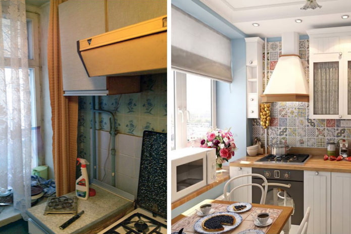
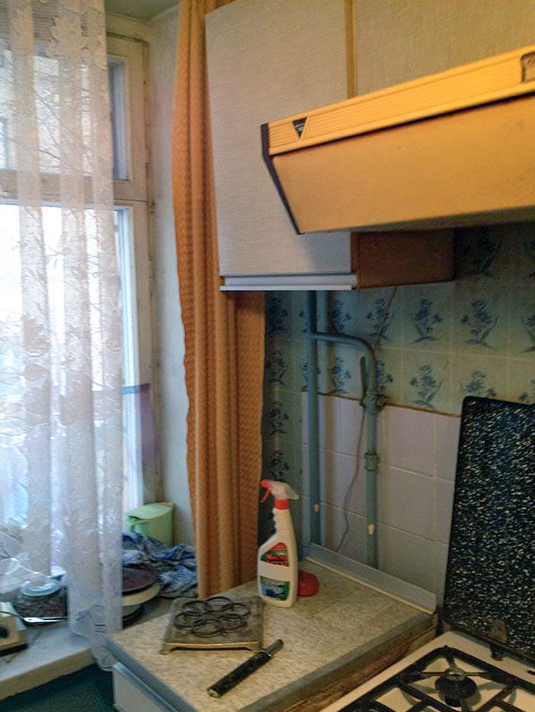
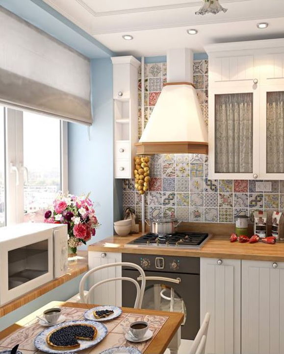
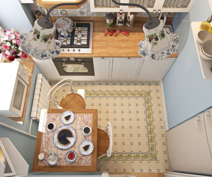
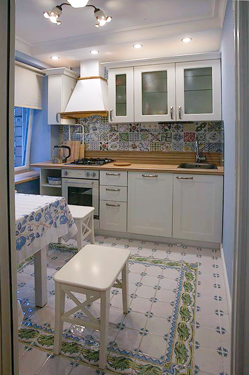
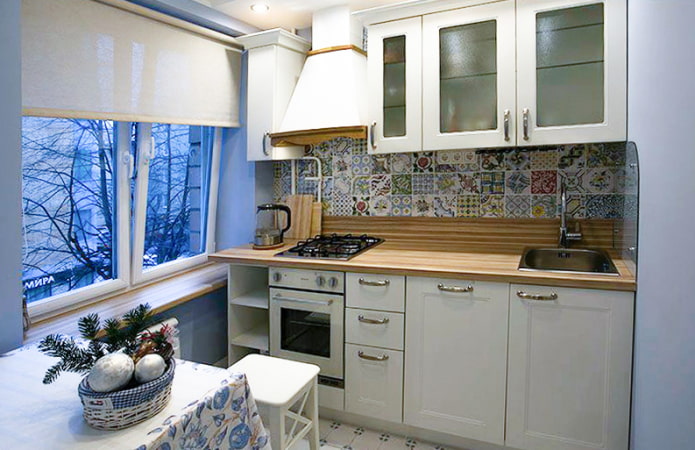
The kitchen area is only 4 square meters. The apron is decorated with Spanish tiles Vives with ornaments reminiscent of old tiles.
The kitchen set almost exactly repeats the visualization: every centimeter is used as functionally as possible.
A light set, glass facades, roller blinds no frills and ceiling lighting with Ferroluce spotlights.
From microwave ovens, the place for which was not found, the owners decided to refuse. The wall next to the sink was protected by a tempered glass screen.
Living room
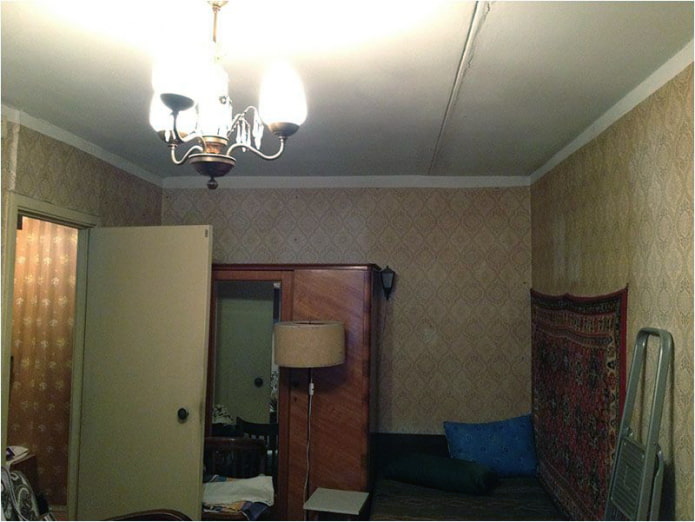
The interior of the living room before the renovation was dilapidated and ill-considered:
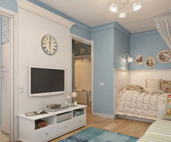
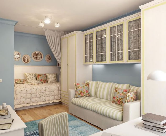
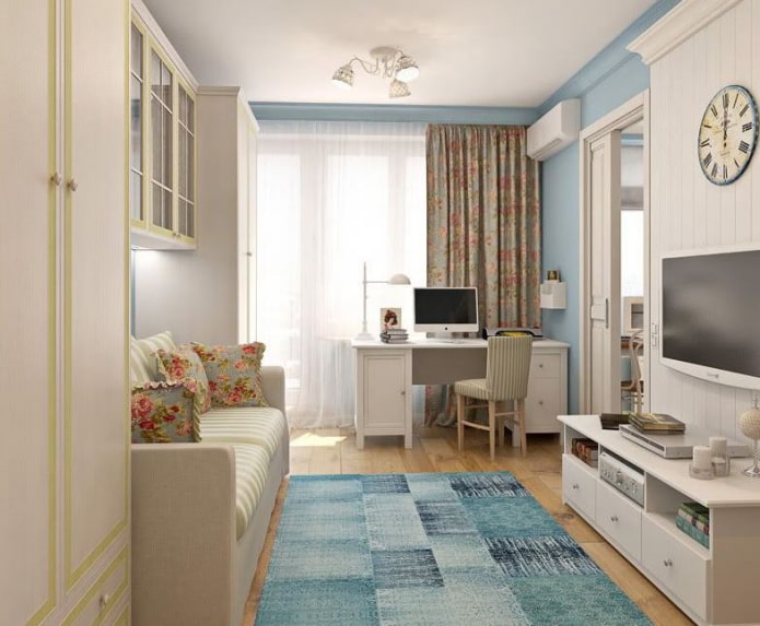
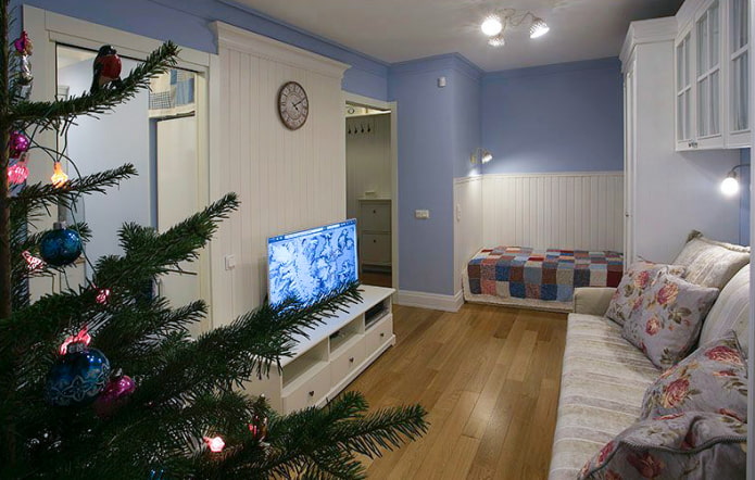
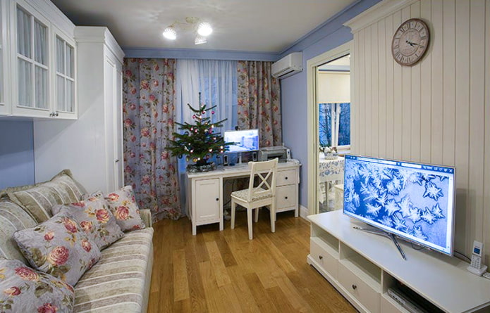
Now it combines several functions at once and serves as a living room, bedroom and cabinet... The sofa is folding, therefore it acts as a berth. It is located in a niche of wardrobes: two wardrobes on the sides and two hinged ones between them. This design creates coziness and serves as a storage place for many things. All furniture was bought in Ikea.
The design of the living room almost completely repeats the visualization of the project, especially the owners reproduced the mini-cabinet and the TV area with great accuracy. In the far corner of the room, the owners of the apartment put an ordinary ottoman, but if desired, it can be replaced with a sofa with drawers - then storage space will become more.
Bathroom
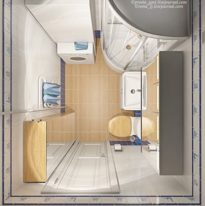
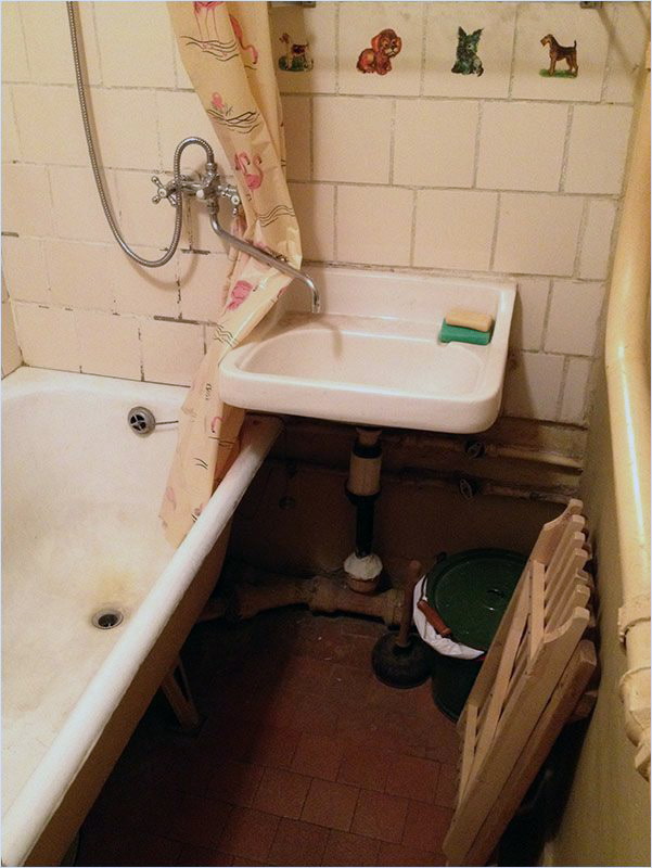
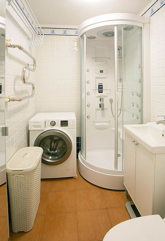
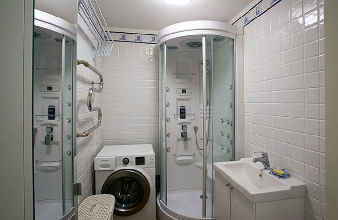
Bathroom area - 3.4 sq. m. After combining the bathroom and toilet, there was a place for a washing machine, and after replacing a bath with a shower - for a wardrobe and a laundry basket.
Mirrored facades and light Kerama Marazzi tiles make the bathroom look even wider. Now it is a comfortable and maximally ergonomic room.
The space of the apartment is united by a common color scheme. All furniture is light, roomy and multifunctional.Thanks to a well-thought-out project and successful implementation, the 28-meter Khrushchev has become a wonderful place for a comfortable and happy life.

 10 practical tips for arranging a small kitchen in the country
 12 simple ideas for a small garden that will make it visually spacious

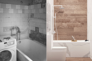 Design project kopeck piece in brezhnevka
 Modern design of a one-room apartment: 13 best projects
 How to equip the design of a small apartment: 14 best projects
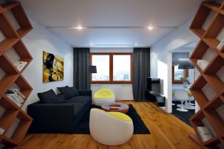 Interior design project of an apartment in a modern style
 Design project of a 2-room apartment 60 sq. m.
 Design project of a 3-room apartment in a modern style