Ornate milling
The world of interior design strives for conciseness, since an overabundance of information and all kinds of details around does not allow a person to rest, creating visual noise. The same approach also affected kitchens: facades, complemented by curly milling, have long been out of fashion - they are only appropriate in country style, but often they do not represent aesthetic value, and most importantly, they make cleaning difficult.
For a modern look, opt for sleek fronts. If the solution seems boring, go for simple rectangular routing.
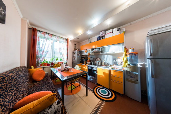
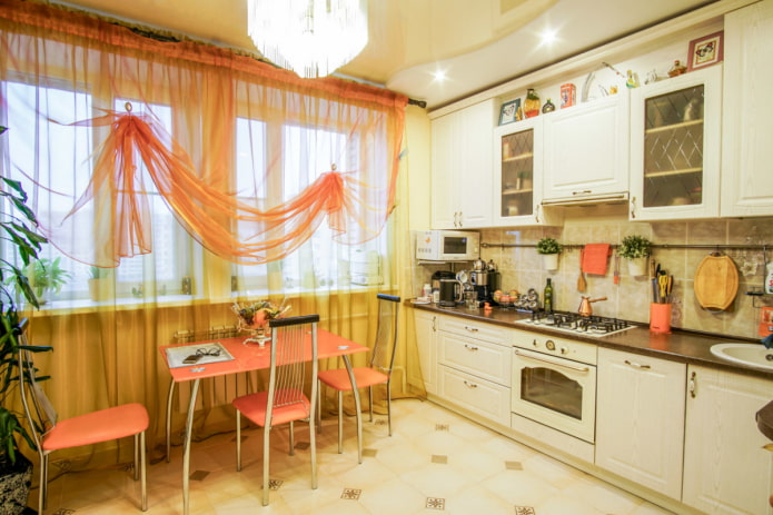
Multilayer curtains on the windows
The only tasteless detail can ruin the entire interior - we are talking about a window frame in the form of a translucent fabric with flowing folds. A noticeable product demonstrates only that the designer in the curtains salon tried his best, but did not take into account kitchen style.
In the modern style, the veil looks out of place, and in the classic style it looks vulgar.
Visor over cabinets
This shelf not only makes the headset heavier, adding bulkiness to it, but also does not carry any special functionality: work area lighting it is more convenient to place it under wall cabinets. Refuse this element when ordering a kitchen, so as not to increase its cost.
The design will give you additional trouble, increasing the time for cleaning, because you will have to wipe one more surface.
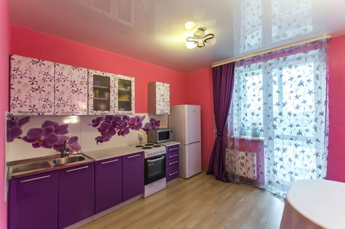
Vivid photo printing
The kitchen is one of the most congested places in the apartment, as it contains a huge amount of small items. Many owners leave dishes, appliances and cutlery in plain sight so that they are always at hand during cooking.
That is why for a kitchen, especially a small one, it is worth choosing a laconic finish. The already irrelevant photo printing in the form of flowers, fruits and a night city, which looks spectacular only in the salon, adds visual clutter to the interior.
Radius headset
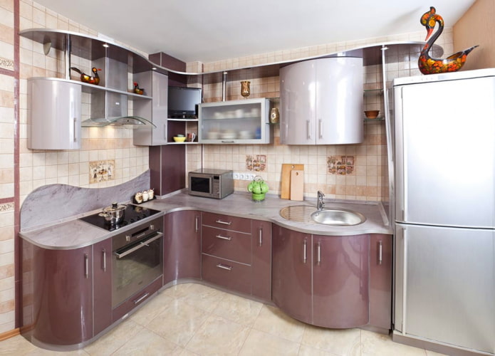
Another relic of the past, which is appreciated by lovers of smooth shapes. But the problem of radius furniture is not only in the overly memorable design, which can quickly get bored, but also in the style itself.
A wave-like headset fits well only in high-tech. Unfortunately, this futuristic style requires open spaces and large investments in technology and decoration, while it is desirable to maintain the chosen direction throughout the apartment.
Cheap oilcloth on the table
If you want a modern kitchen - get rid of the oilcloth tablecloths, which differs only in its relatively low price and easy maintenance. The tasteless design of the products does not add aesthetics to the setting.
Inexpensive oilcloth will quickly deteriorate, fade and bend around the edges, and instead of expensive coatings, it is better to buy a real tablecloth with water-repellent impregnation. Ideally, you should buy a high-quality table that you don't want to hide or protect from chips and stains.
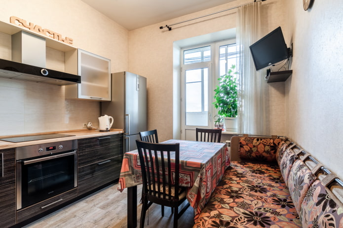
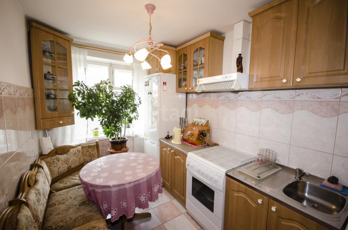
Outdated kitchen corner
It is difficult to argue with the convenience of this upholstered furniture - it successfully fills the corner of the room and can serve as an additional storage place. But the models released in the 90s no longer fit into modern design.
IN cramped kitchen such a corner takes up a lot of space, narrowing the passage and limiting freedom of movement. You should also take into account the amount of dirt, grease and odors accumulated in the upholstery over the decades of using the corner.
There are many other convenient solutions for decorating a dining group, including for a small kitchen:
- a more concise corner or bench with a lid;
- small sofa;
- soft chairs;
- folding chairs;
- stools that you can simply slide under the table.
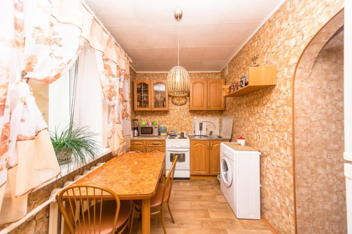
Poor imitation of materials
Laminate countertops "like granite" of dubious quality, film on facades "like marble", wallpaper "like natural stone" - such fakes were in demand on the construction market a couple of decades ago and seemed to be original novelties.
Today, this approach gives out a morally outdated kitchen, and besides, such imitations are not able to deceive anyone - and why?
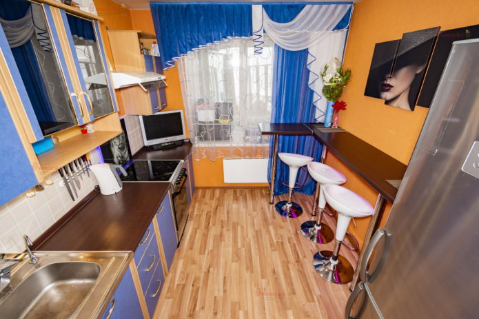
Bar counter with chrome pipe
Once a rounded counter with a metal pole in the middle was considered a real chic: it was installed even in small kitchens.
Modern designs look more restrained and, unlike a chrome pipe with a glass holder, which quickly becomes covered with dust, are not associated with drinking establishments. Against the background of a classic-style kitchen unit, this design looks especially strange.
One set dining group
If you want the setting to express your personality, forget about the ready-made set of table and chairs. Buying such a dining group looks like an ill-considered step and disinterest in your own interior.
Furniture sets with chrome frames and artificial leather upholstery are especially popular - they are not always comfortable due to protruding legs, they look cold and uncomfortable, they do not fit into any style.
Often, a collection of assorted, but neat, wooden chairs from an Internet flea market looks much more interesting and more expensive than a ready-made set. This design trick is easy to replicate at home.
If you want to design your kitchen in a modern way, give up the listed details that make it obsolete. In an effort to stand out or, conversely, to equip the space "like everyone else", give preference to your own convenience, practicality and materials that delight the eye and will be in demand for a long time.

 10 practical tips for arranging a small kitchen in the country
 12 simple ideas for a small garden that will make it visually spacious

 How to choose the color of your kitchen sink?
 White kitchen set: features of choice, combination, 70 photos in the interior
 Black set in the interior in the kitchen: design, choice of wallpaper, 90 photos
 How to choose curtains for the kitchen and not regret it? - we understand all the nuances
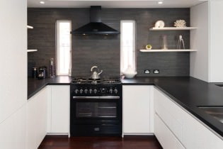 Design of a white kitchen with a black countertop: 80 best ideas, photos in the interior
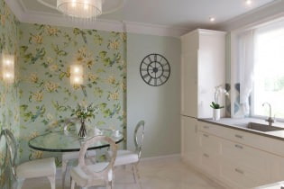 Kitchen design with green wallpaper: 55 modern photos in the interior