Recommendations for the visual expansion of space
The interior of the kitchen with dimensions of 2 by 3 square meters is created with the obligatory consideration design tricks to visually increase the area:
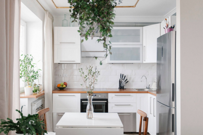
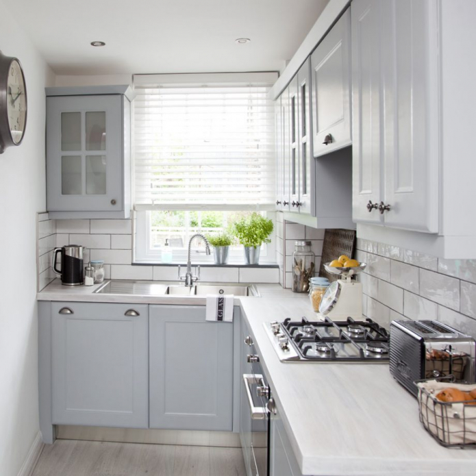
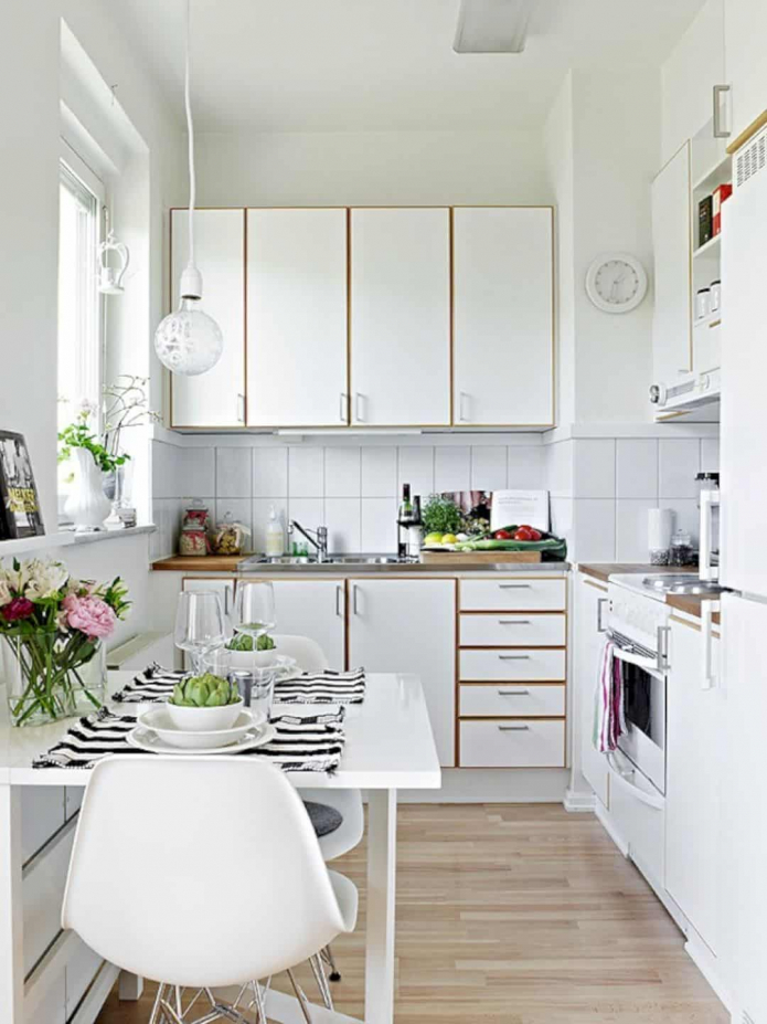
- Color spectrum... Whites, neutral light and pastel shades add small kitchen airiness and lightness.
- Finishing... No complex multi-level structures: minimalism in the repair of the ceiling, floor and walls will make a small kitchen visually more spacious.
- Kitchen set... For a small kitchen, built-in kitchen furniture is the best solution. Built-in drawers efficiently use all the usable space, leaving no empty spaces.
Look examples of kitchen design in Khrushchev.
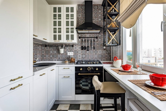
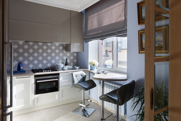
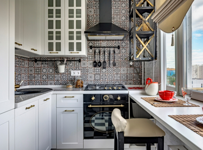
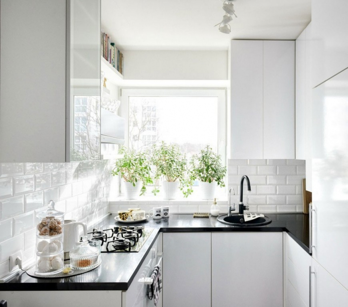
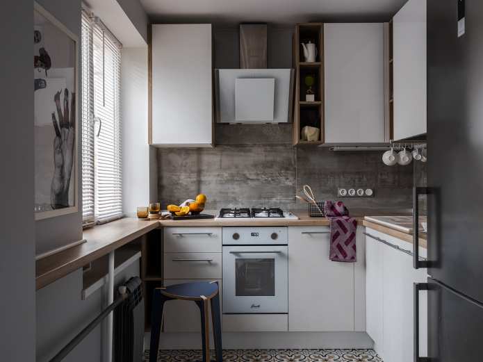
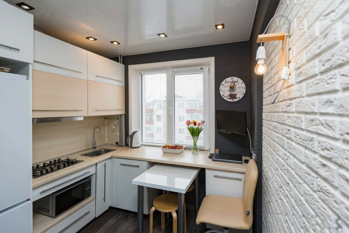
On the picture window sill use case
- Original solutions... In kitchen design, try to make every millimeter of space useful: order three-tiered kitchen set, organize countertop on the windowsill, replace the plinths with roomy drawers.
- Lighting... The design of a kitchen with a window assumes the addition of bright artificial light to daylight. The abundance of light and its sources visually enlarge a room measuring 2 by 3 meters: use ceiling spots, hanging chandeliers, wall sconces, floor lamps, backlight apron.
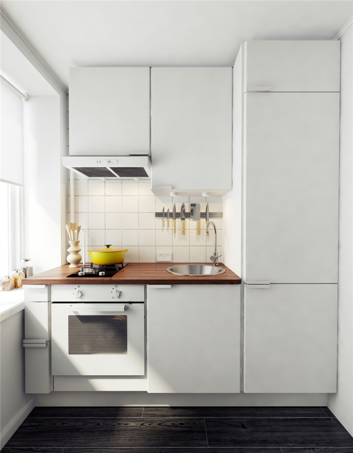
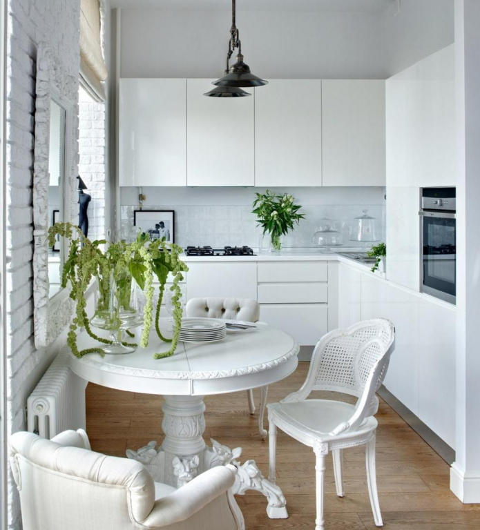
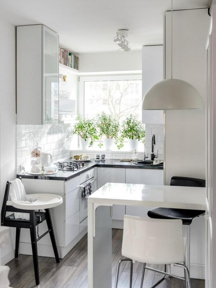
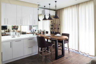
The photo shows a successful use of white
- Reflection... The best way to make a room larger is a mirror, but this is rarely used in kitchens. But a small kitchen can be furnished glossy furniture with or without glass inserts, make glass apron or take glazed ceramic tiles, add shiny stretch ceiling.
Which headset should you choose?
The choice of a headset depends on three factors:
- How often do you cook? This will indicate the required size working area.
- Do you have many things for storage? The smaller the utensils, the fewer boxes you need.
- How many people live in the apartment? The number of residents affects choice of dining area: its shape and size.
Direct kitchen
If your kitchen is 2 by 3 meters and you are not going to cook there often, then, accordingly, you assume the placement of a minimum of things and equipment - save space with linear kitchen set!
All elements are installed along one of the walls, but it is better to place the refrigerator on an adjacent wall: this way it is organized working triangle.
U-shaped layout
In studios where the premises are adjacent to each other, it is permissible to use all the free space for the working area. Dinner table at the same time it is taken out into the hall or a separate dining room.
Read more about the U-shaped kitchen in another article.
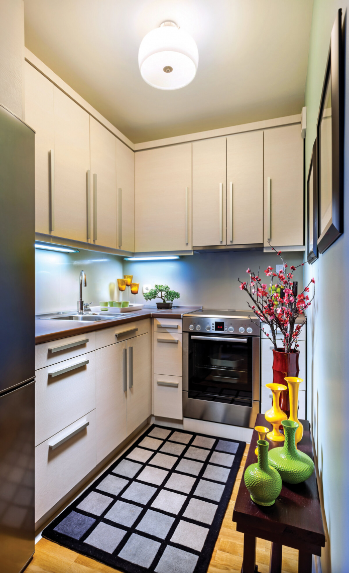
Important! Parallel rows of cabinets are installed on 2 meter walls: this is due to ergonomic rules... There should be 120-150 cm of space between the two rows.
Corner kitchen
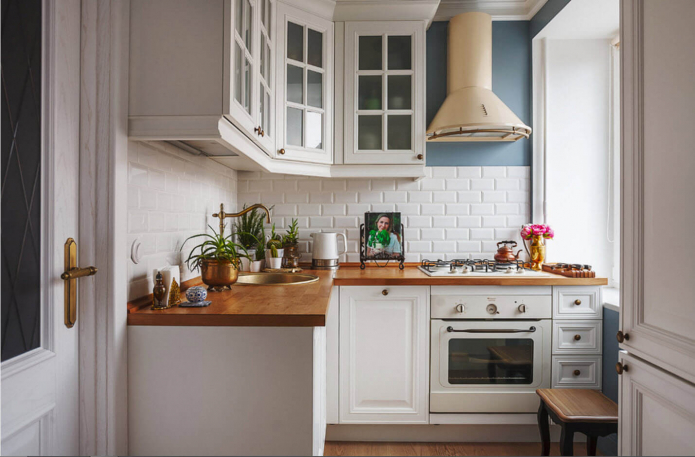
L-shaped model — the best idea for a small kitchen... Large work surface, spacious cabinets, many options for placing household appliances, a convenient functional triangle.
Important! When placing the sink in the corner, order a special beveled cabinet - this will make it much more convenient to wash the dishes.
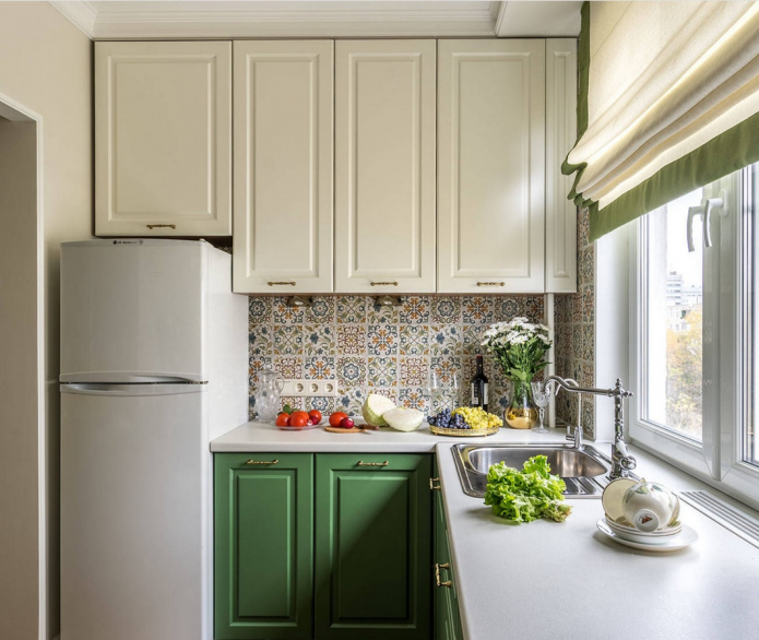
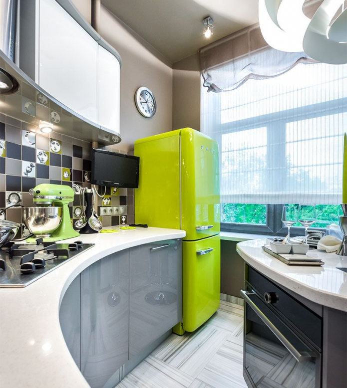
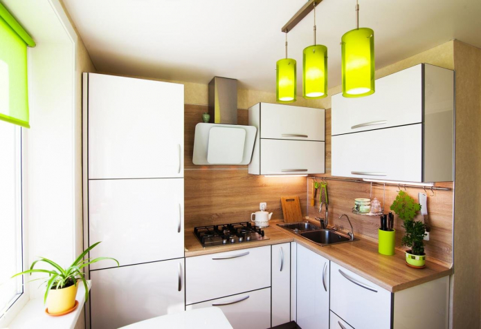
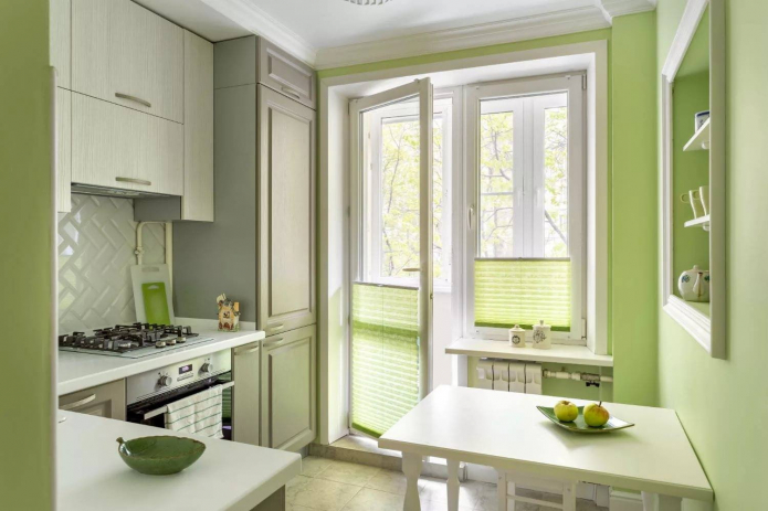
In the photo, bright light green accents in the design of the kitchen are in perfect harmony with wooden countertop and apron
How to arrange furniture and appliances?
When choosing furniture for a small kitchen, it is important to pay attention not only to the size of the working area, but also to take into account the space for household appliances. You must know in advance where you are put the fridge on, stove, oven, dishwasher and, if necessary, washing machine.
Tips for designing a 2 by 3 meter kitchen:
- The refrigerator is installed at the window opening separately or in a row of tall columns.
- If columns are provided in the headset, an oven, microwave oven, washing machine and other household appliances are also built into them.
- The place for the hob is chosen so that at least 40 cm remains on the sides of it.The gas stove should be moved at least 50 cm away from the window.
- The dishwasher should not be moved far from the sink so that you do not have to pull the water supply and sewage system through the entire kitchen with walls 2 by 3 meters.
- A narrow washing machine can be conveniently built into the end of the cabinet - then it will not take up an entire drawer.
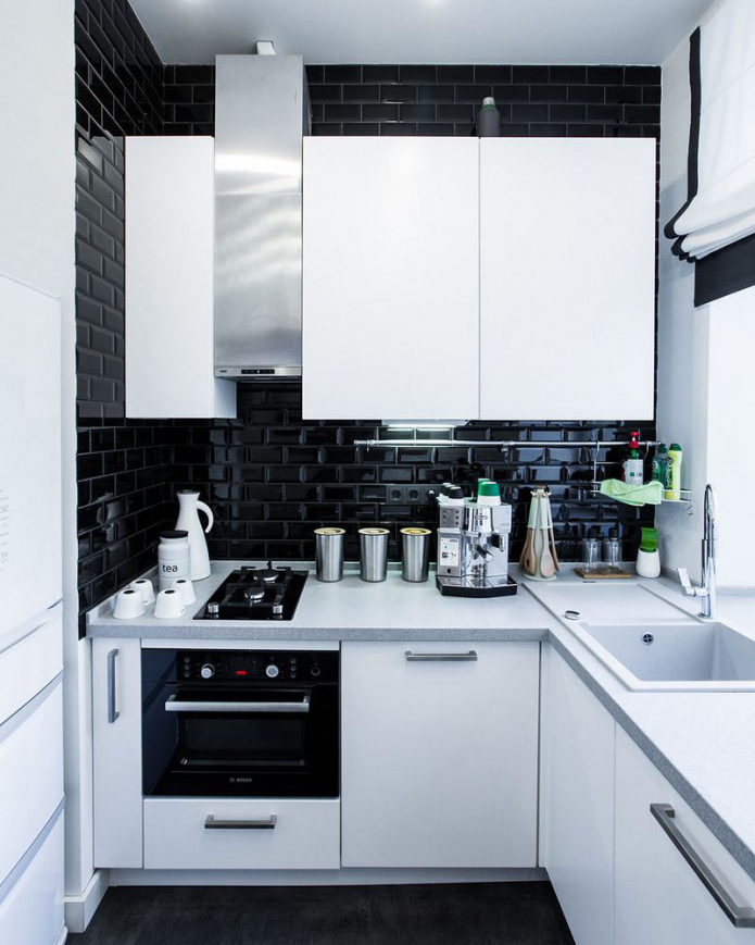
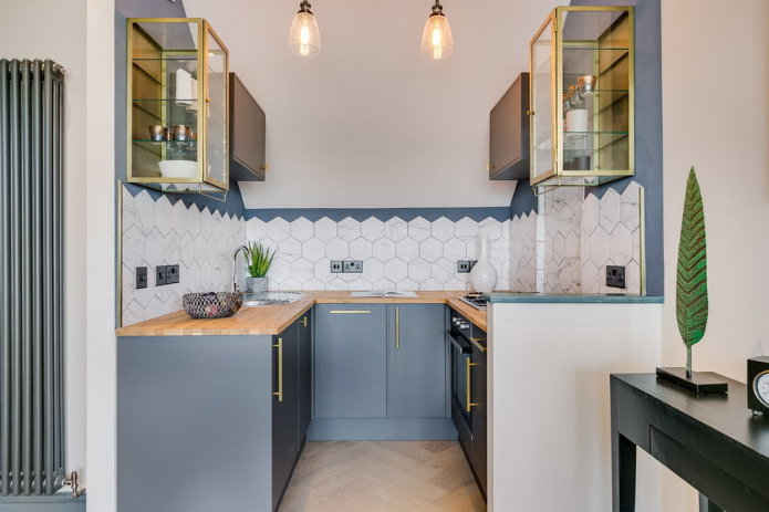
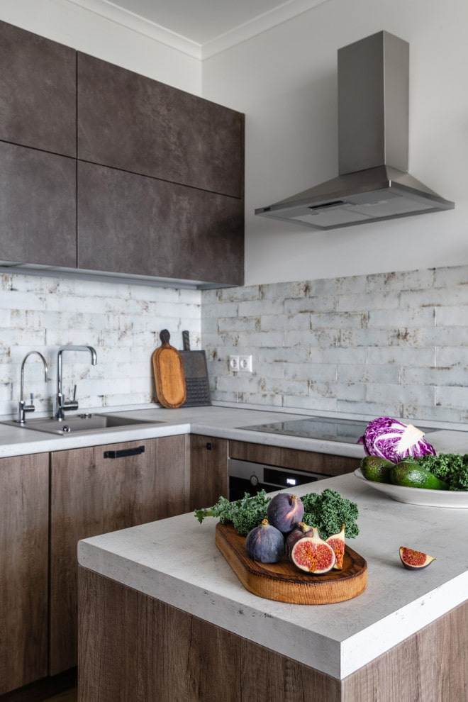
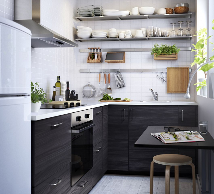
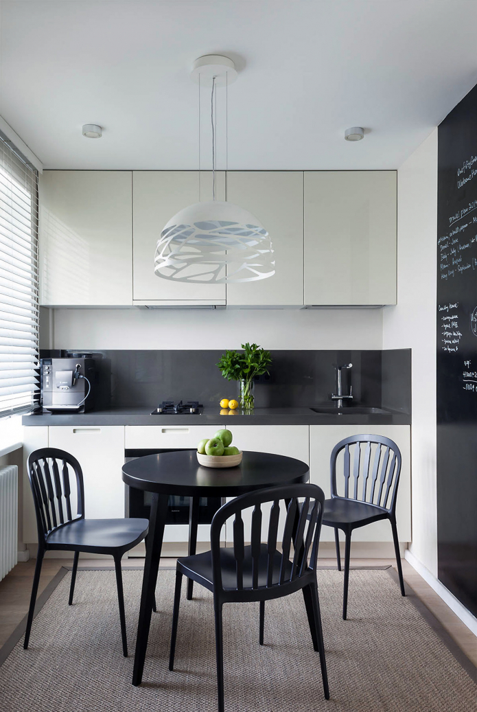
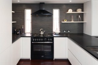
The photo shows dark walls in a small room
Options dining area for a small kitchen several: but first you need to decide on its location. Will there be a main dining area in the kitchen, or does your apartment have an additional dining area and only need a breakfast area?
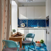
The most comfortable option full furniture in the kitchen measuring 2 by 3 meters - a folding round table with chairs. Due to the absence of sharp corners, the table does not take up much space, and the chairs can be moved under it, stacked into each other or folded and stored more compactly. And when the whole family gathers for dinner, it will be easy to place them around the table.
Suitable for small families bar counter design: it is advisable to make it in the form of a peninsula so that the tabletop also serves as a working space. In a small kitchen, versatility is extremely important.
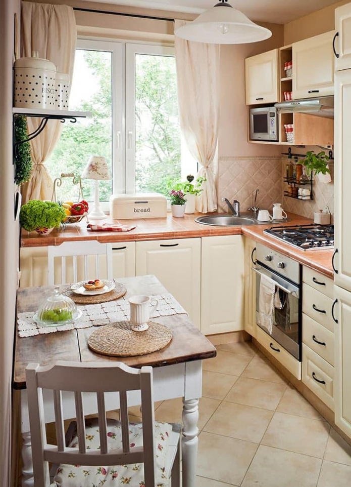
Often the dining area is made on the windowsill - it is convenient and aesthetically pleasing, but you cannot seat many guests behind it. Therefore, additional space with a large table in the living room will come in handy.
An example of design in various styles
Arranging a tiny kitchenette assumes the absence of unnecessary details; modern styles are best suited for this purpose.
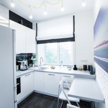
IN minimalism the main rule: nothing more. Empty countertops, closed cabinets with blank facades. The requirement for a single color finish in light colors applies to all surfaces: from walls to furniture.
Give preference to a monochrome palette and paint the walls in the color of the cabinets: with this technique, the furniture literally dissolves against the background of the walls and becomes completely invisible.
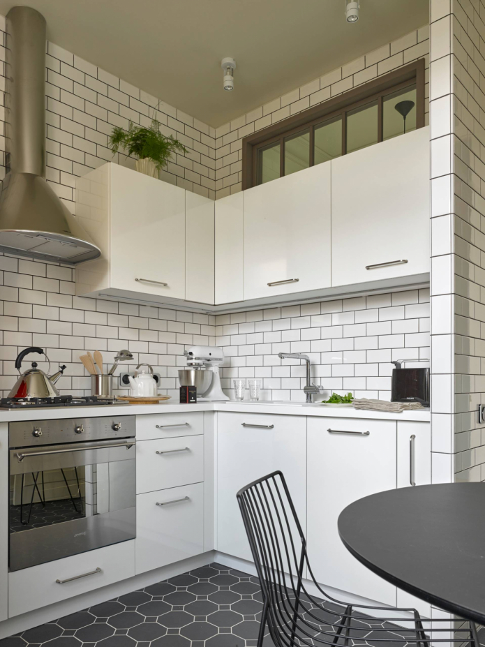
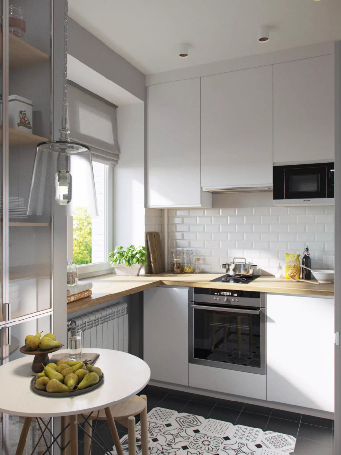
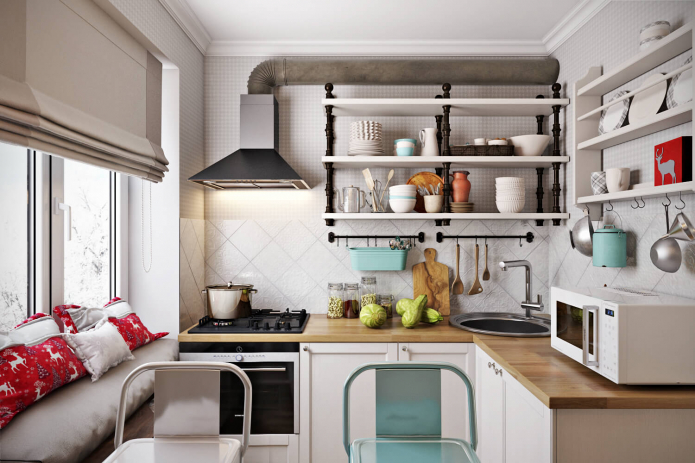
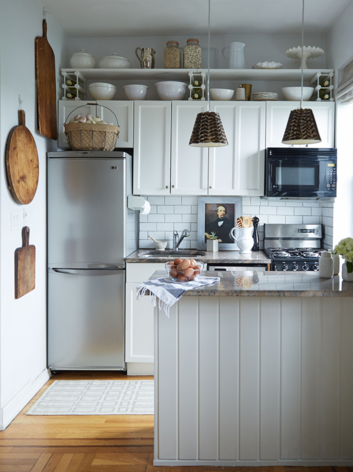
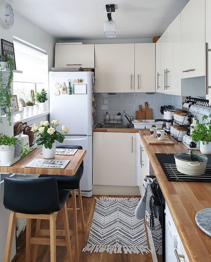
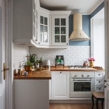
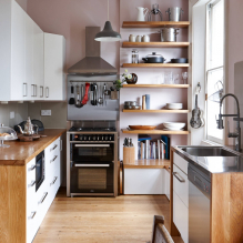
IN scandinavian style the white palette does not look as cold as in the first case. The interior is more cozy thanks to the wooden table top, decor in the form of wicker baskets or posters, beautiful dishes on open shelves, wallpaper with a scandi print.
Advice! By opting for shelves instead of wall cabinets, you will certainly create more space at the top. But the shelves should not be overcrowded to avoid chaos in the kitchen.
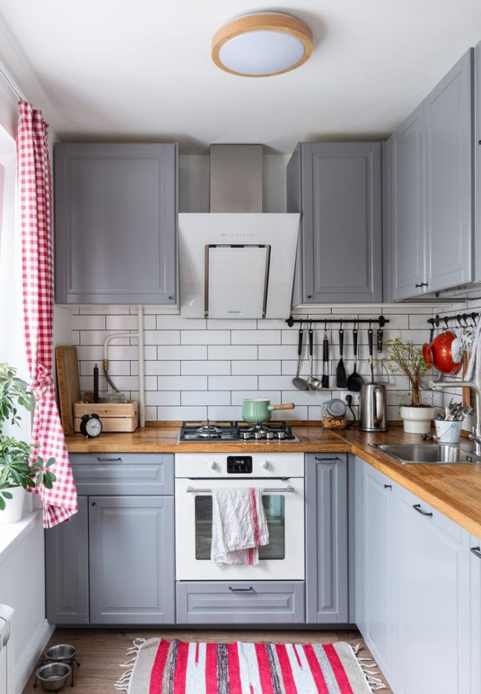
In the photo, a corner set in the scandi style
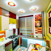
The dominant principle in hi-tech is shine. Glass, metal, high-quality plastic, an abundance of light. And from the first section, we remember that all these elements are visual expanders of space. What is on hand in compact rooms.
Another important rule - the use of modern technologies.This applies to both furniture fittings and appliances: it must be ultramodern and functional.
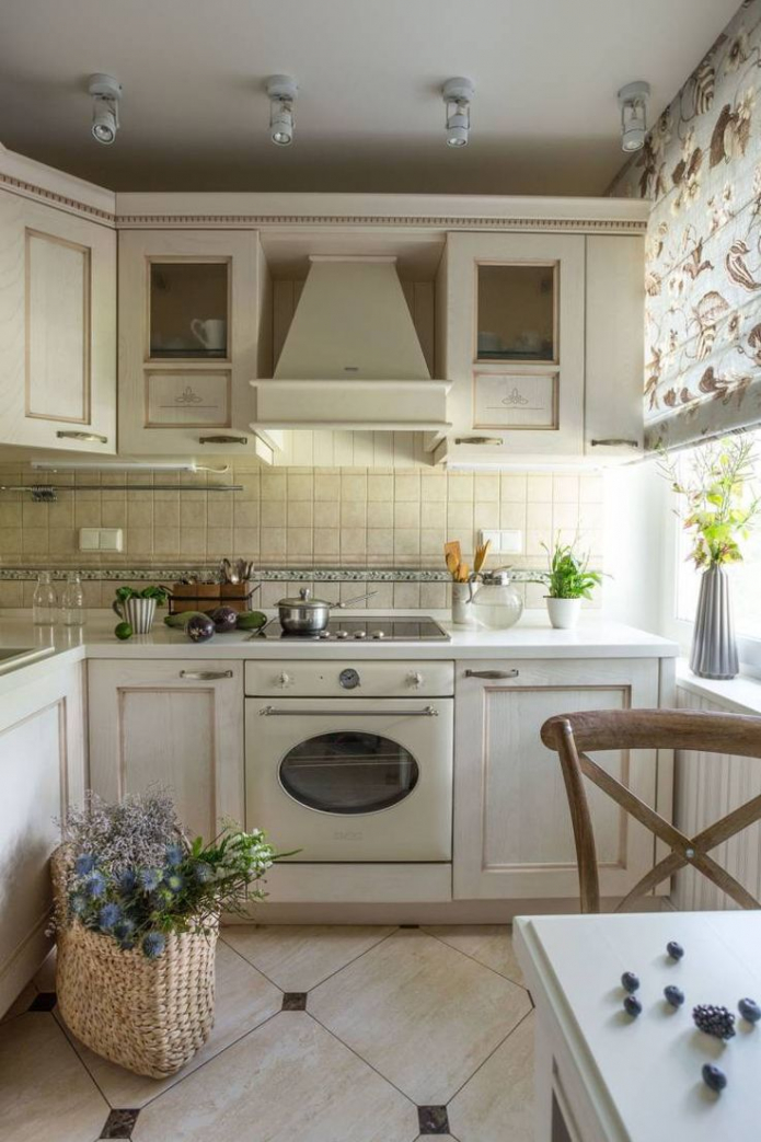
The neoclassical style is not as minimalistic as the previous ones, but still light and modern. Headsets in this style for the most part matte, with beautiful milling: yes, they will not reflect light, but they will not look bulky either - thanks to the white color.
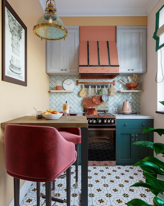
Particular attention should be paid to the luminaires: they are the main decorative elements of the style. Choose medium-sized models in white, gold, or decorated with glass beads. Glass, by the way, can also be on the facades: it is an excellent substitute for gloss.
A small kitchen is not a sentence! It can be functional, roomy and very stylish. See a photo of a 2 by 3 kitchen design in the gallery and choose the option that suits you best.

 10 practical tips for arranging a small kitchen in the country
 12 simple ideas for a small garden that will make it visually spacious
 How to choose the color of your kitchen sink?
 White kitchen set: features of choice, combination, 70 photos in the interior
 Black set in the interior in the kitchen: design, choice of wallpaper, 90 photos
 How to choose curtains for the kitchen and not regret it? - we understand all the nuances
 Design of a white kitchen with a black countertop: 80 best ideas, photos in the interior
 Kitchen design with green wallpaper: 55 modern photos in the interior