Gray walls, white headsets and vice versa
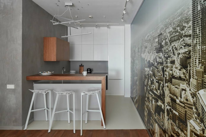
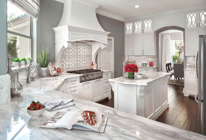
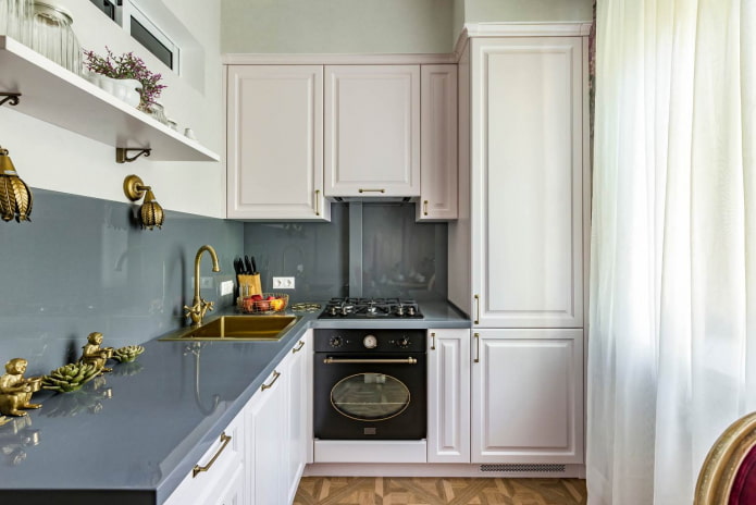
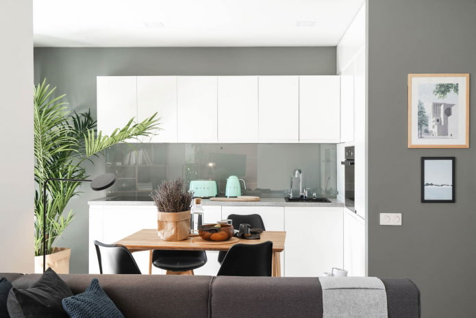
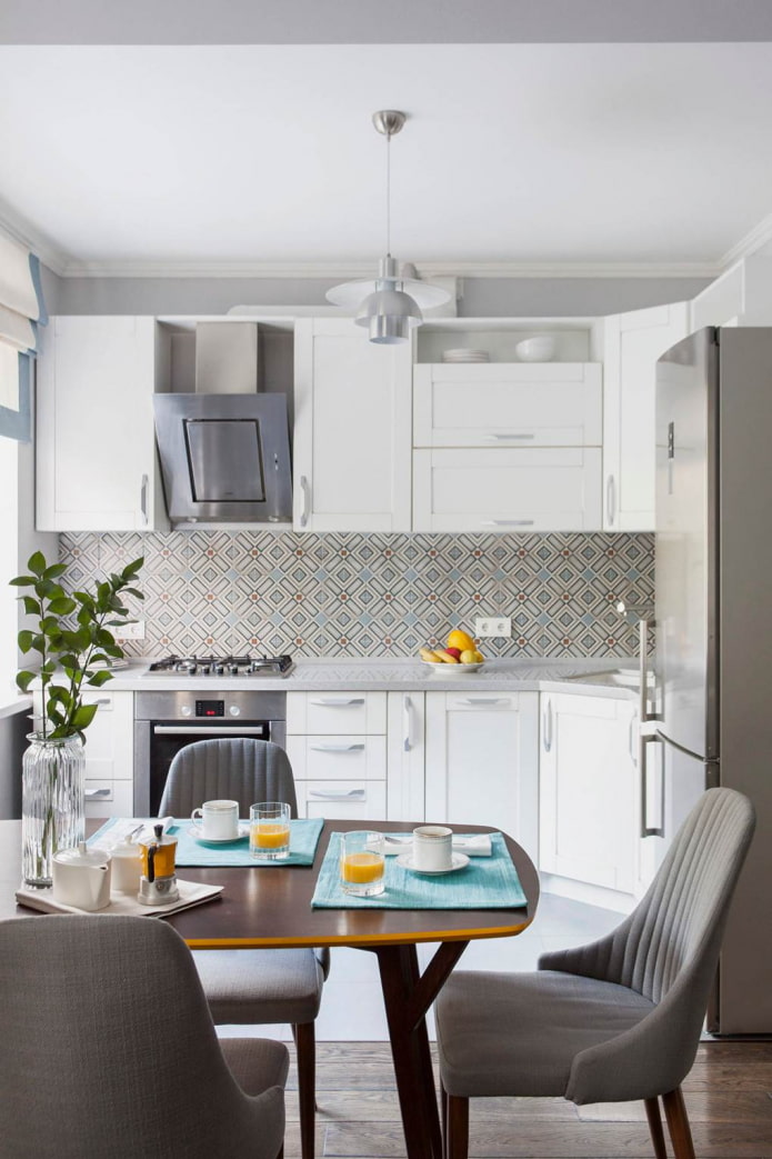
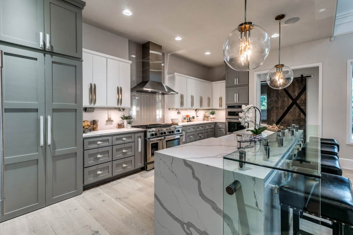
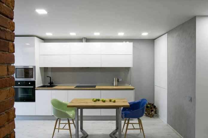
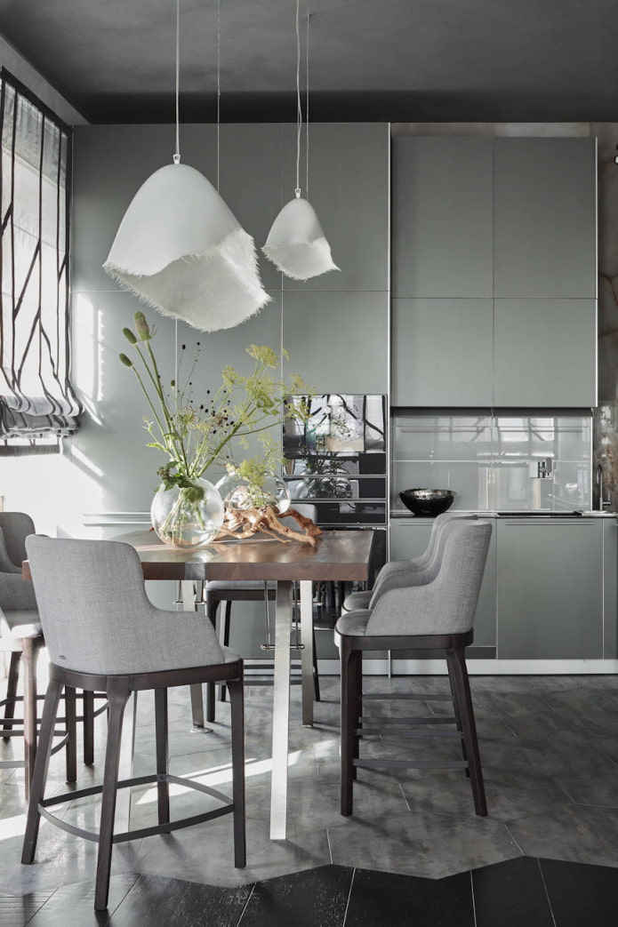
Against a gray background, the snow-white facades of the pedestals and cabinets look especially expressive, and the darker the background, the brighter the contrast. This pattern is best used when arranging spacious kitchens, since a cramped room will visually shrink, and white furniture will "push" from all sides and look larger than it is.
Dark and bright floors and ceilings, especially multi-level ones, will aggravate this impression, but for a large kitchen they will be a real boon.
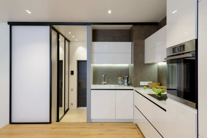
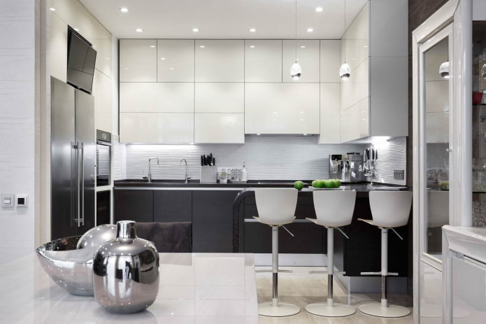
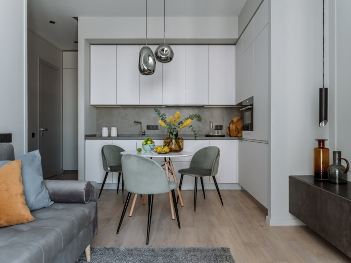
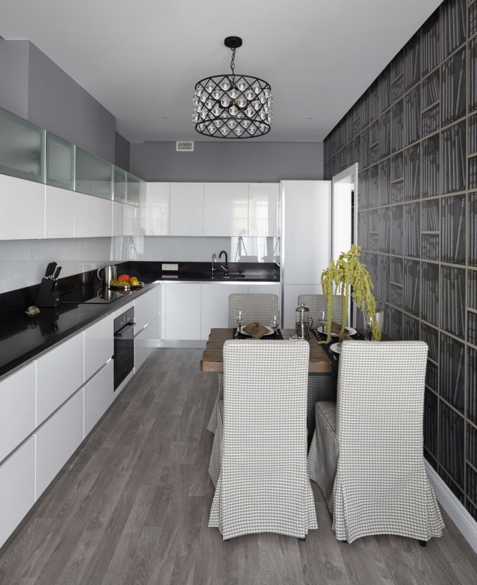
If needed equip a small kitchen and at the same time make it visually more spacious, it is better to choose a light gray furniture set with glossy facades, and make the walls and ceiling white.
In a cramped kitchenette with low ceilings, it is important to install a light countertop that does not contrast very much in color with the sideboards and cabinets. And also avoid too colorful and expressive aprons, otherwise there will be the effect of a room "cut in two" horizontally, because of which the ceiling will visually sag.
White top, gray bottom and vice versa
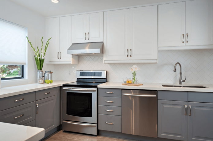
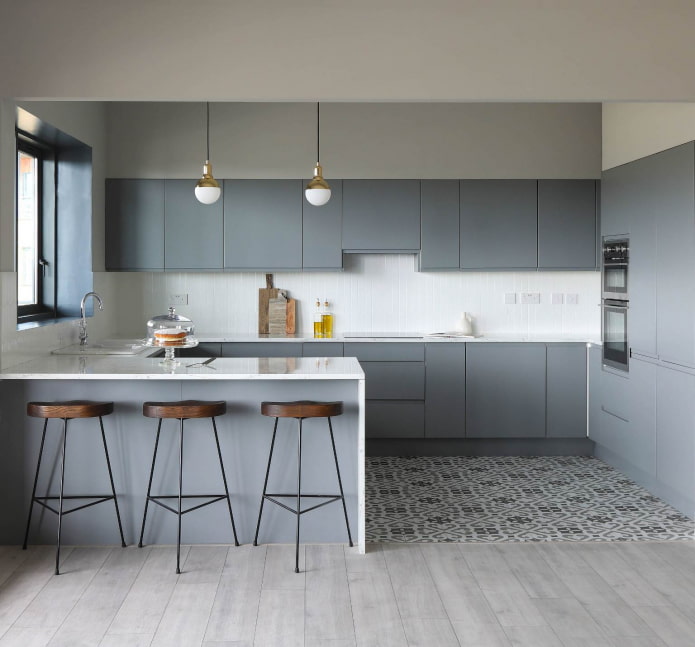
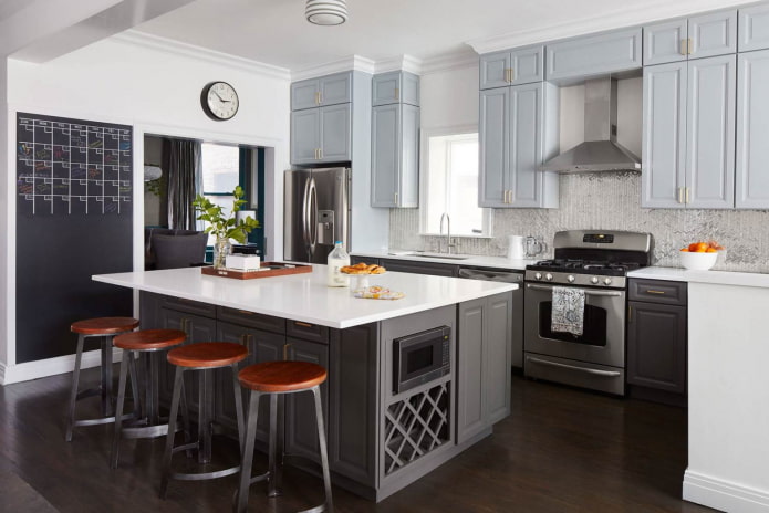
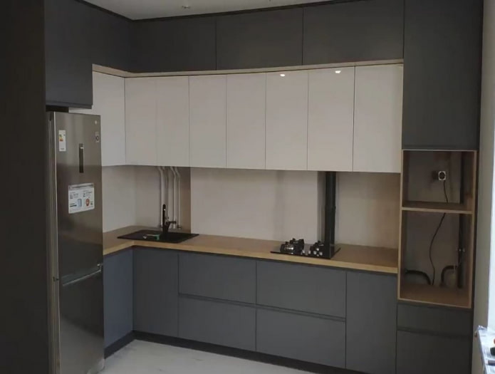
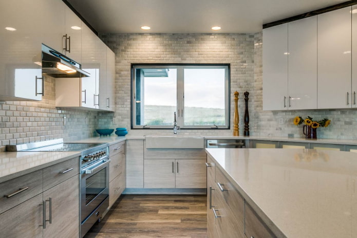
Continuing the sore subject low ceilings, we can recommend for this case white wall cabinets in combination with gray, not too dark cabinets. To smooth the transition from top to bottom of the headset, you can use a kitchen apron and countertops, made of the same light material or painted in the same discreet color.
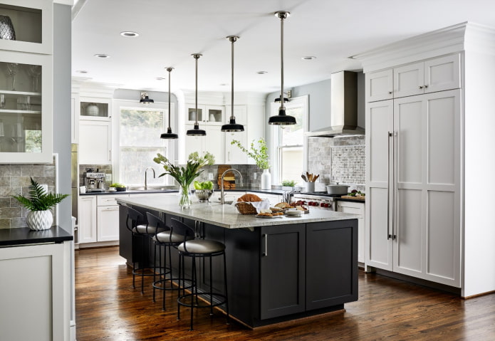
Take a look examples of kitchen design with a dark bottom and a light top.
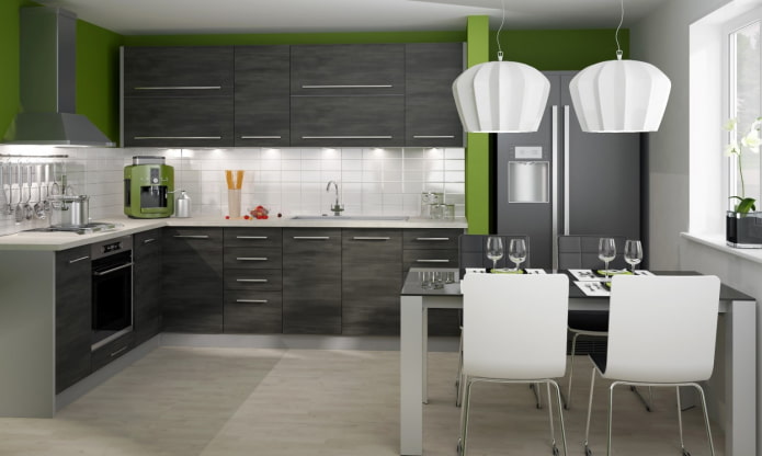
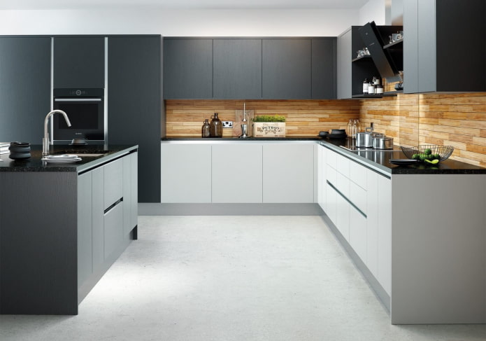
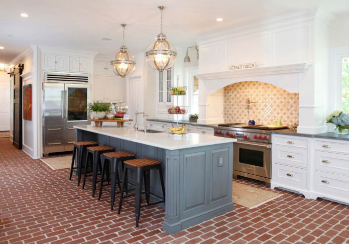
Gray cabinets, especially in dark colors, having an original complex shape, interspersed with open shelves, cluttered with utensils and decor - all this is the lot of spacious kitchens, which at the same time serve as a dining room or bar.
When in a cramped gray-white kitchen with low ceilings the cabinets are snow-white, the countertop is contrasting, and the cabinets are dark, we can say that all the wrong design decisions were made at once.
Non-trivial shades
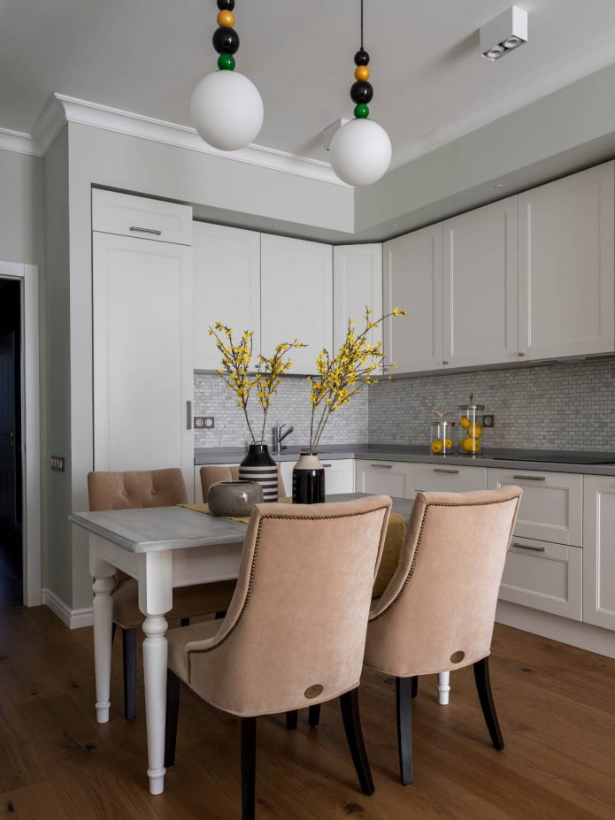
Hearing this very phrase - a gray-white kitchen - many sadly shrug their shoulders and start looking for more interesting options. But gray color is multifaceted and can bring a very different atmosphere to the interior. It all depends on the shade.
Both the furniture set and the walls of the kitchen can be of an unusual color, obtained by adding other tones to the classic gray: yellow, brown, blue, green, red. The temperature of the color will depend on this, it can turn out to be both warm and cold.
The final version sometimes looks so unexpected, fresh and stylish that it sets the whole mood.A few cleverly placed accents complete the overall picture. Calling such an interior dull simply will not turn your tongue.
Third leading color
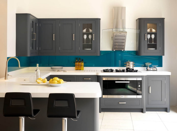
Gray and white kitchens have another hidden virtue - this combination serves as a great backdrop for other, deeper and more vibrant colors, such as black, blue, red, orange, turquoise or purple.
These rich colors reveal their full potential against the background of other neutral elements of the decor.
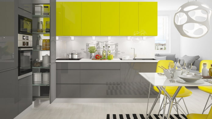
Gray-white-yellow and gray-white-scarlet kitchen interiors have already become classics high-tech style and minimalism, and fans, for example, of Scandinavian design will surely feel comfortable in a restrained gray-white-blue or gray-white-lilac kitchen.
Everybody knows Golden Rule: no more than three primary colors in one room. Let the third, your favorite color, keep the gray and white company, and you can bring it into the interior with the help of furniture, curtains, vases, paintings and other objects.
Mosaic floor
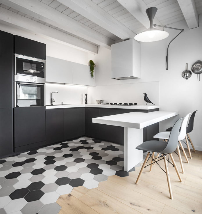
If the area allows, you can focus on flooring and with its help to emphasize the harmony of gray-white kitchen. In a tiny room, a variegated floor will "steal" precious meters.
Even if you just lay out the floors with white and gray tiles in the same shades that were used in the design of the rest of the kitchen interior, it will look boring. And if you add a third primary color, you get a complete picture.
Original apron
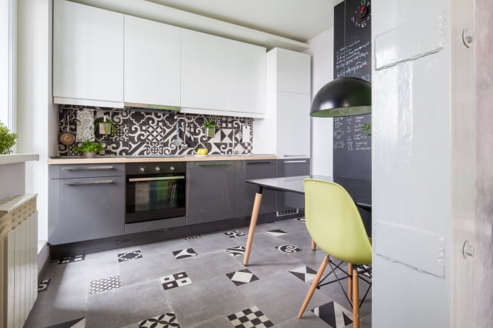
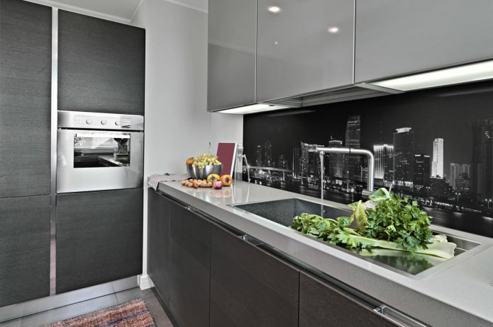
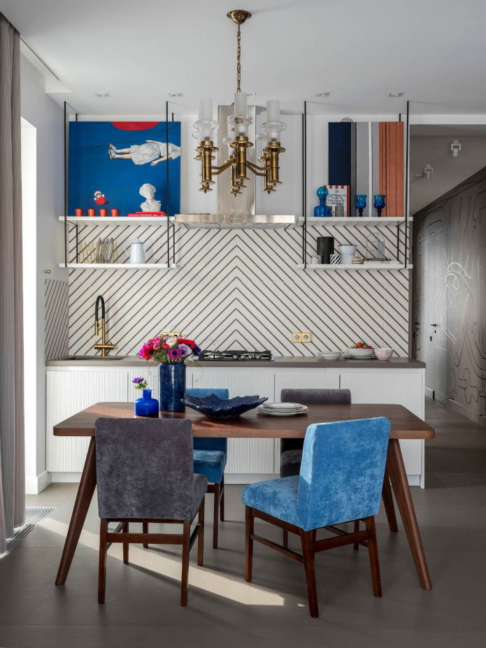
Kitchen apron or skinali can play the first violin to the unobtrusive gray-white accompaniment of other elements of the kitchen design. Moreover, in the wall above the working area, you can both combine the colors and textures already used in the interior, or add completely new ones that will attract all the attention.
In gray-white kitchens, any original aprons look advantageous: glass with 3D images and juicy photos, tiled, mosaic and brick, inlaid with natural stone or mirrored.
The warmth of natural wood
Another common reason why people abandon the decision to make a gray and white kitchen is the fear that it will turn out to be too formal, austere and cold. This will happen if not make cozy notes.
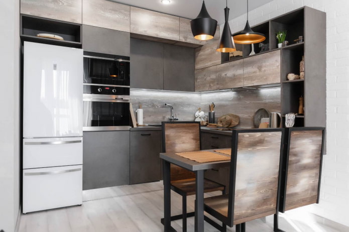
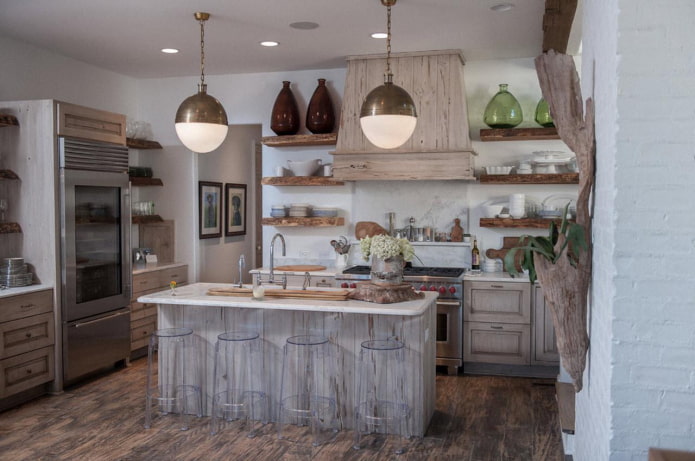
It will help to do this woodwhose natural warmth captivates at first sight when placed in a discreet gray and white frame.
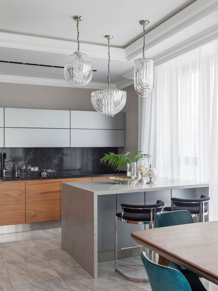
In such kitchens they look good wooden countertops, furniture and floors in a variety of shades, including deep and rich: yellowish, brown, cherry. For small rooms, light and bright wood is better; for spacious rooms, dark wood is also acceptable.
Cold shine of metal
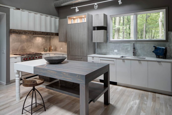
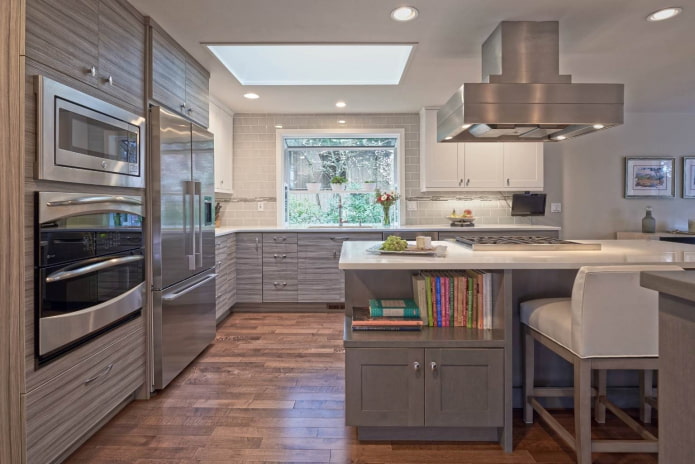
The classic gray color is similar to the metallic shade and therefore harmonizes with the furnishings made of metal. If you are not afraid of cold, daring and stylish interiors, emphasize this harmony.
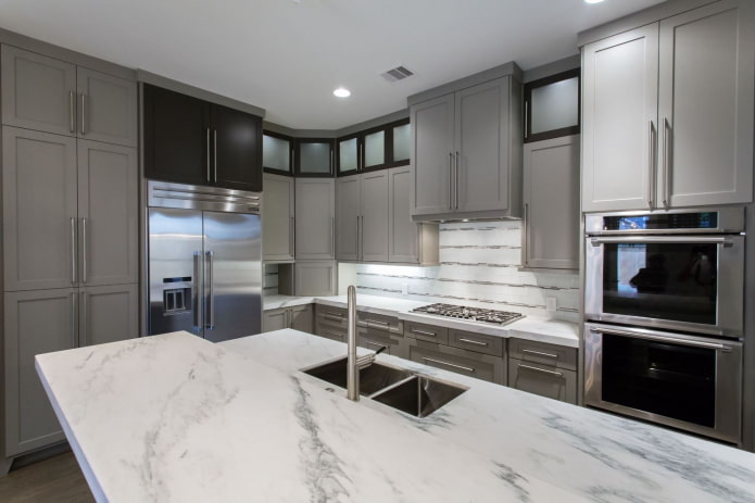
You can add harshness to a gray and white kitchen with metal lampshades on pendant lamps, chrome handles on furniture fronts, gleaming steel dishes and household appliances.
The brutality of brickwork
Those who found the previous idea tempting should think about kitchen design in an industrial style... It allows you to create cozy and, of course, unconventional interiors in your own way.
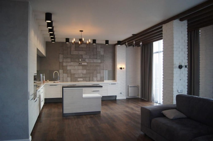
Brickwork, The "heart" of the loft, can be of a natural color, painted, or it can be raw, worn and deliberately rough. In any case, it will look great in a gray and white kitchen, and on the walls, and even on the floor.
Bright accents
Color, light and textured accents will help make a calm and restrained gray-white kitchen more interesting. The most obvious are chairs, curtains, tablecloths, wall decorations, decor and lighting fixtures. All this can be found a place even in a cramped kitchenette.
As for shades, then in modern gray-white kitchens juicy colors look especially advantageous:
- imperial red;
- fuchsia;
- ocher;
- sea wave;
- green grass;
- night blue;
- violet;
- emerald;
- an electrician.
Quieter shades such as olive, dusty pink or lemon will find their place in gray and white kitchens, decorated in classic and rustic styles.
Textured accents are also directly related to the style of the room... It can be linen, silk, bamboo, rattan, cork decoration or decoration.
About lighting must be said separately. With the help of well-placed main and spot lights, even the most cramped and poorly designed kitchen can be completely transformed. The bright looks especially impressive work lighting, dining or bar area in kitchens with an abundance of gloss and mirrors.
The gray and white kitchen is a space for self-expression and the embodiment of bold creative ideas. Such a range will fit into any design direction, so if it is pleasing to your eye, there is no need to abandon what was conceived. Gray and white doesn't mean boring.

 10 practical tips for arranging a small kitchen in the country
 12 simple ideas for a small garden that will make it visually spacious
 How to choose the color of your kitchen sink?
 White kitchen set: features of choice, combination, 70 photos in the interior
 Black set in the interior in the kitchen: design, choice of wallpaper, 90 photos
 How to choose curtains for the kitchen and not regret it? - we understand all the nuances
 Design of a white kitchen with a black countertop: 80 best ideas, photos in the interior
 Kitchen design with green wallpaper: 55 modern photos in the interior